
HOW TO CREATE A RAINBOW TEXT EFFECT ON YOUR WEBSITE
Sometimes it's fun to just add a random, pretty effect to your website, just because. Because who doesn't like rainbows? And since the answer to that is "No one!", why not add some rainbows to your website?

Sometimes it's fun to just add a random, pretty effect to your website, just because. Because who doesn't like rainbows? And since the answer to that is "No one!", why not add some rainbows to your website?
Let's do it.
How to create a rainbow text effect on your website:
First, add a CODE content block to your page.
Then add this snippet of code and change YOUR TEXT GOES HERE to whatever you'd like your text to say:
<style> .rainbowhead { display: block; margin:auto; background: linear-gradient(330deg, #e05252 0%, #99e052 25%, #52e0e0 50%, #9952e0 75%, #e05252 100%); background-clip: text; text-fill-color: transparent; } </style><body> <h1 class="rainbowhead">YOUR TEXT GOES HERE</span></h1> </body>
And that's it! You should now have rainbow text effect on your Heading 1 text! You can change this to any heading or font size you need by changing the "h1" to match the following:
<h1> = Heading 1
<h2> = Heading 2
<h3> = Heading 3
<p> = Normal
And that's it! Isn't it pretty?
The following information was created for use with templates made with Squarespace 7.0.
Stay tuned for more tips and tricks for the new 7.1 platform!
need even more help with squarespace?
Skip the overwhelm and have your website
designed and launched in just 5 days!


HOW TO CREATE A SLIDER WITH TEXT BLOCK OVERLAY
Adding a slider can create a lot of dynamic engagement with your content. I think this is a great item to feature on a custom blog layout! You can also add it to the homepage, or anywhere really!

Adding a slider can create a lot of dynamic engagement with your content. I think this is a great item to feature on a custom blog layout! You can also add it to the homepage, or anywhere really!
This quick customization allows you to customize the design of the caption that appears on top of the image. By adding a background box and some pretty text, your audience will definitely get clicking!
Ready to learn how? Let's do it.
How to create a slider with text block overlay
on your Squarespace website:
First, add a Slider content block to your page (Gallery > Slideshow)
Then add this snippet of code below to your Custom CSS (Design > Custom CSS)
To change the color of the text or background box, change the bold parts of the code below.
/* slider with text overlay */
.sqs-block-gallery .sqs-gallery-block-slideshow {
max-height: 500px !important;
.sqs-gallery-design-stacked-slide {
max-height: 500px !important;
overflow: hidden;
img {
transition: all ease-in-out 300ms !important;
}
}
.meta {
background-color: white;
max-width: 60% !important;
transition: all ease-in-out 700ms !important;
-webkit-transition: all ease-in-out 700ms !important;
-moz-transition: all ease-in-out 700ms !important;
-ms-transition: all ease-in-out 700ms !important;
}
.meta-title {
text-align: center;
font-size: 16px;
text-transform: uppercase;
letter-spacing: 2px;
padding: 6px 20px;
color: #042663;
}
.meta-description p {
text-align: center;
color: #9DB0D8;
font-size: 12px;
letter-spacing: 1px;
padding-top: 4px;
max-width: 550px;
}
.meta-description a:link {
color: #9DB0D8;
text-align: center !important;
}
.sqs-gallery-design-stacked-slide:hover {
img {
-webkit-filter: blur(3px);
filter: blur(3px);
}
}
@media (max-width : 667px) {
.meta {
display: block !important;
max-width: 70% !important;
min-width: 70% !important;
left: 50% !important;
}
.meta-title {
font-size: 12px;
}
.meta-description p {
display: none;
}
}
}
You should now have a slider with text block overlay!

All you have to do now is upload your images and add your Title Captions!
(To do this, hover over a slider image and click the gear icon. Then add your title! If you want to add the "Read Post" text, simply add this to the description box and link it to whatever page or post you'd like.)
And that's it!
The following information was created for use with templates made with Squarespace 7.0.
Stay tuned for more tips and tricks for the new 7.1 platform!
need even more help with squarespace?
Skip the overwhelm and have your website
designed and launched in just 5 days!

HOW TO DISPLAY GALLERY CAPTIONS ON A MOBILE DEVICE
Ever notice how sometimes a perfectly amazing feature set up for a desktop browser doesn't quite translate like you want it to on mobile? I've found a way to modify the gallery caption display so that it will always work no matter what device you're on!
Ever notice how sometimes a perfectly amazing feature set up for a desktop browser doesn't quite translate like you want it to on mobile? It's a bummer and can make you rethink the whole design.
This happened to a client's site recently when I set up a gallery of her art work and displayed the name of each painting as a caption. The default gallery caption option displays the caption when you hover your mouse over the image. Cool! But not so cool on a mobile device where it just doesn't display at all! Womp womp.
So, I've found a way to modify the caption display so that it will always work no matter what device you're on.
First, head into the Design panel.
Click Custom CSS.
Paste in the following code:
/*** DISPLAY GALLERY CAPTION ***/
.yui3-lightbox2 .sqs-lightbox-meta {
opacity: 1 !important;
background: rgba(0, 0, 0, 0.7) !important;
}
@media only screen and (max-width: 1024px){
.yui3-lightbox2 .sqs-lightbox-meta{
bottom: 0px !important;
}
}
And that's it!
You should now be able to view the gallery captions
on both mobile and desktop browsers.
The following information was created for use with templates made with Squarespace 7.0.
Stay tuned for more tips and tricks for the new 7.1 platform!
2 Easy Newsletter Customizations for Squarespace
More customizations for all you Squarespace lovers today! This one changes the standard newsletter block. I find that this can be a dead giveaway that your site is built on Squarespace, so why not jazz it up? These two handy code snippets will allow you to customize your submit buttons as well as the form fields. As always, it's super easy - just copy and paste!
More customizations for all you Squarespace lovers today! This one changes the standard newsletter block. I find that this can be a dead giveaway that your site is built on Squarespace, so why not jazz it up?
These two handy code snippets will allow you to customize your submit buttons as well as the form fields. As always, it's super easy - just copy and paste! Below is the example newsletter with the design changes.
01. Newsletter Button Font
There are a few little code changes you can make to jazz up the plain "Read More" to match your branding colors. Here are the steps:
In the main Squarespace menu, click DESIGN. Then CUSTOM CSS.
Copy and paste the following code:
/*** NEWSLETTER BUTTON - TEXT AND BACKGROUND COLOR ***/
.newsletter-block .newsletter-form-button{
font-family: Kessel !important;
letter-spacing: .2em;
}
The red highlighted text is where you can change your font and background color for the button. Do not edit the other text! (You can also add this code to an individual page if you don’t want it to affect all newsletter buttons on your site).
02. Open Form Fields for the Newsletter
There are a few little code changes you can make to jazz up the plain form fields to match your branding colors and feel more modern. Here are the steps:
In the main Squarespace menu, click DESIGN. Then CUSTOM CSS.
Copy and paste the following code:
/*** NEWSLETTER FORM FIELDS ***/
.newsletter-form-field-element {
background: none !important;
border-top: none !important;
border-left: none !important;
border-right: none !important;
border-bottom: solid 3px #F2CBCB !important;
}
/*** NEWSLETTER BUTTON BORDER ***/
.newsletter-block .newsletter-form-button{
border-bottom: solid 3px #F2CBCB !important;}
The red highlighted text is where you can change your form's line color. You can also make the line thicker or thinner by changing the pixel weight (ie: 1px for thinner and 6px for thicker). Do not edit the other text! (You can also add this code to an individual page if you don’t want it to affect all newsletter form fields on your site).
And that's it!
The following information was created for use with templates made with Squarespace 7.0.
Stay tuned for more tips and tricks for the new 7.1 platform!
NEW!
A templated guide to messaging magic
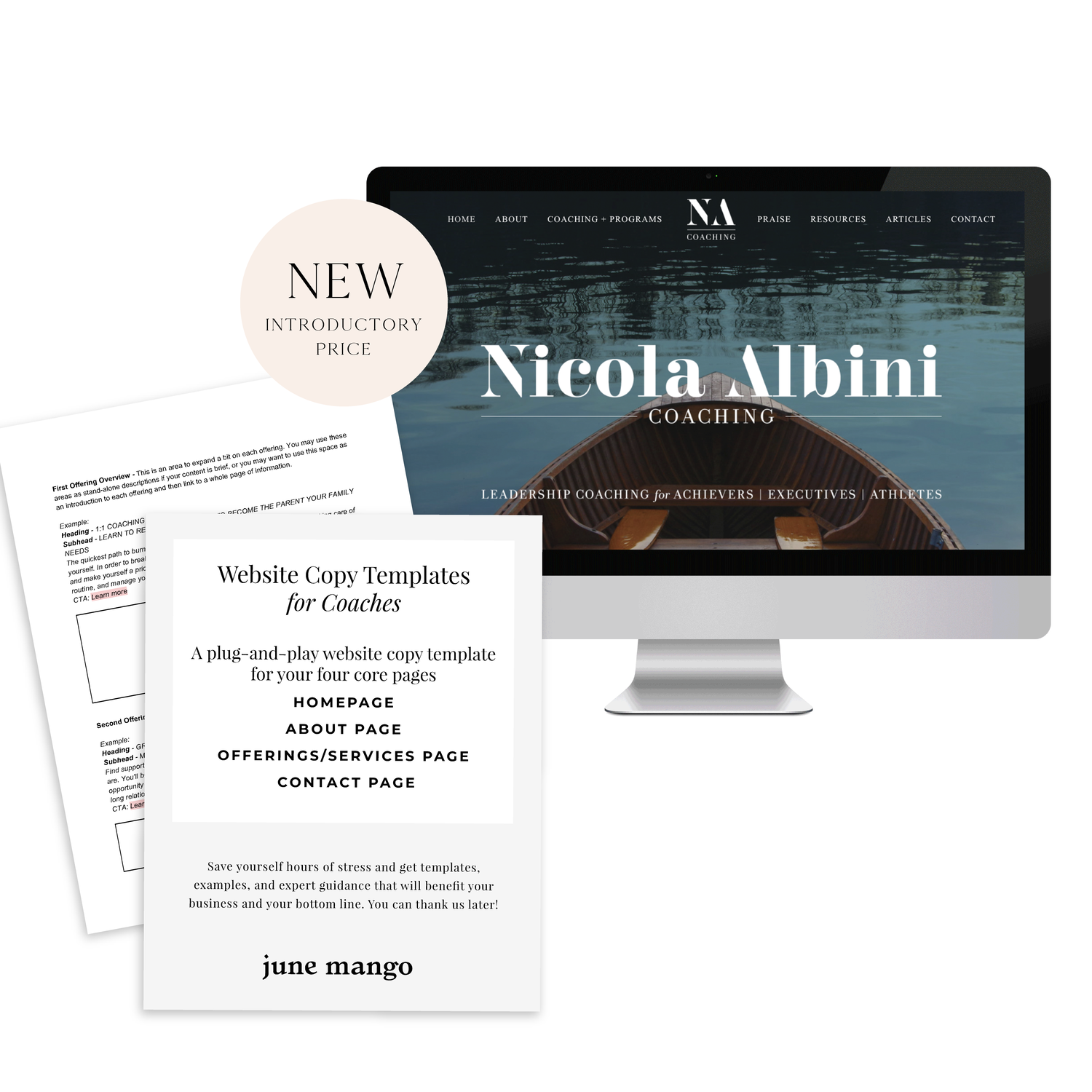
A plug-and-play website copy template for your four core pages (Home, About, Offerings, Contact). Save yourself hours of stress and get templates, examples, and expert guidance that will benefit your business and your bottom line.
LEARN MORE


HOW TO CUSTOMIZE YOUR "READ MORE" LINK ON SQUARESPACE
I've got another little snippet of code for all you Squarespace lovers today! This one is for that boring old "Read More" link that appears on a Summary Block. Especially if you are using Squarespace's Summary Block to showcase your blog posts, the "Read More" link is often a good spot to get your audience to engaged (ie: so that they read more!) with your featured posts. So how do you take it from boring black text to something that matches your brand? I've gotcher back.
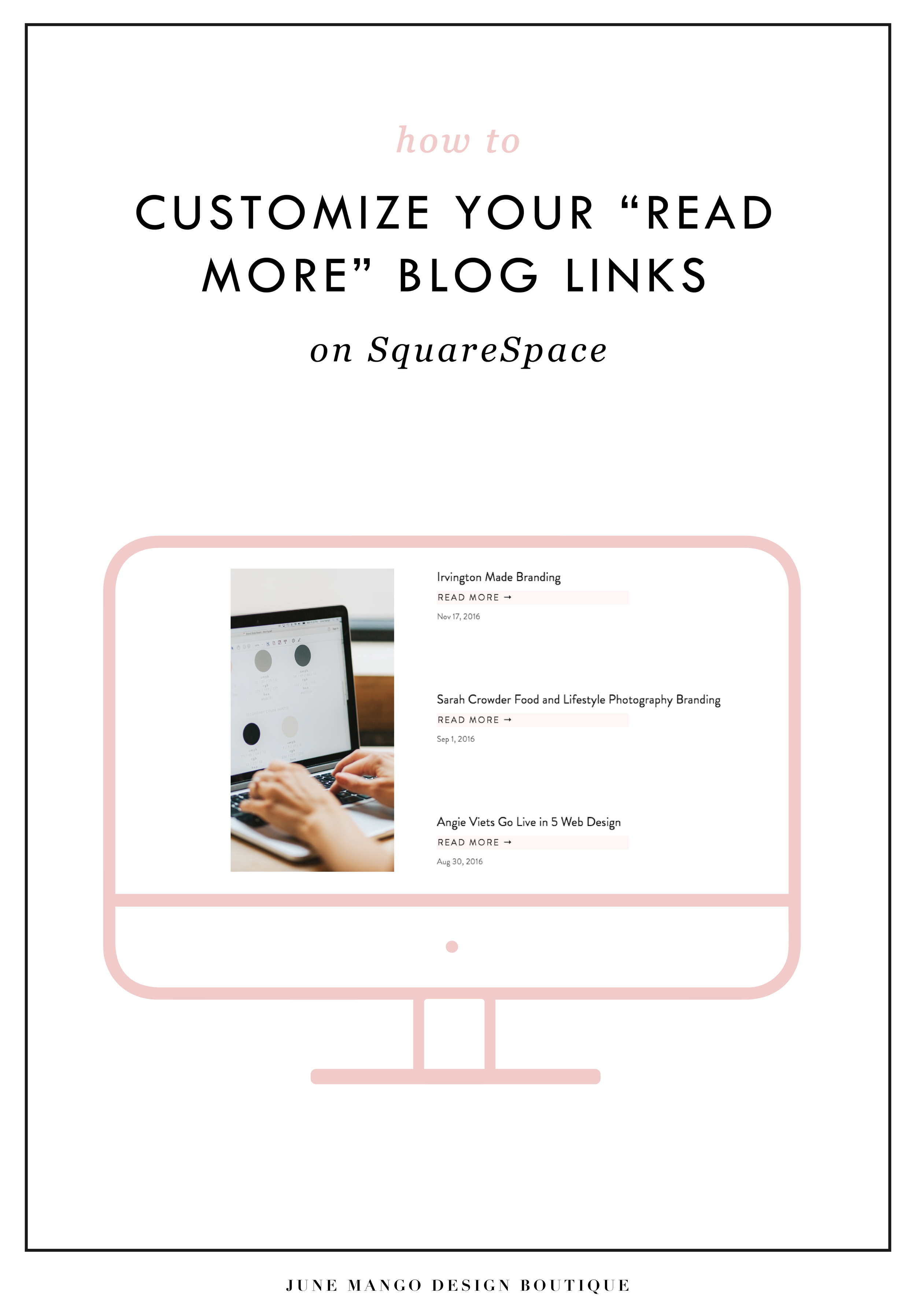
I've got another little snippet of code for all you Squarespace lovers today! This one is for that boring old "Read More" link that appears on a Summary Block. Especially if you are using Squarespace's Summary Block to showcase your blog posts, the "Read More" link is often a good spot to get your audience to engaged (ie: so that they read more!) with your featured posts. So how do you take it from boring black text to something that matches your brand? I've gotcher back.
There are a few little code changes you can make to jazz up the plain "Read More" to match your branding colors. Here are the steps:
In the main Squarespace menu, click DESIGN. Then CUSTOM CSS.
Copy and paste the following code:
/*** READ MORE LINK - TEXT ***/
.entry-more-link a:not(.sqs-block-button-element) {
color: #F2CBCB !important;
}
.entry-more-link a:not(.sqs-block-button-element):hover {
color: #444444 !important;
}
The pink highlighted text is where you can change your colors. Do not edit the other text. (You can also add this code to an individual page if you don’t want it to affect all “Read More” links on your site).
IMPORTANT ! !
Each template has a different method to define their "Read More" links. Please select the method for your template below, and then replace the red CSS code (.entry-more-link) with your template’s method. (If you’re template isn’t listed below, please try the links below, - many work for more than one template. If none of these work, feel free to email me with your specific template at hello@junemango.com).
Adirondack:.link
Five: .inline-read-more
Fulton: .summary-read-more-link
Horizon: .summary-read-more-link
Peak: .read-more
Mohave: .summary-read-more-link
Marquee: .entry-more-link
And that's it!
The following information was created for use with templates made with Squarespace 7.0.
Stay tuned for more tips and tricks for the new 7.1 platform!


need even more help with squarespace?
Skip the overwhelm and have your website
designed and launched in just 5 days!

HOW TO REMOVE THE DATE FROM YOUR SQUARESPACE BLOG POSTS
If you would like to remove the blog date and time from Squarespace, there is an easy bit of CSS code you can use to make it work. The catch is that you have to do a bit of research first. I've listed the steps below, which are super simple, but they work best if you're working within a Chrome browser.
Squarespace is so great for its Drag and Drop abilities, but once in a while, SquareSpace gets a little stubborn and won't let you change the simplest things. One of those things is your blog post publish date.
If you would like to remove the blog date and time from SquareSpace, there is an easy bit of CSS code you can use to make it work. The catch is that you have to do a bit of research first. I've listed the steps below, which are super simple, but they work best if you're working within a Chrome browser.
How to remove the date from your Squarespace blog posts:
First, move your cursor over the date on your blog and right click.
Click "Inspector". This should bring up all the code from your SquareSpace site.
Find the "Class" that contains the date. The "class" name should look something like this: <time class="thisisthenameoftheclass">March 31, 2016</time>
Copy and paste the class name into your Custom CSS. To get here, go to DESIGN -> CUS TOM CSS and paste in the code below. (Make sure you change .insertclass to the name of your class from Step #3).
.insertclass{ display: none; }
And that's it! You should now have hidden all the dates from showing on your Squarespace blog.
The following information was created for use with templates made with Squarespace 7.0.
Stay tuned for more tips and tricks for the new 7.1 platform!


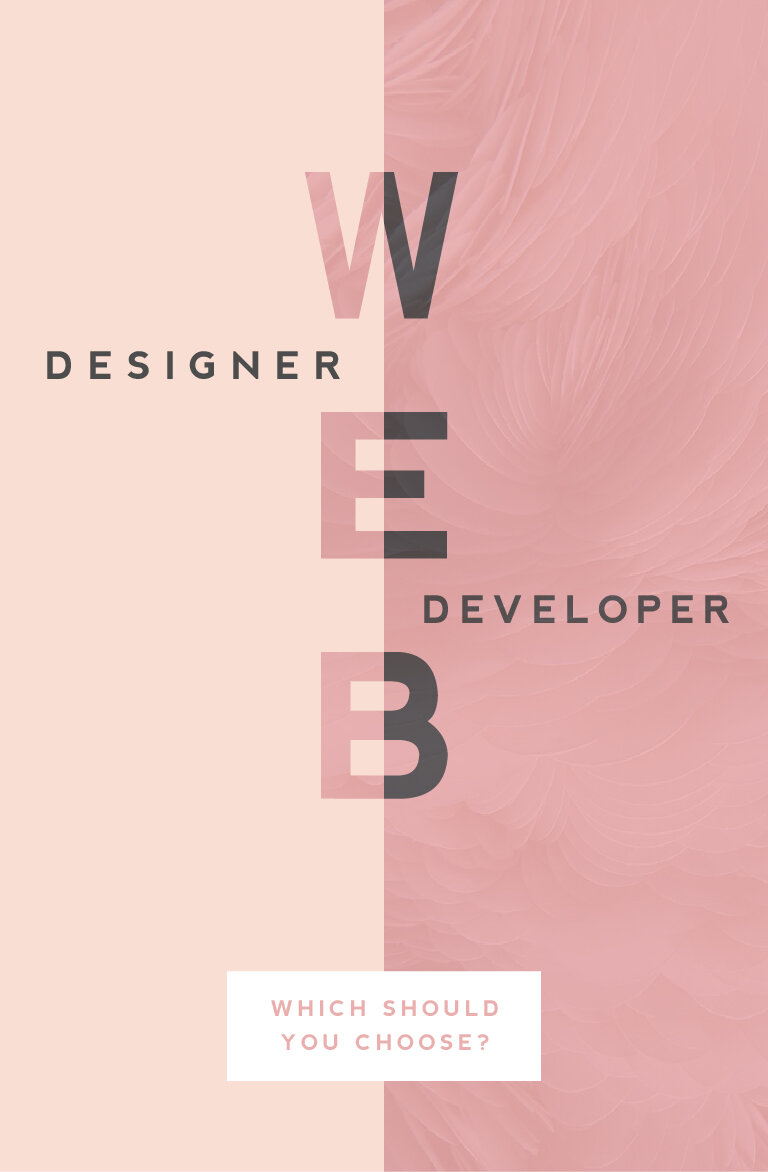
WEB DESIGNER VS. WEB DEVELOPER: WHICH SHOULD YOU CHOOSE?
One of the questions I get asked most often is "What is the difference between a web designer and a web developer?". There are some very clear-cut differences, which I'll get into below, but truthfully, they can often overlap. I think this is why it can be confusing. But what are the main differences and which should you choose? Read on...
WEB DESIGNER
Web designers create and direct all visual aspects of a website including graphics, photos, layout, fonts, color palettes, and interactivity, which can include color changes, mouse rollovers, moving images, etc.
This person usually has the following responsibilities:
Researching and designing concepts that are easy to use (user-friendly), beautiful, and engage the audience
Designing page layouts and interactions (i.e.: button turns pink when you click it)
Working closely with web developers during the process of building the website online
Having an understanding of different audiences and interests with the ability to translate that into an interactive web space
Working collaboratively with content creators and copywriters to visually represent their work
Bringing a brand to life dynamically through layout, font selection, color palette and interactivity
Overseeing a project’s entire creative process
When looking to hire a web designer, make sure they also have the following skills:
Knowledge and interest in current trends in design, both digital and print
Ability to to understand the client's perspectives or problems and come up with ideas that are clear and TKTK
Significant comprehension of how HTML, CSS, browsers, and devices all work together
Ability to simplify solutions to problems and solve them through design
A style that jives with your own
A strong portfolio of projects that are similar to yo urs
WEB DEVELOPER
(There are two main types of web developers, front-end or back-end. PRO TIP: If you're looking to build a website, that's front-end.)
A web developer is someone who uses HTML, CSS and JavaScript to create a website that a user interacts with directly through their web browser. Basically, they build the 'front-end' of the website (vs. the 'back-end' of a website which is like what you interact with when you login to a website, like WordPress).
This person usually has the following responsibilities:
Translating wireframes or design mock-ups to actual code that will produce visual elements
Bridging the gap between graphic design and technical implementation
Develop web pages for commercial and content management systems, or CMS platform (like WordPress)
Understanding of web development user experience best practices (i.e.: the logo should be at the top of every web page)
Having experience with and a deep understanding of web technologies including JavaScript/jQuery, CSS, PHP and HTML5
Developing and implementing responsive websites (i.e.: does it look flawless on your tablet or phone AND your desktop computer?)
When looking to hire a web developer, make sure they also have the following skills:
Excellent problem solving skills (PRO TIP: Any good web dev. will tell you the job is about 98% problem solving!)
Experience working directly with graphic designers and website design mock-ups
If not hiring with a designer, developer should have excellent design and layout skills
So now you know the difference but your still not sure which you should hire to build your website? This doesn't necessarily have a clear cut answer because it depends on you and what you're looking for.
Personally, I recommend finding a web designer who knows a great web developers to help build custom WordPress sites. Otherwise, many web designers (like yours truly) typically know enough HTML and CSS to customize a pre-programmed website or theme, like this website. It simply depends on the project.
Hopefully this (long) list of differences will help you choose who's right for your web project. And if you're still confused or have more questions, just holla at me! I'm always happy to chat!
Related Posts
need even more help with squarespace?
Skip the overwhelm and have your website designed and launched in just 5 days (or less)!