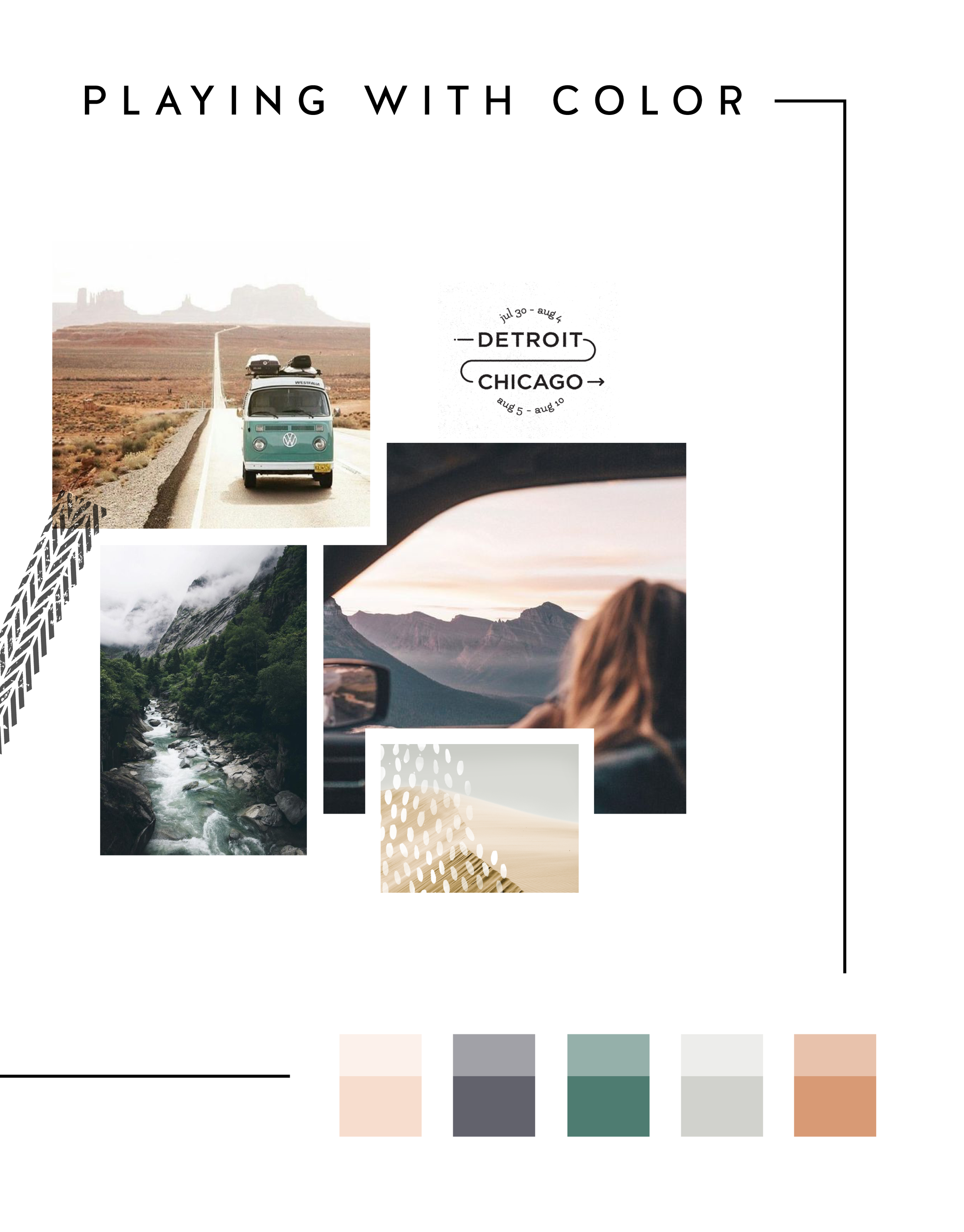
In the MOOD boards: Road Trippin'
Feeling excited for a little road trip in the works, so I created a mood board and color palette for inspiration. Deep green trees, windows down, sunsets fading into starry nights... serious design inspiration!

Related Posts
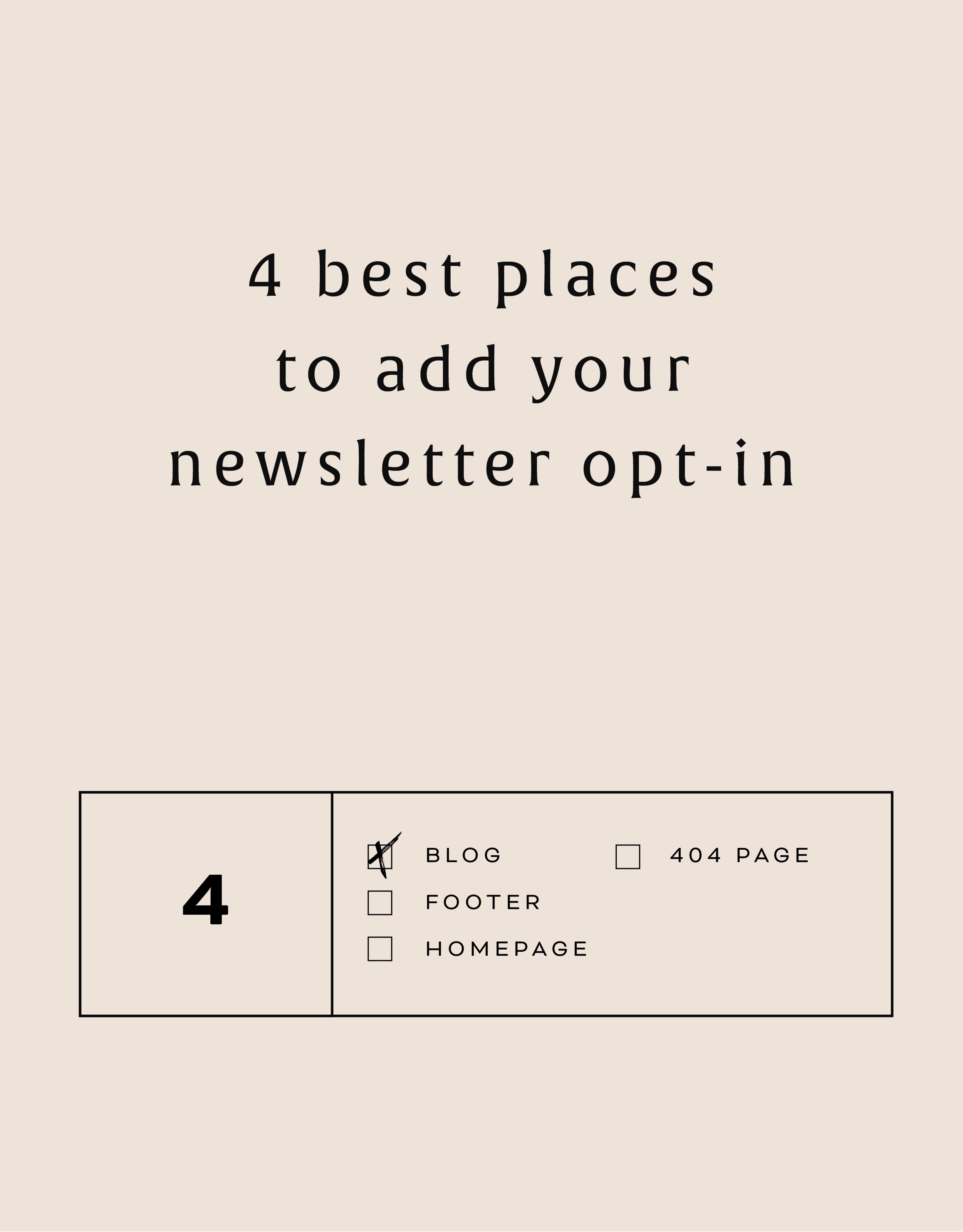
The 4 best places to add your newsletter opt-in
Growing your newsletter list is so important when you run an online business. It can help you keep in touch with your dream clients, build trust with your audience and promote new offerings. But the question my web clients always ask is: Where is the best place to add my newsletter opt-in or sign up form?
Growing your newsletter list is so important when you run an online business. It can help you keep in touch with your dream clients, build trust with your audience and promote new offerings. But the question my web clients always ask is: Where is the best place to add my newsletter opt-in or sign up form?
There are 4 places I ALWAYS add the newsletter opt-in forms on any website.
Blog
Adding the newsletter opt-in to your blog allows you to capture people who are already interested in what you have to say. They are on your blog reading all of your juicy content, so why not try to get them onto your newsletter list where you have even juicier content! I like to make sure this opt-in is specific, and maybe different from other sign up forms elsewhere on the site. For example, it should incentivize them to sign up with the promise of sharing your expertise for free with a worksheet, guide, etc. Adding this opt-in to the sidebar of your blog is one of my favorite places to engage newsletter subscribers on your site.
Footer
It's the one place people will see no matter what page of your website they land on (or click to!). So make it work for you by adding a newsletter sign up form. Repetition of views will also increase the chance that people will sign up. I like to keep this one more generic with a description of what you typically send out vs. a specific freebie or promo.
Homepage
You probably guessed this one, right? But do you know where on the homepage you should add your opt-in? The rule of thumb is above the fold
(aka: the amount of the webpage a user sees before needing to scroll down).
Ideally, you will still be able to communicate your mission statement (who you are, what you do, and who you do it for) before the newsletter. No one is going to sign up for a newsletter if they don't know who the heck you are yet! But grabbing their attention before they scroll down the page is a great way to ensure they get on your list.
404 Page
Have you given much thought to your 404 page? It's a handy little page that pops up when someone clicks a broken link or types a URL wrong. It has so much potential to be interesting and engaging, which is important for keeping your audience on your site! Besides giving them a link back to your homepage, you can also sneak in a newsletter opt-in here! It's an unexpected place to get that person to sign up.
You can add your newsletter opt-in to all four of these places or just pick and choose. Have another spot you think would be great? Let me know!
Related Posts

Easily Add Custom Fonts To Your Squarespace Website Design (WITHOUT TYPEKIT)
So you've just been given a beautiful new branding package from your designer full of brand new fonts and everything else. But now you're stumped as to how to add these custom branded fonts to your Squarespace site. But I've gotcher back with a Squarespace hack for you that will bring those branded fonts to life online!
So you've just been given a beautiful new branding package from your designer full of brand new fonts and everything else. But now you're stumped as to how to add these custom fonts to Squarespace. But I've got your back with a Squarespace hack for you that will bring those branded fonts to life online! This little Squarespace hack took me a long time to discover (*covers eyes in shame*)... which is crazy because it's actually pretty simple! It just takes a few simple steps and a little custom code. But anyone can do it! I promise.
Read on for the full tutorials to learn how to add custom font to Squarespace 7.0 and 7.1.
HERE ARE THE STEPS for 7.0:
In the main Squarespace menu, click DESIGN. Then CUSTOM CSS.
Below the CSS editor, click MANAGE CUSTOM FILES.
Then upload your font file (this is a file with an extension of .ttf or .otf)

Copy and paste the following code into the CSS editor:
@font-face {
font-family: 'FONT NAME';
src: url('FONT GOES HERE');}
Change the text that says FONT NAME to the name of your custom font
Highlight the text that says FONT GOES HERE. Then click MANAGE CUSTOM FILES and click on the font you uploaded in the steps above. FONT GOES HERE should now be replaced with a url.

Repeat this step with all of your custom fonts.
Once you have all of your fonts uploaded and added to the CSS code, it's time to make them replace the default Squarespace fonts. To do this, copy and paste the code below into the CSS editor:
h1{ font-family: 'FONT NAME' !important;}
h2{font-family: 'FONT NAME' !important;}
h3{font-family: 'FONT NAME' !important;}
p{font-family: 'FONT NAME' !important;}
You can still adjust the settings of each font in the regular style editor (ie: font size, letter spacing, etc). Make sure to click Save at the top of the Custom CSS page. That’s how to add custom fonts to Squarespace 7.0.
Huzzah!
HERE ARE THE STEPS for 7.1:
Repeat the steps above with all of your custom fonts.
(Because Squarespace 7.1 has 8 different font and heading sizes, you have a couple of additional optional lines of CSS to add depending on which size font you want use to add your custom font to Squarespace.)
Once you have all of your fonts uploaded and added to the CSS code, it's time to make them replace the default Squarespace fonts. To do this, copy and paste the code below into the CSS editor:
h1{ font-family: 'FONT NAME' !important;}
h2{font-family: 'FONT NAME' !important;}
h3{font-family: 'FONT NAME' !important;}
h4{font-family: 'FONT NAME' !important;}
p1{font-family: 'FONT NAME' !important;}
p2{font-family: 'FONT NAME' !important;}
p3{font-family: 'FONT NAME' !important;}
p4{font-family: 'FONT NAME' !important;}
You can still adjust the settings of each font in the regular style editor (ie: font size, letter spacing, etc). Make sure to click Save at the top of the Custom CSS page. That’s how to add custom fonts to Squarespace 7.1.
Don’t forget to refresh your website design and test out the new fonts.
Once you have added the custom fonts to your Squarespace website design, you can begin to test out the new look. Refresh any areas of your site that feature text and check for font rendering issues – if everything looks good, then congratulations – you have successfully added custom fonts to your Squarespace site!


need even more help with squarespace?
Skip the overwhelm and have your website
designed and launched in just 5 days!

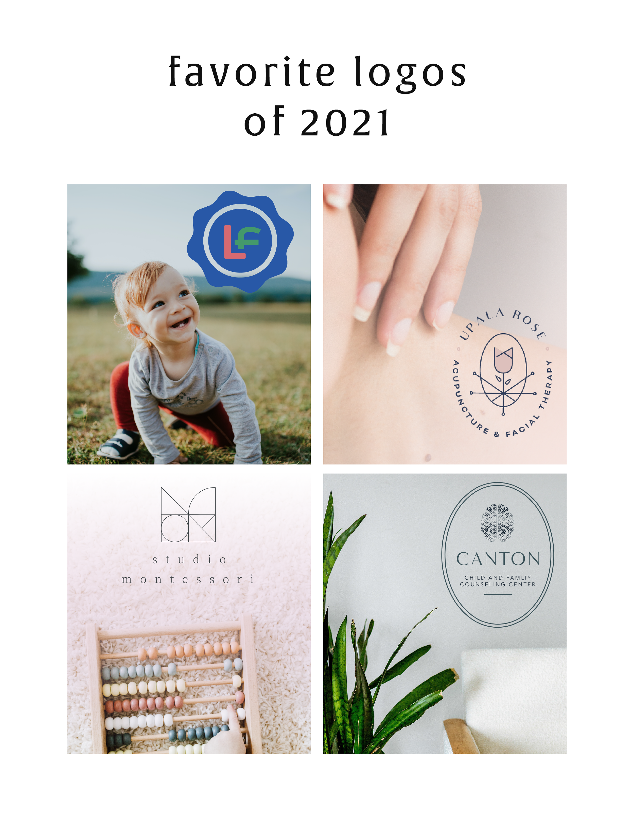
MAKING DESIGN TRENDS UNIQUE TO YOUR BRAND - PART 2
In my last post, I went over how to jazz up some common design trends and make them unique to your brand. I'm diving back into today with some common design trends that I see ALL OVER Pinterest. Especially for wedding pros and boss ladies, these trends are HOT. But I'll show you how to make them distinctive so that you and your brand stand out.
In my last post, I went over how to jazz up some common design trends and make them unique to your brand. I'm diving back into today with some common design trends that I see ALL OVER Pinterest. Especially for wedding pros and boss ladies, these trends are HOT. But I'll show you how to make them distinctive so that you and your brand stand out.
Design trend #1: Watercolor er'thing

Logos by KimberlyPaigeDesigns & Autumn Lane Paperie
There a few great creative brands that can utilize watercolor elements well like artists, wedding industry pros, and brands that cater to babies or kids. But what if you want to up-level the watercolor game for your own brand? Here's how.
A: Layer up! Adding some additional color and texture will help add more visual interest to the logo. You can even add a little details, like the trees in this logo by Happily Ever After Etsy above. Darker colors will also add more sophistication and maturity to the logo.
B: Define it's shape!Instead of creating a simplified watercolor swatch, try creating a watercolor elements in the form of an item related to your business or brand. West End Girl Studio does this well in the logo above with watercolor leaves.
Design trend #2: Floral er'thing

Logos by Arlyne Grace Design & Elle & Co.
Ahh... floral motifs. I have a real love-hate relationship with them. They can be so great and sometimes are so obviously appropriate (hello, wedding florist!). But sometimes, they seems to be a go-to design just because they're pretty. So here are some ways to use these gorgy florals in your branding, but up-level them to match your unique biz.
A: Add additional elements! Adding some additional design or drawn elements to the florals will make the logo more unique. You can even use real florals instead of drawn/painted flower elements, like this bouquet in the logo by One Plus One above.
B: Break the rules! If you read Part 1 of this series, you may be sensing a theme. Breaking some design rules (keyword: some) is a great way to add visual interest to any design. In the logo/letter above by the aleph corporation, the flower petals break out of the border of the letter A's peak. It's just enough to add a bit of whimsy without overpowering the letter or structure.


MAKING DESIGN TRENDS UNIQUE TO YOUR BRAND - PART 1
Can we just have some real talk right now? Ya? Ok, the thing is, there's a lot of design trends that are just being recycled. Over and over and over. The problem with this (besides being boring), is that the logos aren't actually making their brands standout. You deserve to be on trend AND have a logo that won't be seen anywhere else.
Can we just have some real talk right now? Ya? Ok, the thing is, there's a lot of design trends that are just being recycled. Over and over and over. The problem with this (besides being boring), is that the logos aren't actually making their brands standout. You deserve to be on trend AND have a logo that won't be seen anywhere else.
So how can you take these design trends you're crushing on and make them unique to your brand? I have a few examples below to help you do just that.
Design trend #1: Circular Stamps / Submarks
These work so well for businesses who literally need a stamp created for their business. They're succinct, versatile and sophisticated. So now let's make it more unique to your brand.


A: Change the shape! This could be a simplified shape of the brand's distinctive identity, like the logo by Yossi Belkin above, or something as simple as a hexagon, triangle, or scalloped edge.
B: Break the rules! I am a big fan of breaking design rules. It just makes things a bit more interesting, like this logo by Salted Ink. So bust the design elements out of the circular text or make your circle wrap around only 3/4 of the way closed. Just shake shit up a little bit and see what you can come up with.
Design trend #2: Monograms

A: Combine letters! Simplify, simplify, simplify. That's my #1 rule of thumb for design. When it comes to monograms, using the strokes of each letter and combining them can help you create a totally unique mark.
B: Sneak in the second letter!Using negative space and the natural lines of the letters, you can 'imply' where the second letter is. In the logo for web dev Kyle Acker above, the K is prominent, but the A is inferred. It makes you take a second look, which if you ask me, is the mark of a strong logo.
These are just a few ways you can take something that's ay-ok and up-level it to be something really cool and unique to your brand! I'll have more on this and other common design trend in Part 2 of this series.
Related Posts

THE SIMPLEST GUIDE TO COLOR PSYCHOLOGY
If you know anything about me at all, you know how much I love color. It is one of my favorite things - right up there with my family and chocolate. So it’s no wonder that adding color to a project is my favorite part of the process. It's also a crucial part of the process because it can change the feeling and appeal of a brand or website.
There are literally college courses (I took many!), books and a ton of in-depth resources devoted to the study of color and color psychology. But since you are probably not a #colornerd like me, I have broken down how to work with your color palette without having to dive deep into all that is Color Psychology.

Quick Color Psychology Overview
Whether you realize it or not, colors evoke emotions, feelings, and memories, and you can utilize this to create a brand or business presence that works to attract your dream client or customer. But since this can quickly become a rabbit hole of color-nerdiness, I have laid out the Quick and Dirty Guide to Color Psychology above. This little chart will show you how you can apply this knowledge to your logo, branding, website and anything else that incorporates color. Feel free to click the image to download a PDF version for yourself to reference in your future projects.
As John Ruskin said, "The purest and most thoughtful minds are those which love color the most.” And I couldn't agree more. 😉
WANT to CREATE
a custom WEBSITE?


ESSENTIAL FILE FORMATS FOR DESIGN
This post is for those of you who may not understand a lot of the terms designers talk about when it comes to sending along your final logo or design files. And this is also helpful for you to know once you get that big ol' package of file formats so that you can use each file type in the appropriate place. So, today I am focusing on understanding the main file formats used for design, which includes JPG, PNG, GIF, EPS, PDF, and TIFF files. Each file type can be used for a different reason. I’ve listed out each of the main types along with their best uses below.
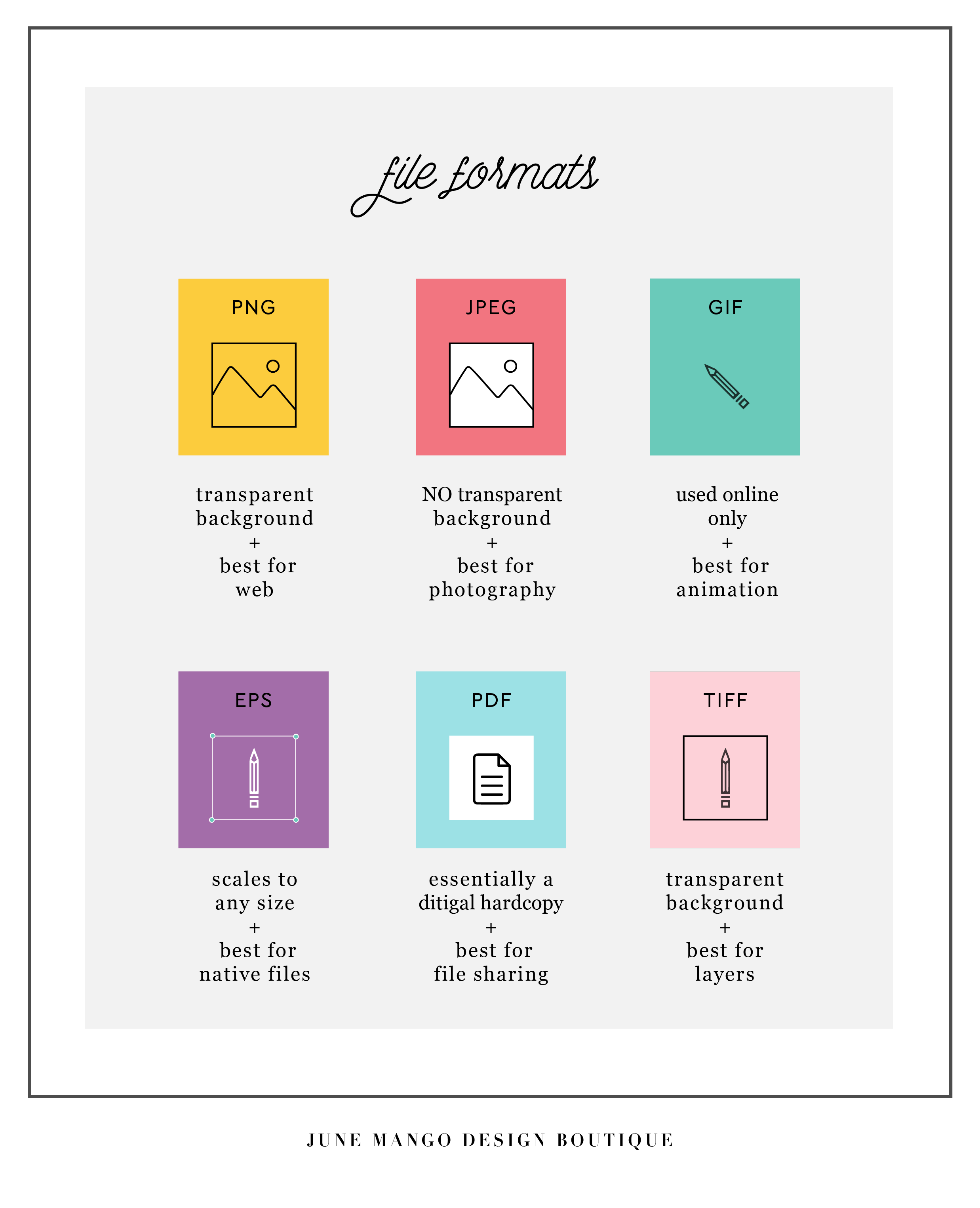
Hopefully you can use this as a quick guide to your file formats when you're feeling a little lost in the proverbial design jungle. Feel free to save this to your desktop and look back to it whenever you need it!
Related Posts

15 BOOKS FOR CREATIVES
As creatives running our own businesses, it can be hard to wear All The Hats and be experts in every area. I find this is especially true for creatives because we usually start our businesses because we want to do what we love all day everyday - not because we're great at business plans, marketing or legal business issues.
To help you be the very best creativepreneur you can be, I've compiled a list of 15 books for creatives to help you keep learning and growing professionally!

This book will give you a swift kick in your creative ass. It lists practical ideas and questions to help you beat back fear, overcome your vulnerbility, validate your plans and launch ANYTHING.
We get so used to our own story, that sometimes we even forget that we're telling it. This book helps creatives explain their stories and re-launch your brand in a way that makes people want to you buy you.
This is a great book for the creative entrepreneur that is just starting out on their own. It can feel like a big leap and this book gives you all you need to get started including creating a portfolio of work, legal issues and the basics of building a business doing what you love.
I'm a big planner and so anything that gives me a concise way of organizing my creative content is a winner in my book.
This is such a great book for creatives who aren't formally trained in branding. Touching on all the elements that go into logo designa nd branding, the book touches on how to color to create an emotive connection; how patterns can create personality and how to carefully select typefaces that are intentional and well-integrated into your brand.
This book is a perfect blend of business plan meets art project, and as creatives, isn't that the best way to create a business plan?! Using "the four pillars" of every successful business (great name, great business setup, a legit legal structure, and a well thought out financial system), the book guides you through the steps to create a strong business foundation the right-brain way.
As someone who makes lists just to cross things off (shower...check!), I love this book! The weekly prompts allow you to open a space in your life to create goals and dream that you may have otherwise missed. While this is less likely to directly help you run your business, it will certainly get those creative juices flowing!
This books dives into why and how things become popular or even viral! It reveals the interesting science behind word-of-mouth and the social spread of information. It even breaks it down into six basic principles that you can compare your own business + marketing decisions.
For those of use who need a good kick in the ass for planning, and staying on top of our creative careers (and if you don't fall into this category at some point, please give me your secret powers!), this book gives you actionable advice for building a steady work routine, focusing your creative energy, beating back the never-ending emails, and generating new ideas.
This book is a breath of fresh air when it comes to setting goals and getting clear on what you want to achieve. Danielle LaPort suggests we first think about our "core desired feelings" and work backward from there to set a clear pathway to reaching those the accomplishments that will drive those feelings into existence.
Anything I missed? What are you guys currently reading? I'd love to know, so holla at me!
Related Posts

THE FIRST STEP TO GREAT DESIGN IS...
habits can cause you to miss an opportunity or see something new. A huge part of good design is focusing on the tiny little details to make each touchpoint seamless, easy, and in tune with people's needs. If you aren't aware, you can miss some of these design opportunities.
So how can you snap yourself out of your habitual views?
Conscious attention.
Most of the time, we walk around in our little worlds, moving through daily life habitually doing what we know how to do, unconsciously going through the motions. I do this, you do this, your mom does this. Sometimes, it's really helpful. If you're taking a shower, for example, it would be such a pain if you had to consciously think how to wash your hair or use a bar of soap.
But sometimes, habits can cause you to miss an opportunity or see something new. A huge part of good design is focusing on the tiny little details to make each touchpoint seamless, easy, and in tune with people's needs. If you aren't aware, you can miss some of these design opportunities.
So how can you snap yourself out of your habitual views?
Take a step back and ask questions. Ask yourself if the way you're doing something is really the best way. Could something be changed for the better? Could you add something to make life a bit easier (ie: a few easy-to-access links on your homepage, a bold and bright pop of color to make your business cards more noticeable, etc)?
Look closer. Design is in the details. It's hidden in the little conscious decisions that make something more user-friendly. Think about how someone who knows nothing about your brand will interact with your website or logo. Are there ways you can make them clearly understand your mission?
Think younger. "That's just the way the world works" is a phrase adults tell kids because it's the easiest way out. But kids haven't been around long enough to get used to 'the way the world works.' They see the world through fresh eyes. Getting into the mindset of a child can help you think outside of the normal, day-to-day habits.
If you want to practice these tips, go exploring. Try to ask questions about things you think you already know everything about. This applies to everything from the stars to your website.
Keep an open mind and see if you can't get those creative juices flowing!
Related Posts
need even more help with squarespace?
Skip the overwhelm and have your website designed and launched in just 5 days (or less)!
LEARN MORE

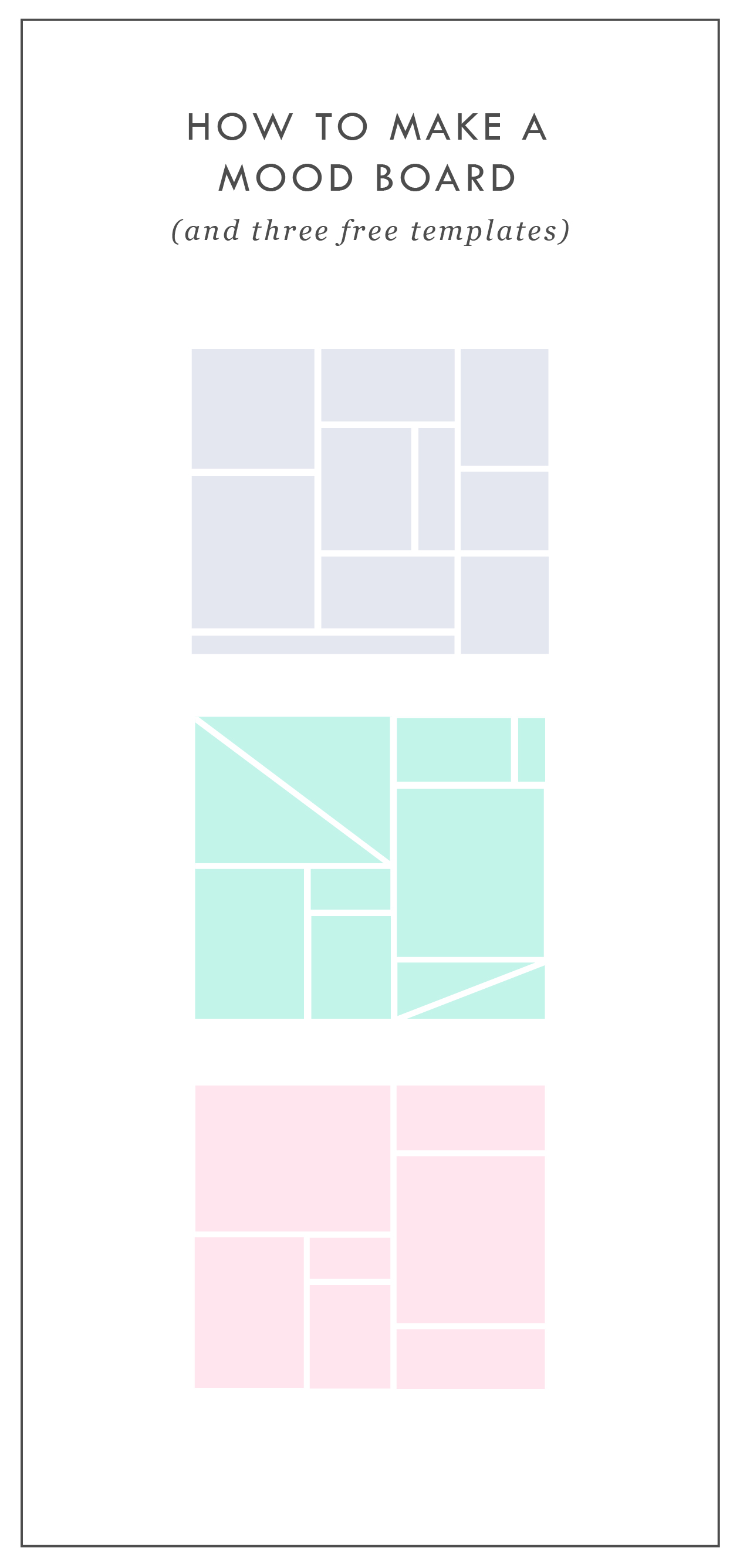
HOW TO MAKE A MOOD BOARD
Mood boards help align the aesthetic, color palette, and tone of a project. They get me on the same page with my clients. They can also help get the ideas out of my brain (or off of Pinterest, if I'm wedding planning) and into a clearly organized visual hierarchy.
Mood boards are so crucial to everything I do that's visual. Starting a logo project? MOOD BOARD! Re-decorating my living room? MOOD BOARD! Planning my wedding visuals? MOOD BOARD!
Mood boards force you to select the crucial images that best represent the style of whatever you're getting ready to create. I go a step further and make sure to pick images that include the following:
texture
design elements / inspiration
lifestyle images
color palette swatches
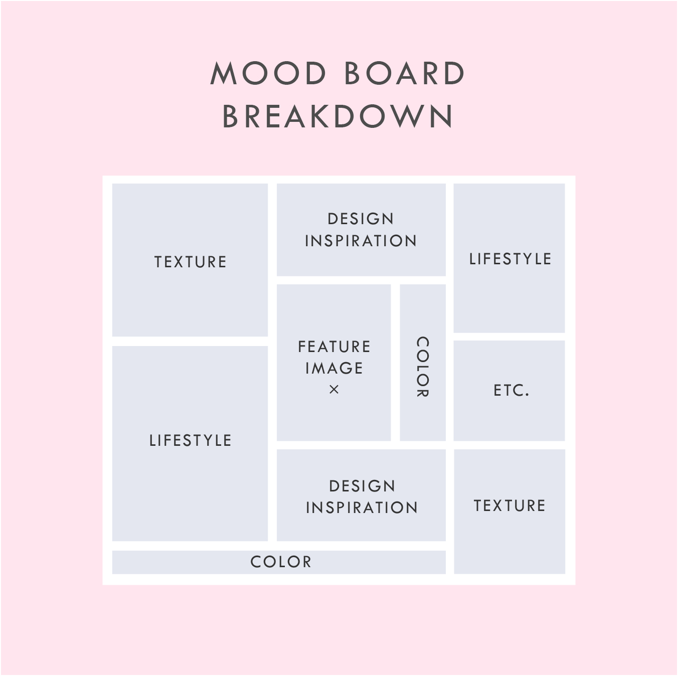
Above is a breakdown of how I organize a sample mood board which each of these elements.
In addition to the elements listed in this mood board layout, you can see that I also have a space for a "feature image" right in the middle. This should be the core mood / style / feeling of the project. It should be whatever resonates with you the most.
I also have a space for whatever else makes sense for the brand or project. I called this "Etc." This can be any image or detail that you find is inspirational but may not fit the other elements.
A good mood board should help keep you visually focused as you move into the next phases of the project.
If you'd like some inspiration, try this or this!
If you'd like to try your hand at creating your own mood board, I've got three free mood board templates you can download here! These are in PDF format, which means you can open them in most design programs.
NEW!
a templated guide to messaging magic
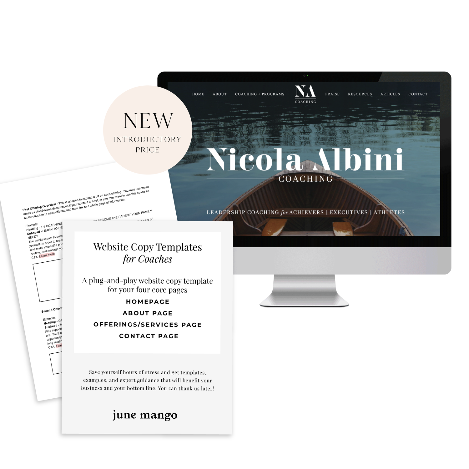
A plug-and-play website copy template for your four core pages (Home, About, Offerings, Contact). Save yourself hours of stress and get templates, examples, and expert guidance that will benefit your business and your bottom line.
learn more >

3 REASONS TO REFRESH YOUR WEBSITE
Sometimes the idea of building a brand new website can be a little scary. There are probably a few reasons for this. You may be afraid the process will take too long or that it's too expensive. You think of updating your website as a 'backburner' item that you will get to eventually.
Building your website doesn't have to be this big scary monster of a task. Here are three solutions to those three main fears.

It doesn't have to take months. It can take days. Really.
When I worked as an agency designer, we had a process of building websites that caused the projects to take months. There was even one project that I started when I was hired and was still ongoing when I left. This is sooo unnecessary. The reason some web project take so long is the process. But with a process that allows me to collaborate with my clients, the project time is drastically reduced. By helping hone in on what we will need BEFORE we dive into the design process, the whole project can take just a few short weeks (or even days!).
It's NOT too expensive.
This can be true, but it really depends on what you want in a website. If you would like to see unicorns fly across the screen as the user scrolls, well, sure, that is a bit fancier and will cost a bit more money to custom code those details. But if you are looking for a website that reflects your personal brand and is cleanly coded and responsive, it's completely within reason to create this on a budget.
It's affects your bottom line.
Is your business a priority? Then your website should be, too. If you look at your website as your online business card, is it saying everything you need it to say? If not, creating your better online business presence should really be a priority, too.
Your website is your hardest working employee. It should tell people who you are, what you do, and how to buy you - when you aren't there to do that in person. Does yours?
Creating and updating your website doesn't have to be so scary. You may just need to rethink the type of web design project that's right for you. There are so many options and resources out on the internet that you can use to help you keep growing your biz online and off. :)
Related Posts
NEED EVEN MORE HELP WITH SQUARESPACE?
Skip the overwhelm and have your website designed and launched in just 5 days (or less)!
LEARN MORE

WHAT IS CREATIVITY?
Creativity is defined as the ability to transcend traditional ideas, rules, patterns, relationships, or the like, and to create meaningful new ideas, forms, methods, interpretations, etc.; originality, progressiveness, or imagination.
There are a few words that jump out at me from that definition...
Creativity is defined as the ability to transcend traditional ideas, rules, patterns, relationships, or the like, and to create meaningful new ideas, forms, methods, interpretations, etc.; originality, progressiveness, or imagination.

There are a few words that jump out at me from that definition:
- meaningful
- progressive
- original
- imaginative
I think each one of these words could generate a whole post in and of itself. The thing is, though, these words aren't mutually exclusive. You don't always have to have an original idea to be imaginative. And you can create something meaningful without necessarily being progressive.
In order to be creative, you simply need to be able to view something from a different perspective. Allowing your mind to open up to the possibility of seeing and exploring something common in a new way. If you are trying to paint, for example, you may apply a new technique that skews the reality of what your subject is. This is exactly was Picasso, Monet and Seurat did. Their subjects weren't unique, but they broke the 'rules' and applied new methods of painting them.
So I wanted to explore the elusive act of being creative. I think so many people believe they simply aren't creative at all. And on the flip side, people who spend their lives and build their careers by being creative often feel like they are chasing this elusive muse. Creativity is so highly valued, and we're all capable of embracing creativity in our work and lives.
Keep an eye out for more posts on this subject including how creativity works in relation to fear, imagination, and passion PLUS what the attitudes, approaches, and habits we need to live our most creative lives.


5 ITEMS YOU NEED ON YOUR HOMEPAGE
the first thing you see on any website is the homepage. It's like the internet's handshake. "Nice to meet you! Let me introduce myself." Needless to say, your homepage is important. With that in mind, there are some super simple things that you can do to improve your homepage and make sure it's giving that firm handshake.

I've seen too many websites to count. This is, in part, because I am a human living in the 21st century. But it's also because I'm a web designer, and it's my job to stare at, create, and edit websites day in and day out! After years of studying and perusing the web world, I've learned some pretty important items that make for a successful website. And the first thing you see on any website is the homepage. It's like the internet's handshake. "Nice to meet you! Let me introduce myself." Needless to say, your homepage is important. With that in mind, there are some super simple things that you can do to improve your homepage and make sure it's giving that firm handshake.
Clear Call-to-Actions• This is so important. Direct your audience to the places you'd like them to visit by including clear call-to-actions in the form of links or buttons. You control where they end up on your website!
Your Mission Statement • What do you even do?! You know your business inside and out, but a new visitor may know nothing about it. A short sentence front and center is essential.
Your Brand Name • Duh! But you'd be surprised how often I find myself on a website and have no idea where I am or whose website the page belongs to. Make sure your logo is easy to see. It should be at the top and bottom of your homepage.
Appropriate Imagery • Your homepage imagery should represent your business offering. If you're a florist, you should have photos of flowers or bouquets, not nessiciarily yourself.
Services Overview • You've added your mission, but what are your actual service offerings? If your a graphic design boutique (ahem), you may put that in your mission statement, but then list out what design services you offer (branding, web design, etc). Not every business in the same field offers the same services.
Related Posts
need even more help with squarespace?
Skip the overwhelm and have your website designed and launched in just 5 days (or less)!
LEARN MORE
USING GIFS IN WEB DESIGN
It's simply an animated photo / graphic made by placing several layers together that play in a loop. And it's a fantastic tool for your website. Here's why:
It's the gif that keeps on giving!! #hilarious
But actually, that's kind of what a gif is. It's simply an animated photo / graphic made by placing several layers together that play in a loop. And it's a fantastic tool for your website. Here's why:
This animation grabs the users attention. The changing visuals catch the eye and cause the user to take notice.
Your message or image stands out. This make a gif a great option for a featured item in an e-commerce site. Kate Spade has some great examples of this.
You can use it to direct the user to a particular page. Since the image is eye catching, use it as a button or link it to a place you want your audience to go, like your Contact or Services page.
They get a lot of love. Gifs are more likely to be shared on social media platforms and garner more user engagement.
These animated visuals are processed faster in your brain! That means that your message is received sooner and is likely clearer. It's science, yo.
You can showcase different styles for different tastes. This is another great use for an e-commerce site that may sell an item in various colors, for example.
• They're fun. This is maybe the best reason. Because, hey, why not?
PRO TIP: You can use these little guys in your email marketing, too! It's another great way to pack a lot into a small space.
Related Posts
need even more help with squarespace?
Skip the overwhelm and have your website designed and launched in just 5 days (or less)!
LEARN MORE

BRANDING FOR PHOTOGRAPHERS
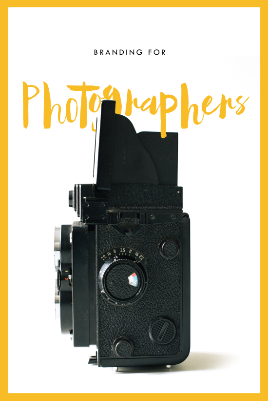
Whether you’ve just launched your photography business or are a seasoned veteran looking for a brand refresh, there are four main ideas to help you find your focus.
1. Be distinctive
The kind of photography you focus on is the most important item to consider before you begin a logo or branding project. Are you a food and styling photographer, wedding and family photographer, or an urban street photographer? These are all such vastly different styles of capturing a moment that they will require completely different branding approaches. Now we can narrow it down from here.
2. Brand it, #boss
How do you take your unique photography niche and turn it into a beautiful brand?
Answer: Style. Find that emotional connection your style has with your customers. A bride-to-be has seen your most recent engagement shoot and just adores the way you captured the couples love. She wants that romantic feeling for her engagement shoot, too. Allow your branding to reflect that romance you bring to your photography. Show this bride-to-be and any other that when they hire you, your photography style will make her swoon. Maybe that means using calligraphy in your logo or creating a soft and feminine color palette. Keep asking yourself throughout the process, "Is this in line with my style?" This emotional tie into your branding elements will give clients a sense of your approach before they even chat with you.
3. Work your website
As a photographer, your website is so important. This is the best place to showcase your photos. Organizing them into galleries and recent shoots will help your future client visualize their own photos. Continue the emotional experience of your brand by telling a fluid story to your customer. A good example may look like this:
Click … HomepageIntroduction to Drizzle Food Photography and Styling, where I am inspired by ingredients and abundance in the kitchen.
Click … Gallery A collection of gorgy examples of past photo shoots for dreamy clients and delish dishes.
Click … Contact How to get in touch to book my unique and valuable photography services.
Let the photos do the talking. On your website, the branding should act and an important accent that underscores your photography style.
4. One step further
As the savvy photography business owner you are, you know there’s more to branding than just the logo and website. Social media (styled photos anyone?), photo flyers and media kits are all places to expose your branding and your business. Think about each client’s experience from beginning to end. From finding you on Instagram to thank you stationary, gather all your pieces and review what you have. Make sure it conveys the emotion and style of the photos you take.
In the end, it should all be in line with your vision, mission and fabulous photography.

BRANDING FOR FLORISTS
I'm starting a new blog series called "Branding for...". In these posts, I will highlight a creative industry and zero in on some key how-to's for:
• Communicating your mission
• Translating your passion into a unique brand identity
• Inspiring your dream clients to work with you
• Creating a winning website
• Finding the "joy" job (you know, the client and project that ignites your passion!)
Let's dive in, shall we?!

I'm starting a new blog series called "Branding for...". In these posts, I will highlight a creative industry and zero in on some key how-to's for:
Communicating your mission
Translating your passion into a unique brand identity
Inspiring your dream clients to work with you
Creating a winning website
Finding the "joy" job (you know, the client and project that ignites your passion!)
Let's dive in, shall we?!
Branding for Florists
Whether you've just launched your business or are a seasoned veteran looking for a brand refresh, there are four main ideas to help you find your focus.
1. Be distinctive
What makes you unique? What is the thing that makes your floral business stand out from all the rest. Is that you grew up in Hawaii and have a deep-rooted love for all things bright and tropical? Is it that you are a hopeless romantic at heart and derive deep joy from bringing a wedding to life through floristry? What makes your clients love you and your work?
2. Brand it, #bossbabe
How do you take your unique-ness ( see above! ), and turn it into the most fantastic florist branding ever?
Answer: Emotion. Find that emotional connection your style has with your customers. A bride-to-be has seen your whimsical hanging eucalyptus installation on Pinterest and has fallen in love. She wants that romantic feeling for her big day, too. Allow your branding to reflect that romance you bring to your floral design. Show this bride-to-be and any other that when they hire you, your floral arrangements will make her swoon.
You create an emotional connection through your branding based on the patterns, colors and fonts you choose to marry into a uniquely perfect fit for your business. Done right, clients will have a sense of your style before they even chat with you.
3. Work your website
Branding doesn't stop with your business cards. Your brand needs to carry through to your website, too. Now is the time to consider your dream client's journey through your site. Yes, I said journey. Think about where they will start (homepage, blog?) and where you want them to end up (contact page, portfolio?). Continue the emotional experience by telling a fluid story to your customer. A good example may look like this:
Click ... Homepage Introduction to Sweet Pea Floral Design, where my mission is to create seasonal arrangements that are whimsical and romantic.
Click ... Portfolio A collection of gorgy examples of past work for dreamy clients.
Click ... Contact How to get in touch to book my unique and valuable services.
Thinking about how a potential customer will wander through your website will allow you to create the right structure, content and navigation.
4. One step further
As the savvy floral business owner you are, you know there's more to consider. Social media ( header images, profile pictures, behind the scenes Instagram shoots ), advertisements and media kits are all places to carry over your branding. Think about each client's experience from beginning to end. From ribbons to store front signs to thank you stationary, pull everything together and review what you have. Make sure to ask yourself if it sends the signals to the right kind of clients. In the end, it should all be in line with your vision, mission and style.
Looking for examples of a florist's branding in action?
Head on over this-a-way.

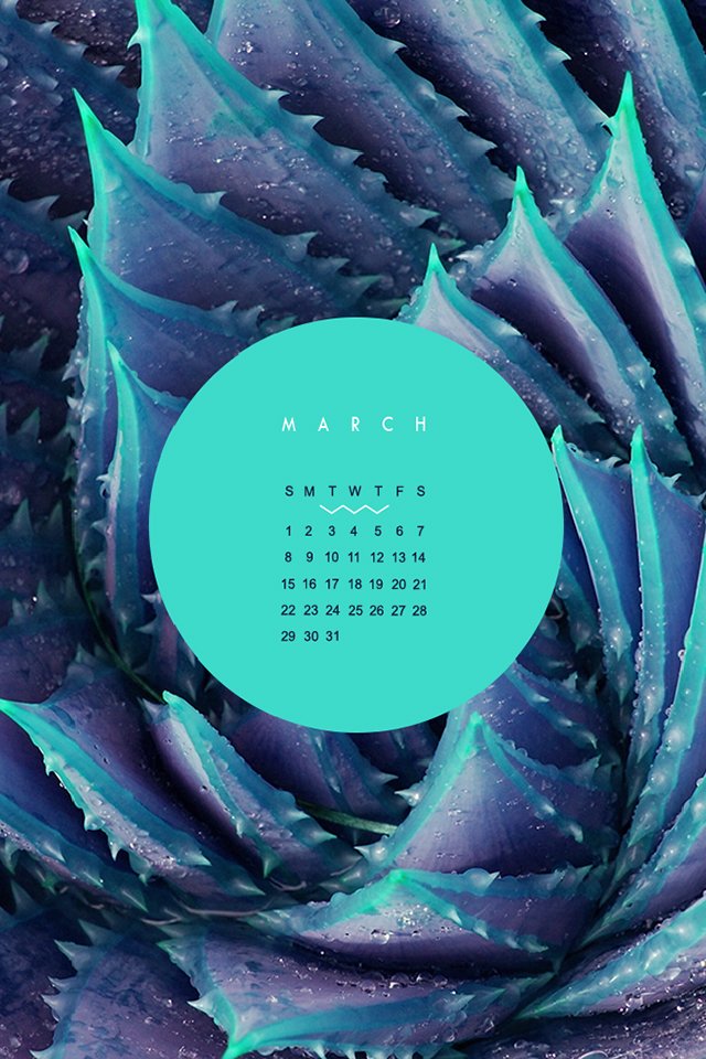
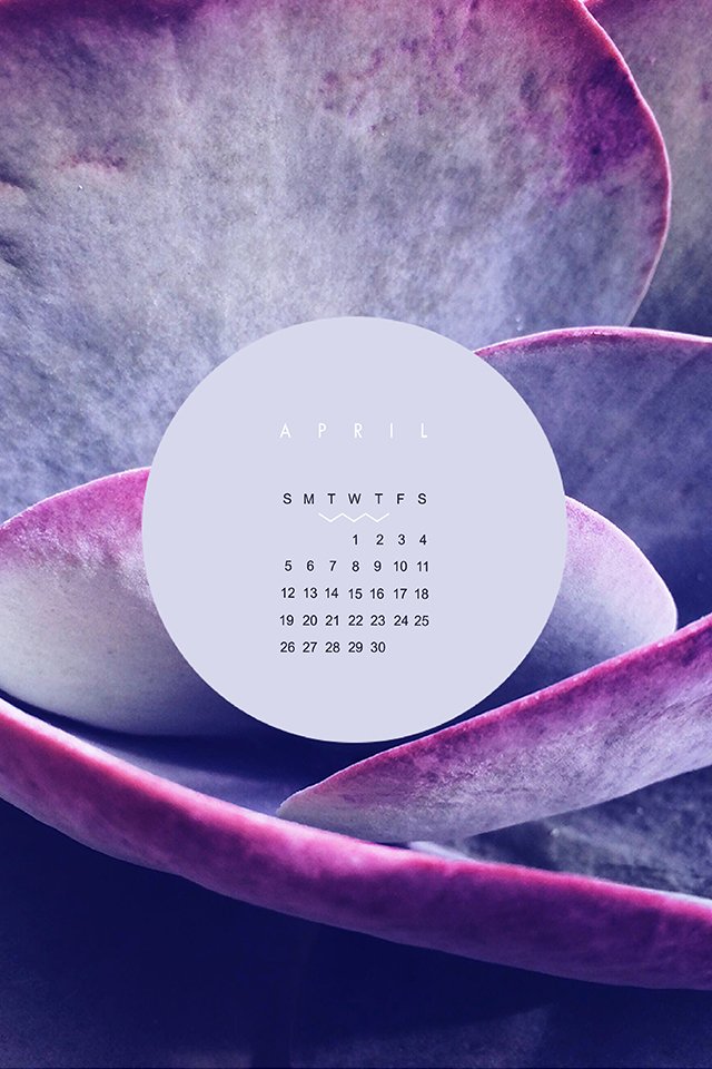
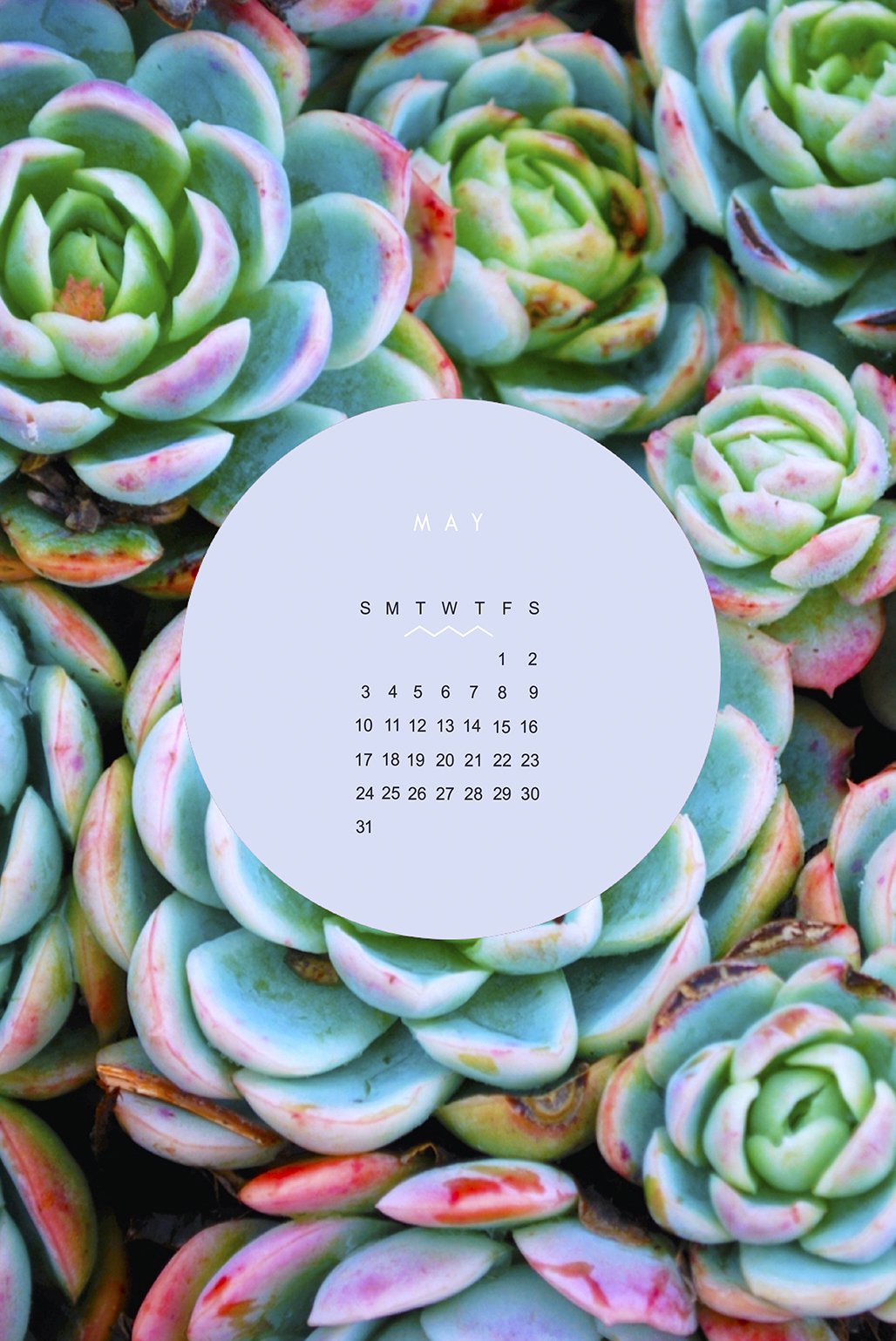
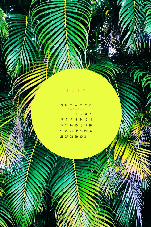
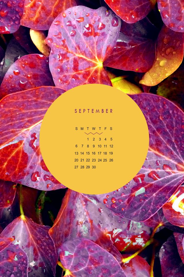
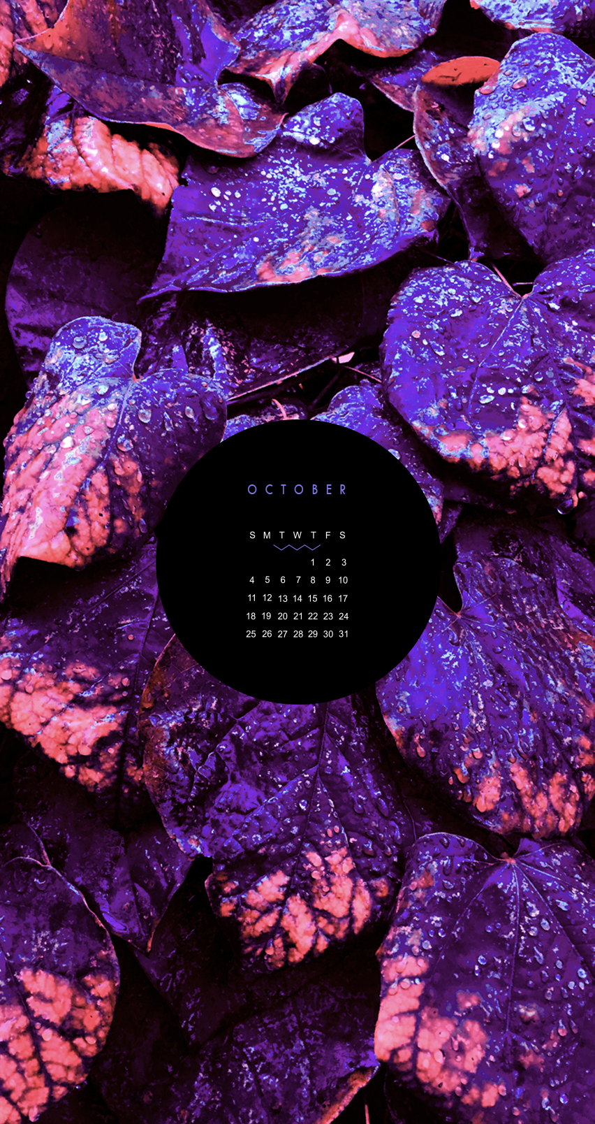
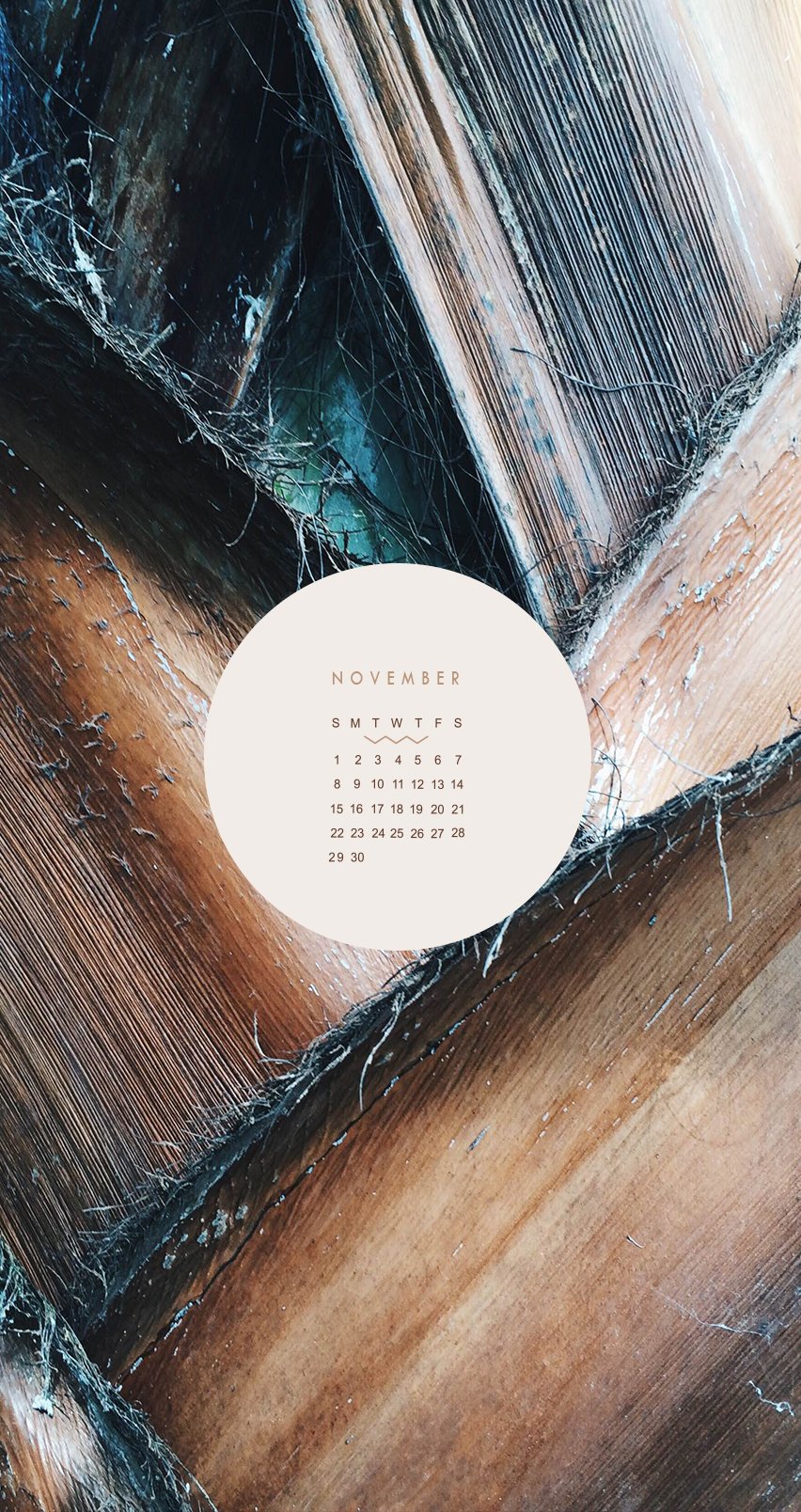
CALENDARS FOR IPHONE + IPAD
These babes were made for the 2015 calendar year as background for a phone or tablet. I didn't want them to get lost, so they can live for ever in design-land here on the blog!
Click through to see each month and feel free to reach out if you like this idea and would like to see more for 2018!


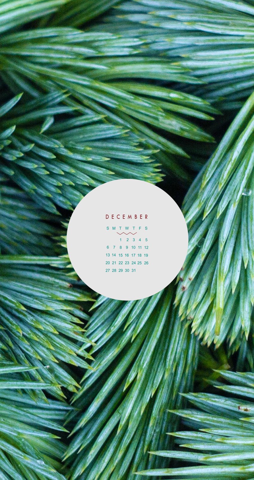
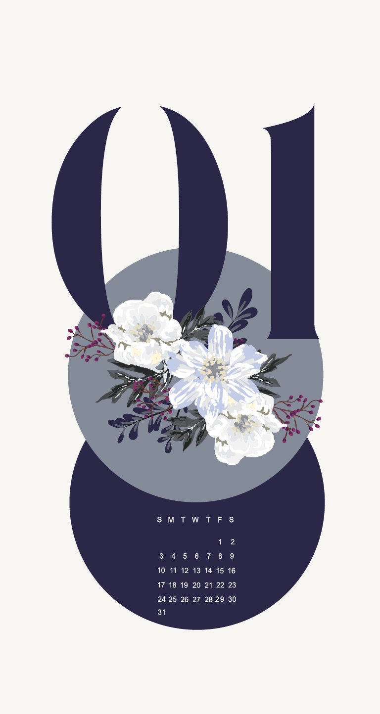

These babes were made as background for my phone and tablet many years ago. I didn't want them to get lost, so they can live for ever in design-land here on the blog.
Click through to see each month and feel free to reach out if you like this idea and would like to see more like this!


FINDING DREAM CLIENTS
Finding your dream clients starts with knowing yourself. You have be 100% behind their business to be able to create exactly what will fit their brand best. If you feel lukewarm about their passion, it will likely show in your work. But if you wake up wide-eyed and excited to crank out your best work, then you know you've likely found your dream client.
I work with all sorts of people who do amazing, creative things. Bakery owners, skin care product developers and fashion bloggers to name a few. There are a lot of reasons I choose to do design for people like this. One of the biggest reasons I love to work with these groups of creatives is their passion.

You can learn a recipe for a perfect cake or what's hot for Spring, but passion is something you just have. It bubbles up inside you the minute you wake up and doesn't settle until your head hits the pillow at night. You can't teach that. Adeo Ressi, a serial entrepreneur, says, "...real passion and conviction, there's no test to measure that, except the test of hard knocks. When you get punched in the face ten times and get up and keep going."
That's your passion.
I feel so lucky to get to narrow in on that passion, and translate it into design. That's kind of a good one-sentence summation of what I strive to do through branding and web design: bring your passion and drive for your business to life through design. ( To see the fashion blogger + skincare brands, click here )
My client's passions are also usually ones I can get behind. They're doing things I also really enjoy and spark my interest, and that ignites my creativity. While some may be really passionate about the newest i-gadget, that's not really my thang. But the newest craft brew on the market? I'm down!
Finding your dream clients starts with knowing yourself. Click to Tweet!
You have be 100% behind their business to be able to create exactly what will fit their brand best. If you feel lukewarm about their passion, it will likely show in your work. But if you wake up wide-eyed and excited to crank out your best work, then you know you've likely found your dream client.
Thank you may be my dream client? Holla at me!