
BREAKING THE BOUNDARIES OF MOOD BOARD MOSAICS
Totally deconstructed. More white space, more breathing room. More color blocks, but all integrated into the collage vs. being stacked together. Still a brand-focused lifestyle image at the center grounding the collage as well as the brand. And little, layered type elements.
I think all designers have a touch of Creative ADD. All of my favorite designers are constantly changing and pushing their brands + the creative processes to be better, cooler, or more unique.
I have this ADD too, and recently I've been itching to bust out of the standard mood board mosaic design. It's just EVERYWHERE, and frankly, I'm bored. And here's a little secret: boredom = creativity's best friend. Being bored makes me want to shake it up! Create something new and funky! Get weird and wild! Design-wise, that is. :)
So here's where I ended up on a the new make-up of my mood boards.
Totally deconstructed. More white space, more breathing room. More color blocks, but all integrated into the collage vs. being stacked together. Still a brand-focused lifestyle image at the center grounding the collage as well as the brand. And little, layered type elements.


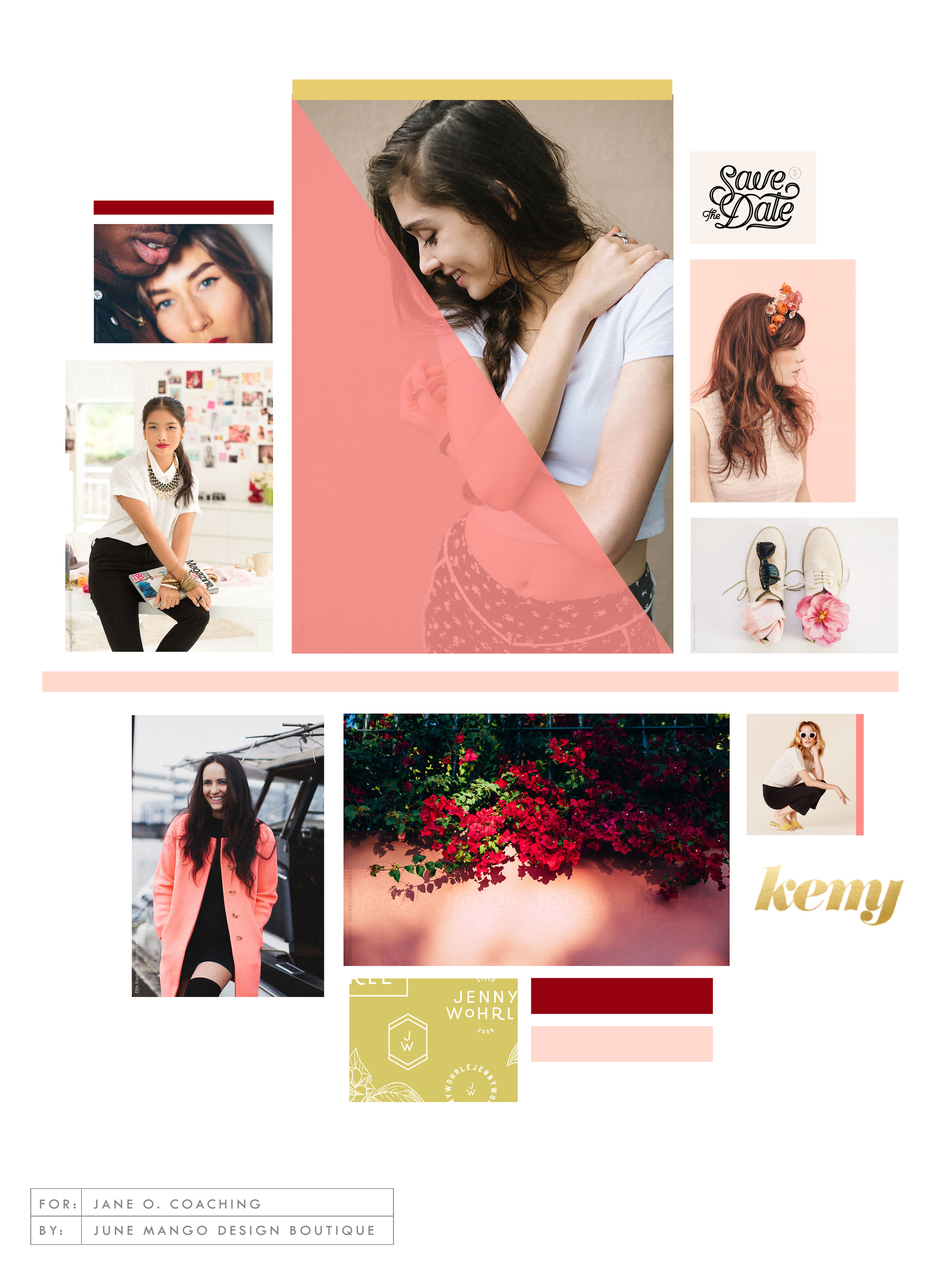
I think mood board collages + color are my love language. ❤️
So what do you think? Love it? Hate it? Wanna live in it (I do!!). I'd love to hear your thoughts on the new mood board so feel free to holla at me!
Related Posts
USING GIFS IN WEB DESIGN
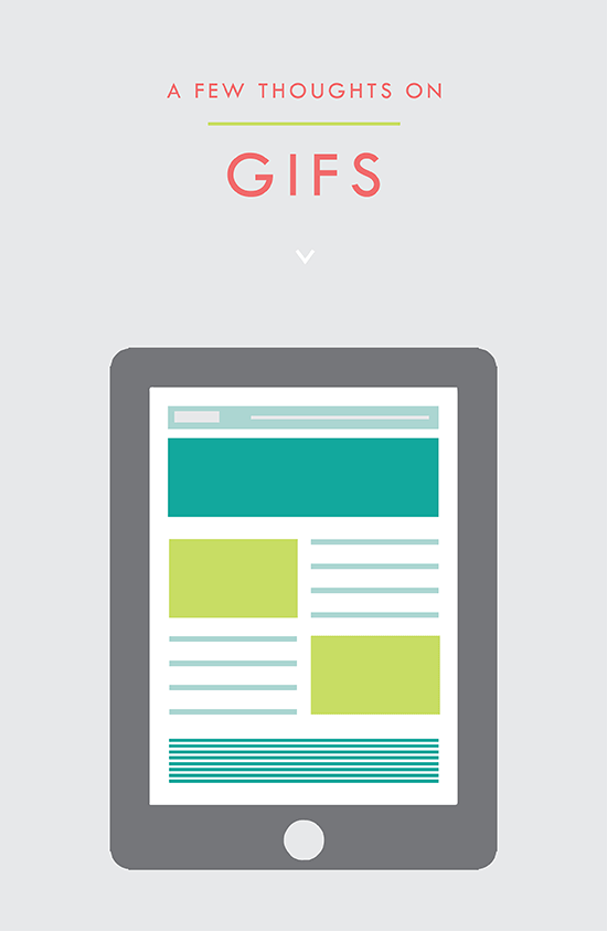
It's simply an animated photo / graphic made by placing several layers together that play in a loop. And it's a fantastic tool for your website. Here's why:
It's the gif that keeps on giving!! #hilarious
But actually, that's kind of what a gif is. It's simply an animated photo / graphic made by placing several layers together that play in a loop. And it's a fantastic tool for your website. Here's why:
This animation grabs the users attention. The changing visuals catch the eye and cause the user to take notice.
Your message or image stands out. This make a gif a great option for a featured item in an e-commerce site. Kate Spade has some great examples of this.
You can use it to direct the user to a particular page. Since the image is eye catching, use it as a button or link it to a place you want your audience to go, like your Contact or Services page.
They get a lot of love. Gifs are more likely to be shared on social media platforms and garner more user engagement.
These animated visuals are processed faster in your brain! That means that your message is received sooner and is likely clearer. It's science, yo.
You can showcase different styles for different tastes. This is another great use for an e-commerce site that may sell an item in various colors, for example.
• They're fun. This is maybe the best reason. Because, hey, why not?
PRO TIP: You can use these little guys in your email marketing, too! It's another great way to pack a lot into a small space.
Related Posts
need even more help with squarespace?
Skip the overwhelm and have your website designed and launched in just 5 days (or less)!
LEARN MORE
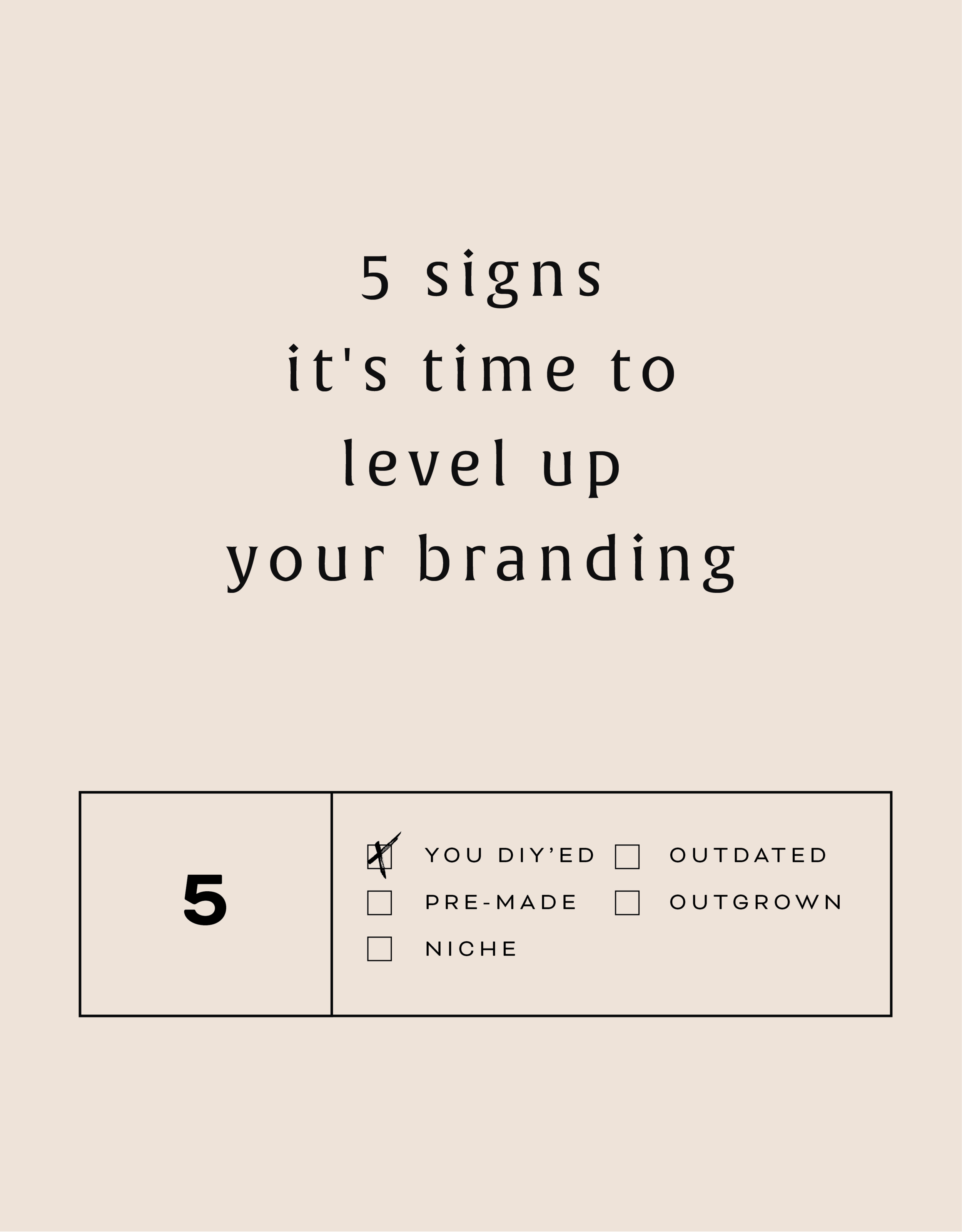
5 SIGNS IT'S TIME TO LEVEL UP YOUR BRANDING
There are lots of reason to give your business a branding refresh. Depending on where you are with your business or blog, it may be time for you to rethink your current design identity. Here are five of the most common, and most necessary, signs that it's time to upgrade your branding.

There are lots of reason to give your business a branding refresh. Depending on where you are with your business or blog, it may be time for you to rethink your current design identity. Here are five of the most common, and most necessary, signs that it's time to level up your branding.
1 - You made a DIY logo because you have the philosophy that "Done!" is better than "Perfect"
You wanted to launch your business or product and didn't have time to invest in full-blown branding. Now that you've settled into steady business, you're looking for a more professional look that showcases your growing biz.
2 - You bought a pre-made logo
Etsy has some damn fine design, let me just say. If you are one of the many shoppers who purchased a pre-made logo from a creative market like Etsy, you may have a cute logo, but you may also share it with countless other businesses. Time to develop a logo that's unique to you.
3 - You've officially defined your niche
Maybe you are a photographer that started out snapping shots of everything from babies to interior design. Now that you've settled into your work, you've decided you'd like to focus on weddings and engagements. Make sure your logo reflects your niche market.
4 - It's outdated or you just don't like it
You may have created your branding materials years ago and feel that they just aren't working for you anymore. Perhaps you wanted your logo to follow a trend that now feels outdated. Put simply, you just don't love it.
5 - You're business has outgrown you
You started a one-woman shop but have grown into a small business with - yay! - employees. You may even want to change your business name from something that is personal ( ie: Kali Edwards Creative ) to a something a more over-arching name.
This isn't as daunting as it sounds. Finding a designer you jive with (heyyy!) and who will help you through the process will allow you to love your branding and continue to grow your business!