
Favorite Logos of 2022
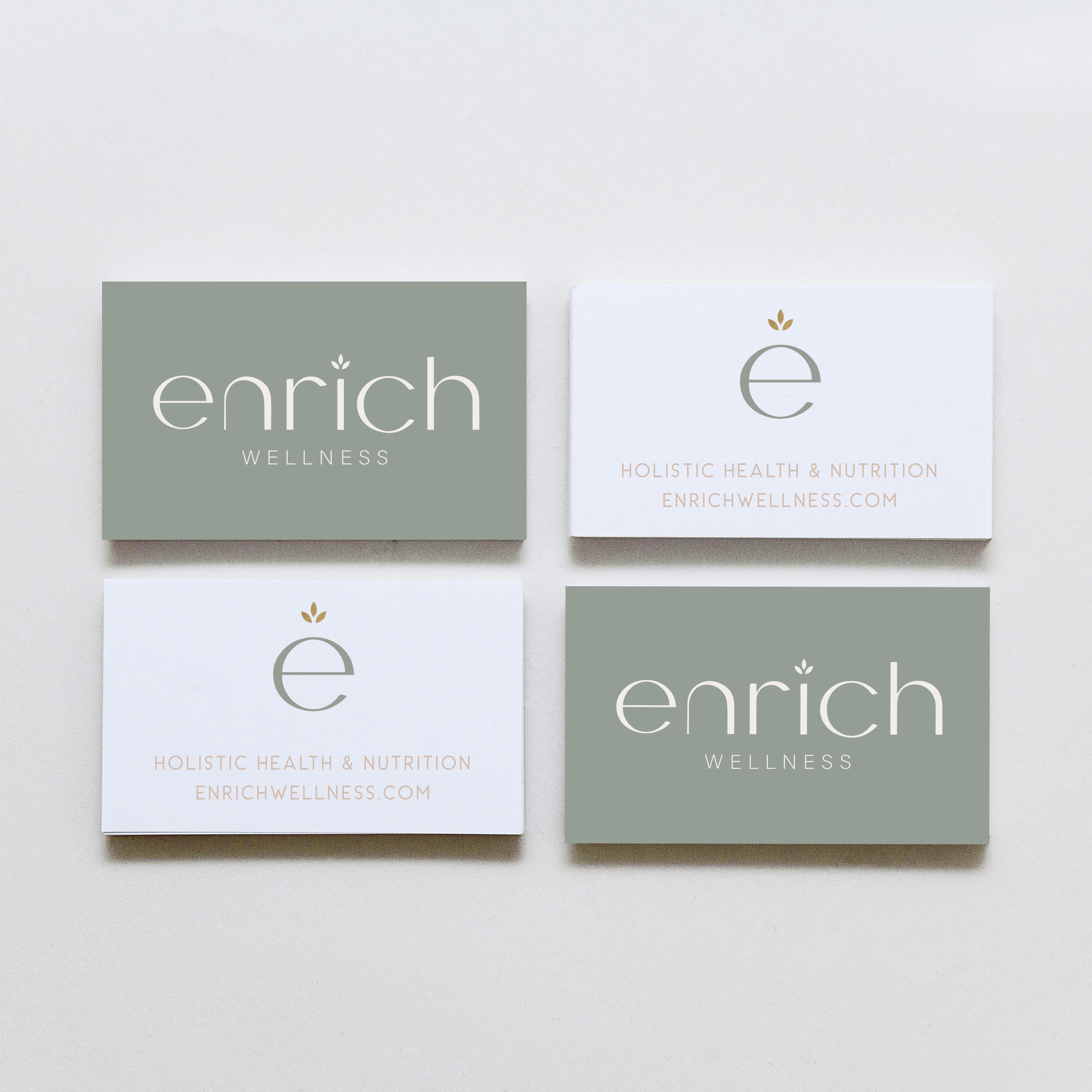
A recap of some of my favorite unchosen logos and submarks from 2022 branding projects including one of a geometric hummingbird logo and one for a health and wellness coach logo.


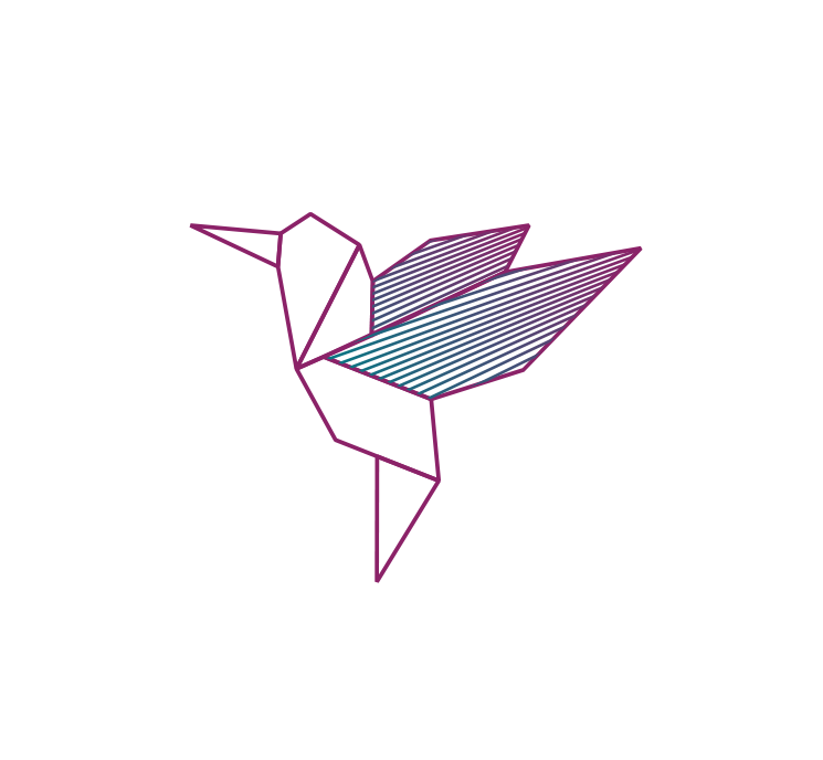
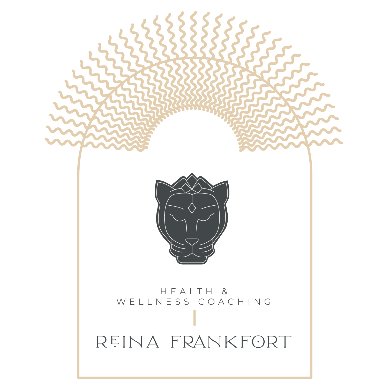

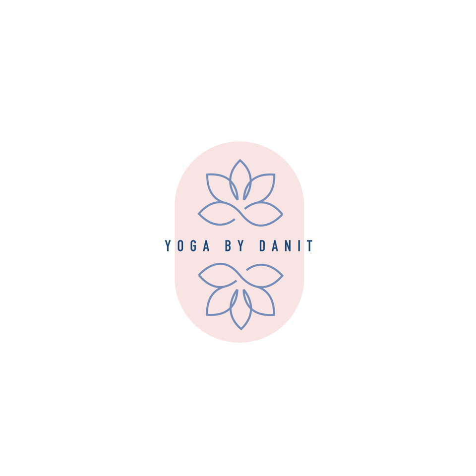
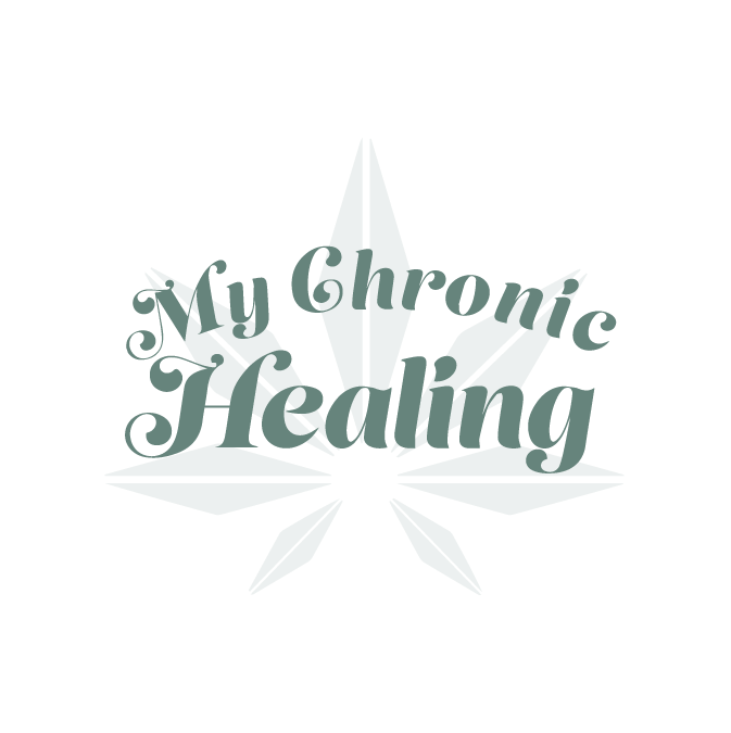
There were so many fun branding projects in 2022 and so many amazing clients! Since each branding process gets 2-3 fully designed brand identity options, not all logos make the cut. Even if they don’t become the final version of a logo design, the creation and refinement is still an important part of the process. The health and wellness coaching logo on the bottom left even got featured on designrush best-designs. And I’m still a little in love with the geometric hummingbird logo. 😍
pst…
Like a logo above and think it’s the perfect fit for your business?
Feel free to reach out for details on how to purchase!


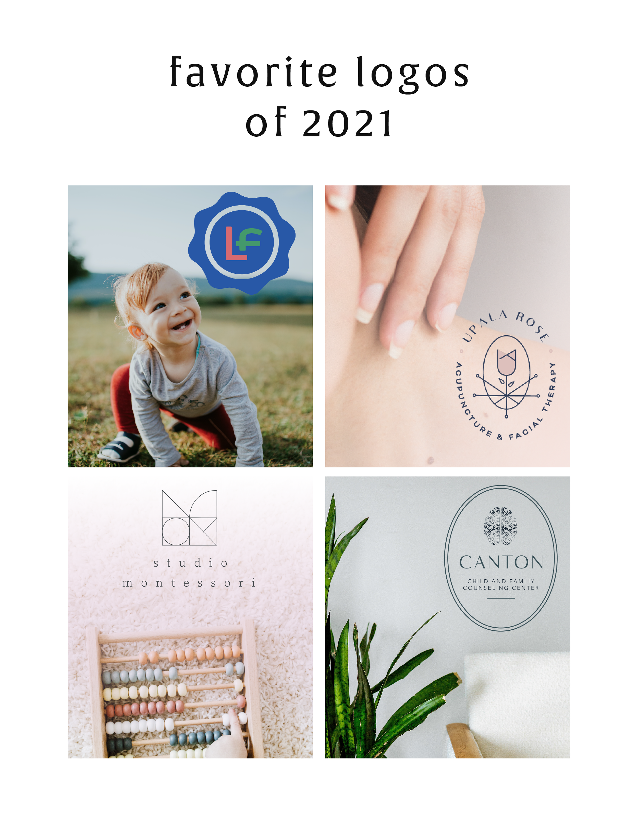
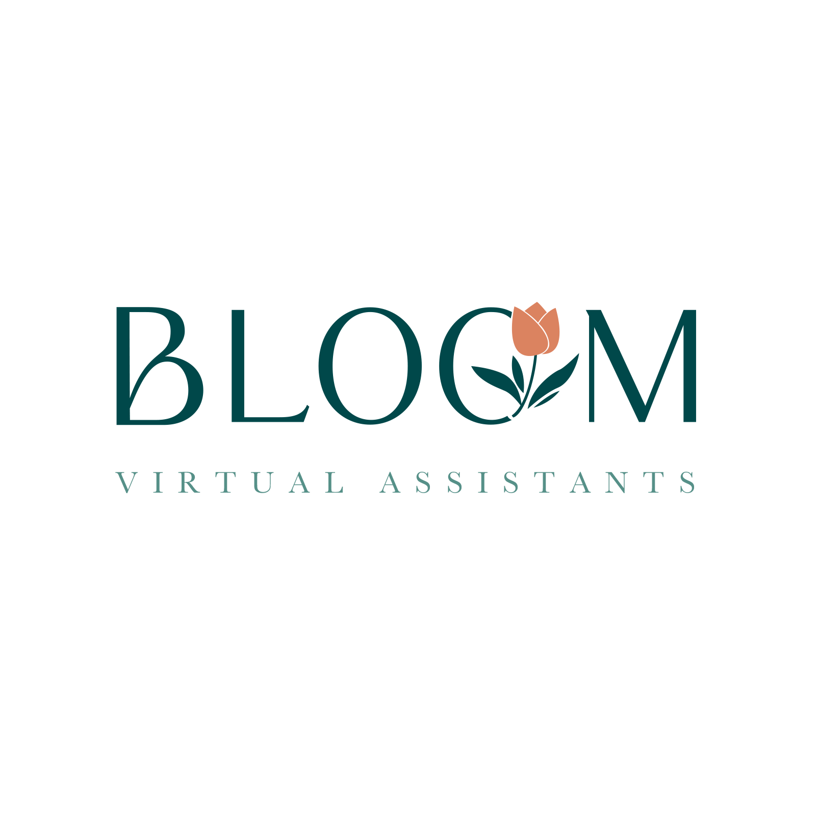
Favorite Logos of 2021
A recap of some of my favorite unchosen logos and submarks from 2021 branding projects including one for an acupuncturist and a child and family counseling logo.
There were so many fun branding projects in 2021 and so many amazing clients! Since each branding process gets 3-4 fully designed brand identity options, not all logos get the green light. Some aren't quite right for the client or maybe just didn't fit as well as another option, but I have a little love for all of my logos (and maybe get a little too attached?? Eh, whatever!).
These are some of my favorite branding concepts and their variations created that didn't make the final cut.
pst…
Like a logo above and think it’s the perfect fit for your business?
Feel free to reach out for details on how to purchase!

Favorite Logos of 2019
A recap of some of my favorite unchosen logos and submarks from 2019 branding projects.
There were so many fun branding projects in 2019 and so many amazing clients! Since each branding process gets 3-4 fully designed brand identity options, not all logos get the green light. Some aren't quite right for the client or maybe just didn't fit as well as another option, but I have a little love for all of my logos (and maybe get a little too attached?).
Below are some of my favorite branding concepts and their variations created that didn't make the final cut.
WANT to CREATE
a custom LOGO?

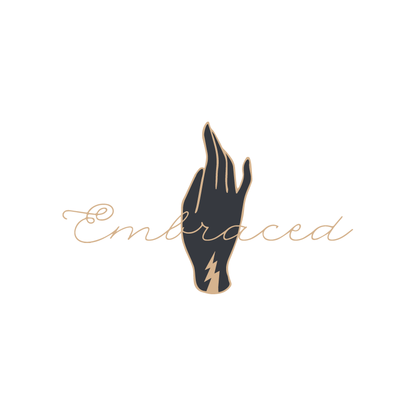
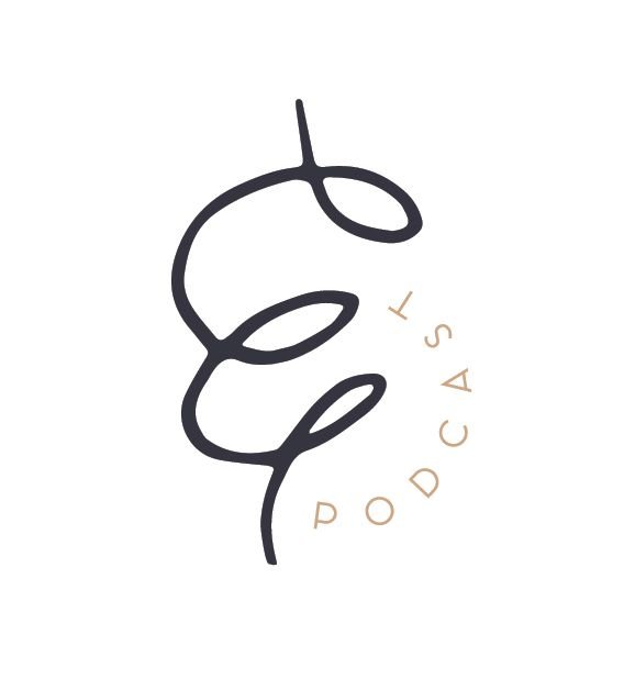
LOGO PROCESS: EMBRACED PODCAST
This little logo process is from the branding process for Embraced Podcast, a podcast about women empowering women.
This little logo process is from the branding process for Embraced Podcast, a podcast about women empowering women. Having dabbled in the podcasting world for a hot second, I was excited to brand someone else's podcast! The branding to needed to embody women who share their strength, courage, perseverance, and self-love. Um... hell yes! Feminine strength was the design direction.
Below are several of the concepts and variations created before we nailed down the final logo.
WANT to CREATE
a custom LOGO?


Favorite Logos of 2017
A recap of some of my favorite unchosen logos and submarks from 2017 branding projects.
There were so many fun branding projects in 2017 and so many amazing clients! Since each branding process gets 3-4 fully designed brand identity options, not all logos get the green light. Some aren't quite right for the client or maybe just didn't fit as well as another option, but I have a little love for all of my logos (and maybe get a little too attached?? Eh, whatever!).
Below are some of my favorite branding concepts and their variations created that didn't make the final cut.

Related Posts

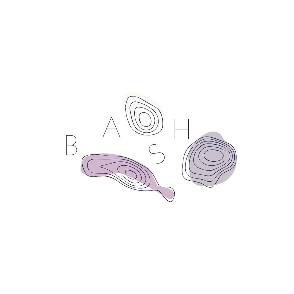
LOGO PROCESS: BASH EVENT PLANNING
This little logo process is from the branding process for BASH Event Planning & Design. This was a challenging but FUN design process that included ideas like topography, layering and disco!
This little logo process is from the branding process for BASH Event Planning & Design. This was a challenging but FUN design process that included ideas like topography, layering and disco!
Below are several of the concepts and variations created before we nailed down the final logo.
Related Posts
LOGO PROCESS: JANE O. COACHING
I haven't shared a logo process in a while. This logo process is from Jane O. Coaching, who is a love and style coach with an amazing colorful, bright vibe. So of course, she wanted her branding to be feminine, colorful and fun to show off her coaching niches.
I haven't shared a logo process in a while. This logo process is from Jane O. Coaching, who is a love and style coach with an amazing colorful, bright vibe. So of course, she wanted her branding to be feminine, colorful and fun to show off her coaching niches.
We ended up heading in the direction of #3, with some additional tweaks and customizations to make it fully unique to Jane. To see the full branding and web design that came from this logo process, head on over to janeocoaching.com.
And if you want to chat about your own logo or branding, holla at me!
Related Posts
LOGO PROCESS: JULIA KILKENNY
This little behind the scenes of the logo process is from the branding project for Julia Kilkenny, who is a coach for creative entrepreneurs. She described her ideal brand to me as "the first blue sky day of Spring." Amazing, right?! I took that and really ran with it and created these little nuggets for her.
This little behind the scenes of the logo process is from the branding project for Julia Kilkenny, who is a coach for creative entrepreneurs. She described her ideal brand to me as "the first blue sky day of Spring." Amazing, right?! I took that and really ran with it and created these little nuggets for her.
We ended up going with #2 and brought in more of that gorgy color palette. You can see the final branding and the web design to match this logo process over at juliakilkenny.com.
And if you feel like chatting with me about your own logo and branding, I'd love for you to holla at me
Related Posts

HOW TO ATTRACT YOUR IDEAL CLIENTS
Your brand's logo has some serious power to help you attract your ideal client. You just need to know how to use it. Your logo is one of the first things people see when they meet your biz, whether it's online or on your business card. Make your logo work for you by attracting your ideal clients ... like a magnet!
Your brand's logo has some serious power to help you attract your ideal client. You just need to know how to use it. Your logo is one of the first things people see when they meet your biz, whether it's online or on your business card. Make your logo work for you by attracting your ideal clients ... like a magnet!
So here's the trick:
Take out a notebook and really think about who your ideal client is. Write down as much information about them as you can (gender, hobbies, where do they hang out online, what do they do on weekends, what's their age, etc.). From there, try to understand EXACTLY what visually inspires them.
Next, pretend you're them. I'd head to Pinterest for this part of the exercise. Create a pinboard and GO TO TOWN. Pin everything you think they would like. Get that visual inspiration all in one place. And VOILA! What you now have is a great resource of visuals that you can use to apply to your logo. Look for common colors, patterns, styles and apply it all to your branding design. And that, my friends, is how to make your logo attract your ideal clients like a magnet.
Want to see these tips in action? Here’s an example or two of a client magnet.
Related Posts

BRAND STYLE BOARDS 101

You may have seen these little guys floating around on Pinterest and not known exactly what they are or what their purpose is.
Every designer does their Brand Style Boards a little bit differently, but as a rule there are a few things that should be included.
Logo
This is the main logo that will be used on important touch points like the website, business cards, etc
Submark / Secondary Logo
This is a variation of the logo and usually much simpler. Often an icon, it can be used as an avatar on social media or as a stamp on images for bloggers and photographers
Color Palette
I always make sure to include not only the color swatches, but the various color values. This helps a client match their color palette from anything like a printed business card to their website
Fonts
The fonts are really important to the brand and are NOT an afterthought, so it's imp ortant to make sure to include them on the Brand Style Board to ensure that the fonts match up on all future branded collateral.
In the examples below, I also include design elements that can be used as icons or graphics on the website. Sometimes a branding package will include patterns or buttons / graphics for the client's website, which are also helpful to include on the Brand Style Board. I also always include the mood board that I created for the internal branding process. I think it helps tie everything together and give the client a good idea for the types of imagery they should look for when creating other items for the brand (ie: website, media kit, etc).


Ultimately, the Brand Style Board should contain the core of your brand. At a glance, it should be everything you need as a reference for you and anyone you hire down the line. It should guide every visual choice you make for your business.
To see more examples, head this-a-way or to chat with me about your brand head that-a-way!
need even more help with squarespace?
Skip the overwhelm and have your website designed and launched in just 5 days (or less)!
LEARN MORE
Related Posts

KYLEE ACKER BRANDING PROCESS
This is a behind the scenes peek at the branding process. The goal was to really showcase her initials since this is her personal brand. The trick was to make both the K & A recognizable because each letter is of equal importance. Th color palette combines classic neutrals with a slightly feminine, but not overpowering pop of pink.

Every designer has a slightly different process. Some designers like to share just 2-3 design concepts, and some like to share 10+. I'm somewhere in the middle and tend to share 4-6. I think that gives enough variety without overwhelming my clients. Too many choices can be paralyzing and ineffective.
Remember that hella stylish mood board I shared recently? This is a behind the scenes peek at the branding process. The goal was to really showcase her initials since this is her personal brand. The trick was to make both the K & A recognizable because each letter is of equal importance. Th color palette combines classic neutrals with a slightly feminine, but not overpowering pop of pink.
Which one would you choose?
Related Posts

LOGO PROCESS • RLS FASTPITCH
I like to give six logo concepts to my clients, because this feels like the perfect number. It's the Goldilocks of branding ( not too overwhelming and more than just a few options ). I know everyone's process is a bit different. Some designers only give three logos. Some give 15+. But I feel like I can nail down enough concepts to get the ball rolling and have each be creative and unique with six. Too many more than six and my creative juice stop flowing. Plus, I have found that my clients often feel paralyzed by the decision if there are too many to choose from.
I thought it might be nice to show some behind the scenes details for those curious about my branding process. These are six logo concepts that I designed for RLS Fastpitch. Although we ended up going through a few more iterations before we nailed down the final logo, these were a great starting point.
I like to give six logo concepts to my clients, because this feels like the perfect number. It's the Goldilocks of branding ( not too overwhelming and more than just a few options ). I know everyone's process is a bit different. Some designers only give three logos. Some give 15+. But I feel like I can nail down enough concepts to get the ball rolling and have each be creative and unique with six. Too many more than six and my creative juice stop flowing. Plus, I have found that my clients often feel paralyzed by the decision if there are too many to choose from.
The other thing about my logo process is that all of these logos are black and white. I find that color can be distracting, especially in the beginning. Once a client nails down one or two logo concepts, I implement color in the next round. I sometimes include the color palette direction along side the black and white logos, which is what I did here. This helps give them an idea of the logos as a whole ( design + color ).
Related Posts
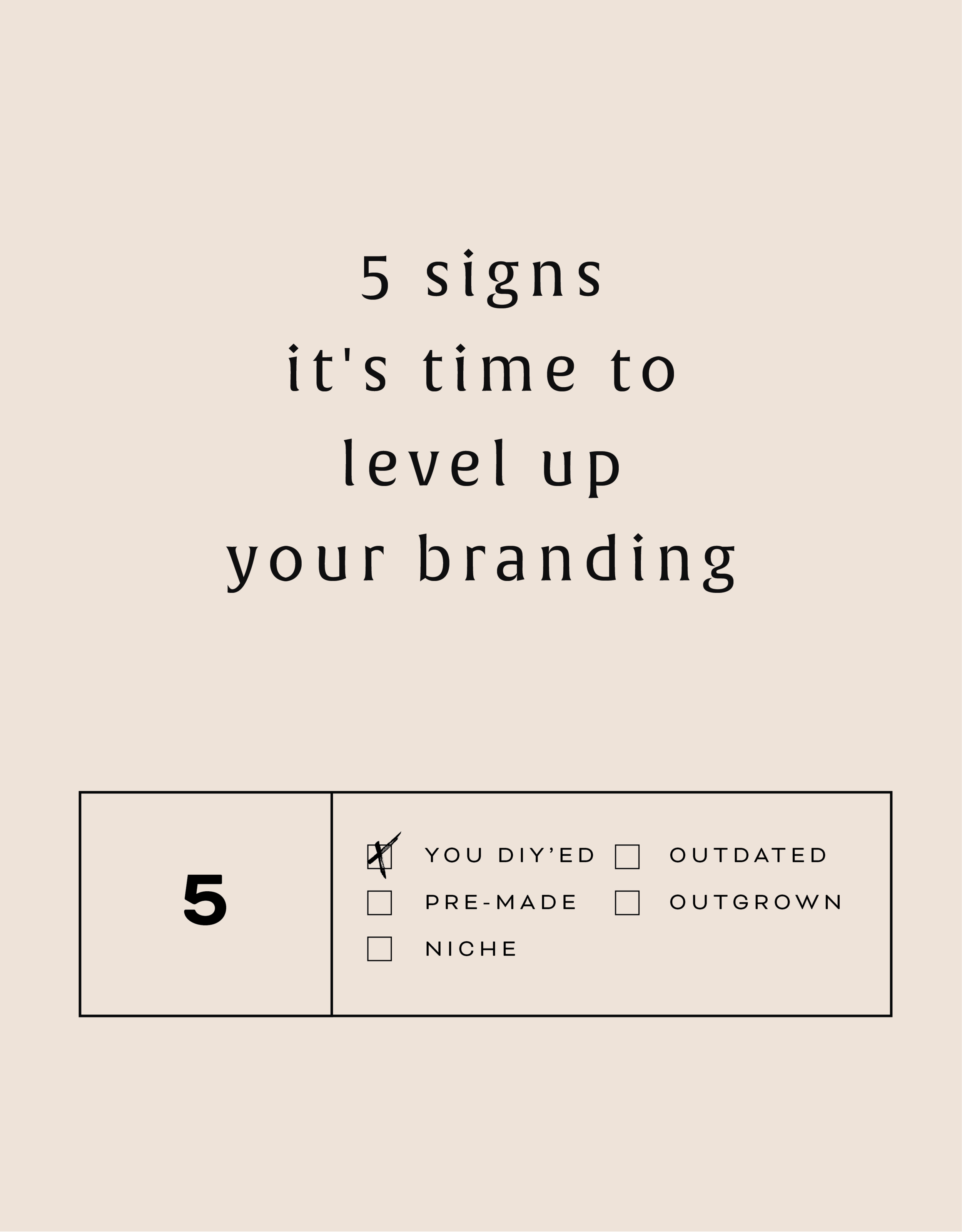
5 SIGNS IT'S TIME TO LEVEL UP YOUR BRANDING
There are lots of reason to give your business a branding refresh. Depending on where you are with your business or blog, it may be time for you to rethink your current design identity. Here are five of the most common, and most necessary, signs that it's time to upgrade your branding.

There are lots of reason to give your business a branding refresh. Depending on where you are with your business or blog, it may be time for you to rethink your current design identity. Here are five of the most common, and most necessary, signs that it's time to level up your branding.
1 - You made a DIY logo because you have the philosophy that "Done!" is better than "Perfect"
You wanted to launch your business or product and didn't have time to invest in full-blown branding. Now that you've settled into steady business, you're looking for a more professional look that showcases your growing biz.
2 - You bought a pre-made logo
Etsy has some damn fine design, let me just say. If you are one of the many shoppers who purchased a pre-made logo from a creative market like Etsy, you may have a cute logo, but you may also share it with countless other businesses. Time to develop a logo that's unique to you.
3 - You've officially defined your niche
Maybe you are a photographer that started out snapping shots of everything from babies to interior design. Now that you've settled into your work, you've decided you'd like to focus on weddings and engagements. Make sure your logo reflects your niche market.
4 - It's outdated or you just don't like it
You may have created your branding materials years ago and feel that they just aren't working for you anymore. Perhaps you wanted your logo to follow a trend that now feels outdated. Put simply, you just don't love it.
5 - You're business has outgrown you
You started a one-woman shop but have grown into a small business with - yay! - employees. You may even want to change your business name from something that is personal ( ie: Kali Edwards Creative ) to a something a more over-arching name.
This isn't as daunting as it sounds. Finding a designer you jive with (heyyy!) and who will help you through the process will allow you to love your branding and continue to grow your business!
Any of these apply to you? More than one even? It may be time to consider giving your brand a simple refresh.
Related Posts

BRANDING FOR PHOTOGRAPHERS
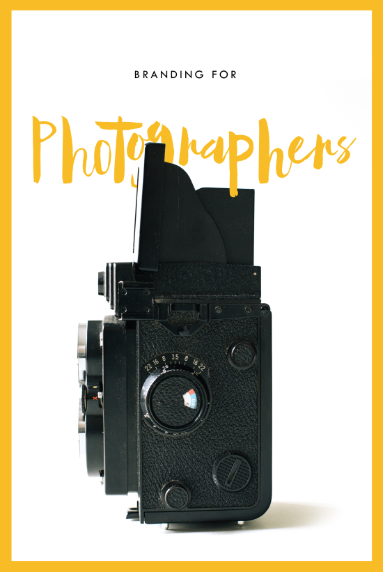
Whether you’ve just launched your photography business or are a seasoned veteran looking for a brand refresh, there are four main ideas to help you find your focus.
1. Be distinctive
The kind of photography you focus on is the most important item to consider before you begin a logo or branding project. Are you a food and styling photographer, wedding and family photographer, or an urban street photographer? These are all such vastly different styles of capturing a moment that they will require completely different branding approaches. Now we can narrow it down from here.
2. Brand it, #boss
How do you take your unique photography niche and turn it into a beautiful brand?
Answer: Style. Find that emotional connection your style has with your customers. A bride-to-be has seen your most recent engagement shoot and just adores the way you captured the couples love. She wants that romantic feeling for her engagement shoot, too. Allow your branding to reflect that romance you bring to your photography. Show this bride-to-be and any other that when they hire you, your photography style will make her swoon. Maybe that means using calligraphy in your logo or creating a soft and feminine color palette. Keep asking yourself throughout the process, "Is this in line with my style?" This emotional tie into your branding elements will give clients a sense of your approach before they even chat with you.
3. Work your website
As a photographer, your website is so important. This is the best place to showcase your photos. Organizing them into galleries and recent shoots will help your future client visualize their own photos. Continue the emotional experience of your brand by telling a fluid story to your customer. A good example may look like this:
Click … HomepageIntroduction to Drizzle Food Photography and Styling, where I am inspired by ingredients and abundance in the kitchen.
Click … Gallery A collection of gorgy examples of past photo shoots for dreamy clients and delish dishes.
Click … Contact How to get in touch to book my unique and valuable photography services.
Let the photos do the talking. On your website, the branding should act and an important accent that underscores your photography style.
4. One step further
As the savvy photography business owner you are, you know there’s more to branding than just the logo and website. Social media (styled photos anyone?), photo flyers and media kits are all places to expose your branding and your business. Think about each client’s experience from beginning to end. From finding you on Instagram to thank you stationary, gather all your pieces and review what you have. Make sure it conveys the emotion and style of the photos you take.