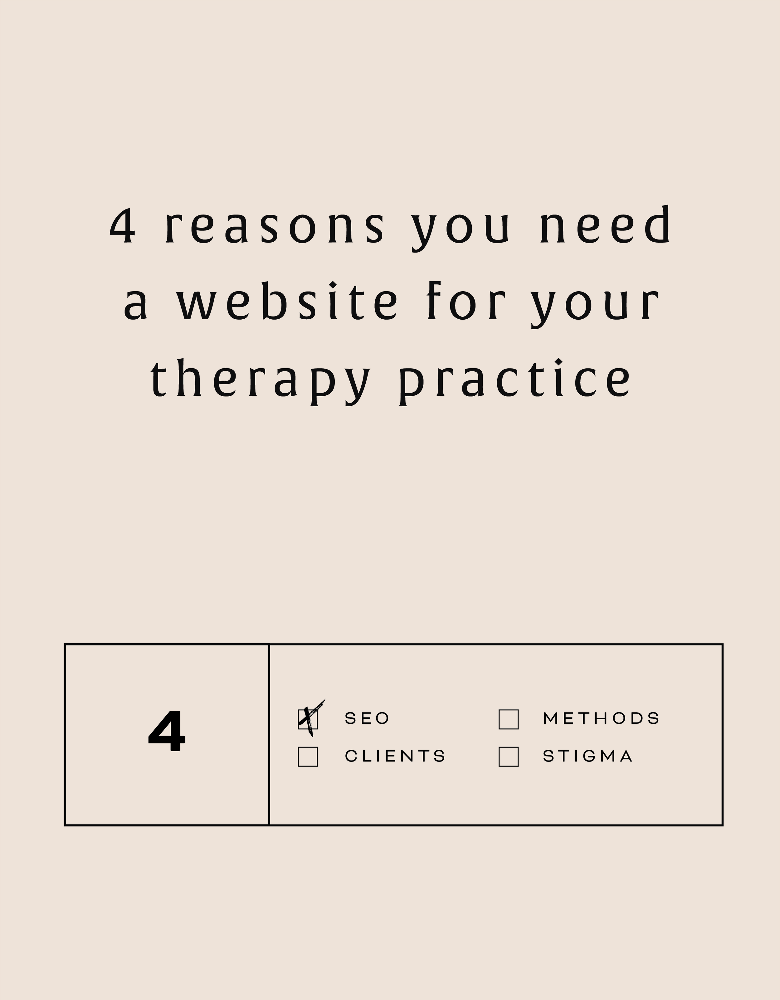
{Design Principles} CONTRAST
Contrast is a design principle that is so crucial to creating beautiful branding and web design. But contrast touches all parts of design, not just color. Put simply, contrast occurs when two elements of the design are different - like REALLY different.
So why the hell should you care? (I get it, you've got a business to run... so let's cut to the chase!)
Contrast is a design principle that is so crucial to creating beautiful branding and web design. When you think of contrast, you may think of color - or maybe black and white photography. The higher the contrast, the darker the blacks appear and the lighter the whites appear with little grey in between.
But contrast touches all parts of design, not just color. Put simply, contrast occurs when two elements of the design are different - like REALLY different.
So why the hell should you care? (I get it, you've got a business to run... so let's cut to the chase!)

01. CONTRAST GRABS ATTENTION. Attention gets your audience engaged. An engaged audience clicks through your website, and eventually, they get in touch with you.
02. CONTRAST CREATES ORGANIZATION. It helps your audience flow seamlessly through your About bio, your Services page and your whole site in general!
03. CONTRAST DEFINES THE FOCAL POINT. Think buttons ("Contact Me!"), header text (your mission statement) and photos. Secretly guiding your audience towards what you want them to see or do is this simple little thing called... yup - contrast! 😉
Below is a breakdown of how to create contrast:

POSITION
front/behind
above/below
centered/off-centered
isolated grouped
in/out
right/left
FORM
simple/complex
whole/broken
symmetry/asymmetry
geometric/organic
hard angles/round

DIRECTION
vertical/horizontal
stability/movement
forward/back
clockwise/counter
convex/concave
serif text/sans serif text/script text
Related Posts

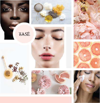
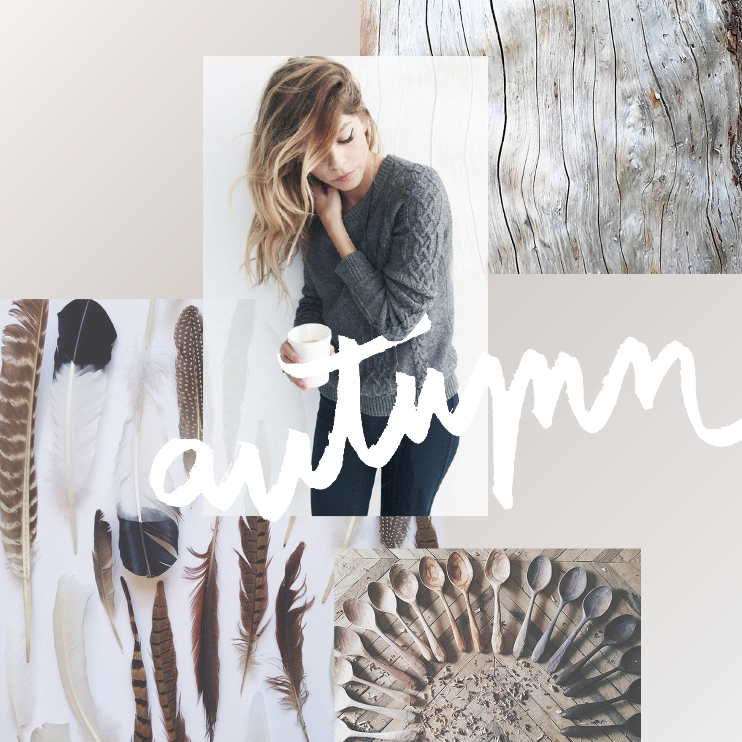
GET THE MOST OUT OF YOUR MOOD BOARD
Have I told you how much I love mood boards? They are crazy-crucial for my design process to make sure I'm on the same page with my clients. They probably take the most time out everything I work on in a branding project. I spend so much time curating images to make sure it's just right.
Why?

Have I told you how much I love mood boards? They are crazy-crucial for my design process to make sure I'm on the same page with my clients. They probably take the most time out everything I work on in a branding project. I spend so much time curating images to make sure it's just right.
Why? Because it sets the tone for the rest of the project.
I show these mood boards to a client and invite criticism because it should be dead-on with their brand vision.
If it's not, discussing what works and what doesn't gives me valuable feedback that I use to dictate what comes next: the logo design. The mood board is like the essence of the brand, boiled down into one big ol' beautiful soup-o-squares.


So how can you make sure you
get the most out of your mood board?
Think about how you feel when you look at the mood board as a whole. This is honestly the most important item. What mood does it convey? What emotions do you feel? What actions do you want to take? These should be in line with what you want others to feel when they see you brand or website. It should be dead on. And if it isn't...
Think about what doesn't fit that mood. Is there an element that's giving off the wrong vibe? Maybe some of the graphic elements or colors aren't quite right. You can even try covering the offending element to see if the mood board works without it.
Consider the big picture. Sure, it's on trend and the colors are pretty, but does it really work for all the visual platforms you'll be using to tell your brand story? Make sure the mood board will allow your brand to live online, in print and anywhere else you will run your biz.
Are you proud of this de sign? Do you want to show your mom, you're biz bestie or even your cat? AWESOME! You should love it and be excited to show it off to your future clients. It will be the direction for your beautiful business, after all.
If you look for these key items when critiquing the mood board for your brand's direction, you should easily get the most out of the mood board process.

Ready to get the mood board party started?
Head this-a-way to try your hand at a DIY mood board.


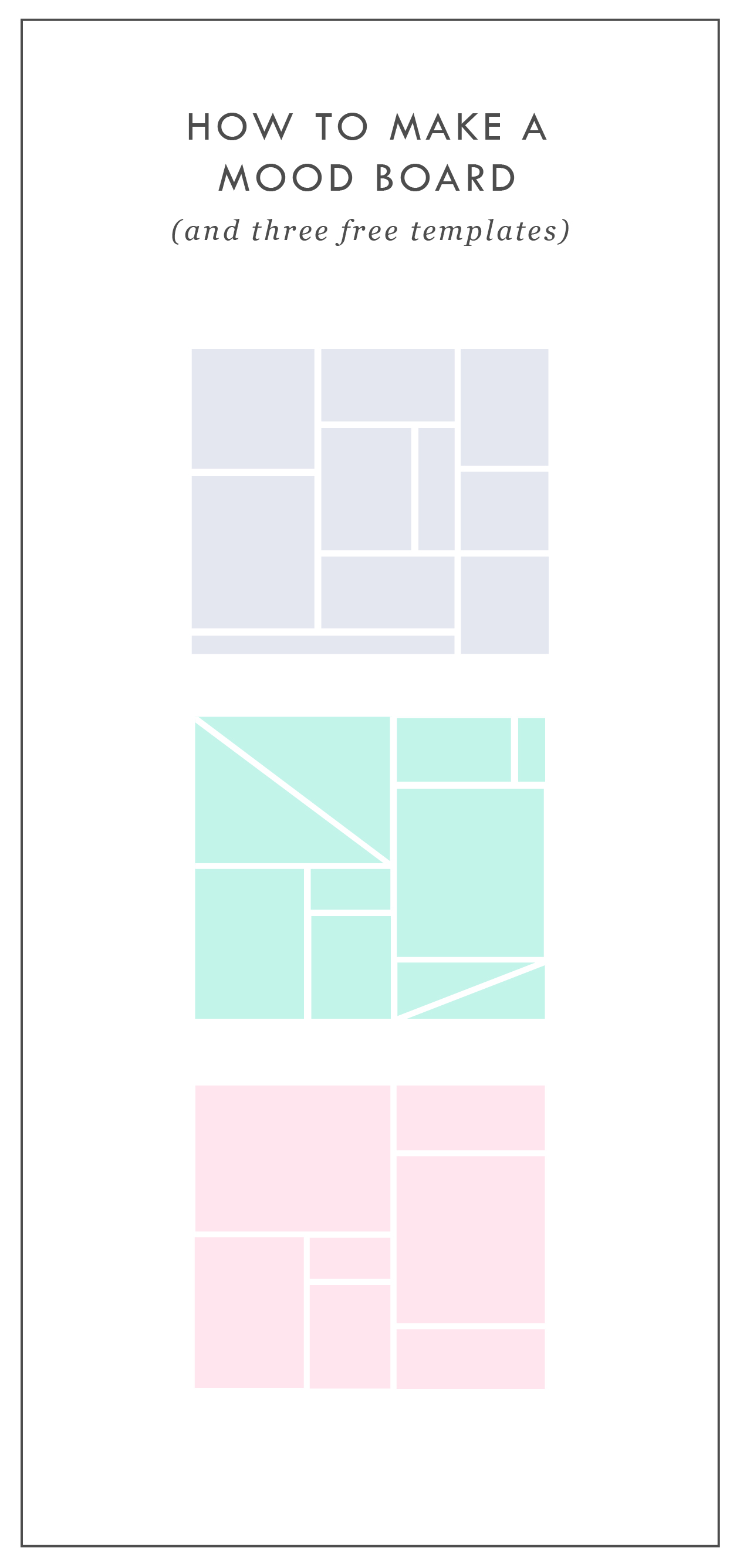
HOW TO MAKE A MOOD BOARD
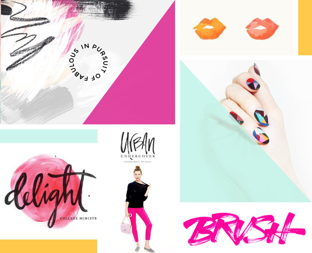
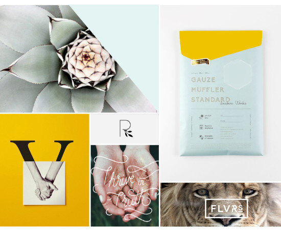
Mood boards help align the aesthetic, color palette, and tone of a project. They get me on the same page with my clients. They can also help get the ideas out of my brain (or off of Pinterest, if I'm wedding planning) and into a clearly organized visual hierarchy.
Mood boards are so crucial to everything I do that's visual. Starting a logo project? MOOD BOARD! Re-decorating my living room? MOOD BOARD! Planning my wedding visuals? MOOD BOARD!
Mood boards force you to select the crucial images that best represent the style of whatever you're getting ready to create. I go a step further and make sure to pick images that include the following:
texture
design elements / inspiration
lifestyle images
color palette swatches
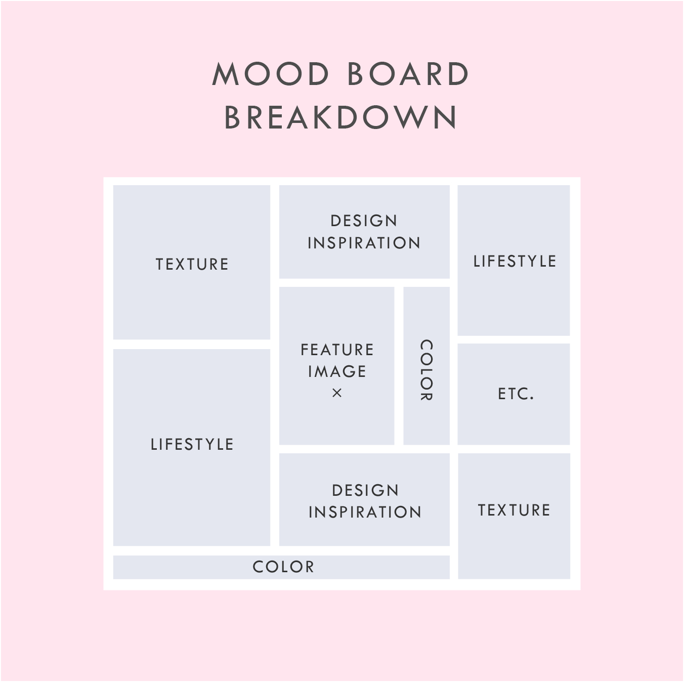
Above is a breakdown of how I organize a sample mood board which each of these elements.
In addition to the elements listed in this mood board layout, you can see that I also have a space for a "feature image" right in the middle. This should be the core mood / style / feeling of the project. It should be whatever resonates with you the most.
I also have a space for whatever else makes sense for the brand or project. I called this "Etc." This can be any image or detail that you find is inspirational but may not fit the other elements.
A good mood board should help keep you visually focused as you move into the next phases of the project.
If you'd like some inspiration, try this or this!
If you'd like to try your hand at creating your own mood board, I've got three free mood board templates you can download here! These are in PDF format, which means you can open them in most design programs.
NEW!
a templated guide to messaging magic
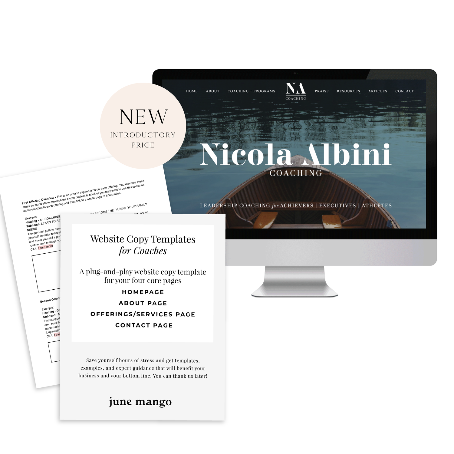
A plug-and-play website copy template for your four core pages (Home, About, Offerings, Contact). Save yourself hours of stress and get templates, examples, and expert guidance that will benefit your business and your bottom line.