


Previous
Previous
LOGO PROCESS: MARIANNE K. RILEY
Next
Next


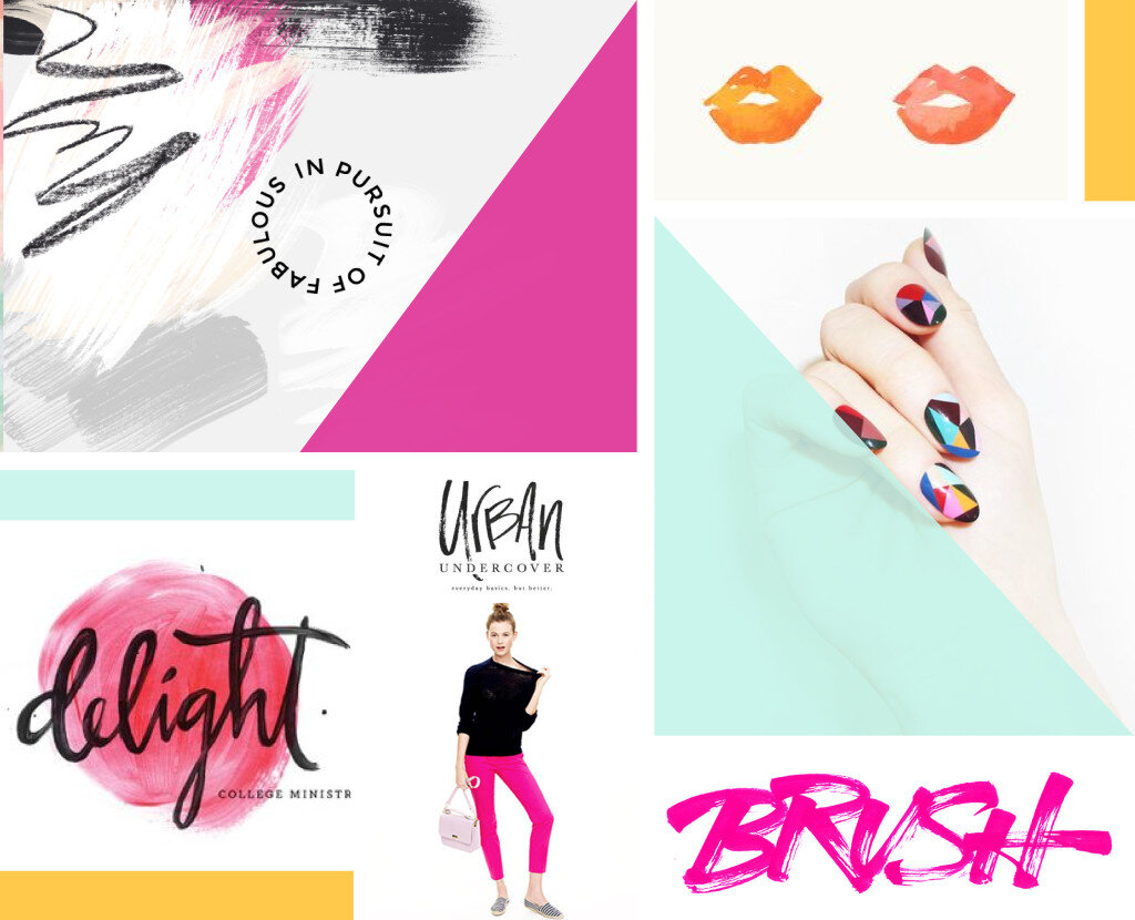


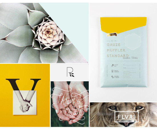
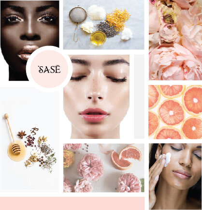


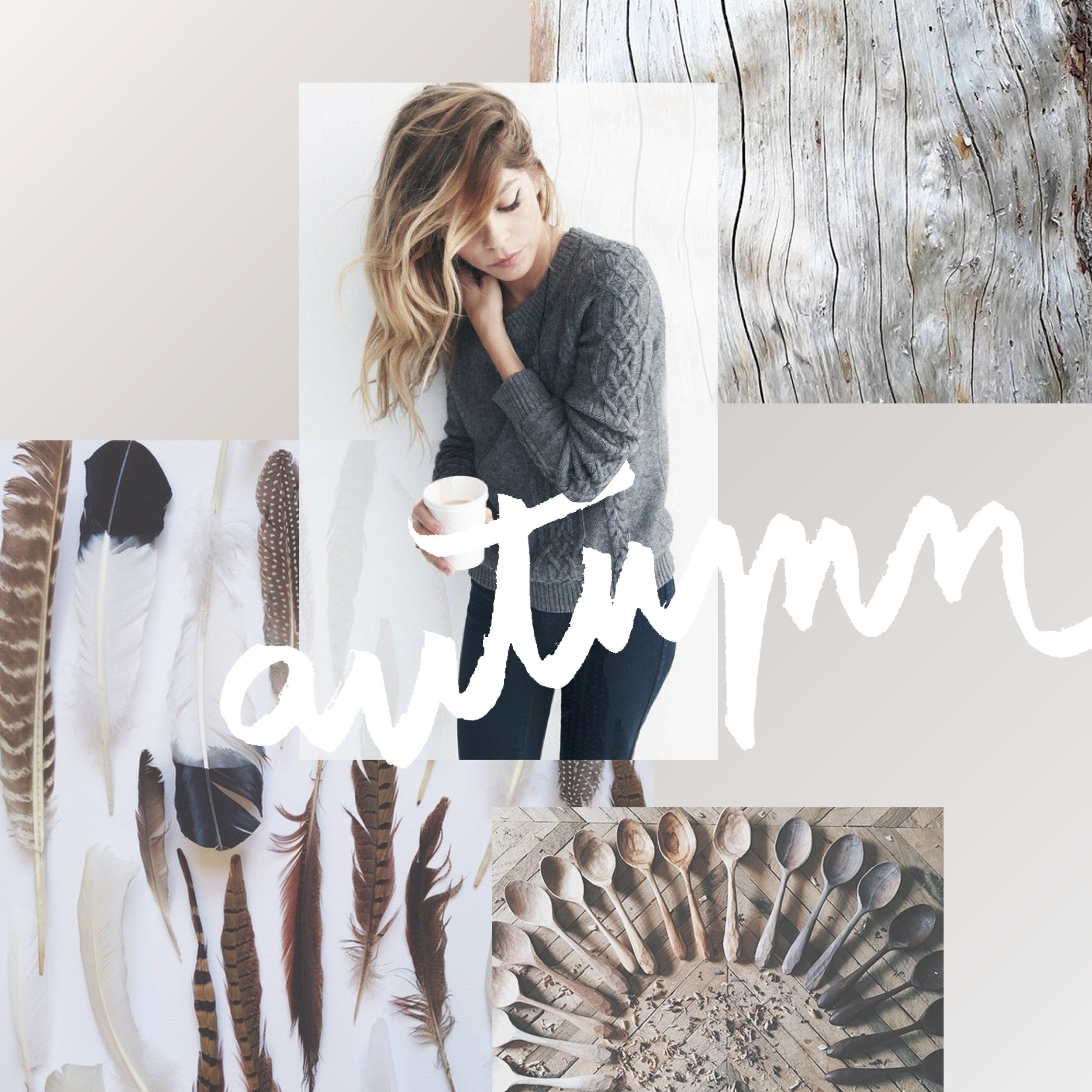
Totally deconstructed. More white space, more breathing room. More color blocks, but all integrated into the collage vs. being stacked together. Still a brand-focused lifestyle image at the center grounding the collage as well as the brand. And little, layered type elements.
Have I told you how much I love mood boards? They are crazy-crucial for my design process to make sure I'm on the same page with my clients. They probably take the most time out everything I work on in a branding project. I spend so much time curating images to make sure it's just right.
Why?
Contrast is a design principle that is so crucial to creating beautiful branding and web design. But contrast touches all parts of design, not just color. Put simply, contrast occurs when two elements of the design are different - like REALLY different.
So why the hell should you care? (I get it, you've got a business to run... so let's cut to the chase!)