
5 REASONS YOUR WEBSITE NEEDS A REDESIGN
Because you deserve a killer website to match your badass brand and business.
1 - You can't even update it If you have to call your web developer for every little text change, you should rethink your website set up. There is LITERALLY no reason for you to have any trouble updating your own site on a basic level.

1 - You can't even update it If you have to call your web developer for every little text change, you should rethink your website set up. There is LITERALLY no reason for you to have any trouble updating your own site on a basic level. With amazing platforms like Squarespace and Wordpress, you can do so much yourself without the need to be a web guru. It's so important to keep your content relevant, and redesigning your website on a new platform can really help you keep it current without breaking the bank or your site.
2 - It's not clear what you do Ask a friend to take a stroll through your website and see if they can tell you exactly what services you offer and how to buy you. This should be completely clear and easy, so if they can't you may need to rework the layout, design or call-to-actions to make sure your dream customers aren't confused, too.
3 - Your content is below the fold Perhaps you've never even heard of a "fold" referring to web design. This is simply the part of the website you see before you need to scroll. It varies depending on how big your web browser is, but it where you most important content should be, especially on the homepage. For example, if I landed on your website's homepage, would I be able to know what and how to buy your product of services? If not, you probably need to rethink your layout to push this important info above the fold.
4 - You've outgrown your website As a web designer, I am obviously able to change my website whenever I please. And this is part of the reason I have redesigned my website 3 times in less than two years. But the bigger reason is because I was swiftly outgrowing my first two sites. They didn't represent my growing brand and business anymore, not to mention that they didn't include some important web design updates (see #5 below!). But just because you're not a web designer doesn't mean you can't (or shouldn't) update your website more frequently than every couple of years. If it is out of date or no longer makes sense for your growing brand, it may be time to rework it.
5 - Your website isn't responsive This is sooooooo important. Did you count the o's in there? That's how important it is! Your website is your online business card - I say it all the time. So that means it's representing you and your business when you aren't there to do it in person. If you website is hard to read or wonky on a mobile phone or tablet, that's your dream client's impression of your business, too. On top of this, Google has now started docking points in it's search rankings for sites that are not mobile-friendly.
If any of these reasons resonated with you, I would l-o-v-e to chat with you. I am happy to walk you through the process from start to finish, look over your current website, or give you pointers on SEO. Whatever you need, I gotcher back.
Because you deserve a killer website to match your badass brand and business.
Related Posts
need even more help with squarespace?
Skip the overwhelm and have your website designed and launched in just 5 days (or less)!
LEARN MORE
2 Easy Newsletter Customizations for Squarespace
More customizations for all you Squarespace lovers today! This one changes the standard newsletter block. I find that this can be a dead giveaway that your site is built on Squarespace, so why not jazz it up? These two handy code snippets will allow you to customize your submit buttons as well as the form fields. As always, it's super easy - just copy and paste!
More customizations for all you Squarespace lovers today! This one changes the standard newsletter block. I find that this can be a dead giveaway that your site is built on Squarespace, so why not jazz it up?
These two handy code snippets will allow you to customize your submit buttons as well as the form fields. As always, it's super easy - just copy and paste! Below is the example newsletter with the design changes.
01. Newsletter Button Font
There are a few little code changes you can make to jazz up the plain "Read More" to match your branding colors. Here are the steps:
In the main Squarespace menu, click DESIGN. Then CUSTOM CSS.
Copy and paste the following code:
/*** NEWSLETTER BUTTON - TEXT AND BACKGROUND COLOR ***/
.newsletter-block .newsletter-form-button{
font-family: Kessel !important;
letter-spacing: .2em;
}
The red highlighted text is where you can change your font and background color for the button. Do not edit the other text! (You can also add this code to an individual page if you don’t want it to affect all newsletter buttons on your site).
02. Open Form Fields for the Newsletter
There are a few little code changes you can make to jazz up the plain form fields to match your branding colors and feel more modern. Here are the steps:
In the main Squarespace menu, click DESIGN. Then CUSTOM CSS.
Copy and paste the following code:
/*** NEWSLETTER FORM FIELDS ***/
.newsletter-form-field-element {
background: none !important;
border-top: none !important;
border-left: none !important;
border-right: none !important;
border-bottom: solid 3px #F2CBCB !important;
}
/*** NEWSLETTER BUTTON BORDER ***/
.newsletter-block .newsletter-form-button{
border-bottom: solid 3px #F2CBCB !important;}
The red highlighted text is where you can change your form's line color. You can also make the line thicker or thinner by changing the pixel weight (ie: 1px for thinner and 6px for thicker). Do not edit the other text! (You can also add this code to an individual page if you don’t want it to affect all newsletter form fields on your site).
And that's it!
The following information was created for use with templates made with Squarespace 7.0.
Stay tuned for more tips and tricks for the new 7.1 platform!
NEW!
A templated guide to messaging magic
A plug-and-play website copy template for your four core pages (Home, About, Offerings, Contact). Save yourself hours of stress and get templates, examples, and expert guidance that will benefit your business and your bottom line.
LEARN MORE


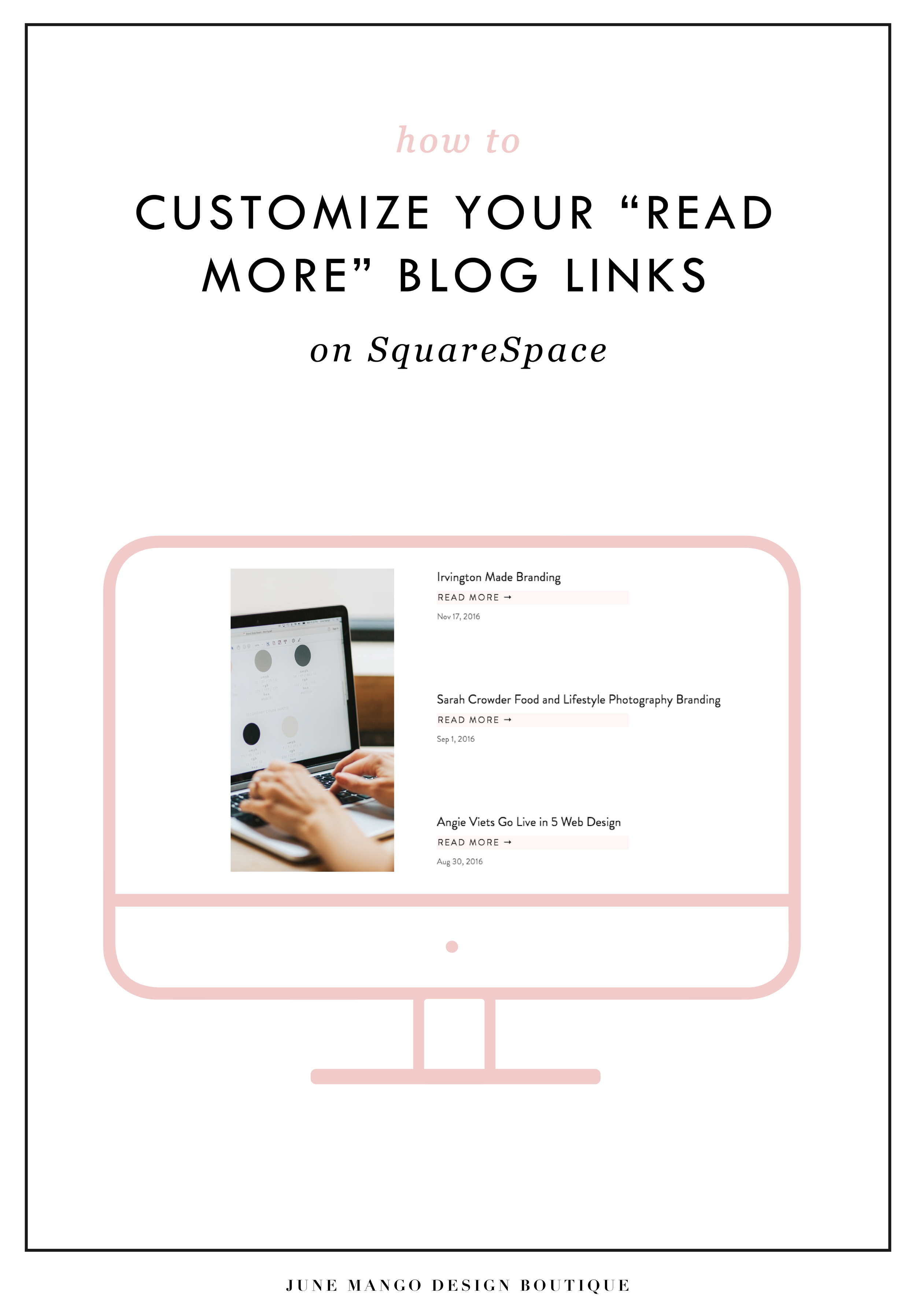
HOW TO CUSTOMIZE YOUR "READ MORE" LINK ON SQUARESPACE
I've got another little snippet of code for all you Squarespace lovers today! This one is for that boring old "Read More" link that appears on a Summary Block. Especially if you are using Squarespace's Summary Block to showcase your blog posts, the "Read More" link is often a good spot to get your audience to engaged (ie: so that they read more!) with your featured posts. So how do you take it from boring black text to something that matches your brand? I've gotcher back.
I've got another little snippet of code for all you Squarespace lovers today! This one is for that boring old "Read More" link that appears on a Summary Block. Especially if you are using Squarespace's Summary Block to showcase your blog posts, the "Read More" link is often a good spot to get your audience to engaged (ie: so that they read more!) with your featured posts. So how do you take it from boring black text to something that matches your brand? I've gotcher back.
There are a few little code changes you can make to jazz up the plain "Read More" to match your branding colors. Here are the steps:
In the main Squarespace menu, click DESIGN. Then CUSTOM CSS.
Copy and paste the following code:
/*** READ MORE LINK - TEXT ***/
.entry-more-link a:not(.sqs-block-button-element) {
color: #F2CBCB !important;
}
.entry-more-link a:not(.sqs-block-button-element):hover {
color: #444444 !important;
}
The pink highlighted text is where you can change your colors. Do not edit the other text. (You can also add this code to an individual page if you don’t want it to affect all “Read More” links on your site).
IMPORTANT ! !
Each template has a different method to define their "Read More" links. Please select the method for your template below, and then replace the red CSS code (.entry-more-link) with your template’s method. (If you’re template isn’t listed below, please try the links below, - many work for more than one template. If none of these work, feel free to email me with your specific template at hello@junemango.com).
Adirondack:.link
Five: .inline-read-more
Fulton: .summary-read-more-link
Horizon: .summary-read-more-link
Peak: .read-more
Mohave: .summary-read-more-link
Marquee: .entry-more-link
And that's it!
The following information was created for use with templates made with Squarespace 7.0.
Stay tuned for more tips and tricks for the new 7.1 platform!


need even more help with squarespace?
Skip the overwhelm and have your website
designed and launched in just 5 days!
HOW TO REBRAND STRATEGICALLY
There are a lot of moving parts to a business, and your brand is just one of them. Branding is about getting to the heart of what I do best, who I serve best, and how I can best represent that through my business. So how do you even begin to strategically rebrand your biz? I have laid out my process with a few tips below, so read on!
If you have been following June Mango for a while, you will obviously have noticed that it's just gotten a major facelift. I am so excited about it and it's been a long time coming.
What I mean by that is that I have been diving deep behind the scenes to strategically rebrand my biz. This is more than just a new logo and color palette, although that's definitely part of it. This is about really getting to the heart of what I do best, who I serve best, and how I can best represent that through my brand. So how do you even begin to strategically rebrand your biz? I have laid out my process with a few tips below, so read on!
There are a lot of moving parts to a business, and your brand is just one of them. For me, I knew it was time for a rebrand when I felt that my messaging and design weren't matching up with:
A) the level of clients I was working with
B) the types of clients I wanted to attract
C) the level of expertise that I have collected from running my business for a few years
D) the actual design work I want to be creating
So these pieces each were key elements that just weren't matching up with what I was putting out into the world. In short, I had grown a lot as a designer and business owner, and wanted my brand to reflect that.
So now that I as aware of what I wanted to be sharing with my ideal audience, it was time to create the messaging and design to match. Now, I am NOT a copywriter, but I do think that the copy in your brand is just as important for your consistent business voice as your design. There are a lot of amazing copywriters that can help you share your vision in your voice, so don't be afraid to hand over the reigns.
Design-wise, I tried to really get clear on what:
A) I'm really good at
B) I can do that not many other designer's can
C) type of design I like to create
D) what type of design my ideal audience is looking for
With these things in mind, it was easy to create a website and brand that showcased all of the above. And the key here is that the real reason it was easy, is because it was natural. This is another reason I knew it was time to rebrand - I was eager to stretch my legs into design that fit me better.
Finally, I always like to keep in mind the visuals of the previous logo and branding. You don't want to completely change your look or else no one will recognize you! (Think Jennifer Grey after the nose job). So I stuck closely to the layout of my old logo, kept some of the same colors, like the pink, and just updated the hues. I also added a new stamp as an alternative logo to help share my services + expertise in a clear way and round everything out.
Overall, I am so happy with it. It really represents me, my design style, and my ideal clients. And that is exactly what your brand should do. :)
The full branding + web design:


5 QUESTIONS TO ASK BEFORE SWITCHING FROM WORDPRESS TO SQUARESPACE
So you've been thinking about switching from WordPress to SquareSpace, but aren't sure if it's right for you or your business. So how do you know if you should switch things up or stay put? Here are a few questions to help you decide:

So you've been thinking about switching from WordPress to SquareSpace, but aren't sure if it's right for you or your business. So how do you know if you should switch things up or stay put? Here are a few questions to help you decide:
How much do you blog? If you are a regular blogger posting content more than once a week, you may want to stay with WordPress. Not only does WordPress have an amazing database for all that content, but it will also be quite a process to move all of that content over to SquareSpace without messing with the posts' formatting, plugins, etc. If you don't blog as regularly, this is less of an issue. I merge blogs over from WordPress to SquareSpace all the time, so it definitely can be done. You may end up tweaking each post to make sure it works in the new SquareSpace site, but if you don't have hundreds of posts, this isn't a huge issue.
How often will you be adding pages or tweaking your content? If you know you're going to be adding new forms, creating pages for an e-course or anything else that would require you to get in the backend and easily create your own content, SquareSpace is the clear winner. It's user interface is extremely easy to use and it even has pre-made page layouts for the novice web designer.
Do you need a lot of customization?Do you need to be able to tweak a lot of little things or have some crazy-cool functionality like a unicorn that flies across the screen? If so, stick with WordPress. WordPress allows you to create a custom-coded child theme and you can pretty much do anything you want with that (with the help of a developer). SquareSpace's customization is a little limited, mostly because they don't want the novice web designer to break his/her site! But even SquareSpace can be customized to a certain extent , like I've talked about this and this post.
Do you want to be hands-off for the website's maintenance? Then SquareSpace is the better choice. Since SquareSpace isn't open-source, unlike WordPress, they control everything. This means there are hardly any bugs, no need to manually backup your site, and if you ever have an issue, their support team is ah-mazing. I can't even count how many times I've used their live chat option when I have a question about something.
What's your price point? There's obviously no "set cost" for either of the platforms, it just depends on what you need. For WordPress, you have to pay for hosting as well as your domain name, plus any theme you purchase or web designer/developer you may hire to help create the site. If you're creating a custom site, you could be paying upwards of 20K! SquareSpace has a few plans that you can choose from, and most businesses can get away with the Personal plan, which is $12/month. Add that cost to your domain name and it's only a few hundred dollars if you set it up yourself. If you hire a web designer to help you, you will likely still walk away with a brand new site for less than a few thousand dollars.
So what do you think? It really just depends on your answers to these questions, but hopefully you find them helpful in determining which choice is right for you! And hey, if you want to chat through any of this more, I'm here! Just holla at me.
The following information was created for use with templates made with Squarespace 7.0.
Stay tuned for more tips and tricks for the new 7.1 platform!
Related Posts
need even more help with squarespace?
Skip the overwhelm and have your website designed and launched in just 5 days (or less)!
LEARN MORE
HOW TO USE & ABUSE GRIDS FOR WEB DESIGN
A little design secret is that any good design is probably breaking a rule. Not ALL the rules, because otherwise, things get a little confusing. But breaking a rule here and there allows you to create something that catches your eye. And eye-catching design is noteworthy. And noteworthy sites are remembered. You see where I'm going with this, right??

Every website is designed using a grid. This is so helpful when you are thinking about layout and placement of content. If you're just starting out in web design, or are DIY-ing your site, this is basically the number one rule to keep in mind. JUST FOLLOW THE GRID.
But! You can also use the grid to your advantage to create unique layouts. A little design secret is that any good design is probably breaking a rule. Not ALL the rules, because otherwise, things get a little confusing. But breaking a rule here and there allows you to create something that catches your eye. And eye-catching design is noteworthy. And noteworthy sites are remembered. You see where I'm going with this, right?? :)
So using this website as an example, you can see that there is a grid as a guide, but the elements in the layout don't all fit perfectly within the rules of the grid. Some elements are perfectly centered, like the mission statement at the top and the newsletter opt-in at the bottom.
Other elements use the grid, but in unexpected ways, like the "Next Step" graphic and text. While the white space that holds the text is along the line of the grid, the pattern that encompasses the white space + text is above the line of the grid. But you'll also notice that the black pattern does follow the rules of the grid from left to right and fits nice and snug into the right-hand side of the site. The images on the left do the same thing. They break the grid vertically, but fit centered from left to right.
So you can see that this website breaks the rules a little, but each element still follows the grid in another way, which keeps it clean and cohesive, but also a little interesting and eye-catching.
If you want to take a look through the full website used in this example to see how I carried this organized rule-breaking throughout the rest of the site, head on over this-a-way!
For even more web design craziness, check out this, this, and this site.
Related Posts
need even more help with squarespace?
Skip the overwhelm and have your website designed and launched in just 5 days (or less)!
LEARN MORE

NEW WORK: AMY KURETSKY ACUPUNCTURE WEBSITE
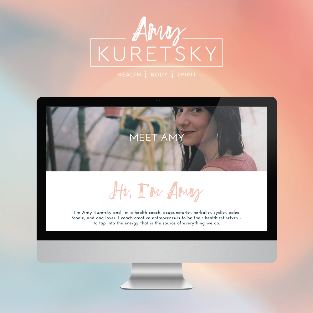
Amy Kuretsky is an acupuncturist and health coach who is killing it with awesome health tips and an awesome holistic approach to life and business. She shares some of her insights via Periscope on the daily, so definitely check her out there.
We created a website that really showcased her personal brand and expertise. Lots of (super informative) content get broken up by graphic elements and client testimonials. I am very slightly obsessed. Plus, we rocked it out in just 5 days.

See more of the website and give Amy some heart eyes this-a-way.

NEW WORK: STEMS AND SPRIGS SQUARESPACE WEB DESIGN
This SquareSpace web design project has me feeling all fuzzy inside. This lovely little site was created for a florist in Northern Michigan who A) Is one of the sweetest ladies I've ever virtually met, and B) Makes the most gorgeous floral designs EVAH.
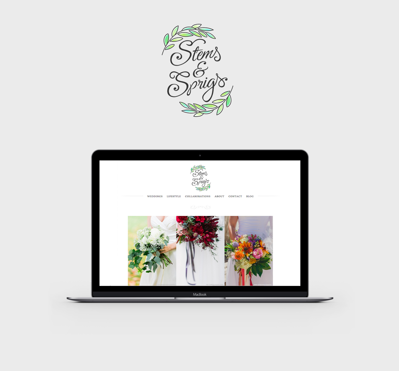
This SquareSpace web design project has me feeling all fuzzy inside. This lovely little site was created for a florist in Northern Michigan who A) Is one of the sweetest ladies I've ever virtually met, and B) Makes the most gorgeous floral designs EVAH.
Kalin, the owner of Stems and Sprigs, had a SquareSpace website set up but just couldn't seem to align the layout and design with her brand. We worked together to create a soft, feminine, and sophisticated feel for her website that now allows her to truly broadcast her brand in an authentic way.
Take a peek at the results below.

Related Posts

ENGAGED, A WEDDING PODCAST
I can't believe it's taken me this long to post about the branding and web design for my podcast, Engaged! This is one of my fave projects to date. I started this podcast because I was feeling a lack of authenticity out there in the wedding industry. It often feels like a lot of fluff (bouquets and sequins and napkins, oh my!) and not a lot of real talk. What if you're planning the wedding while you two live in separate places? Or how do you plan a wedding if you just want to have a barefooted love party in your backyard? (Hint: Here's how). What do you do if you start planning a wedding and then find out your pregnant! Yep, that's a future episode.

It's been great to get advice and hear real stories from couple who've done the wedding planning dance. But of course, I can't do anything without branding it! #designerd

This is just a peek at the website's design. If you want to see more of the website or listen to some of the episodes, head on over this-a-way. We'd love to have you listen!!
Related Posts
need even more help with squarespace?
Skip the overwhelm and have your website designed and launched in just 5 days (or less)!
LEARN MORE

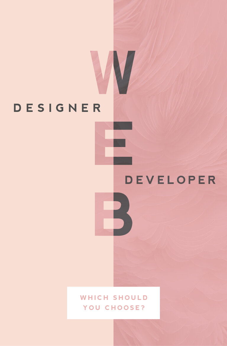
WEB DESIGNER VS. WEB DEVELOPER: WHICH SHOULD YOU CHOOSE?
One of the questions I get asked most often is "What is the difference between a web designer and a web developer?". There are some very clear-cut differences, which I'll get into below, but truthfully, they can often overlap. I think this is why it can be confusing. But what are the main differences and which should you choose? Read on...
WEB DESIGNER
Web designers create and direct all visual aspects of a website including graphics, photos, layout, fonts, color palettes, and interactivity, which can include color changes, mouse rollovers, moving images, etc.
This person usually has the following responsibilities:
Researching and designing concepts that are easy to use (user-friendly), beautiful, and engage the audience
Designing page layouts and interactions (i.e.: button turns pink when you click it)
Working closely with web developers during the process of building the website online
Having an understanding of different audiences and interests with the ability to translate that into an interactive web space
Working collaboratively with content creators and copywriters to visually represent their work
Bringing a brand to life dynamically through layout, font selection, color palette and interactivity
Overseeing a project’s entire creative process
When looking to hire a web designer, make sure they also have the following skills:
Knowledge and interest in current trends in design, both digital and print
Ability to to understand the client's perspectives or problems and come up with ideas that are clear and TKTK
Significant comprehension of how HTML, CSS, browsers, and devices all work together
Ability to simplify solutions to problems and solve them through design
A style that jives with your own
A strong portfolio of projects that are similar to yo urs
WEB DEVELOPER
(There are two main types of web developers, front-end or back-end. PRO TIP: If you're looking to build a website, that's front-end.)
A web developer is someone who uses HTML, CSS and JavaScript to create a website that a user interacts with directly through their web browser. Basically, they build the 'front-end' of the website (vs. the 'back-end' of a website which is like what you interact with when you login to a website, like WordPress).
This person usually has the following responsibilities:
Translating wireframes or design mock-ups to actual code that will produce visual elements
Bridging the gap between graphic design and technical implementation
Develop web pages for commercial and content management systems, or CMS platform (like WordPress)
Understanding of web development user experience best practices (i.e.: the logo should be at the top of every web page)
Having experience with and a deep understanding of web technologies including JavaScript/jQuery, CSS, PHP and HTML5
Developing and implementing responsive websites (i.e.: does it look flawless on your tablet or phone AND your desktop computer?)
When looking to hire a web developer, make sure they also have the following skills:
Excellent problem solving skills (PRO TIP: Any good web dev. will tell you the job is about 98% problem solving!)
Experience working directly with graphic designers and website design mock-ups
If not hiring with a designer, developer should have excellent design and layout skills
So now you know the difference but your still not sure which you should hire to build your website? This doesn't necessarily have a clear cut answer because it depends on you and what you're looking for.
Personally, I recommend finding a web designer who knows a great web developers to help build custom WordPress sites. Otherwise, many web designers (like yours truly) typically know enough HTML and CSS to customize a pre-programmed website or theme, like this website. It simply depends on the project.
Hopefully this (long) list of differences will help you choose who's right for your web project. And if you're still confused or have more questions, just holla at me! I'm always happy to chat!
Related Posts
need even more help with squarespace?
Skip the overwhelm and have your website designed and launched in just 5 days (or less)!
LEARN MORE
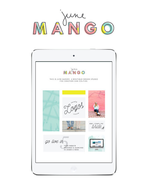
THE NEW JUNEMANGO.COM
Perhaps it's a little cliche, but I genuinely believe that a solid fresh start is the perfect way to set yourself up for great things. I love to set goals and re-evaluate where I'm at in both my business and personal life every year in January. It just seems fitting. A whole new year is ahead with 365 days to do and see and discover wonderful things!
In that vein, I thought it was time that I redesigned my website. This is something that I do more often than others, I'm sure, given that I have the ability to do it myself. But it's actually a great goal to include on anyone's list. Websites get outdated faster than almost anything else, so it's important to make sure it's up to date.
I also made a giant change by switching from WordPress to SquareSpace. As a designer, I felt that WordPress was just a bit too clunky. Every time I updated WordPress, pieces of my website would need to be re-coded, and I was always having issues with plug-ins. These aren't make-or-break issues by any means, but I felt like I wanted a platform that wasn't such a hassle. That meant giving up a tiny bit of design freedom, but honestly, not much. Given my background, I was able to code in some custom details on my new SquareSpace website without any trouble at all. This makes it unique to me, but I don't have to mess with all the backend bugs.
The design stays true to my design style: clean, colorful and clear. A lot of organized rule-breaking, which ultimately left me with this as the final product:

Related Posts

3 REASONS TO REFRESH YOUR WEBSITE
Sometimes the idea of building a brand new website can be a little scary. There are probably a few reasons for this. You may be afraid the process will take too long or that it's too expensive. You think of updating your website as a 'backburner' item that you will get to eventually.
Building your website doesn't have to be this big scary monster of a task. Here are three solutions to those three main fears.

It doesn't have to take months. It can take days. Really.
When I worked as an agency designer, we had a process of building websites that caused the projects to take months. There was even one project that I started when I was hired and was still ongoing when I left. This is sooo unnecessary. The reason some web project take so long is the process. But with a process that allows me to collaborate with my clients, the project time is drastically reduced. By helping hone in on what we will need BEFORE we dive into the design process, the whole project can take just a few short weeks (or even days!).
It's NOT too expensive.
This can be true, but it really depends on what you want in a website. If you would like to see unicorns fly across the screen as the user scrolls, well, sure, that is a bit fancier and will cost a bit more money to custom code those details. But if you are looking for a website that reflects your personal brand and is cleanly coded and responsive, it's completely within reason to create this on a budget.
It's affects your bottom line.
Is your business a priority? Then your website should be, too. If you look at your website as your online business card, is it saying everything you need it to say? If not, creating your better online business presence should really be a priority, too.
Your website is your hardest working employee. It should tell people who you are, what you do, and how to buy you - when you aren't there to do that in person. Does yours?
Creating and updating your website doesn't have to be so scary. You may just need to rethink the type of web design project that's right for you. There are so many options and resources out on the internet that you can use to help you keep growing your biz online and off. :)
Related Posts
NEED EVEN MORE HELP WITH SQUARESPACE?
Skip the overwhelm and have your website designed and launched in just 5 days (or less)!
LEARN MORE

3 REASONS YOU NEED A GREAT WEBSITE
If you have an audience, you should have a website.
Ok, that makes sense, right? If you have an audience, that means you have people who are interested in what you have to say, offer or sell. That's KILLER! Congrats! So why do you need more than just any old website, but a great website?

Your website is your online business card.
It speaks for you when you aren't there to do it yourself. Below are three of the top reasons you need a beautiful, functional website:
1. A Great Website Grows Your Audience
Your website will help you increase those eyeballs on your content. It gives you a place to refer new contacts and stay in touch with the current contacts you've already cultivated.
2. A Great Website Makes You Legit
If you're friend referred you to a new hair salon, but they didn't have a website, would you trust them to tame your mane? Or worse, what if their site was clunky and outdated? A great website legitimizes you and your brand. It make you look like the bona fide expert you are.
3. A Great Website Is Responsive
People have access to everything, including your website, right in their pocket. All they have to do is whip out their phone anytime and anywhere and - voila! - there you are! But if your audience can't read your blog or can't buy your services from the tablet, you may actually turn your dream audience away.
A great website is all of the above, and your badass brand deserves to have a beautiful business presence online. If you feel you could use a website refresh, shoot me an email. I'd love to make your website great!
If you're not sure where your website stands, download this checklist to help you determine what's working and what could use a web refresh!
Related Posts
need even more help with squarespace?
Skip the overwhelm and have your website designed and launched in just 5 days (or less)!
LEARN MORE
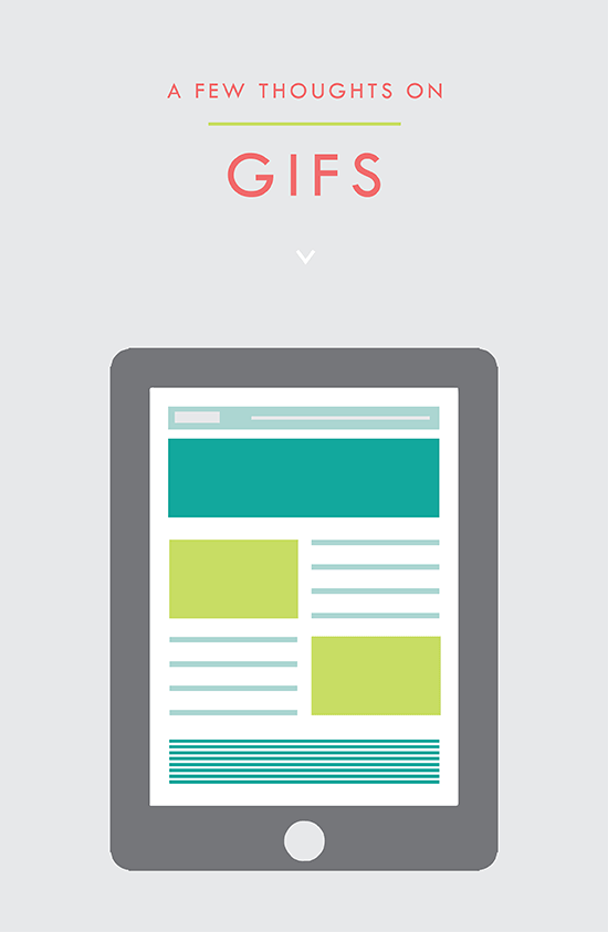
USING GIFS IN WEB DESIGN
It's simply an animated photo / graphic made by placing several layers together that play in a loop. And it's a fantastic tool for your website. Here's why:
It's the gif that keeps on giving!! #hilarious
But actually, that's kind of what a gif is. It's simply an animated photo / graphic made by placing several layers together that play in a loop. And it's a fantastic tool for your website. Here's why:
This animation grabs the users attention. The changing visuals catch the eye and cause the user to take notice.
Your message or image stands out. This make a gif a great option for a featured item in an e-commerce site. Kate Spade has some great examples of this.
You can use it to direct the user to a particular page. Since the image is eye catching, use it as a button or link it to a place you want your audience to go, like your Contact or Services page.
They get a lot of love. Gifs are more likely to be shared on social media platforms and garner more user engagement.
These animated visuals are processed faster in your brain! That means that your message is received sooner and is likely clearer. It's science, yo.
You can showcase different styles for different tastes. This is another great use for an e-commerce site that may sell an item in various colors, for example.
• They're fun. This is maybe the best reason. Because, hey, why not?
PRO TIP: You can use these little guys in your email marketing, too! It's another great way to pack a lot into a small space.
Related Posts
need even more help with squarespace?
Skip the overwhelm and have your website designed and launched in just 5 days (or less)!
LEARN MORE

BRANDING FOR PHOTOGRAPHERS
Whether you’ve just launched your photography business or are a seasoned veteran looking for a brand refresh, there are four main ideas to help you find your focus.
1. Be distinctive
The kind of photography you focus on is the most important item to consider before you begin a logo or branding project. Are you a food and styling photographer, wedding and family photographer, or an urban street photographer? These are all such vastly different styles of capturing a moment that they will require completely different branding approaches. Now we can narrow it down from here.
2. Brand it, #boss
How do you take your unique photography niche and turn it into a beautiful brand?
Answer: Style. Find that emotional connection your style has with your customers. A bride-to-be has seen your most recent engagement shoot and just adores the way you captured the couples love. She wants that romantic feeling for her engagement shoot, too. Allow your branding to reflect that romance you bring to your photography. Show this bride-to-be and any other that when they hire you, your photography style will make her swoon. Maybe that means using calligraphy in your logo or creating a soft and feminine color palette. Keep asking yourself throughout the process, "Is this in line with my style?" This emotional tie into your branding elements will give clients a sense of your approach before they even chat with you.
3. Work your website
As a photographer, your website is so important. This is the best place to showcase your photos. Organizing them into galleries and recent shoots will help your future client visualize their own photos. Continue the emotional experience of your brand by telling a fluid story to your customer. A good example may look like this:
Click … HomepageIntroduction to Drizzle Food Photography and Styling, where I am inspired by ingredients and abundance in the kitchen.
Click … Gallery A collection of gorgy examples of past photo shoots for dreamy clients and delish dishes.
Click … Contact How to get in touch to book my unique and valuable photography services.
Let the photos do the talking. On your website, the branding should act and an important accent that underscores your photography style.
4. One step further
As the savvy photography business owner you are, you know there’s more to branding than just the logo and website. Social media (styled photos anyone?), photo flyers and media kits are all places to expose your branding and your business. Think about each client’s experience from beginning to end. From finding you on Instagram to thank you stationary, gather all your pieces and review what you have. Make sure it conveys the emotion and style of the photos you take.
In the end, it should all be in line with your vision, mission and fabulous photography.

#MOBILEGEDDON
#mobilegeddon is here. Are you ready?!
Ok, fine. That's a little over-dramatic. But for many websites, today marks a day a lot like a mobile Armageddon for their search rankings on our good friend Google. Why? Google will start a new overhaul of it's famous algorithm to determine if a website is mobile-friendly. And if yours is not... well, you might want to rethink your web design.
Is your website mobile friendly enough for google? Here's the break down of the good, the bad and what it means for your website.
THE GOOD
For you, the mobile-friendly consumer, this is great! Online retailers and larger companies with complex websites will be easy to navigate on a smartphone or tablet. Same goes for online magazine websites like Refinery29 and EOnline. This will ensure that all your have to do is click, click and read everything you ever wanted to know about Kim Kardashian's bleach blonde hair and pregnancy woes.
THE BAD
If you are a small business with a site made even one or two years ago, you may not be ready for #mobilegeddon. According to the Economist, 40% of the leading sites failed Google's "mobile-friendly" test. Ouch. And the result is that those site's search rankings will be dropped. So if your website was on page one of Google when a user searched for "DC area photographer", you may have just been bumped to page two or three. Now you're less likely to get clicked on by your dream client.
NOW WHAT?
So now that you're officially freaking out and creating a algorithm-safe bunker with canned foods and a pile of US Weekly, what can you do? First, determine if you're website is in the clear or not with this test. It will determine if your text is too small or your links and contact information aren't easy to use. If you find your site doesn't pass the Google test, it might be time to rethink your web design. This may mean something as simple are creating a mobile-friendly version of what you already have. It doesn't have to be a full overhaul.
Overall, it's better to know about these Google changes and take it in stride, than to wonder why in the world you suddenly have less page visitors than last week. But if you find your website isn't ready for #mobilegeddon and you just need to be cheered up, you can always turn to these mobile-friendly Kim Kardashian selfies.
Related Posts
need even more help with squarespace?
Skip the overwhelm and have your website designed and launched in just 5 days (or less)!