
STOCK PHOTO GUIDE · PART 2
Best stock photo sites for your blog or website
In my last post, I talked about how to pick the right stock photos for your blog or personal brand. In part 2 of this post series, I want to dive into where to find the best stock photos. There are so many sites out there that offer both free and paid photos. But a lot of them don't even come close to offering an authentic product. So where should you start your search for cool, creative photos? Dive down to my curated list of free stock photos below.
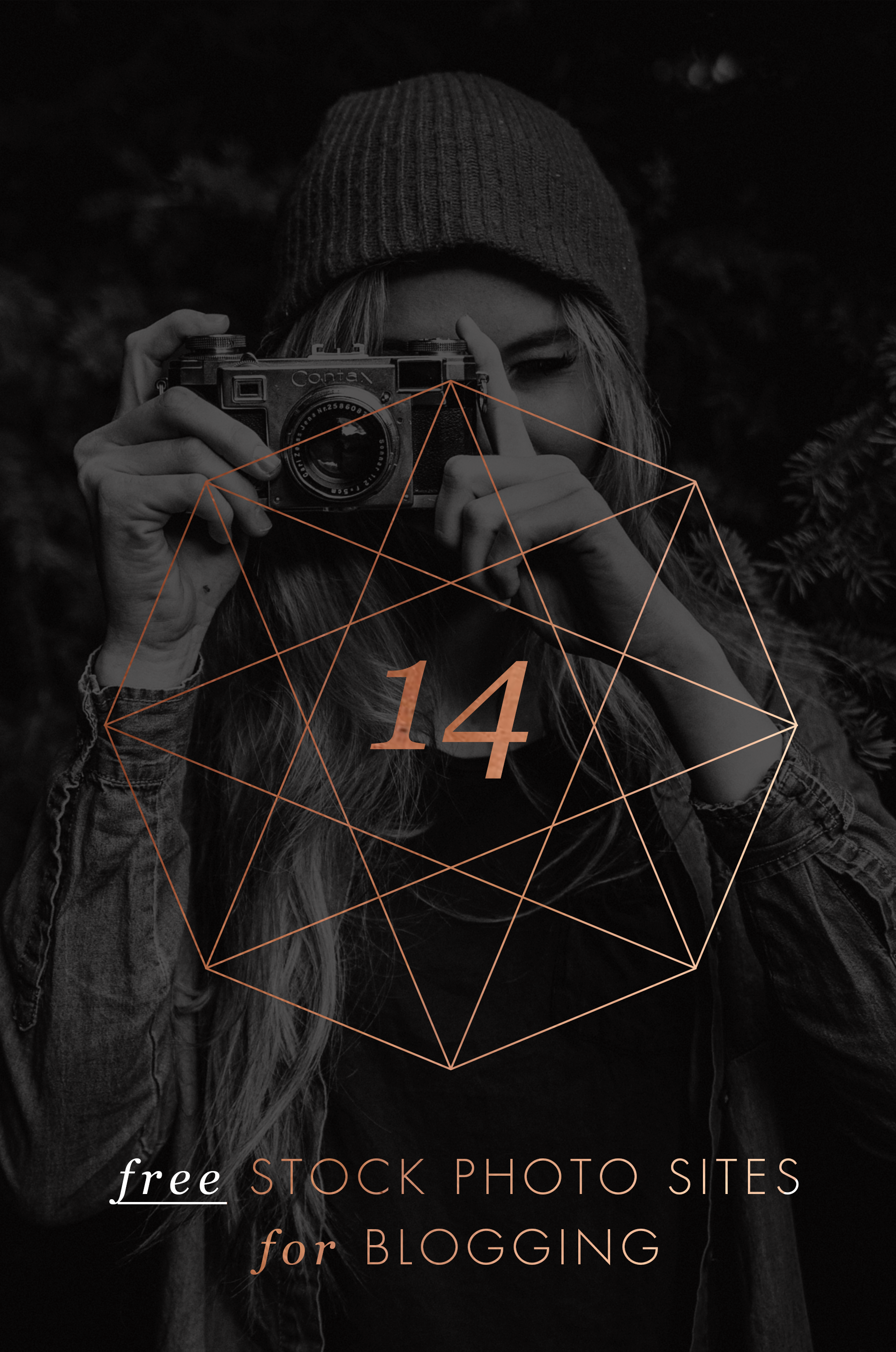
Best Free Stock Photos
Unsplash This website adds 10 new royalty-free photos every few days, and the photos consist of breathtaking landscapes and unique portraits.
Picjumbo This is a great one for food or nutrition bloggers since they have some awesome food photography. The photos also have a little less of a hipster vibe if you're looking for something traditional.
IM Creator This is such a well organized collection of photos. This site also has web templates and other goodies to assist with your website. The catch: attribution is required.
Death to Stock Photo With 10 free photos every month just for signing up, this site offers curated images that are really high quality. You can also purchase the premium membership for access to over 400 photos.
FancyCrave These are great for both commercial and personal projects. With two new photos added daily, there's a pretty giant selection to choose from!
Stocka If you're looking for 'product' photos or images with a clean, white background, Stocka is perfect.
Splitshare Another great resource with a lot of photos to choose from. It's also organized really well making it easy to search and find exactly what you're looking for.
Pexels This is one of my faves for it's colorful, creative selection. These photos are perfect for blogs and websites.
Startup Stock Photos These are more business-oriented, but are great if you're looking for a computer / desk shot.
Gratisography Looking for the opposite of corporate stock photos? Look no further. These quirky (sometimes creepy?) photos are anything but the same old stock photo.
stocksnap.io This site offers high-res, photos with a handful of unique layouts and compositions.
Jay Mantri This lady has some gorgy photos. Most consist of destinations and amazing texture shots. It's set up like a photo blog, so it's a bit hard to search, but they're worth getting lost in.
Designer Pics These photos have a faded, yet colorful feel. They're really unique and perfect for the right niche.
finda.photo This site is made for the phrase 'last but not least'. This site is brings together tons of free photos from a lot of the sites I've listed above. It has a robust search engine that lets you narrow down your choices through filters like color, collection (landscapes or close-ups) or source (unsplash or Jay Mantri). In short, it's awesome.
Related Posts
NEED EVEN MORE HELP WITH SQUARESPACE?
Skip the overwhelm and have your website designed and launched in just 5 days (or less)!
LEARN MORE

SYMMETRY VS ASYMMETRY
Sometimes people wonder how I layout my designs or if there are certain rules that I follow. The answer is yes! I studied Fine Arts in college and learned some basic, but crucial design principles that I apply to every project I create. A super standard design principle that everyone knows, is symmetry. But you may not know that asymmetry is an equally important tool. Read on!
Sometimes people wonder how I layout my designs or if there are certain rules that I follow. The answer is yes! I studied Fine Arts in college and learned some basic, but crucial design principles that I apply to every project I create. A super standard design principle that everyone knows, is symmetry. But you may not know that asymmetry is an equally important tool. Read on!
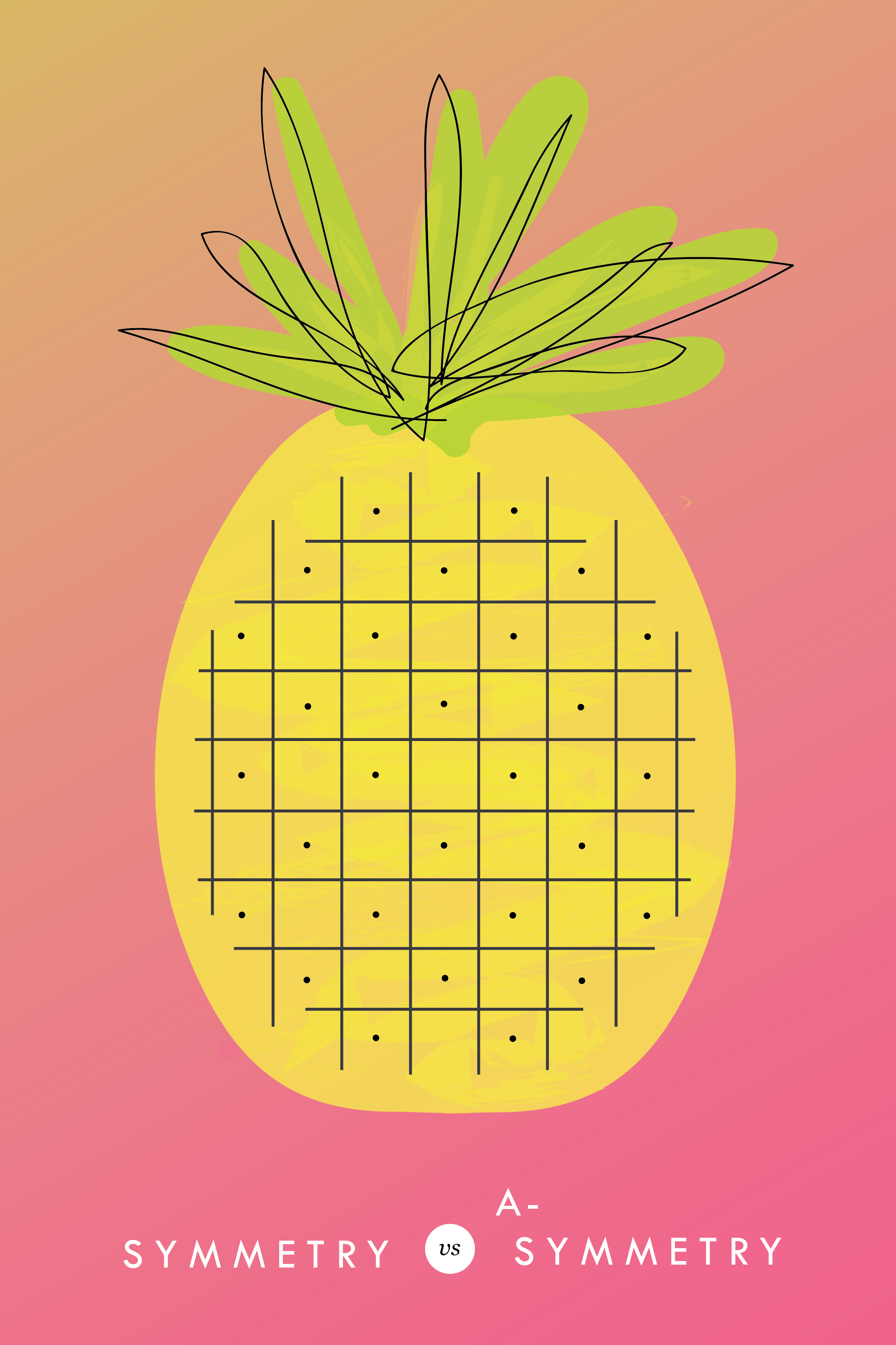
Symmetry has long been touted as the gold standard of design. By definition, symmetry allows a composition to be balanced on all sides. This is visually easy on the eye and therefore, great for organizing content in a logical way.
But don’t rush to choose symmetry as your default design tool. The downside to symmetry is that it can feel a bit boring, especially when used in excess. It becomes predictable and oversimplified.
Asymmetry, when used thoughtfully, can break up the uniformity to create a composition that is visually exciting and complex.
There is a still a need for balance between design elements in order to even out the visual weight, but when used deliberately, the effect feels modern and dynamic. Take this ombre pineapple for example (because, if we're going to have an example, isn't it better if it's an ombre pineapple?!). The body of the pineapple is completely symmetrical, but it's offset by the top of the pineapple's asymmetrical leaves. This creates visual interest AND balance.
Both symmetry and asymmetry can be used in a composition to create a balanced communication framework. And while these are important design principles to keep in mind, they are simply the groundwork for creativity. Maybe your ombre pineapple is completely symmetrical with a crazy patterned background. Use the design principles as a framework, but don't be afraid to get creative!
pssst... this is a great tip for web design, too!


KYLEE ACKER BRANDING PROCESS
This is a behind the scenes peek at the branding process. The goal was to really showcase her initials since this is her personal brand. The trick was to make both the K & A recognizable because each letter is of equal importance. Th color palette combines classic neutrals with a slightly feminine, but not overpowering pop of pink.

Every designer has a slightly different process. Some designers like to share just 2-3 design concepts, and some like to share 10+. I'm somewhere in the middle and tend to share 4-6. I think that gives enough variety without overwhelming my clients. Too many choices can be paralyzing and ineffective.
Remember that hella stylish mood board I shared recently? This is a behind the scenes peek at the branding process. The goal was to really showcase her initials since this is her personal brand. The trick was to make both the K & A recognizable because each letter is of equal importance. Th color palette combines classic neutrals with a slightly feminine, but not overpowering pop of pink.
Which one would you choose?
Related Posts
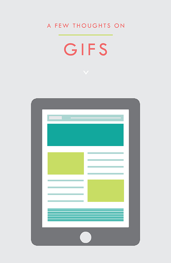
USING GIFS IN WEB DESIGN
It's simply an animated photo / graphic made by placing several layers together that play in a loop. And it's a fantastic tool for your website. Here's why:
It's the gif that keeps on giving!! #hilarious
But actually, that's kind of what a gif is. It's simply an animated photo / graphic made by placing several layers together that play in a loop. And it's a fantastic tool for your website. Here's why:
This animation grabs the users attention. The changing visuals catch the eye and cause the user to take notice.
Your message or image stands out. This make a gif a great option for a featured item in an e-commerce site. Kate Spade has some great examples of this.
You can use it to direct the user to a particular page. Since the image is eye catching, use it as a button or link it to a place you want your audience to go, like your Contact or Services page.
They get a lot of love. Gifs are more likely to be shared on social media platforms and garner more user engagement.
These animated visuals are processed faster in your brain! That means that your message is received sooner and is likely clearer. It's science, yo.
You can showcase different styles for different tastes. This is another great use for an e-commerce site that may sell an item in various colors, for example.
• They're fun. This is maybe the best reason. Because, hey, why not?
PRO TIP: You can use these little guys in your email marketing, too! It's another great way to pack a lot into a small space.
Related Posts
need even more help with squarespace?
Skip the overwhelm and have your website designed and launched in just 5 days (or less)!
LEARN MORE

LOGO PROCESS • RLS FASTPITCH
I like to give six logo concepts to my clients, because this feels like the perfect number. It's the Goldilocks of branding ( not too overwhelming and more than just a few options ). I know everyone's process is a bit different. Some designers only give three logos. Some give 15+. But I feel like I can nail down enough concepts to get the ball rolling and have each be creative and unique with six. Too many more than six and my creative juice stop flowing. Plus, I have found that my clients often feel paralyzed by the decision if there are too many to choose from.
I thought it might be nice to show some behind the scenes details for those curious about my branding process. These are six logo concepts that I designed for RLS Fastpitch. Although we ended up going through a few more iterations before we nailed down the final logo, these were a great starting point.
I like to give six logo concepts to my clients, because this feels like the perfect number. It's the Goldilocks of branding ( not too overwhelming and more than just a few options ). I know everyone's process is a bit different. Some designers only give three logos. Some give 15+. But I feel like I can nail down enough concepts to get the ball rolling and have each be creative and unique with six. Too many more than six and my creative juice stop flowing. Plus, I have found that my clients often feel paralyzed by the decision if there are too many to choose from.
The other thing about my logo process is that all of these logos are black and white. I find that color can be distracting, especially in the beginning. Once a client nails down one or two logo concepts, I implement color in the next round. I sometimes include the color palette direction along side the black and white logos, which is what I did here. This helps give them an idea of the logos as a whole ( design + color ).
Related Posts
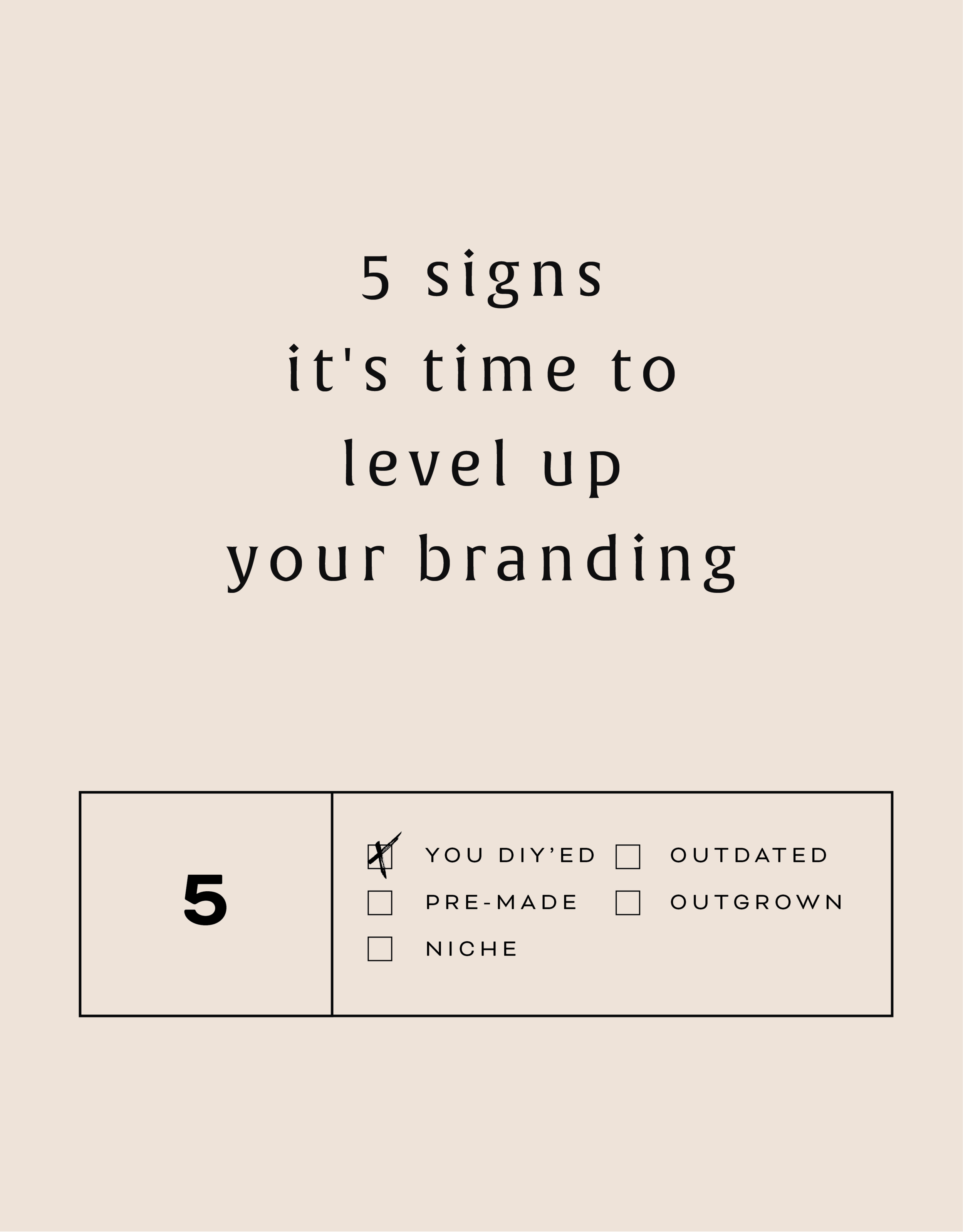
5 SIGNS IT'S TIME TO LEVEL UP YOUR BRANDING
There are lots of reason to give your business a branding refresh. Depending on where you are with your business or blog, it may be time for you to rethink your current design identity. Here are five of the most common, and most necessary, signs that it's time to upgrade your branding.

There are lots of reason to give your business a branding refresh. Depending on where you are with your business or blog, it may be time for you to rethink your current design identity. Here are five of the most common, and most necessary, signs that it's time to level up your branding.
1 - You made a DIY logo because you have the philosophy that "Done!" is better than "Perfect"
You wanted to launch your business or product and didn't have time to invest in full-blown branding. Now that you've settled into steady business, you're looking for a more professional look that showcases your growing biz.
2 - You bought a pre-made logo
Etsy has some damn fine design, let me just say. If you are one of the many shoppers who purchased a pre-made logo from a creative market like Etsy, you may have a cute logo, but you may also share it with countless other businesses. Time to develop a logo that's unique to you.
3 - You've officially defined your niche
Maybe you are a photographer that started out snapping shots of everything from babies to interior design. Now that you've settled into your work, you've decided you'd like to focus on weddings and engagements. Make sure your logo reflects your niche market.
4 - It's outdated or you just don't like it
You may have created your branding materials years ago and feel that they just aren't working for you anymore. Perhaps you wanted your logo to follow a trend that now feels outdated. Put simply, you just don't love it.
5 - You're business has outgrown you
You started a one-woman shop but have grown into a small business with - yay! - employees. You may even want to change your business name from something that is personal ( ie: Kali Edwards Creative ) to a something a more over-arching name.
This isn't as daunting as it sounds. Finding a designer you jive with (heyyy!) and who will help you through the process will allow you to love your branding and continue to grow your business!
Any of these apply to you? More than one even? It may be time to consider giving your brand a simple refresh.
Related Posts

BRANDING FOR PHOTOGRAPHERS
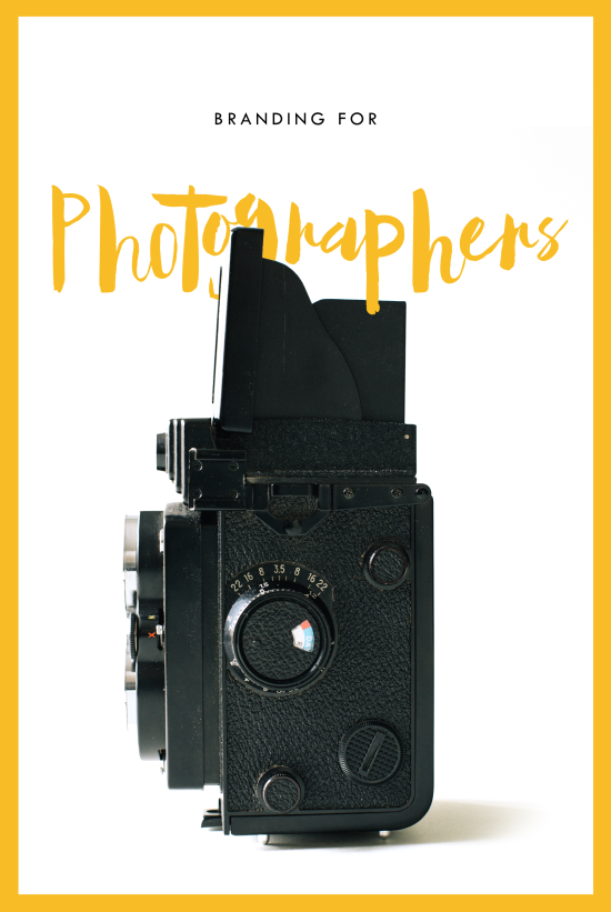
Whether you’ve just launched your photography business or are a seasoned veteran looking for a brand refresh, there are four main ideas to help you find your focus.
1. Be distinctive
The kind of photography you focus on is the most important item to consider before you begin a logo or branding project. Are you a food and styling photographer, wedding and family photographer, or an urban street photographer? These are all such vastly different styles of capturing a moment that they will require completely different branding approaches. Now we can narrow it down from here.
2. Brand it, #boss
How do you take your unique photography niche and turn it into a beautiful brand?
Answer: Style. Find that emotional connection your style has with your customers. A bride-to-be has seen your most recent engagement shoot and just adores the way you captured the couples love. She wants that romantic feeling for her engagement shoot, too. Allow your branding to reflect that romance you bring to your photography. Show this bride-to-be and any other that when they hire you, your photography style will make her swoon. Maybe that means using calligraphy in your logo or creating a soft and feminine color palette. Keep asking yourself throughout the process, "Is this in line with my style?" This emotional tie into your branding elements will give clients a sense of your approach before they even chat with you.
3. Work your website
As a photographer, your website is so important. This is the best place to showcase your photos. Organizing them into galleries and recent shoots will help your future client visualize their own photos. Continue the emotional experience of your brand by telling a fluid story to your customer. A good example may look like this:
Click … HomepageIntroduction to Drizzle Food Photography and Styling, where I am inspired by ingredients and abundance in the kitchen.
Click … Gallery A collection of gorgy examples of past photo shoots for dreamy clients and delish dishes.
Click … Contact How to get in touch to book my unique and valuable photography services.
Let the photos do the talking. On your website, the branding should act and an important accent that underscores your photography style.
4. One step further
As the savvy photography business owner you are, you know there’s more to branding than just the logo and website. Social media (styled photos anyone?), photo flyers and media kits are all places to expose your branding and your business. Think about each client’s experience from beginning to end. From finding you on Instagram to thank you stationary, gather all your pieces and review what you have. Make sure it conveys the emotion and style of the photos you take.
In the end, it should all be in line with your vision, mission and fabulous photography.

BRANDING FOR FLORISTS
I'm starting a new blog series called "Branding for...". In these posts, I will highlight a creative industry and zero in on some key how-to's for:
• Communicating your mission
• Translating your passion into a unique brand identity
• Inspiring your dream clients to work with you
• Creating a winning website
• Finding the "joy" job (you know, the client and project that ignites your passion!)
Let's dive in, shall we?!

I'm starting a new blog series called "Branding for...". In these posts, I will highlight a creative industry and zero in on some key how-to's for:
Communicating your mission
Translating your passion into a unique brand identity
Inspiring your dream clients to work with you
Creating a winning website
Finding the "joy" job (you know, the client and project that ignites your passion!)
Let's dive in, shall we?!
Branding for Florists
Whether you've just launched your business or are a seasoned veteran looking for a brand refresh, there are four main ideas to help you find your focus.
1. Be distinctive
What makes you unique? What is the thing that makes your floral business stand out from all the rest. Is that you grew up in Hawaii and have a deep-rooted love for all things bright and tropical? Is it that you are a hopeless romantic at heart and derive deep joy from bringing a wedding to life through floristry? What makes your clients love you and your work?
2. Brand it, #bossbabe
How do you take your unique-ness ( see above! ), and turn it into the most fantastic florist branding ever?
Answer: Emotion. Find that emotional connection your style has with your customers. A bride-to-be has seen your whimsical hanging eucalyptus installation on Pinterest and has fallen in love. She wants that romantic feeling for her big day, too. Allow your branding to reflect that romance you bring to your floral design. Show this bride-to-be and any other that when they hire you, your floral arrangements will make her swoon.
You create an emotional connection through your branding based on the patterns, colors and fonts you choose to marry into a uniquely perfect fit for your business. Done right, clients will have a sense of your style before they even chat with you.
3. Work your website
Branding doesn't stop with your business cards. Your brand needs to carry through to your website, too. Now is the time to consider your dream client's journey through your site. Yes, I said journey. Think about where they will start (homepage, blog?) and where you want them to end up (contact page, portfolio?). Continue the emotional experience by telling a fluid story to your customer. A good example may look like this:
Click ... Homepage Introduction to Sweet Pea Floral Design, where my mission is to create seasonal arrangements that are whimsical and romantic.
Click ... Portfolio A collection of gorgy examples of past work for dreamy clients.
Click ... Contact How to get in touch to book my unique and valuable services.
Thinking about how a potential customer will wander through your website will allow you to create the right structure, content and navigation.
4. One step further
As the savvy floral business owner you are, you know there's more to consider. Social media ( header images, profile pictures, behind the scenes Instagram shoots ), advertisements and media kits are all places to carry over your branding. Think about each client's experience from beginning to end. From ribbons to store front signs to thank you stationary, pull everything together and review what you have. Make sure to ask yourself if it sends the signals to the right kind of clients. In the end, it should all be in line with your vision, mission and style.
Looking for examples of a florist's branding in action?
Head on over this-a-way.


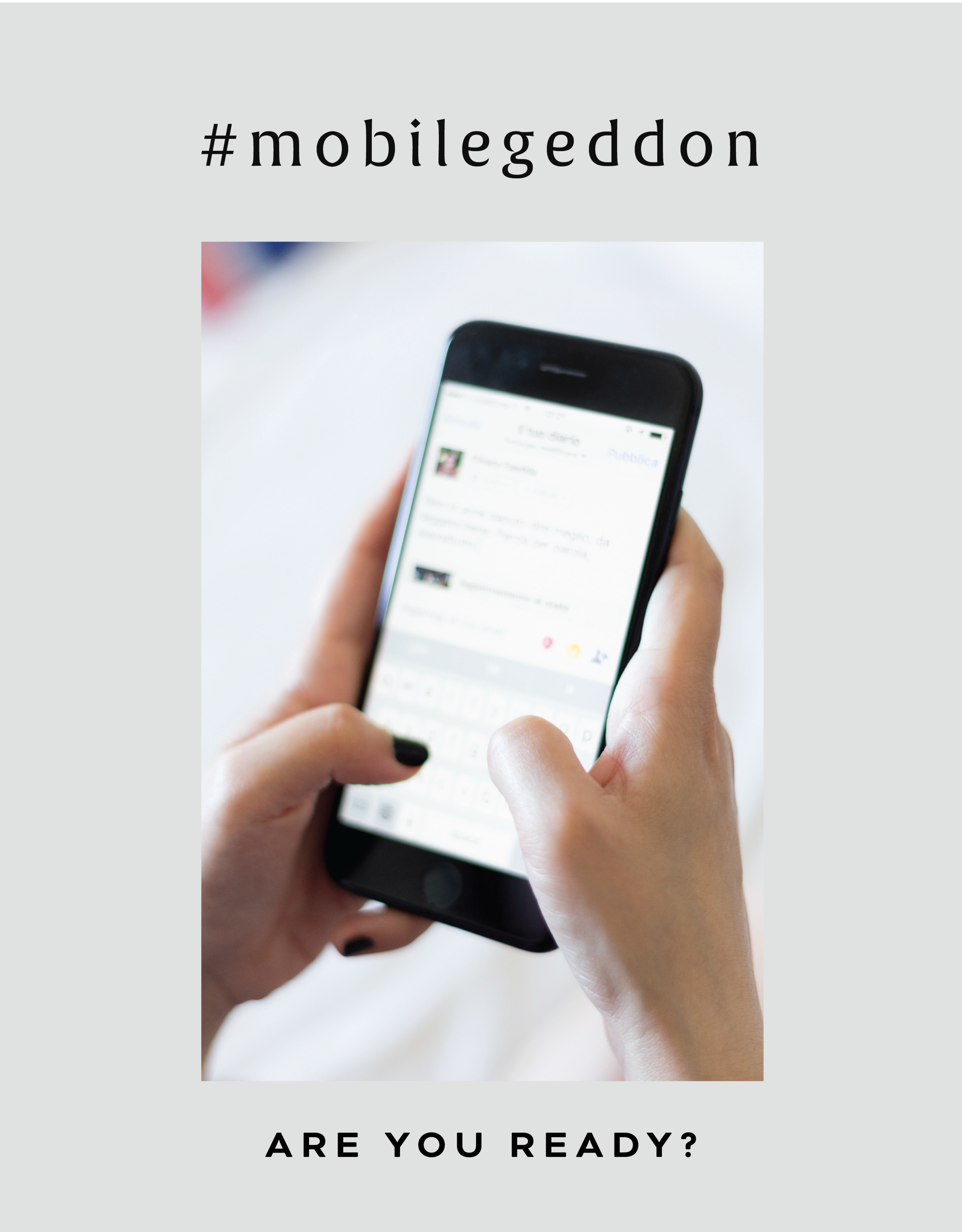
#MOBILEGEDDON
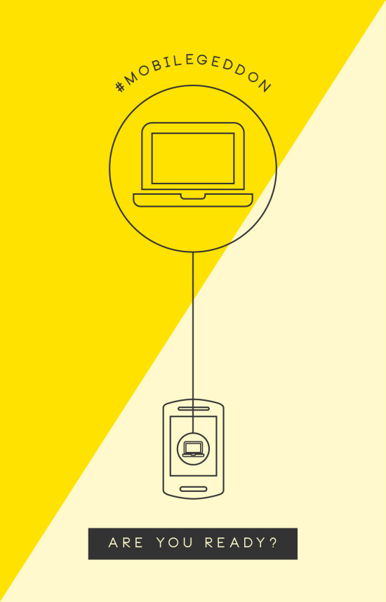
#mobilegeddon is here. Are you ready?!
Ok, fine. That's a little over-dramatic. But for many websites, today marks a day a lot like a mobile Armageddon for their search rankings on our good friend Google. Why? Google will start a new overhaul of it's famous algorithm to determine if a website is mobile-friendly. And if yours is not... well, you might want to rethink your web design.
Is your website mobile friendly enough for google? Here's the break down of the good, the bad and what it means for your website.
THE GOOD
For you, the mobile-friendly consumer, this is great! Online retailers and larger companies with complex websites will be easy to navigate on a smartphone or tablet. Same goes for online magazine websites like Refinery29 and EOnline. This will ensure that all your have to do is click, click and read everything you ever wanted to know about Kim Kardashian's bleach blonde hair and pregnancy woes.
THE BAD
If you are a small business with a site made even one or two years ago, you may not be ready for #mobilegeddon. According to the Economist, 40% of the leading sites failed Google's "mobile-friendly" test. Ouch. And the result is that those site's search rankings will be dropped. So if your website was on page one of Google when a user searched for "DC area photographer", you may have just been bumped to page two or three. Now you're less likely to get clicked on by your dream client.
NOW WHAT?
So now that you're officially freaking out and creating a algorithm-safe bunker with canned foods and a pile of US Weekly, what can you do? First, determine if you're website is in the clear or not with this test. It will determine if your text is too small or your links and contact information aren't easy to use. If you find your site doesn't pass the Google test, it might be time to rethink your web design. This may mean something as simple are creating a mobile-friendly version of what you already have. It doesn't have to be a full overhaul.
Overall, it's better to know about these Google changes and take it in stride, than to wonder why in the world you suddenly have less page visitors than last week. But if you find your website isn't ready for #mobilegeddon and you just need to be cheered up, you can always turn to these mobile-friendly Kim Kardashian selfies.
Related Posts
need even more help with squarespace?
Skip the overwhelm and have your website designed and launched in just 5 days (or less)!
LEARN MORE

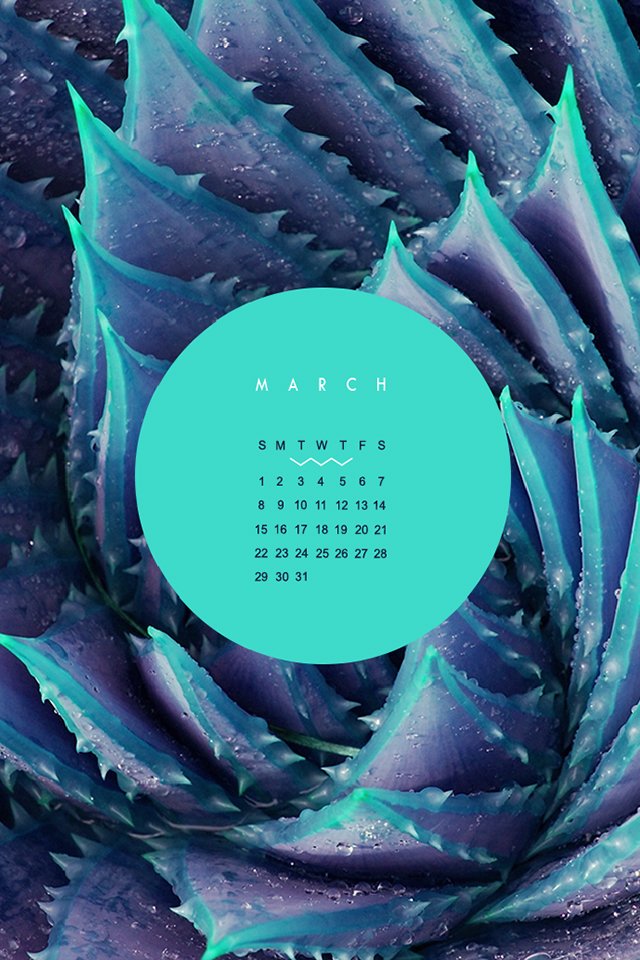
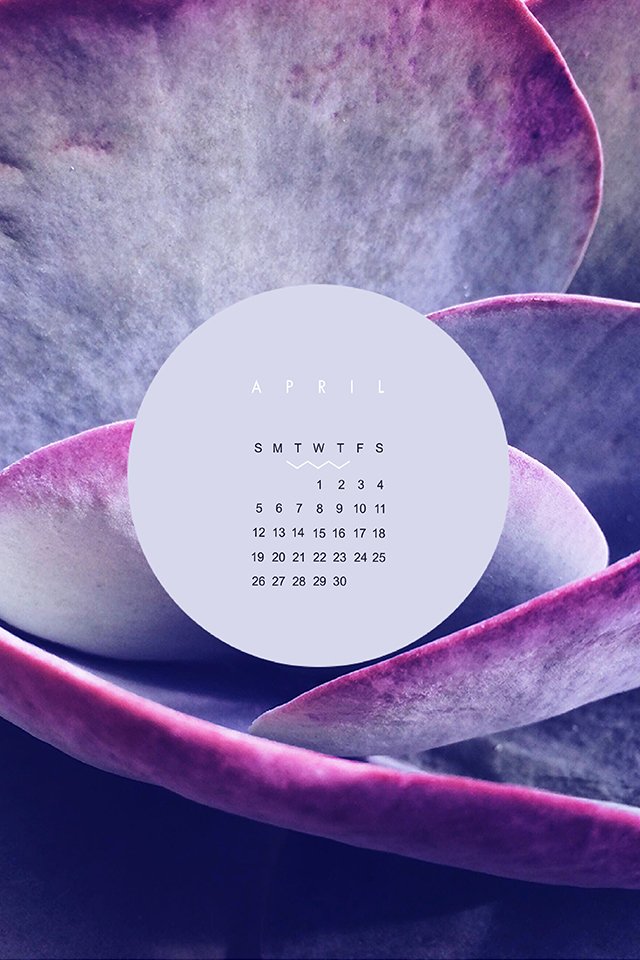
CALENDARS FOR IPHONE + IPAD
These babes were made for the 2015 calendar year as background for a phone or tablet. I didn't want them to get lost, so they can live for ever in design-land here on the blog!
Click through to see each month and feel free to reach out if you like this idea and would like to see more for 2018!
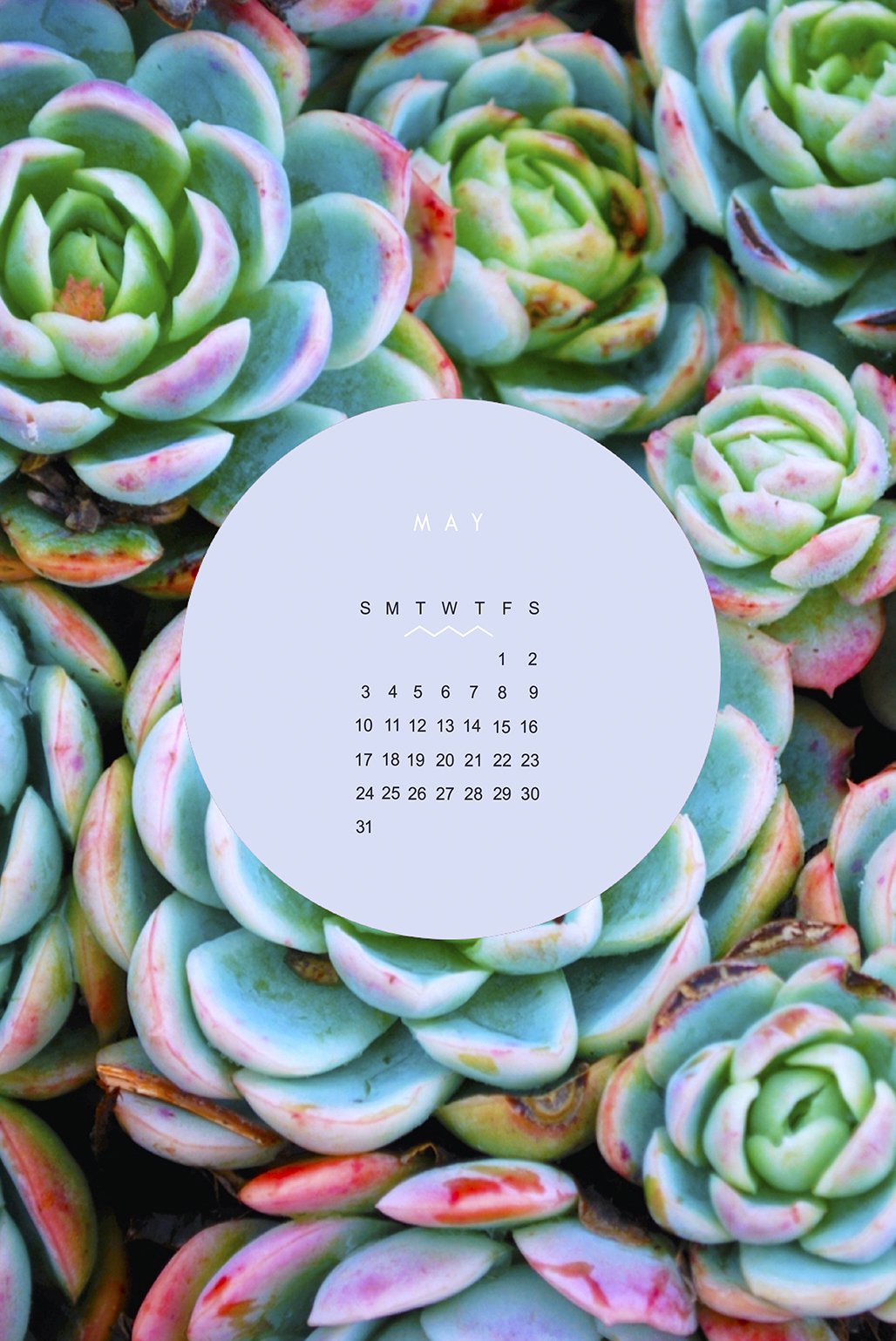

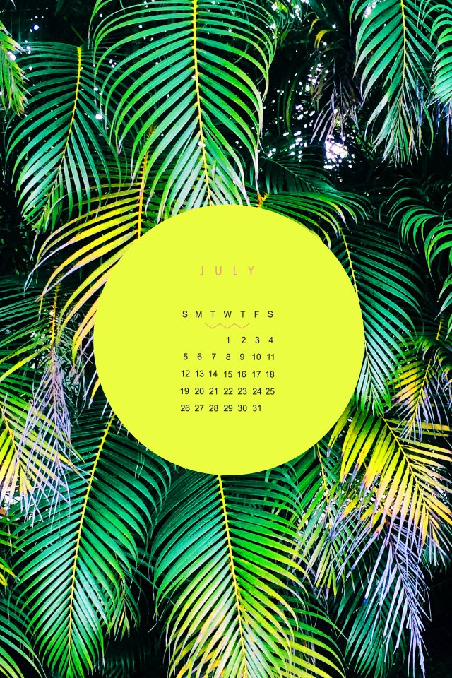

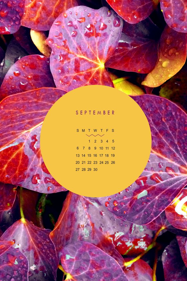
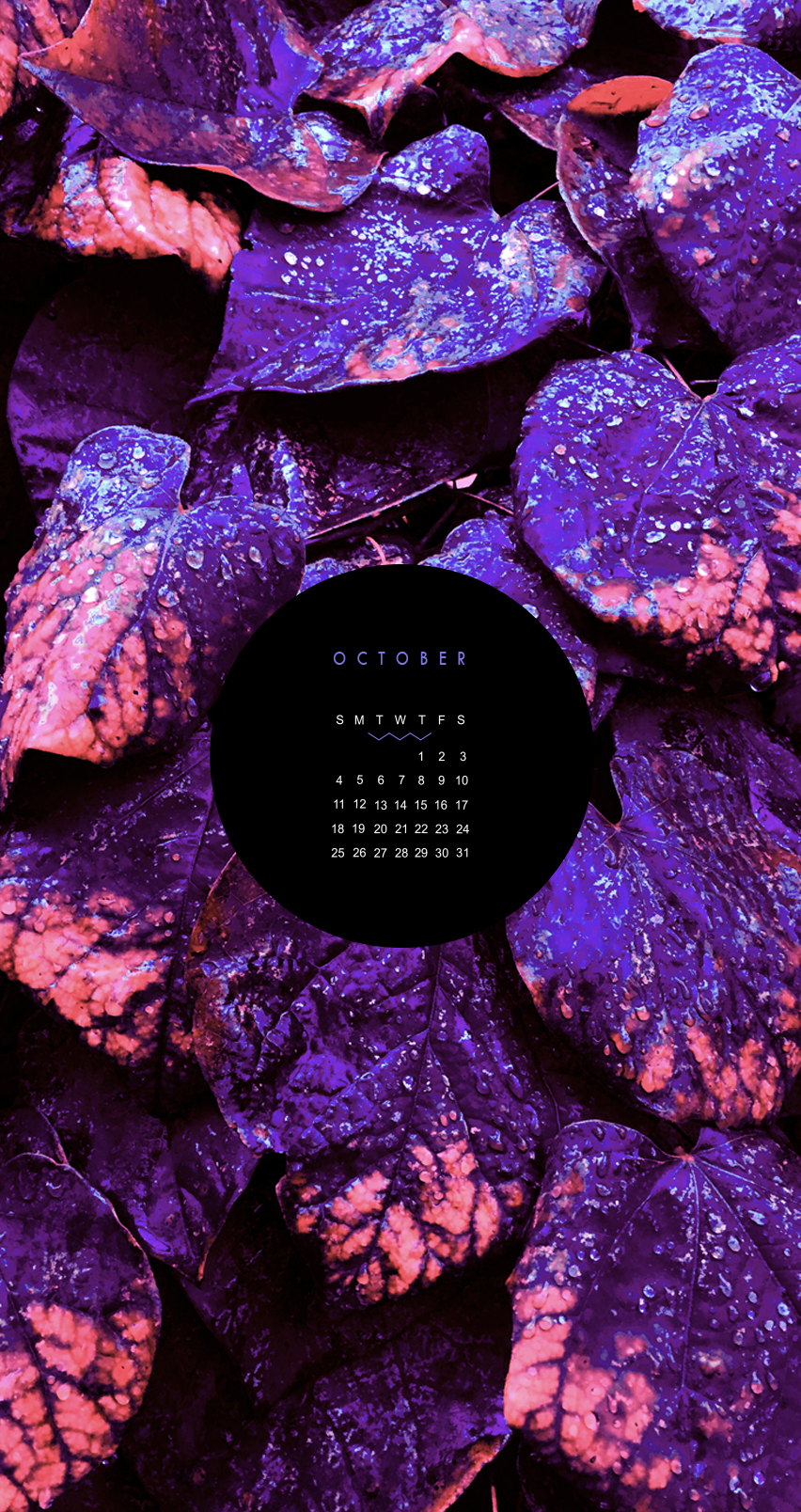
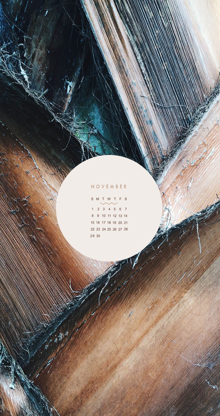
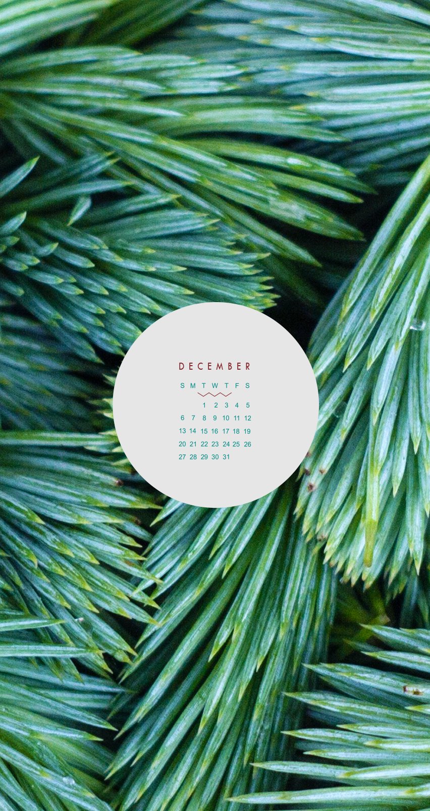
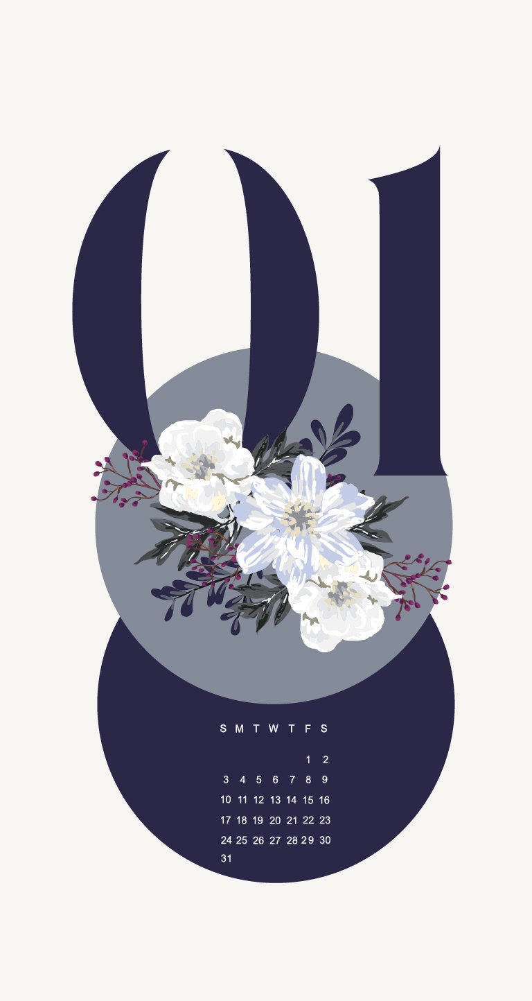

These babes were made as background for my phone and tablet many years ago. I didn't want them to get lost, so they can live for ever in design-land here on the blog.
Click through to see each month and feel free to reach out if you like this idea and would like to see more like this!


FINDING DREAM CLIENTS
Finding your dream clients starts with knowing yourself. You have be 100% behind their business to be able to create exactly what will fit their brand best. If you feel lukewarm about their passion, it will likely show in your work. But if you wake up wide-eyed and excited to crank out your best work, then you know you've likely found your dream client.
I work with all sorts of people who do amazing, creative things. Bakery owners, skin care product developers and fashion bloggers to name a few. There are a lot of reasons I choose to do design for people like this. One of the biggest reasons I love to work with these groups of creatives is their passion.

You can learn a recipe for a perfect cake or what's hot for Spring, but passion is something you just have. It bubbles up inside you the minute you wake up and doesn't settle until your head hits the pillow at night. You can't teach that. Adeo Ressi, a serial entrepreneur, says, "...real passion and conviction, there's no test to measure that, except the test of hard knocks. When you get punched in the face ten times and get up and keep going."
That's your passion.
I feel so lucky to get to narrow in on that passion, and translate it into design. That's kind of a good one-sentence summation of what I strive to do through branding and web design: bring your passion and drive for your business to life through design. ( To see the fashion blogger + skincare brands, click here )
My client's passions are also usually ones I can get behind. They're doing things I also really enjoy and spark my interest, and that ignites my creativity. While some may be really passionate about the newest i-gadget, that's not really my thang. But the newest craft brew on the market? I'm down!
Finding your dream clients starts with knowing yourself. Click to Tweet!
You have be 100% behind their business to be able to create exactly what will fit their brand best. If you feel lukewarm about their passion, it will likely show in your work. But if you wake up wide-eyed and excited to crank out your best work, then you know you've likely found your dream client.
Thank you may be my dream client? Holla at me!
Related Posts

NEW YEARS CHECKLIST - 15 QUESTIONS FOR YOUR BEST YEAR YET
It's easier for me to think about what I've already done or accomplished, and then build goals from there. So I thought I'd share a little list of questions that you can use to do the same. At the end, review your answers and you may find that the goal or resolution that would be the most beneficial for the new year is not so hard to conjure after all.
I find it can be hard to create goals and resolutions when the new year comes lurking around the corner. How am I supposed to alter my life for the better when I'm still recovering from my holiday food-coma? It's slightly unfair, if you ask me. What I've done instead, is think about what happened in the past year. It's easier for me to think about what I've already done or accomplished, and then build goals from there. So I thought I'd share a little list of questions that you can use to do the same. At the end, review your answers and you may find that the goal or resolution that would be the most beneficial for the new year is not so hard to conjure after all. Enjoy!

1. ARE THERE ANY SIGNIFICANT PLACES I TRAVELED?
2. WHAT DID I SEE, DISCOVER OR EXPLORE?
3. WHAT DID I SPEND THE MOST TIME WORKING ON THIS YEAR?
4. WHAT SKILLS DID I LEARN, IMPROVE OR MASTER?
5. WHICH PERSONAL QUALITY DID I DEVELOP OR STRENGTHEN?
6. I FELT MOST ALIVE WHEN __________ ?
7. WHICH HABITS DID I CHANGE, CULTIVATE OR GET RID OF?
8. WHAT DID I ACHIEVE CAREER-WISE?
9. WHAT BROUGHT ME HAPPINESS IN THIS PAST YEAR?
10. WHAT AM I MOST PROUD OF THIS YEAR?
11. WHAT DO I WANT MY EVERYDAY LIFE TO BE LIKE IN THIS NEW YEAR?
12. HOW WOULD I LIKE THIS NEW YEAR TO BE DIFFERENT FROM THIS PAST YEAR?
13. WHAT DO I WANT MY OVERARCHING THEME TO BE THIS NEW YEAR?
14. HOW DO I WANT TO REMEMBER THIS NEW YEAR WHEN I LOOK BACK ON IT NEXT YEAR?
15. WHAT IS MY NUMBER ONE GOAL FOR THE NEW YEAR?