
GET THE MOST OUT OF YOUR MOOD BOARD
Have I told you how much I love mood boards? They are crazy-crucial for my design process to make sure I'm on the same page with my clients. They probably take the most time out everything I work on in a branding project. I spend so much time curating images to make sure it's just right.
Why?

Have I told you how much I love mood boards? They are crazy-crucial for my design process to make sure I'm on the same page with my clients. They probably take the most time out everything I work on in a branding project. I spend so much time curating images to make sure it's just right.
Why? Because it sets the tone for the rest of the project.
I show these mood boards to a client and invite criticism because it should be dead-on with their brand vision.
If it's not, discussing what works and what doesn't gives me valuable feedback that I use to dictate what comes next: the logo design. The mood board is like the essence of the brand, boiled down into one big ol' beautiful soup-o-squares.


So how can you make sure you
get the most out of your mood board?
Think about how you feel when you look at the mood board as a whole. This is honestly the most important item. What mood does it convey? What emotions do you feel? What actions do you want to take? These should be in line with what you want others to feel when they see you brand or website. It should be dead on. And if it isn't...
Think about what doesn't fit that mood. Is there an element that's giving off the wrong vibe? Maybe some of the graphic elements or colors aren't quite right. You can even try covering the offending element to see if the mood board works without it.
Consider the big picture. Sure, it's on trend and the colors are pretty, but does it really work for all the visual platforms you'll be using to tell your brand story? Make sure the mood board will allow your brand to live online, in print and anywhere else you will run your biz.
Are you proud of this de sign? Do you want to show your mom, you're biz bestie or even your cat? AWESOME! You should love it and be excited to show it off to your future clients. It will be the direction for your beautiful business, after all.
If you look for these key items when critiquing the mood board for your brand's direction, you should easily get the most out of the mood board process.

Ready to get the mood board party started?
Head this-a-way to try your hand at a DIY mood board.
MAKE YOUR 404 PAGE WORK FOR YOU

A 404 page is the often overlooked little page that exists on every website to help a user who's lost their way. You've surely ended up on a 404 page at some point over your years of surfing the web. It's main purpose two-fold:
It should first tell you that the page your looking for doesn't exist. This could be because it's been deleted or moved, or maybe you typed it wrong by accident.
The second purpose should be to direct you to something else. You were trying to get somewhere in the first place, so the 404 says, "Here, let me help you find your way back home." And usually, the homepage is the only place you have the option to go.
But what if your soon-to-be favorite client ends up on your 404 page? Wouldn't you like them to stick around, maybe even learn a bit about your services, or even end up contacting / buying from you??
The answer is yes. Of course!
So how can you out your 404 page to work for you?
Here are a few options you can include on your 404 page to keep your website open and in front of the eyes of your soon-to-be favorite client (and everyone else!):
Add a link to your most popular article(s)
Add a link to your About page
Add a link to your Services page
Add a link to your social media account(s)
Add a sign-up form for your newsletter
Add a link to your blog
Do you see where I'm going with this? Add a call-to-action that gets them interested and locked into another part of your website. Adding in a bit of fun text is a great way to ensure that they'll click.
This is a super simple trick that you should definitely consider adding to your own website. I promise, it's worth it!
Need help customizing your 404 page, want to know more or just want to chat? Holla at me!
Related Posts
need even more help with squarespace?
Skip the overwhelm and have your website designed and launched in just 5 days (or less)!
LEARN MORE

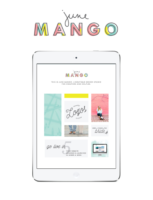
NEW WORK: AMY KURETSKY ACUPUNCTURE WEBSITE
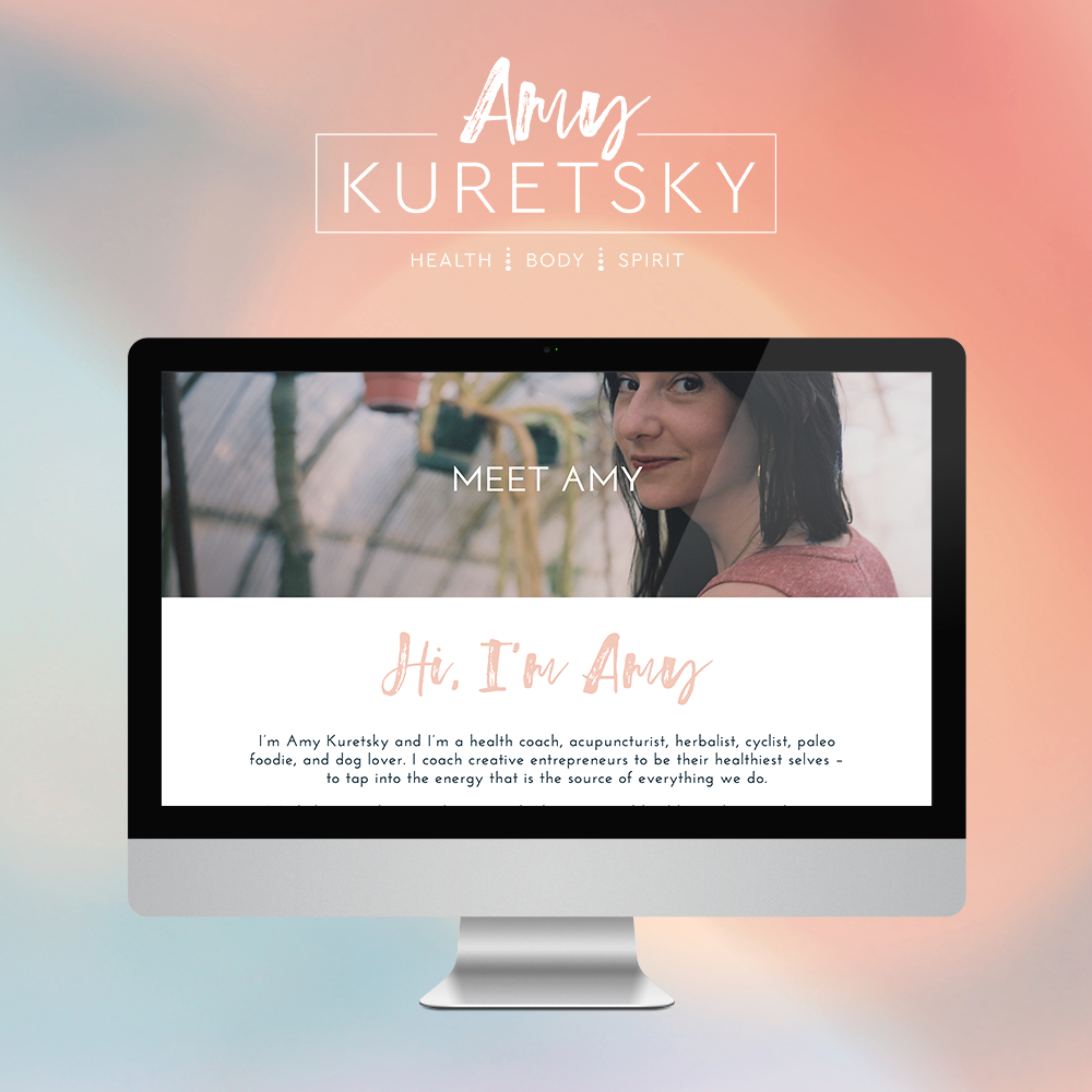
Amy Kuretsky is an acupuncturist and health coach who is killing it with awesome health tips and an awesome holistic approach to life and business. She shares some of her insights via Periscope on the daily, so definitely check her out there.
We created a website that really showcased her personal brand and expertise. Lots of (super informative) content get broken up by graphic elements and client testimonials. I am very slightly obsessed. Plus, we rocked it out in just 5 days.

See more of the website and give Amy some heart eyes this-a-way.

THE FIRST STEP TO GREAT DESIGN IS...
habits can cause you to miss an opportunity or see something new. A huge part of good design is focusing on the tiny little details to make each touchpoint seamless, easy, and in tune with people's needs. If you aren't aware, you can miss some of these design opportunities.
So how can you snap yourself out of your habitual views?
Conscious attention.
Most of the time, we walk around in our little worlds, moving through daily life habitually doing what we know how to do, unconsciously going through the motions. I do this, you do this, your mom does this. Sometimes, it's really helpful. If you're taking a shower, for example, it would be such a pain if you had to consciously think how to wash your hair or use a bar of soap.
But sometimes, habits can cause you to miss an opportunity or see something new. A huge part of good design is focusing on the tiny little details to make each touchpoint seamless, easy, and in tune with people's needs. If you aren't aware, you can miss some of these design opportunities.
So how can you snap yourself out of your habitual views?
Take a step back and ask questions. Ask yourself if the way you're doing something is really the best way. Could something be changed for the better? Could you add something to make life a bit easier (ie: a few easy-to-access links on your homepage, a bold and bright pop of color to make your business cards more noticeable, etc)?
Look closer. Design is in the details. It's hidden in the little conscious decisions that make something more user-friendly. Think about how someone who knows nothing about your brand will interact with your website or logo. Are there ways you can make them clearly understand your mission?
Think younger. "That's just the way the world works" is a phrase adults tell kids because it's the easiest way out. But kids haven't been around long enough to get used to 'the way the world works.' They see the world through fresh eyes. Getting into the mindset of a child can help you think outside of the normal, day-to-day habits.
If you want to practice these tips, go exploring. Try to ask questions about things you think you already know everything about. This applies to everything from the stars to your website.
Keep an open mind and see if you can't get those creative juices flowing!
Related Posts
need even more help with squarespace?
Skip the overwhelm and have your website designed and launched in just 5 days (or less)!
LEARN MORE
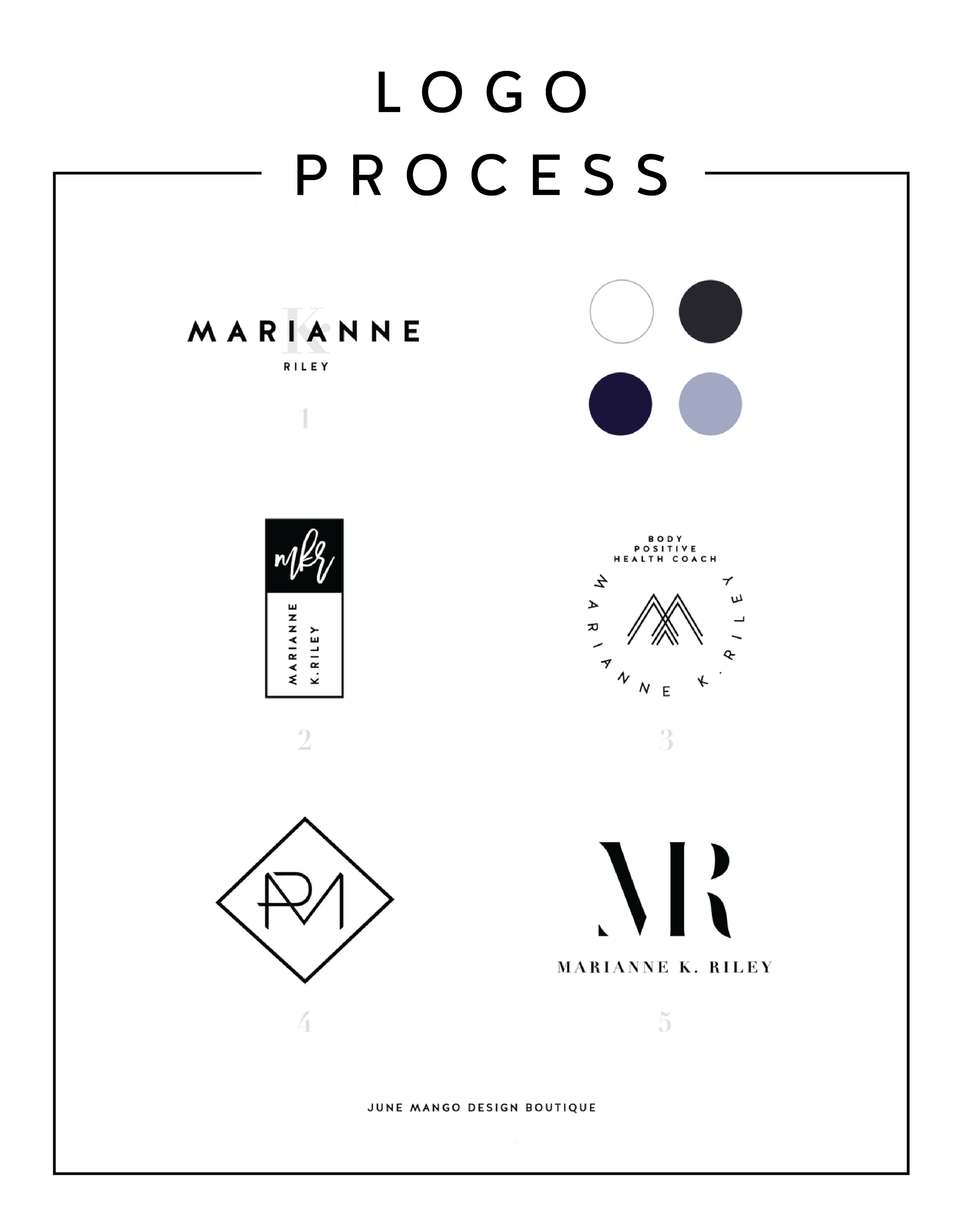
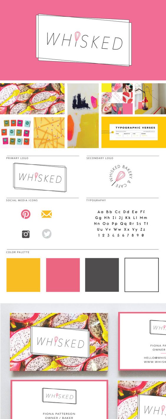
LOGO PROCESS: MARIANNE K. RILEY
Just a little peek inside the process of a logo project I've recently completed. This logo is for a health coach who was looking for a super-sophisticated, font-based mark with a heavy nod toward monograms. I tried to get a little creative with that and so the concepts are pretty varied.
Just a little peek inside the process of a logo project I've recently completed. This logo is for a health coach who was looking for a super-sophisticated, font-based mark with a heavy nod toward monograms. I tried to get a little creative with that and so the concepts are pretty varied.
I'll have more on the final logo and branding deets soon!
Related Posts


NEW WORK: STEMS AND SPRIGS SQUARESPACE WEB DESIGN
This SquareSpace web design project has me feeling all fuzzy inside. This lovely little site was created for a florist in Northern Michigan who A) Is one of the sweetest ladies I've ever virtually met, and B) Makes the most gorgeous floral designs EVAH.
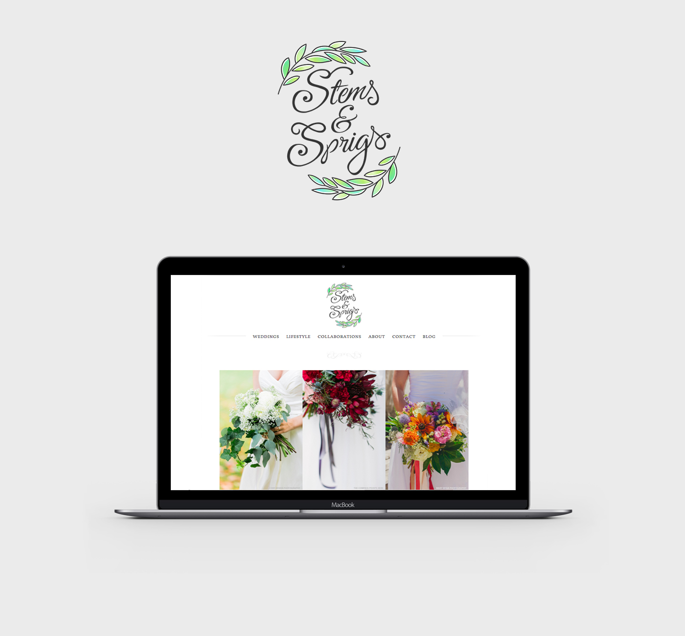
This SquareSpace web design project has me feeling all fuzzy inside. This lovely little site was created for a florist in Northern Michigan who A) Is one of the sweetest ladies I've ever virtually met, and B) Makes the most gorgeous floral designs EVAH.
Kalin, the owner of Stems and Sprigs, had a SquareSpace website set up but just couldn't seem to align the layout and design with her brand. We worked together to create a soft, feminine, and sophisticated feel for her website that now allows her to truly broadcast her brand in an authentic way.
Take a peek at the results below.

Related Posts
BRANDING FOR ETSY STORE OWNERS
Whether you've just launched your first Etsy store or are a seasoned veteran looking for a brand refresh, there are four main ideas to help you narrow down your vision.
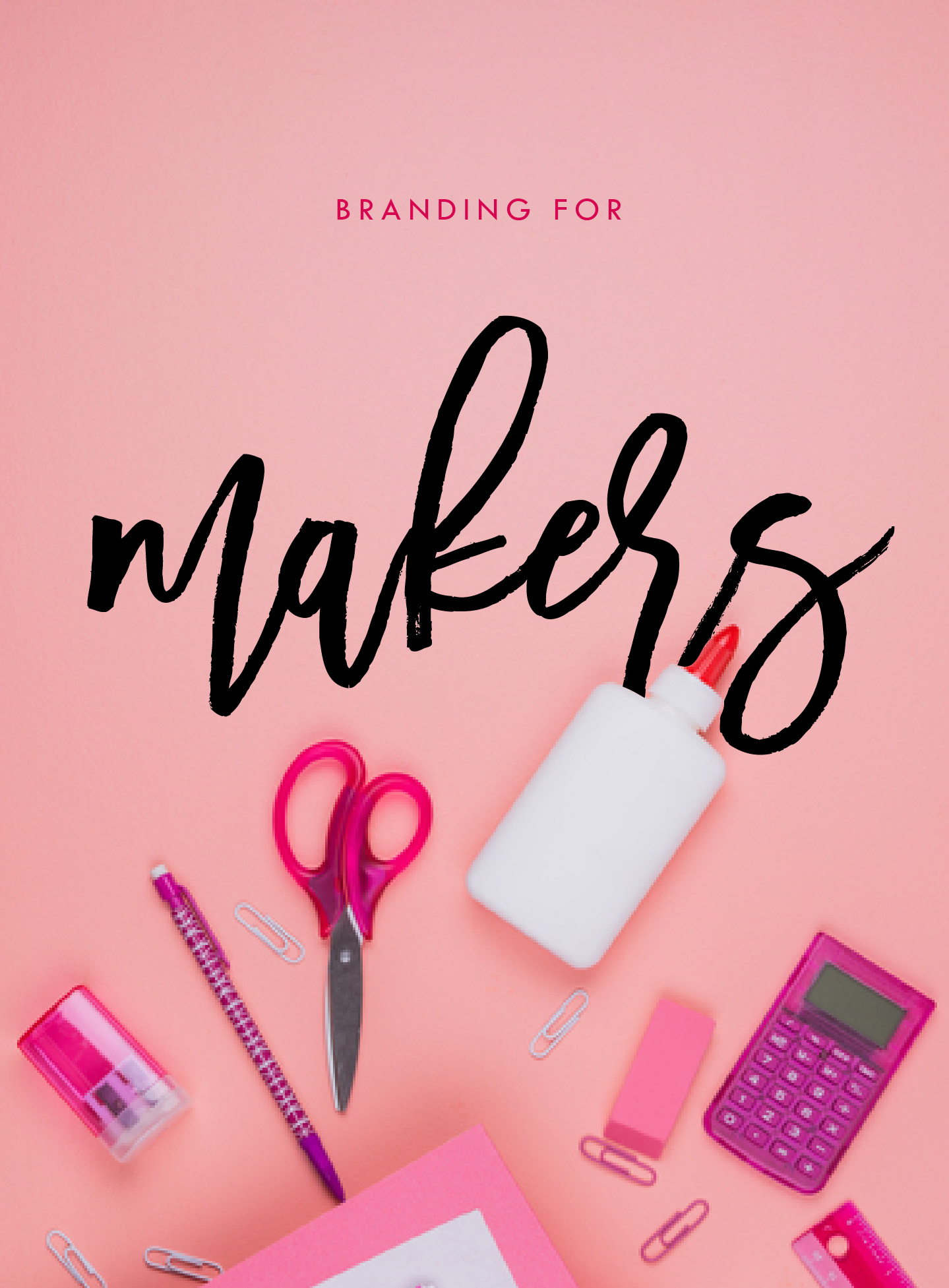
Whether you've just launched your first Etsy store or are a seasoned veteran looking for a brand refresh, there are four main ideas to help you narrow down your vision.
1. Be distinctive
What makes you unique? What is the thing that makes your work stand out from all the rest. Do you knit quirky, colorful scarves? Do your greeting cards put Hallmark to shame? Are you selling witty handmade pillows to throw on a newlywed bed? Whatever it is, narrow in on that, because that is what makes you unique and will get your dream customers attention.
2. Brand it!
How do you take your unique-ness ( see above! ), and turn it into the most fantastic branding ever?
Answer: Emotion. Find that emotional connection your style has with your customers. A new mamma wants to feel cool and stylish, but is also covered in drool all day. Do you sell funky t-shirts that are comfy and totally trendy? Boom. Are your greeting cards tackling hard subjects with humor? YES! Capture that.
If you take these emotional pieces and translate them into visuals, you have your branding. Done right, clients will have a sense of your style before they even see the whole catalog of your products.
3. Work your website
Branding doesn't stop with your logo or color palette. Your brand needs to carry through to your website and online shop, if you have one. Now is the time to consider your dream client's journey through your site. Yes, I said journey. Think about where they will start (homepage, Etsy storefront?) and where you want them to end up (contact page, Checkout?).
You can continue to work in that emotional component by telling a story as you go. Here is an example:
Click ... Main shop / storefront A collection of creative, quality handmade items for the home.
Click ... product page from search A quirky state-shaped cheese platter made from Acacia wood, which would be the perfect gift.
Click ... Checkout How much are they going to love this gift!
Thinking about how a potential customer will wander through your website will allow you to create the right structure, content and navigation.
4. One step further
As the creative business owner you are, you know there's more to consider. Social media (product shots, header images, etc), advertisements and wholesale price sheets are all places to carry over your branding. Think about each customer's experience from beginning to end. From the logo to store front signs to packaging to thank you stationary, everything should be cohesive. Make sure to ask yourself if it sends the right signals and emotions. In the end, it should be in line with your unique creations.
Looking for examples of a maker's branding in action? Head on over this-a-way.
Related Posts

Go Live In 5® Web Design - Your Website Done in 5 Days Flat
With the Go Live in 5 service, you get a fully customized Squarespace website LIVE online in just 5 days. It all starts by booking a week to complete your custom design. Then I will dive into customizing the website, which includes tailoring it specifically to your business and personal brand style.
Start on Monday. Go live on Friday.
Your gorgeous custom website done in just 5 days.
With the Go Live in 5® service, you get a fully customized Squarespace website LIVE online in just 5 days. It all starts by booking a week to complete your custom design. Then we will dive into customizing the website, which includes tailoring it specifically to your business.
This is not a template. This is not one-size-fits all. This is bringing your brand to life online.
We close out the Go Live in 5® experience by reviewing the completed site,
fixing any last tweaks, and sharing a backend tutorial.
Then it's time to celebrate!! Your website is LIVE!
YOUR CUSTOM WEBSITE
LAUNCHED IN JUST 5 DAYS.
A few Go Live in 5™ websites:
"I felt so held back by my website. I didn't want to send potential clients there. Now I absolutely love it and can't wait to share it at my upcoming vendor shows!"
Kate Jones, Pearly Kate Photography
More to Love:
Go Live in 5® Hours

Website looking wonky?
Just can’t get those last few items launched?
Wanting to up-level but on a budget?
THAT’S WHERE WE COME IN.
During our Go Live in 5® Hours process,
we will move through your punch list
as quickly as possible while collaborating
with you on feedback and approval.
Get your site professionally customized
and ready to rock in 5 hours flat.

top-level web + design support,
done in a day.
Related topics

PODCAST COVER ART
I just thought I'd share some of the podcast cover art I made for several of the episodes released. Creating a new addition of cover art for each podcast was admittedly ambitious, but it was well worth it. Such is the life of a creative. Here's a peek at some of the podcast cover art for each episode.


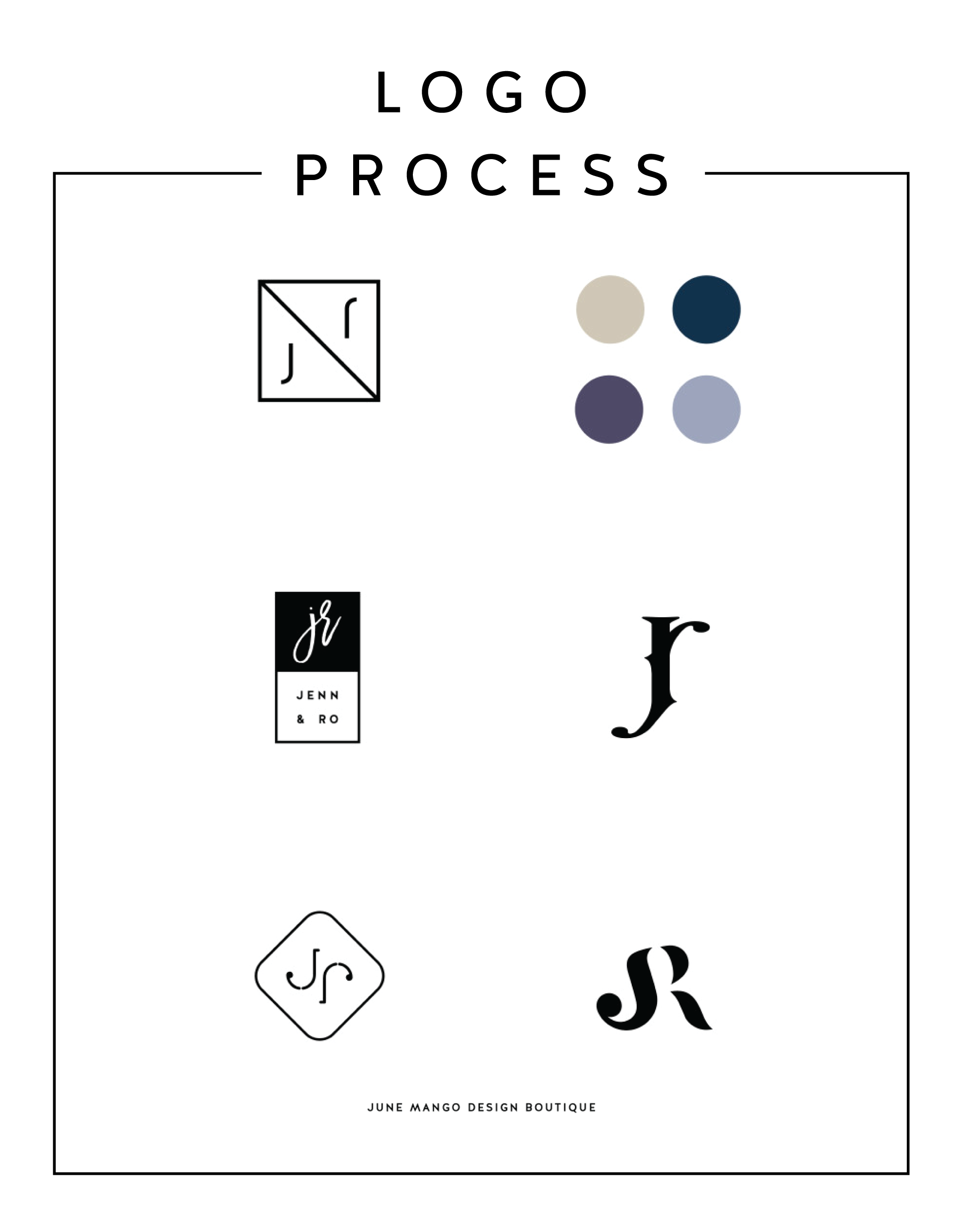
LOGO PROCESS - J&R
Just a little peek inside the process of a current logo project I'm working on right now. It's for a husband and wife photography team, and the trick is to combine the letters of their names - J and R - into a cohesive mark. It's fun and challenging. Can't wait to reveal the final logo!
Related Posts

BRAND STYLE BOARDS 101

You may have seen these little guys floating around on Pinterest and not known exactly what they are or what their purpose is.
Every designer does their Brand Style Boards a little bit differently, but as a rule there are a few things that should be included.
Logo
This is the main logo that will be used on important touch points like the website, business cards, etc
Submark / Secondary Logo
This is a variation of the logo and usually much simpler. Often an icon, it can be used as an avatar on social media or as a stamp on images for bloggers and photographers
Color Palette
I always make sure to include not only the color swatches, but the various color values. This helps a client match their color palette from anything like a printed business card to their website
Fonts
The fonts are really important to the brand and are NOT an afterthought, so it's imp ortant to make sure to include them on the Brand Style Board to ensure that the fonts match up on all future branded collateral.
In the examples below, I also include design elements that can be used as icons or graphics on the website. Sometimes a branding package will include patterns or buttons / graphics for the client's website, which are also helpful to include on the Brand Style Board. I also always include the mood board that I created for the internal branding process. I think it helps tie everything together and give the client a good idea for the types of imagery they should look for when creating other items for the brand (ie: website, media kit, etc).


Ultimately, the Brand Style Board should contain the core of your brand. At a glance, it should be everything you need as a reference for you and anyone you hire down the line. It should guide every visual choice you make for your business.
To see more examples, head this-a-way or to chat with me about your brand head that-a-way!
need even more help with squarespace?
Skip the overwhelm and have your website designed and launched in just 5 days (or less)!
LEARN MORE
Related Posts

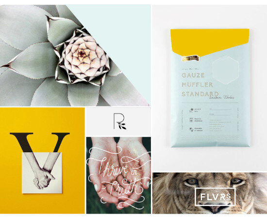
HOW TO MAKE A MOOD BOARD
Mood boards help align the aesthetic, color palette, and tone of a project. They get me on the same page with my clients. They can also help get the ideas out of my brain (or off of Pinterest, if I'm wedding planning) and into a clearly organized visual hierarchy.
Mood boards are so crucial to everything I do that's visual. Starting a logo project? MOOD BOARD! Re-decorating my living room? MOOD BOARD! Planning my wedding visuals? MOOD BOARD!
Mood boards force you to select the crucial images that best represent the style of whatever you're getting ready to create. I go a step further and make sure to pick images that include the following:
texture
design elements / inspiration
lifestyle images
color palette swatches
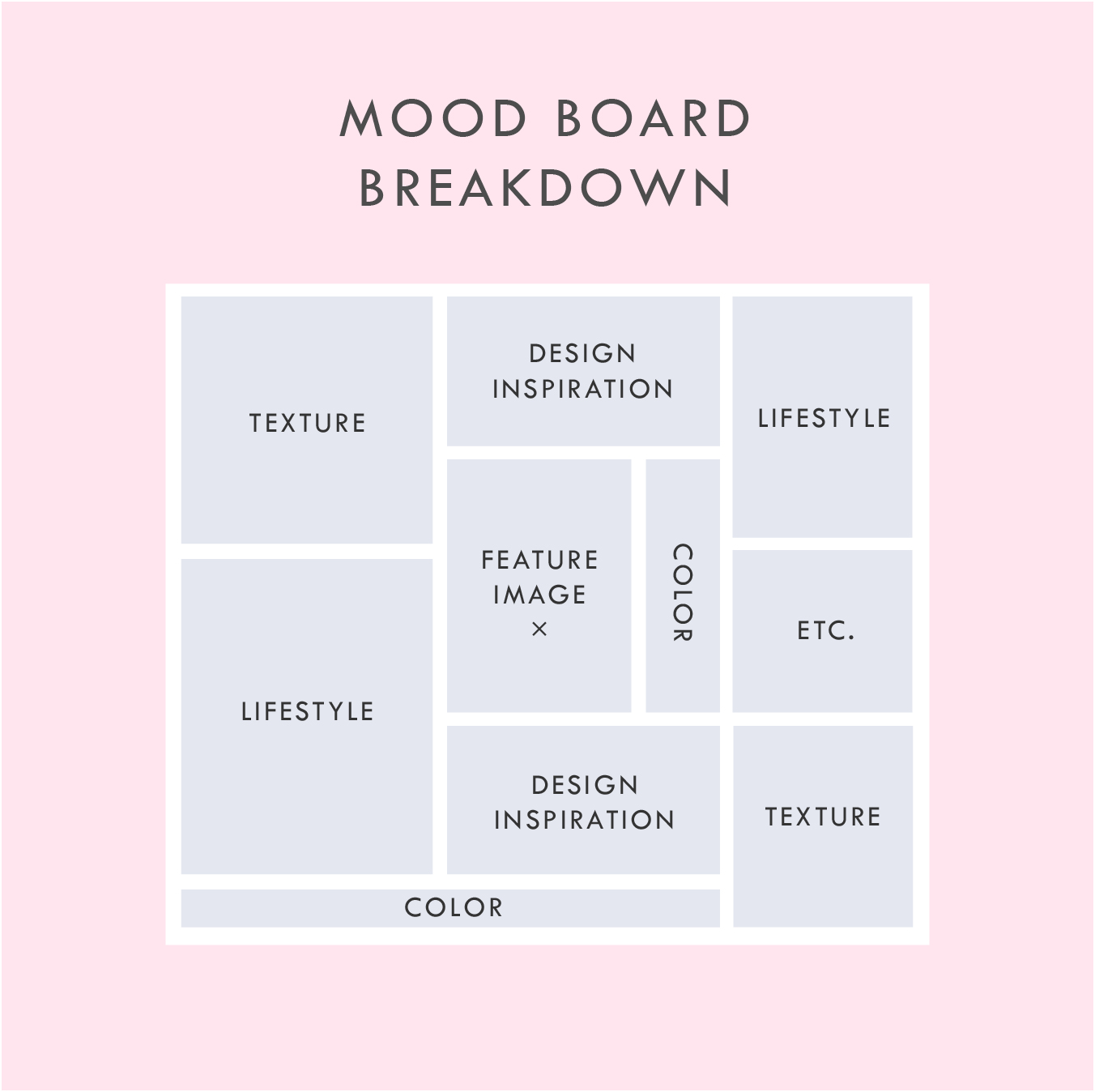
Above is a breakdown of how I organize a sample mood board which each of these elements.
In addition to the elements listed in this mood board layout, you can see that I also have a space for a "feature image" right in the middle. This should be the core mood / style / feeling of the project. It should be whatever resonates with you the most.
I also have a space for whatever else makes sense for the brand or project. I called this "Etc." This can be any image or detail that you find is inspirational but may not fit the other elements.
A good mood board should help keep you visually focused as you move into the next phases of the project.
If you'd like some inspiration, try this or this!
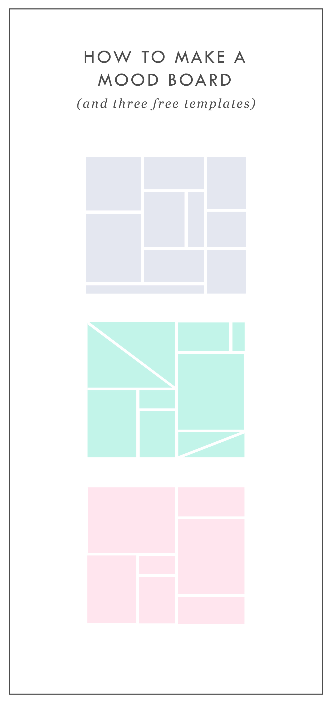
If you'd like to try your hand at creating your own mood board, I've got three free mood board templates you can download here! These are in PDF format, which means you can open them in most design programs.
NEW!
a templated guide to messaging magic
A plug-and-play website copy template for your four core pages (Home, About, Offerings, Contact). Save yourself hours of stress and get templates, examples, and expert guidance that will benefit your business and your bottom line.
learn more >


ENGAGED, A WEDDING PODCAST
I can't believe it's taken me this long to post about the branding and web design for my podcast, Engaged! This is one of my fave projects to date. I started this podcast because I was feeling a lack of authenticity out there in the wedding industry. It often feels like a lot of fluff (bouquets and sequins and napkins, oh my!) and not a lot of real talk. What if you're planning the wedding while you two live in separate places? Or how do you plan a wedding if you just want to have a barefooted love party in your backyard? (Hint: Here's how). What do you do if you start planning a wedding and then find out your pregnant! Yep, that's a future episode.

It's been great to get advice and hear real stories from couple who've done the wedding planning dance. But of course, I can't do anything without branding it! #designerd

This is just a peek at the website's design. If you want to see more of the website or listen to some of the episodes, head on over this-a-way. We'd love to have you listen!!
Related Posts
need even more help with squarespace?
Skip the overwhelm and have your website designed and launched in just 5 days (or less)!
LEARN MORE

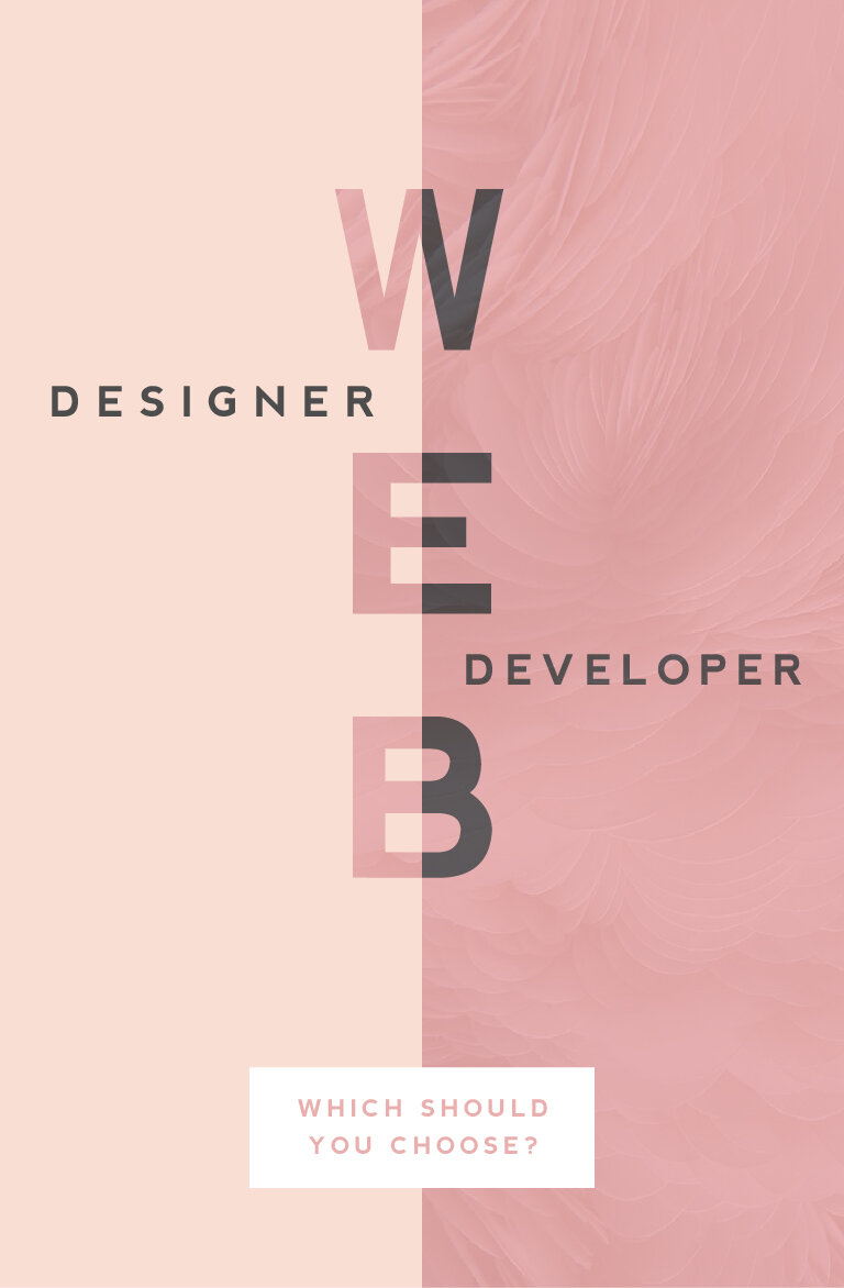
WEB DESIGNER VS. WEB DEVELOPER: WHICH SHOULD YOU CHOOSE?
One of the questions I get asked most often is "What is the difference between a web designer and a web developer?". There are some very clear-cut differences, which I'll get into below, but truthfully, they can often overlap. I think this is why it can be confusing. But what are the main differences and which should you choose? Read on...
WEB DESIGNER
Web designers create and direct all visual aspects of a website including graphics, photos, layout, fonts, color palettes, and interactivity, which can include color changes, mouse rollovers, moving images, etc.
This person usually has the following responsibilities:
Researching and designing concepts that are easy to use (user-friendly), beautiful, and engage the audience
Designing page layouts and interactions (i.e.: button turns pink when you click it)
Working closely with web developers during the process of building the website online
Having an understanding of different audiences and interests with the ability to translate that into an interactive web space
Working collaboratively with content creators and copywriters to visually represent their work
Bringing a brand to life dynamically through layout, font selection, color palette and interactivity
Overseeing a project’s entire creative process
When looking to hire a web designer, make sure they also have the following skills:
Knowledge and interest in current trends in design, both digital and print
Ability to to understand the client's perspectives or problems and come up with ideas that are clear and TKTK
Significant comprehension of how HTML, CSS, browsers, and devices all work together
Ability to simplify solutions to problems and solve them through design
A style that jives with your own
A strong portfolio of projects that are similar to yo urs
WEB DEVELOPER
(There are two main types of web developers, front-end or back-end. PRO TIP: If you're looking to build a website, that's front-end.)
A web developer is someone who uses HTML, CSS and JavaScript to create a website that a user interacts with directly through their web browser. Basically, they build the 'front-end' of the website (vs. the 'back-end' of a website which is like what you interact with when you login to a website, like WordPress).
This person usually has the following responsibilities:
Translating wireframes or design mock-ups to actual code that will produce visual elements
Bridging the gap between graphic design and technical implementation
Develop web pages for commercial and content management systems, or CMS platform (like WordPress)
Understanding of web development user experience best practices (i.e.: the logo should be at the top of every web page)
Having experience with and a deep understanding of web technologies including JavaScript/jQuery, CSS, PHP and HTML5
Developing and implementing responsive websites (i.e.: does it look flawless on your tablet or phone AND your desktop computer?)
When looking to hire a web developer, make sure they also have the following skills:
Excellent problem solving skills (PRO TIP: Any good web dev. will tell you the job is about 98% problem solving!)
Experience working directly with graphic designers and website design mock-ups
If not hiring with a designer, developer should have excellent design and layout skills
So now you know the difference but your still not sure which you should hire to build your website? This doesn't necessarily have a clear cut answer because it depends on you and what you're looking for.
Personally, I recommend finding a web designer who knows a great web developers to help build custom WordPress sites. Otherwise, many web designers (like yours truly) typically know enough HTML and CSS to customize a pre-programmed website or theme, like this website. It simply depends on the project.
Hopefully this (long) list of differences will help you choose who's right for your web project. And if you're still confused or have more questions, just holla at me! I'm always happy to chat!
Related Posts
need even more help with squarespace?
Skip the overwhelm and have your website designed and launched in just 5 days (or less)!
LEARN MORE
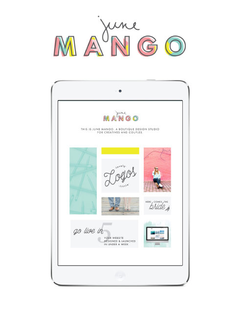
THE NEW JUNEMANGO.COM
Perhaps it's a little cliche, but I genuinely believe that a solid fresh start is the perfect way to set yourself up for great things. I love to set goals and re-evaluate where I'm at in both my business and personal life every year in January. It just seems fitting. A whole new year is ahead with 365 days to do and see and discover wonderful things!
In that vein, I thought it was time that I redesigned my website. This is something that I do more often than others, I'm sure, given that I have the ability to do it myself. But it's actually a great goal to include on anyone's list. Websites get outdated faster than almost anything else, so it's important to make sure it's up to date.
I also made a giant change by switching from WordPress to SquareSpace. As a designer, I felt that WordPress was just a bit too clunky. Every time I updated WordPress, pieces of my website would need to be re-coded, and I was always having issues with plug-ins. These aren't make-or-break issues by any means, but I felt like I wanted a platform that wasn't such a hassle. That meant giving up a tiny bit of design freedom, but honestly, not much. Given my background, I was able to code in some custom details on my new SquareSpace website without any trouble at all. This makes it unique to me, but I don't have to mess with all the backend bugs.
The design stays true to my design style: clean, colorful and clear. A lot of organized rule-breaking, which ultimately left me with this as the final product:

Related Posts

STOCK PHOTO GUIDE · PART 1
Stock photos can be a fabulous asset to your marketing and web design projects. They can lend a helpful hand in creating a gorgeous project, but make sure that hand doesn't end up as a crutch where you just grab any old photo. These are my go-to tips for choosing the right stock photo for YOU.
Stock photos can be a fabulous asset to your marketing and web design projects. They can lend a helpful hand in creating a gorgeous project, but make sure that hand doesn't end up as a crutch where you just grab any old photo. Below are my go-to tips for choosing the right stock photo for YOU.
DON'T -
Go right to the old standards. Pictures of people in business suits jumping, a man pulling his hair out, anyone with a blank white sign.... just don't do it. It's overdone and makes you seems instantly outdated and unoriginal. Plus, they look unnatural, and there's a good chance that people have seen the same (or similar) images elsewhere, which may be bad for your brand depending on what associations they have with these images.
Disregard color. The photo shouldn't be really dark and moody if you're website is mostly pink and yellow. Look for stock photos that have a similar color palette or lightness/darkness to match your project.
Be afraid to edit. Throw that image into Photoshop to crop it, change a color or delete an element that doesn't fit. You don't have to feel limited to what you get when you press download.
DO -
Aim for creativity. You're stock photos should be a curated collection of high-quality photography that doesn't feel phony. Those stock photos with people smiling as they eat their Cheerios scream S-T-O-C-K. No thanks. People want to see modern, relevant, authentic images. Images people can relate to are worth the coveted space on your website or marketing materials.
Refine your search. Most stock photo sites allow you to filter your search results. Take advantage of these tools to search for the photo that will fit best for your project. Need to overlay text? Look for a photo with a composition that includes copy space. Looking for one person, a group or just an object? You can filter by number of people, too.
Accurately reflect your brand. Asking yourself if the photo makes sense for your brand is the most important element of choosing a good stock photo. If you are a marketing towards women, you likely won't benefit from using a photo of a tattoo-covered biker dude (unless these woman like that sorta thang). Make a rule to choose stock photos in the same style for consistency. Use rules like color palettes, similar lighting, white backgrounds only, etc. Whatever matches your brand style.
Hopefully you feel armed with a stock photo plan of action. Using these tips above, you'll be sure to have a gorgeous and consistent look to your project. Check back for Part 2 of this post series where I'll dive into all my favorite paid (and a few free!) stock photo sites!
Related Posts
need even more help with squarespace?
Skip the overwhelm and have your website designed and launched in just 5 days (or less)!
LEARN MORE

BRANDING- BEYOND THE LOGO
A brand is a lot more than the fonts, colors, and design elements that make up the visual brand identity. Branding ultimately is the identity of the business if you were to whittle it down to it's core. So, how do you start to carve that baby down?
So you've seen a lot of lovely little logos on Pinterest and are ready to brand your biz! Heck ya, let's do it! But let's make sure we do it right.

So, how do you start to carve that baby down?
Let's start by thinking about what you want to be known for? This could be a service offering or product. It could also be the way you work with you clients. what makes you the best florist in Northern Michigan, for example? What do your clients value about working with you?
Once you have that nailed down, it's time to narrow in on what you have. Look through your answers to the above questions and ask yourself what's essential and what's just bonus material. This may not be the easiest exercise, but consider what feels like it could really elicit the most powerful brand or what the client would tell someone else about you.
Now, try to narrow it down even further. See if you can get this down to just three words. And try to make them pop a little - you want to stand out right. For example, I may be creative, multifarious and efficient but does that make you really excited to take on a design project with me? Probably not.
Make it easy for people to buy from you, not that other guy. Think about what you want your brand to be at the core, and then jazz it up a bit to differentiate yourself. Once you do this, you are ready for a kick-ass, colorful, clean logo design.
Related Posts

NEW WORK: SWEETWATER LAVENDER FARM
when someone tells me they want me to create a brand identity and landing page around that, well then I just lose it. I loved working on this project so, so much. I'm so excited to see how Sweetwater Lavender Farm grows and all the exciting things headed their way.
When someone tells me that they're quitting their job to buy a lavender farm and pursue their dreams in Northern Michigan, I make weird high-pitched noises and feel all fuzzy inside. Say wha?? You're going to grow lavender and open up an adorable shop? You're pursuing your dream with passion and intention? Hell. Yes.
And when someone tells me they want me to create a brand identity and landing page around that, well then I just lose it. I loved working on this project so, so much. I'm so excited to see how Sweetwater Lavender Farm grows and all the exciting things headed their way.

Related Posts
need even more help with squarespace?
Skip the overwhelm and have your website designed and launched in just 5 days (or less)!
LEARN MORE

3 REASONS TO REFRESH YOUR WEBSITE
Sometimes the idea of building a brand new website can be a little scary. There are probably a few reasons for this. You may be afraid the process will take too long or that it's too expensive. You think of updating your website as a 'backburner' item that you will get to eventually.
Building your website doesn't have to be this big scary monster of a task. Here are three solutions to those three main fears.

It doesn't have to take months. It can take days. Really.
When I worked as an agency designer, we had a process of building websites that caused the projects to take months. There was even one project that I started when I was hired and was still ongoing when I left. This is sooo unnecessary. The reason some web project take so long is the process. But with a process that allows me to collaborate with my clients, the project time is drastically reduced. By helping hone in on what we will need BEFORE we dive into the design process, the whole project can take just a few short weeks (or even days!).
It's NOT too expensive.
This can be true, but it really depends on what you want in a website. If you would like to see unicorns fly across the screen as the user scrolls, well, sure, that is a bit fancier and will cost a bit more money to custom code those details. But if you are looking for a website that reflects your personal brand and is cleanly coded and responsive, it's completely within reason to create this on a budget.
It's affects your bottom line.
Is your business a priority? Then your website should be, too. If you look at your website as your online business card, is it saying everything you need it to say? If not, creating your better online business presence should really be a priority, too.
Your website is your hardest working employee. It should tell people who you are, what you do, and how to buy you - when you aren't there to do that in person. Does yours?
Creating and updating your website doesn't have to be so scary. You may just need to rethink the type of web design project that's right for you. There are so many options and resources out on the internet that you can use to help you keep growing your biz online and off. :)
Related Posts
NEED EVEN MORE HELP WITH SQUARESPACE?
Skip the overwhelm and have your website designed and launched in just 5 days (or less)!