
BRANDING FOR YOGA EXPERTS
Whether you’ve just launched your own yoga studio or are a seasoned veteran looking for a brand refresh, there are four main ideas to help you find your focus. I have 4 simple, actionable tips you can use for your own yoga brand.
Whether you’ve just launched your own yoga studio or are a seasoned veteran looking for a brand refresh, there are four main ideas to help you find your focus.
1. Be distinctive
What makes you unique? What is the thing that makes your yoga studio stand out from all the rest? What makes your clients love you and your approach? Are your classes challenging and invigorating? Do you specialize in restorative yoga and massage? Whatever makes you and your yoga studio stand out - embrace it!
2. Brand that thing!
How do you take your unique-ness (see above!), and turn it into the most beautiful yoga logo and branding ever?
Answer: Emotion. Find that emotional connection your yoga expertise has with your clients. A stressed out mom has been looking for that holistic and healthy time for herself. She needs that calm feeling she has after your class, which keeps her coming back. Allow your branding to reflect that calming effect you bring to your yoga classes. Show this client and any other that when they take your yoga class, your practice will will bring them clarity and connection to themselves.
You create an emotional connection through your branding based on the layout, colors and fonts you choose to marry into a uniquely perfect fit for your business. Done right, clients will have a sense of your yoga teaching style before they even step foot in the studio.
3. One step further
As the smart business owner you are, you know that the logo isn't the end of the proverbial deisgn road. Social media (header images, profile pictures, behind the scenes Instagram shoots), business cards and your website are all places to carry over your branding. Think about each client’s experience from beginning to end. From booking a class to store front signs, pull everything together and review what you have. Make sure to ask yourself every step of the way if it sends the signals to the right kind of clients. In the end, it should all be in line with your vision, mission and style.
Looking for examples of a yoga expert’s branding in action? Head on over here or here or here!


MAKING DESIGN TRENDS UNIQUE TO YOUR BRAND - PART 2
In my last post, I went over how to jazz up some common design trends and make them unique to your brand. I'm diving back into today with some common design trends that I see ALL OVER Pinterest. Especially for wedding pros and boss ladies, these trends are HOT. But I'll show you how to make them distinctive so that you and your brand stand out.
In my last post, I went over how to jazz up some common design trends and make them unique to your brand. I'm diving back into today with some common design trends that I see ALL OVER Pinterest. Especially for wedding pros and boss ladies, these trends are HOT. But I'll show you how to make them distinctive so that you and your brand stand out.
Design trend #1: Watercolor er'thing
Logos by KimberlyPaigeDesigns & Autumn Lane Paperie
There a few great creative brands that can utilize watercolor elements well like artists, wedding industry pros, and brands that cater to babies or kids. But what if you want to up-level the watercolor game for your own brand? Here's how.
A: Layer up! Adding some additional color and texture will help add more visual interest to the logo. You can even add a little details, like the trees in this logo by Happily Ever After Etsy above. Darker colors will also add more sophistication and maturity to the logo.
B: Define it's shape!Instead of creating a simplified watercolor swatch, try creating a watercolor elements in the form of an item related to your business or brand. West End Girl Studio does this well in the logo above with watercolor leaves.
Design trend #2: Floral er'thing

Logos by Arlyne Grace Design & Elle & Co.
Ahh... floral motifs. I have a real love-hate relationship with them. They can be so great and sometimes are so obviously appropriate (hello, wedding florist!). But sometimes, they seems to be a go-to design just because they're pretty. So here are some ways to use these gorgy florals in your branding, but up-level them to match your unique biz.
A: Add additional elements! Adding some additional design or drawn elements to the florals will make the logo more unique. You can even use real florals instead of drawn/painted flower elements, like this bouquet in the logo by One Plus One above.
B: Break the rules! If you read Part 1 of this series, you may be sensing a theme. Breaking some design rules (keyword: some) is a great way to add visual interest to any design. In the logo/letter above by the aleph corporation, the flower petals break out of the border of the letter A's peak. It's just enough to add a bit of whimsy without overpowering the letter or structure.


LOGO PROCESS: ACUPUNCTURE BRANDING
I've had lots of new branding projects lately that I've been meaning to share! Two of these were for holistic health providers specializing in acupuncture + herbal medicine or yoga + massage. Here are the logo processes for both!
I've had lots of new branding projects lately that I've been meaning to share! Two of these were for holistic health providers specializing in acupuncture + herbal medicine or yoga + massage. Here are the logo processes for both!
Logo Process for Wildcrafted Acupuncture & Herbs - Submarks
Logo Process for Wildcrafted Acupuncture & Herbs - Logo
Logo Process for Align Massage and Yoga - Submark
Logo Process for Align Massage and Yoga - Logo


MAKING DESIGN TRENDS UNIQUE TO YOUR BRAND - PART 1
Can we just have some real talk right now? Ya? Ok, the thing is, there's a lot of design trends that are just being recycled. Over and over and over. The problem with this (besides being boring), is that the logos aren't actually making their brands standout. You deserve to be on trend AND have a logo that won't be seen anywhere else.
Can we just have some real talk right now? Ya? Ok, the thing is, there's a lot of design trends that are just being recycled. Over and over and over. The problem with this (besides being boring), is that the logos aren't actually making their brands standout. You deserve to be on trend AND have a logo that won't be seen anywhere else.
So how can you take these design trends you're crushing on and make them unique to your brand? I have a few examples below to help you do just that.
Design trend #1: Circular Stamps / Submarks
These work so well for businesses who literally need a stamp created for their business. They're succinct, versatile and sophisticated. So now let's make it more unique to your brand.


A: Change the shape! This could be a simplified shape of the brand's distinctive identity, like the logo by Yossi Belkin above, or something as simple as a hexagon, triangle, or scalloped edge.
B: Break the rules! I am a big fan of breaking design rules. It just makes things a bit more interesting, like this logo by Salted Ink. So bust the design elements out of the circular text or make your circle wrap around only 3/4 of the way closed. Just shake shit up a little bit and see what you can come up with.
Design trend #2: Monograms

A: Combine letters! Simplify, simplify, simplify. That's my #1 rule of thumb for design. When it comes to monograms, using the strokes of each letter and combining them can help you create a totally unique mark.
B: Sneak in the second letter!Using negative space and the natural lines of the letters, you can 'imply' where the second letter is. In the logo for web dev Kyle Acker above, the K is prominent, but the A is inferred. It makes you take a second look, which if you ask me, is the mark of a strong logo.
These are just a few ways you can take something that's ay-ok and up-level it to be something really cool and unique to your brand! I'll have more on this and other common design trend in Part 2 of this series.
Related Posts
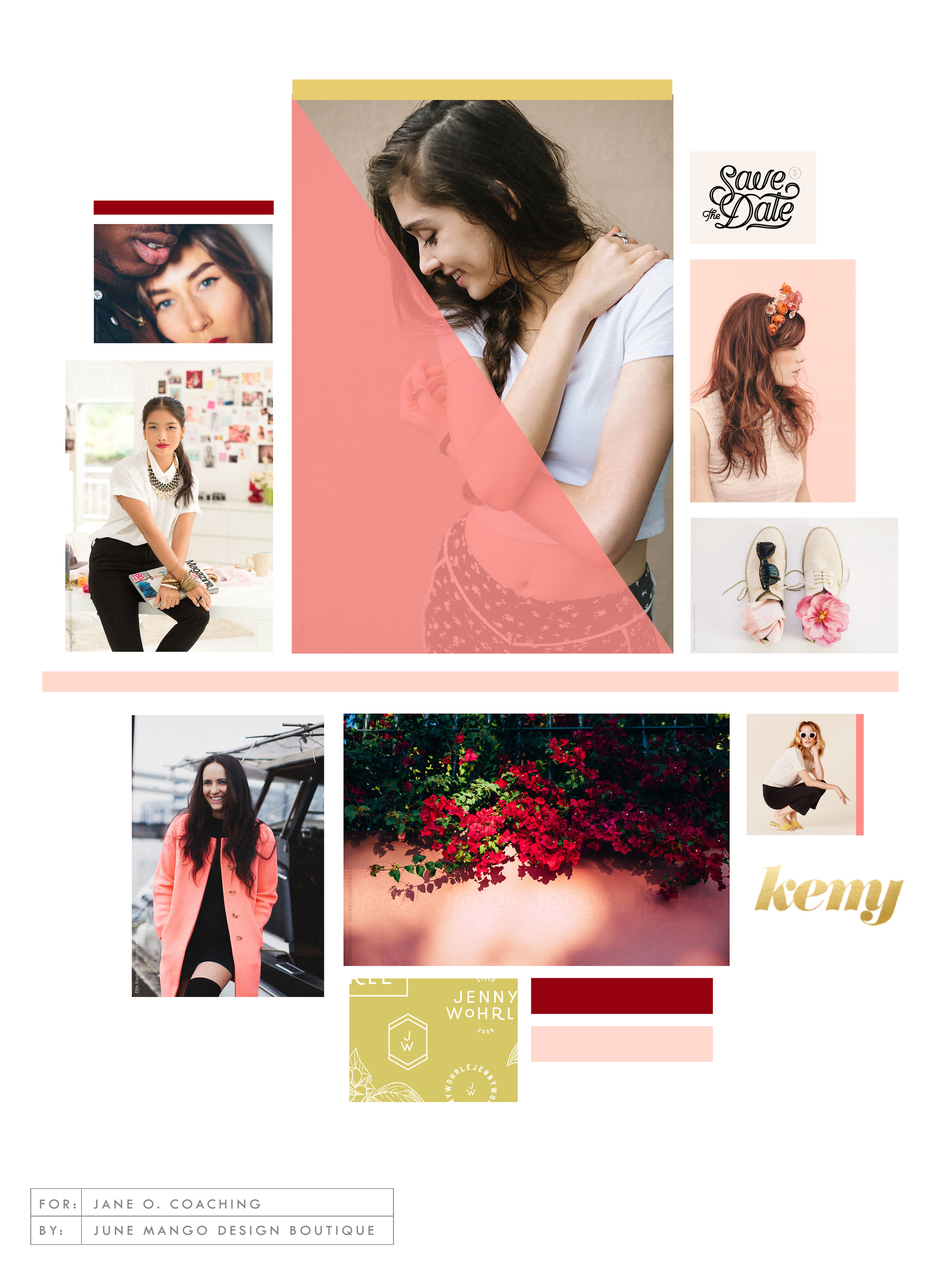
LOGO PROCESS: JANE O. COACHING
I haven't shared a logo process in a while. This logo process is from Jane O. Coaching, who is a love and style coach with an amazing colorful, bright vibe. So of course, she wanted her branding to be feminine, colorful and fun to show off her coaching niches.
I haven't shared a logo process in a while. This logo process is from Jane O. Coaching, who is a love and style coach with an amazing colorful, bright vibe. So of course, she wanted her branding to be feminine, colorful and fun to show off her coaching niches.
We ended up heading in the direction of #3, with some additional tweaks and customizations to make it fully unique to Jane. To see the full branding and web design that came from this logo process, head on over to janeocoaching.com.
And if you want to chat about your own logo or branding, holla at me!
Related Posts
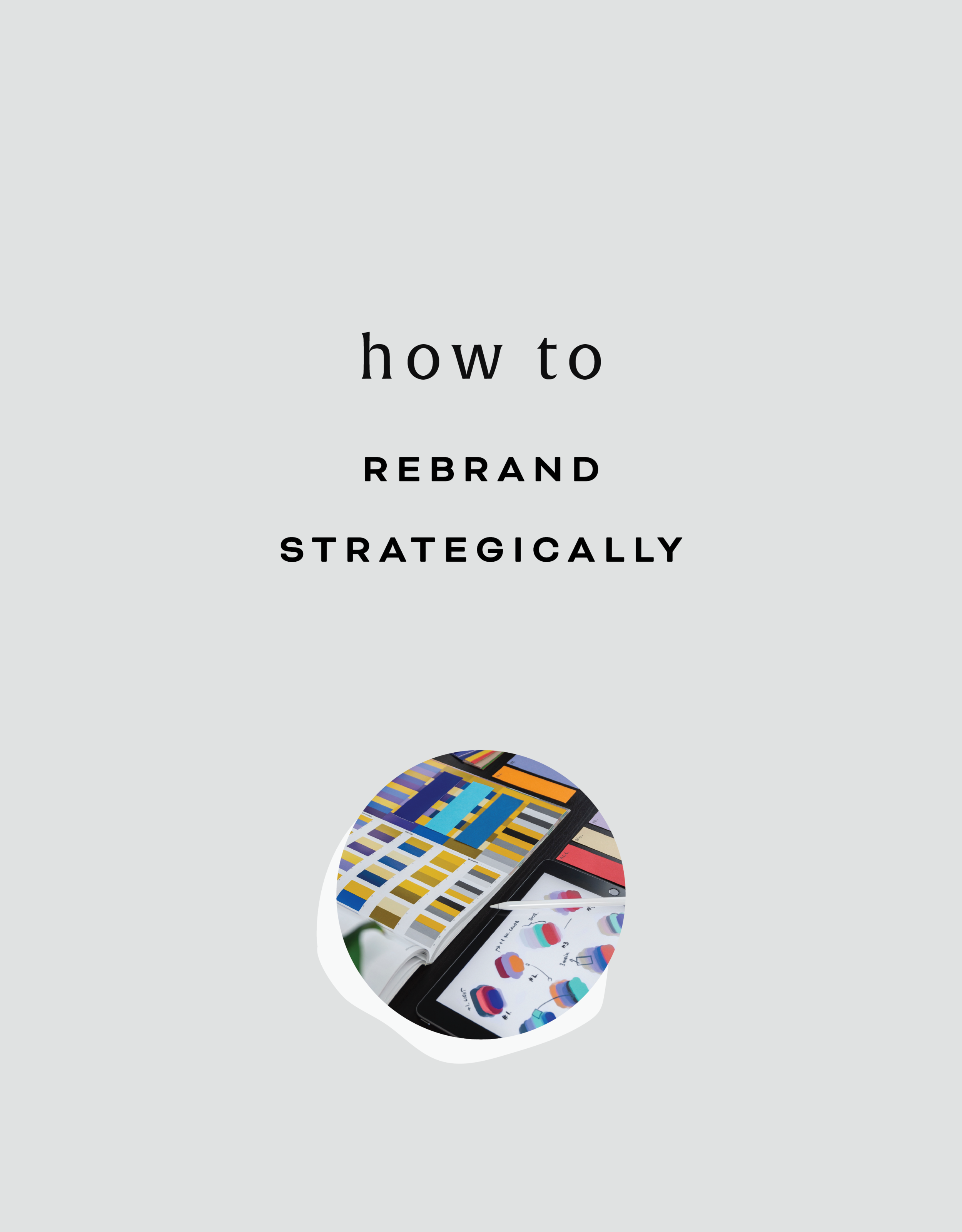
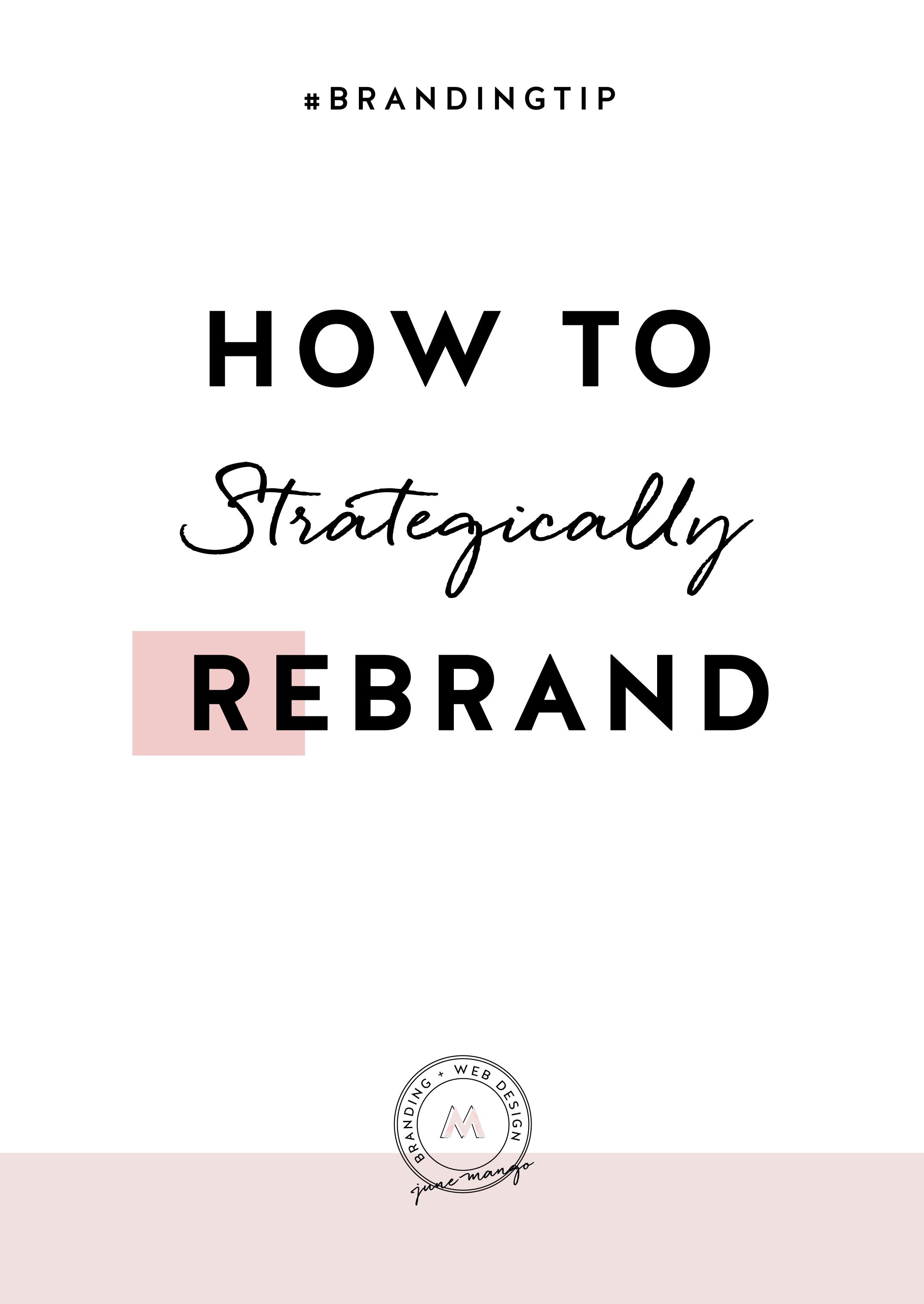
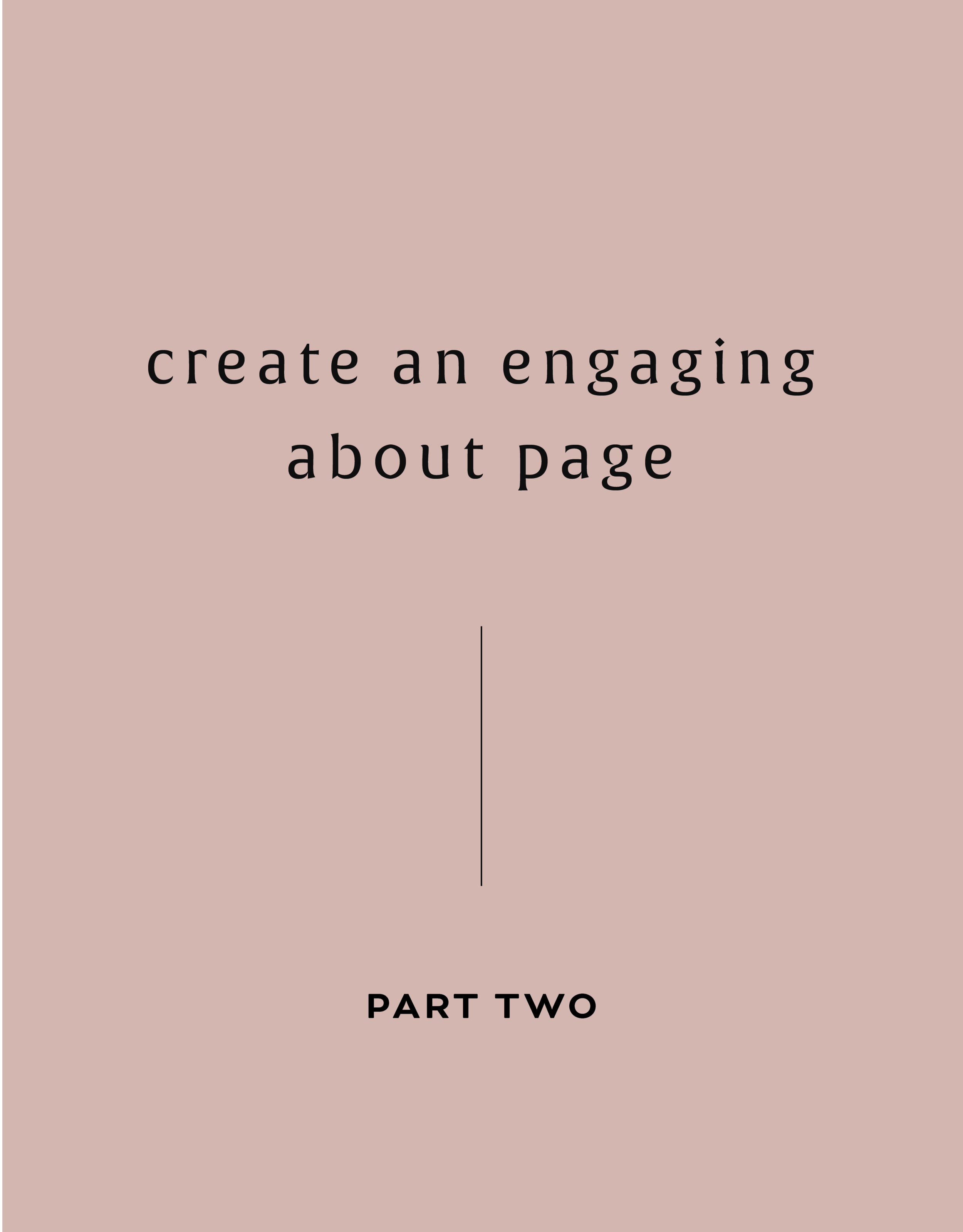
HOW TO REBRAND STRATEGICALLY
There are a lot of moving parts to a business, and your brand is just one of them. Branding is about getting to the heart of what I do best, who I serve best, and how I can best represent that through my business. So how do you even begin to strategically rebrand your biz? I have laid out my process with a few tips below, so read on!
If you have been following June Mango for a while, you will obviously have noticed that it's just gotten a major facelift. I am so excited about it and it's been a long time coming.
What I mean by that is that I have been diving deep behind the scenes to strategically rebrand my biz. This is more than just a new logo and color palette, although that's definitely part of it. This is about really getting to the heart of what I do best, who I serve best, and how I can best represent that through my brand. So how do you even begin to strategically rebrand your biz? I have laid out my process with a few tips below, so read on!
There are a lot of moving parts to a business, and your brand is just one of them. For me, I knew it was time for a rebrand when I felt that my messaging and design weren't matching up with:
A) the level of clients I was working with
B) the types of clients I wanted to attract
C) the level of expertise that I have collected from running my business for a few years
D) the actual design work I want to be creating
So these pieces each were key elements that just weren't matching up with what I was putting out into the world. In short, I had grown a lot as a designer and business owner, and wanted my brand to reflect that.
So now that I as aware of what I wanted to be sharing with my ideal audience, it was time to create the messaging and design to match. Now, I am NOT a copywriter, but I do think that the copy in your brand is just as important for your consistent business voice as your design. There are a lot of amazing copywriters that can help you share your vision in your voice, so don't be afraid to hand over the reigns.
Design-wise, I tried to really get clear on what:
A) I'm really good at
B) I can do that not many other designer's can
C) type of design I like to create
D) what type of design my ideal audience is looking for
With these things in mind, it was easy to create a website and brand that showcased all of the above. And the key here is that the real reason it was easy, is because it was natural. This is another reason I knew it was time to rebrand - I was eager to stretch my legs into design that fit me better.
Finally, I always like to keep in mind the visuals of the previous logo and branding. You don't want to completely change your look or else no one will recognize you! (Think Jennifer Grey after the nose job). So I stuck closely to the layout of my old logo, kept some of the same colors, like the pink, and just updated the hues. I also added a new stamp as an alternative logo to help share my services + expertise in a clear way and round everything out.
Overall, I am so happy with it. It really represents me, my design style, and my ideal clients. And that is exactly what your brand should do. :)
The full branding + web design:


LOGO PROCESS: JULIA KILKENNY
This little behind the scenes of the logo process is from the branding project for Julia Kilkenny, who is a coach for creative entrepreneurs. She described her ideal brand to me as "the first blue sky day of Spring." Amazing, right?! I took that and really ran with it and created these little nuggets for her.
This little behind the scenes of the logo process is from the branding project for Julia Kilkenny, who is a coach for creative entrepreneurs. She described her ideal brand to me as "the first blue sky day of Spring." Amazing, right?! I took that and really ran with it and created these little nuggets for her.
We ended up going with #2 and brought in more of that gorgy color palette. You can see the final branding and the web design to match this logo process over at juliakilkenny.com.
And if you feel like chatting with me about your own logo and branding, I'd love for you to holla at me
Related Posts

BREAKING THE BOUNDARIES OF MOOD BOARD MOSAICS
Totally deconstructed. More white space, more breathing room. More color blocks, but all integrated into the collage vs. being stacked together. Still a brand-focused lifestyle image at the center grounding the collage as well as the brand. And little, layered type elements.
I think all designers have a touch of Creative ADD. All of my favorite designers are constantly changing and pushing their brands + the creative processes to be better, cooler, or more unique.
I have this ADD too, and recently I've been itching to bust out of the standard mood board mosaic design. It's just EVERYWHERE, and frankly, I'm bored. And here's a little secret: boredom = creativity's best friend. Being bored makes me want to shake it up! Create something new and funky! Get weird and wild! Design-wise, that is. :)
So here's where I ended up on a the new make-up of my mood boards.
Totally deconstructed. More white space, more breathing room. More color blocks, but all integrated into the collage vs. being stacked together. Still a brand-focused lifestyle image at the center grounding the collage as well as the brand. And little, layered type elements.


I think mood board collages + color are my love language. ❤️
So what do you think? Love it? Hate it? Wanna live in it (I do!!). I'd love to hear your thoughts on the new mood board so feel free to holla at me!
Related Posts

THE SIMPLEST GUIDE TO COLOR PSYCHOLOGY
If you know anything about me at all, you know how much I love color. It is one of my favorite things - right up there with my family and chocolate. So it’s no wonder that adding color to a project is my favorite part of the process. It's also a crucial part of the process because it can change the feeling and appeal of a brand or website.
There are literally college courses (I took many!), books and a ton of in-depth resources devoted to the study of color and color psychology. But since you are probably not a #colornerd like me, I have broken down how to work with your color palette without having to dive deep into all that is Color Psychology.

Quick Color Psychology Overview
Whether you realize it or not, colors evoke emotions, feelings, and memories, and you can utilize this to create a brand or business presence that works to attract your dream client or customer. But since this can quickly become a rabbit hole of color-nerdiness, I have laid out the Quick and Dirty Guide to Color Psychology above. This little chart will show you how you can apply this knowledge to your logo, branding, website and anything else that incorporates color. Feel free to click the image to download a PDF version for yourself to reference in your future projects.
As John Ruskin said, "The purest and most thoughtful minds are those which love color the most.” And I couldn't agree more. 😉
WANT to CREATE
a custom WEBSITE?
LOGO PROCESS: DEVAN DANIELLE
I had such a crazy-good time creating this little logo, and the logo process above was only step one. We took these logos, refined them and added in some really cool photo elements until we got to a really versatile final logo and matching branding elements.
Devan contacted me to create her logo and branding with some super interesting and unique ideas. She basically said, "I want you to go wild and do whatever you want."
Um, HELL YAS!
The only requirement was that she wanted the logo to feel light, airy and open. Done and done.
I had such a crazy-good time creating this little logo, and the logo process above was only step one. We took these logos, refined them and added in some really cool photo elements until we got to a really versatile final logo and matching branding elements. You should probably head over here to check out the finished project, because, well, it's just so damn lovely!
And if you feel like chatting with me about your own logo and branding, I'd love for you to holla at me!
Related Posts

ESSENTIAL FILE FORMATS FOR DESIGN
This post is for those of you who may not understand a lot of the terms designers talk about when it comes to sending along your final logo or design files. And this is also helpful for you to know once you get that big ol' package of file formats so that you can use each file type in the appropriate place. So, today I am focusing on understanding the main file formats used for design, which includes JPG, PNG, GIF, EPS, PDF, and TIFF files. Each file type can be used for a different reason. I’ve listed out each of the main types along with their best uses below.
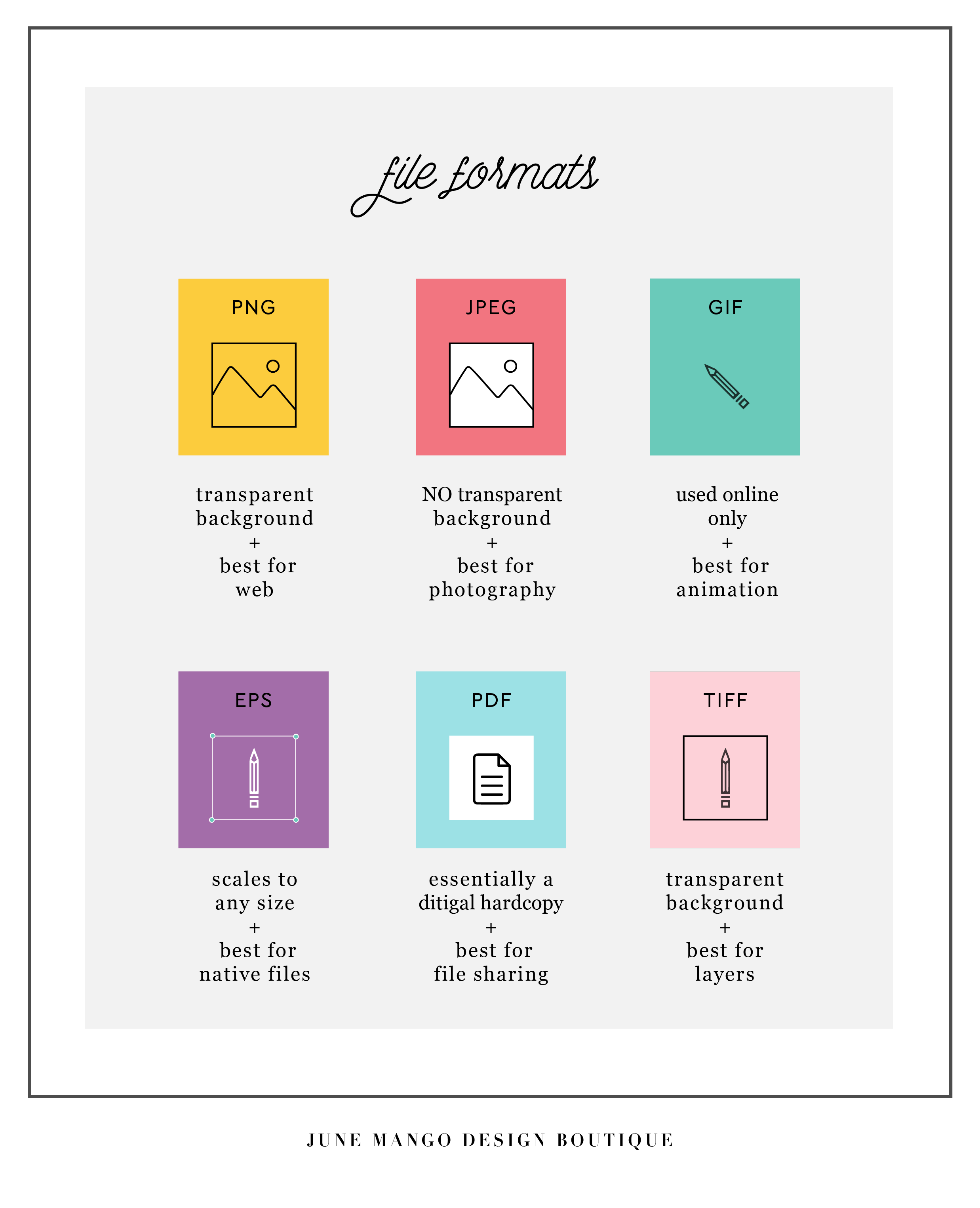
Hopefully you can use this as a quick guide to your file formats when you're feeling a little lost in the proverbial design jungle. Feel free to save this to your desktop and look back to it whenever you need it!
Related Posts

HOW TO ATTRACT YOUR IDEAL CLIENTS
Your brand's logo has some serious power to help you attract your ideal client. You just need to know how to use it. Your logo is one of the first things people see when they meet your biz, whether it's online or on your business card. Make your logo work for you by attracting your ideal clients ... like a magnet!
Your brand's logo has some serious power to help you attract your ideal client. You just need to know how to use it. Your logo is one of the first things people see when they meet your biz, whether it's online or on your business card. Make your logo work for you by attracting your ideal clients ... like a magnet!
So here's the trick:
Take out a notebook and really think about who your ideal client is. Write down as much information about them as you can (gender, hobbies, where do they hang out online, what do they do on weekends, what's their age, etc.). From there, try to understand EXACTLY what visually inspires them.
Next, pretend you're them. I'd head to Pinterest for this part of the exercise. Create a pinboard and GO TO TOWN. Pin everything you think they would like. Get that visual inspiration all in one place. And VOILA! What you now have is a great resource of visuals that you can use to apply to your logo. Look for common colors, patterns, styles and apply it all to your branding design. And that, my friends, is how to make your logo attract your ideal clients like a magnet.
Want to see these tips in action? Here’s an example or two of a client magnet.
Related Posts

GOAL SETTING FOR BRANDING YOUR BUSINESS
As the savvy business owner you are, you probably set certain goals for yourself when you started your business. Setting tangible steps to reach your goals is a foolproof way to reach tangible results.
Here's a secret: you can take those same building blocks you used to start your business and apply them to your branding.
Here's an example. Let's say your goal is to grow your Instagram following to 1000 die-hard Insta-fans. Ok, now what are the steps that will get you there?
Post great content.
Engage with your followers.
Post more regularly.
In this example, we set a goal and created the specific steps to reach it.
Now, let's apply this to branding. What is your goal?
Keep in mind, this can still be a business goal. It doesn't have to be related to design. For example, if you're a photographer trying to book more weddings, your goal might be to attract more brides-to-be. So think about what these women may be looking for. Your goal-oriented branding steps may look like this:
Look through your previous work and identify which shoots relate most to weddings that you would like to build from. Do these shoots have any common aesthetics?
Determine the feeling you want to evoke from future brides (romantic, fun, professional, whimsical, etc).
Translate those adjectives into a branding style. If you choose whimsical and romantic, think about what visuals represent those words (script lettering, florals , and soft colors are a good start!).
By working through these goal-oriented steps, you will find that you're able to fine-tune your branding and vision.
The more specific you can get with this exercise, the better your branding experience will be! If you want to chat about this more, holla at me!
Related Posts

GET THE MOST OUT OF YOUR MOOD BOARD
Have I told you how much I love mood boards? They are crazy-crucial for my design process to make sure I'm on the same page with my clients. They probably take the most time out everything I work on in a branding project. I spend so much time curating images to make sure it's just right.
Why?

Have I told you how much I love mood boards? They are crazy-crucial for my design process to make sure I'm on the same page with my clients. They probably take the most time out everything I work on in a branding project. I spend so much time curating images to make sure it's just right.
Why? Because it sets the tone for the rest of the project.
I show these mood boards to a client and invite criticism because it should be dead-on with their brand vision.
If it's not, discussing what works and what doesn't gives me valuable feedback that I use to dictate what comes next: the logo design. The mood board is like the essence of the brand, boiled down into one big ol' beautiful soup-o-squares.


So how can you make sure you
get the most out of your mood board?
Think about how you feel when you look at the mood board as a whole. This is honestly the most important item. What mood does it convey? What emotions do you feel? What actions do you want to take? These should be in line with what you want others to feel when they see you brand or website. It should be dead on. And if it isn't...
Think about what doesn't fit that mood. Is there an element that's giving off the wrong vibe? Maybe some of the graphic elements or colors aren't quite right. You can even try covering the offending element to see if the mood board works without it.
Consider the big picture. Sure, it's on trend and the colors are pretty, but does it really work for all the visual platforms you'll be using to tell your brand story? Make sure the mood board will allow your brand to live online, in print and anywhere else you will run your biz.
Are you proud of this de sign? Do you want to show your mom, you're biz bestie or even your cat? AWESOME! You should love it and be excited to show it off to your future clients. It will be the direction for your beautiful business, after all.
If you look for these key items when critiquing the mood board for your brand's direction, you should easily get the most out of the mood board process.

Ready to get the mood board party started?
Head this-a-way to try your hand at a DIY mood board.
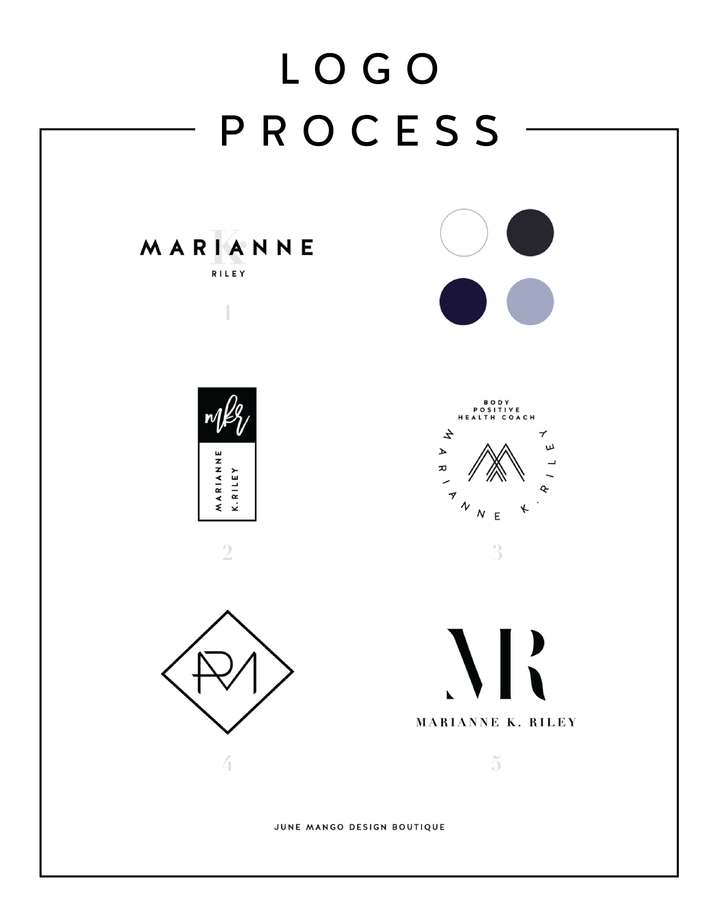
LOGO PROCESS: MARIANNE K. RILEY
Just a little peek inside the process of a logo project I've recently completed. This logo is for a health coach who was looking for a super-sophisticated, font-based mark with a heavy nod toward monograms. I tried to get a little creative with that and so the concepts are pretty varied.
Just a little peek inside the process of a logo project I've recently completed. This logo is for a health coach who was looking for a super-sophisticated, font-based mark with a heavy nod toward monograms. I tried to get a little creative with that and so the concepts are pretty varied.
I'll have more on the final logo and branding deets soon!
Related Posts


BRANDING FOR ETSY STORE OWNERS
Whether you've just launched your first Etsy store or are a seasoned veteran looking for a brand refresh, there are four main ideas to help you narrow down your vision.
Whether you've just launched your first Etsy store or are a seasoned veteran looking for a brand refresh, there are four main ideas to help you narrow down your vision.
1. Be distinctive
What makes you unique? What is the thing that makes your work stand out from all the rest. Do you knit quirky, colorful scarves? Do your greeting cards put Hallmark to shame? Are you selling witty handmade pillows to throw on a newlywed bed? Whatever it is, narrow in on that, because that is what makes you unique and will get your dream customers attention.
2. Brand it!
How do you take your unique-ness ( see above! ), and turn it into the most fantastic branding ever?
Answer: Emotion. Find that emotional connection your style has with your customers. A new mamma wants to feel cool and stylish, but is also covered in drool all day. Do you sell funky t-shirts that are comfy and totally trendy? Boom. Are your greeting cards tackling hard subjects with humor? YES! Capture that.
If you take these emotional pieces and translate them into visuals, you have your branding. Done right, clients will have a sense of your style before they even see the whole catalog of your products.
3. Work your website
Branding doesn't stop with your logo or color palette. Your brand needs to carry through to your website and online shop, if you have one. Now is the time to consider your dream client's journey through your site. Yes, I said journey. Think about where they will start (homepage, Etsy storefront?) and where you want them to end up (contact page, Checkout?).
You can continue to work in that emotional component by telling a story as you go. Here is an example:
Click ... Main shop / storefront A collection of creative, quality handmade items for the home.
Click ... product page from search A quirky state-shaped cheese platter made from Acacia wood, which would be the perfect gift.
Click ... Checkout How much are they going to love this gift!
Thinking about how a potential customer will wander through your website will allow you to create the right structure, content and navigation.
4. One step further
As the creative business owner you are, you know there's more to consider. Social media (product shots, header images, etc), advertisements and wholesale price sheets are all places to carry over your branding. Think about each customer's experience from beginning to end. From the logo to store front signs to packaging to thank you stationary, everything should be cohesive. Make sure to ask yourself if it sends the right signals and emotions. In the end, it should be in line with your unique creations.
Looking for examples of a maker's branding in action? Head on over this-a-way.
Related Posts

PODCAST COVER ART
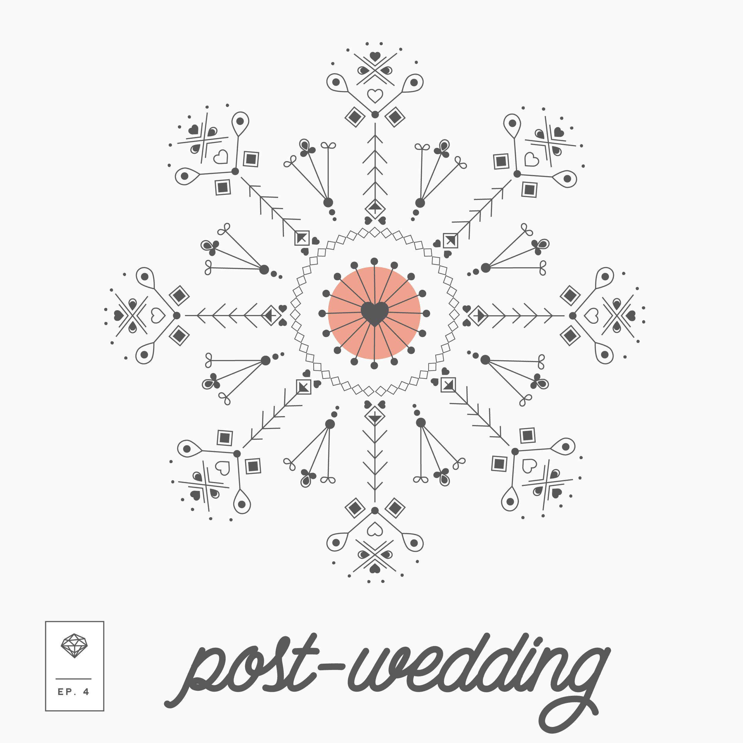
I just thought I'd share some of the podcast cover art I made for several of the episodes released. Creating a new addition of cover art for each podcast was admittedly ambitious, but it was well worth it. Such is the life of a creative. Here's a peek at some of the podcast cover art for each episode.


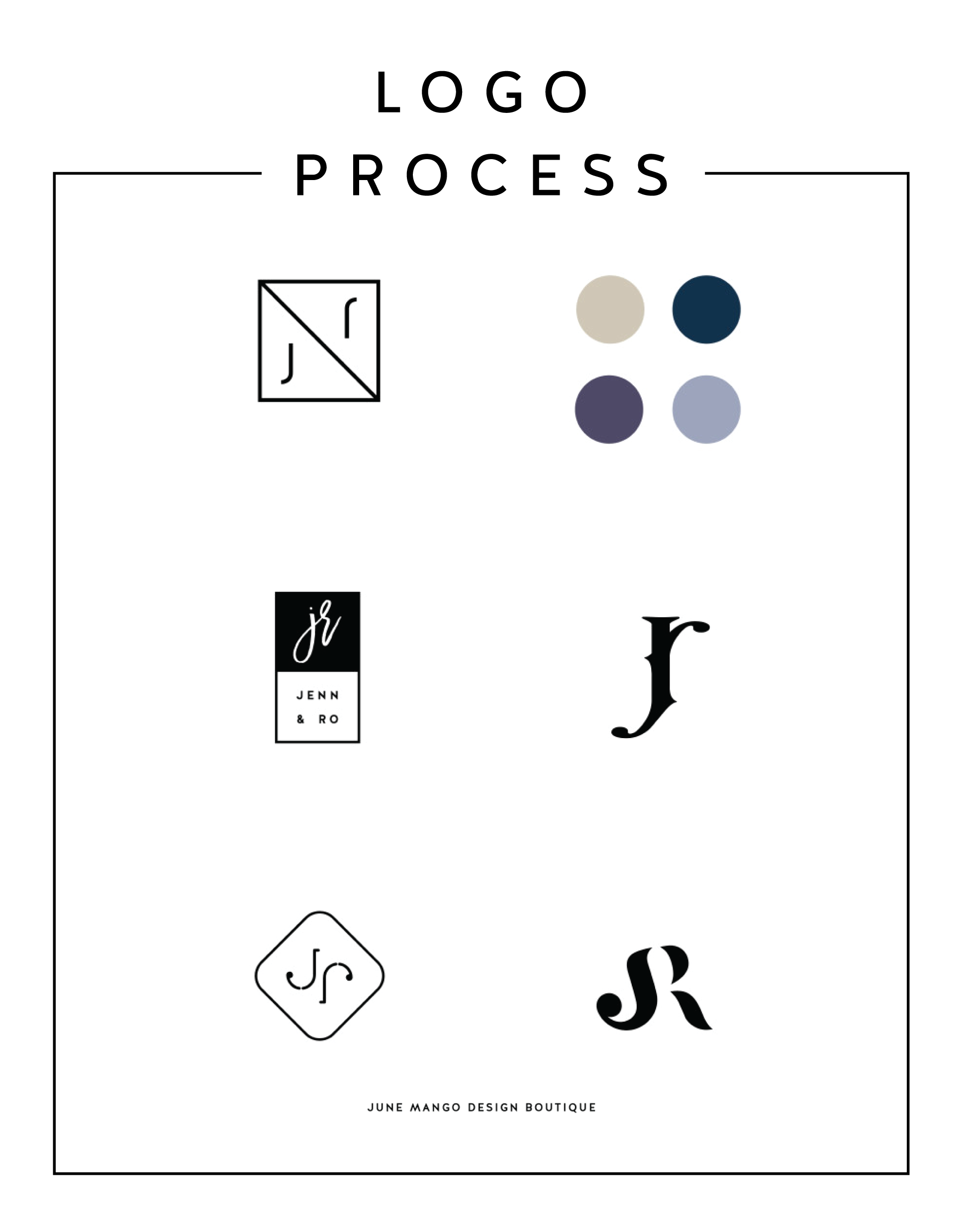
LOGO PROCESS - J&R
Just a little peek inside the process of a current logo project I'm working on right now. It's for a husband and wife photography team, and the trick is to combine the letters of their names - J and R - into a cohesive mark. It's fun and challenging. Can't wait to reveal the final logo!
Related Posts

BRAND STYLE BOARDS 101

You may have seen these little guys floating around on Pinterest and not known exactly what they are or what their purpose is.
Every designer does their Brand Style Boards a little bit differently, but as a rule there are a few things that should be included.
Logo
This is the main logo that will be used on important touch points like the website, business cards, etc
Submark / Secondary Logo
This is a variation of the logo and usually much simpler. Often an icon, it can be used as an avatar on social media or as a stamp on images for bloggers and photographers
Color Palette
I always make sure to include not only the color swatches, but the various color values. This helps a client match their color palette from anything like a printed business card to their website
Fonts
The fonts are really important to the brand and are NOT an afterthought, so it's imp ortant to make sure to include them on the Brand Style Board to ensure that the fonts match up on all future branded collateral.
In the examples below, I also include design elements that can be used as icons or graphics on the website. Sometimes a branding package will include patterns or buttons / graphics for the client's website, which are also helpful to include on the Brand Style Board. I also always include the mood board that I created for the internal branding process. I think it helps tie everything together and give the client a good idea for the types of imagery they should look for when creating other items for the brand (ie: website, media kit, etc).


Ultimately, the Brand Style Board should contain the core of your brand. At a glance, it should be everything you need as a reference for you and anyone you hire down the line. It should guide every visual choice you make for your business.
To see more examples, head this-a-way or to chat with me about your brand head that-a-way!
need even more help with squarespace?
Skip the overwhelm and have your website designed and launched in just 5 days (or less)!