
LOGO PROCESS: BASH EVENT PLANNING
This little logo process is from the branding process for BASH Event Planning & Design. This was a challenging but FUN design process that included ideas like topography, layering and disco!
This little logo process is from the branding process for BASH Event Planning & Design. This was a challenging but FUN design process that included ideas like topography, layering and disco!
Below are several of the concepts and variations created before we nailed down the final logo.
Related Posts
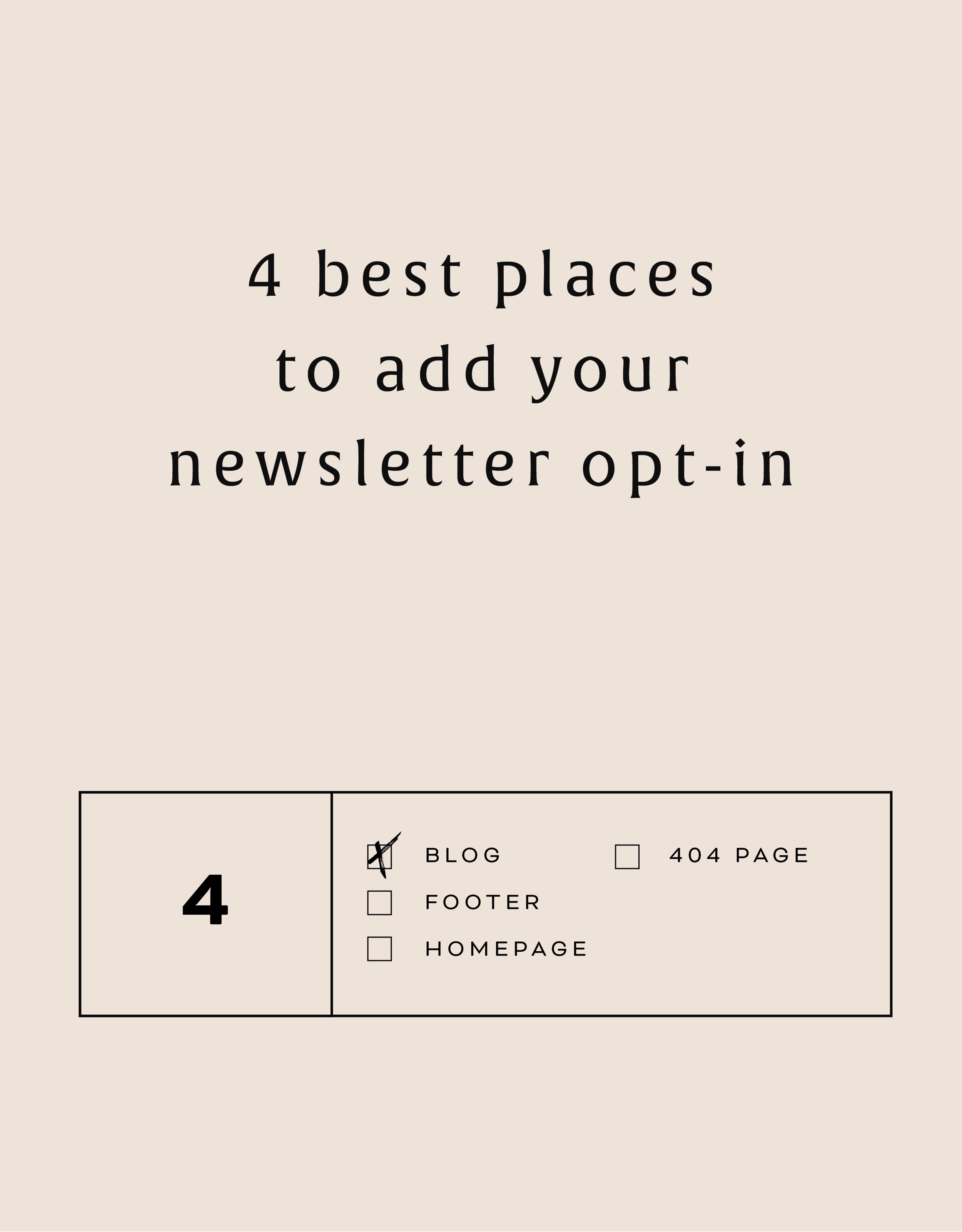
The 4 best places to add your newsletter opt-in
Growing your newsletter list is so important when you run an online business. It can help you keep in touch with your dream clients, build trust with your audience and promote new offerings. But the question my web clients always ask is: Where is the best place to add my newsletter opt-in or sign up form?
Growing your newsletter list is so important when you run an online business. It can help you keep in touch with your dream clients, build trust with your audience and promote new offerings. But the question my web clients always ask is: Where is the best place to add my newsletter opt-in or sign up form?
There are 4 places I ALWAYS add the newsletter opt-in forms on any website.
Blog
Adding the newsletter opt-in to your blog allows you to capture people who are already interested in what you have to say. They are on your blog reading all of your juicy content, so why not try to get them onto your newsletter list where you have even juicier content! I like to make sure this opt-in is specific, and maybe different from other sign up forms elsewhere on the site. For example, it should incentivize them to sign up with the promise of sharing your expertise for free with a worksheet, guide, etc. Adding this opt-in to the sidebar of your blog is one of my favorite places to engage newsletter subscribers on your site.
Footer
It's the one place people will see no matter what page of your website they land on (or click to!). So make it work for you by adding a newsletter sign up form. Repetition of views will also increase the chance that people will sign up. I like to keep this one more generic with a description of what you typically send out vs. a specific freebie or promo.
Homepage
You probably guessed this one, right? But do you know where on the homepage you should add your opt-in? The rule of thumb is above the fold
(aka: the amount of the webpage a user sees before needing to scroll down).
Ideally, you will still be able to communicate your mission statement (who you are, what you do, and who you do it for) before the newsletter. No one is going to sign up for a newsletter if they don't know who the heck you are yet! But grabbing their attention before they scroll down the page is a great way to ensure they get on your list.
404 Page
Have you given much thought to your 404 page? It's a handy little page that pops up when someone clicks a broken link or types a URL wrong. It has so much potential to be interesting and engaging, which is important for keeping your audience on your site! Besides giving them a link back to your homepage, you can also sneak in a newsletter opt-in here! It's an unexpected place to get that person to sign up.
You can add your newsletter opt-in to all four of these places or just pick and choose. Have another spot you think would be great? Let me know!
Related Posts
LOGO PROCESS: ACUPUNCTURE BRANDING
I've had lots of new branding projects lately that I've been meaning to share! Two of these were for holistic health providers specializing in acupuncture + herbal medicine or yoga + massage. Here are the logo processes for both!
I've had lots of new branding projects lately that I've been meaning to share! Two of these were for holistic health providers specializing in acupuncture + herbal medicine or yoga + massage. Here are the logo processes for both!
Logo Process for Wildcrafted Acupuncture & Herbs - Submarks
Logo Process for Wildcrafted Acupuncture & Herbs - Logo
Logo Process for Align Massage and Yoga - Submark
Logo Process for Align Massage and Yoga - Logo


LOGO PROCESS: JANE O. COACHING
I haven't shared a logo process in a while. This logo process is from Jane O. Coaching, who is a love and style coach with an amazing colorful, bright vibe. So of course, she wanted her branding to be feminine, colorful and fun to show off her coaching niches.
I haven't shared a logo process in a while. This logo process is from Jane O. Coaching, who is a love and style coach with an amazing colorful, bright vibe. So of course, she wanted her branding to be feminine, colorful and fun to show off her coaching niches.
We ended up heading in the direction of #3, with some additional tweaks and customizations to make it fully unique to Jane. To see the full branding and web design that came from this logo process, head on over to janeocoaching.com.
And if you want to chat about your own logo or branding, holla at me!
Related Posts
LOGO PROCESS: JULIA KILKENNY
This little behind the scenes of the logo process is from the branding project for Julia Kilkenny, who is a coach for creative entrepreneurs. She described her ideal brand to me as "the first blue sky day of Spring." Amazing, right?! I took that and really ran with it and created these little nuggets for her.
This little behind the scenes of the logo process is from the branding project for Julia Kilkenny, who is a coach for creative entrepreneurs. She described her ideal brand to me as "the first blue sky day of Spring." Amazing, right?! I took that and really ran with it and created these little nuggets for her.
We ended up going with #2 and brought in more of that gorgy color palette. You can see the final branding and the web design to match this logo process over at juliakilkenny.com.
And if you feel like chatting with me about your own logo and branding, I'd love for you to holla at me
Related Posts
LOGO PROCESS: DEVAN DANIELLE
I had such a crazy-good time creating this little logo, and the logo process above was only step one. We took these logos, refined them and added in some really cool photo elements until we got to a really versatile final logo and matching branding elements.
Devan contacted me to create her logo and branding with some super interesting and unique ideas. She basically said, "I want you to go wild and do whatever you want."
Um, HELL YAS!
The only requirement was that she wanted the logo to feel light, airy and open. Done and done.
I had such a crazy-good time creating this little logo, and the logo process above was only step one. We took these logos, refined them and added in some really cool photo elements until we got to a really versatile final logo and matching branding elements. You should probably head over here to check out the finished project, because, well, it's just so damn lovely!
And if you feel like chatting with me about your own logo and branding, I'd love for you to holla at me!
Related Posts
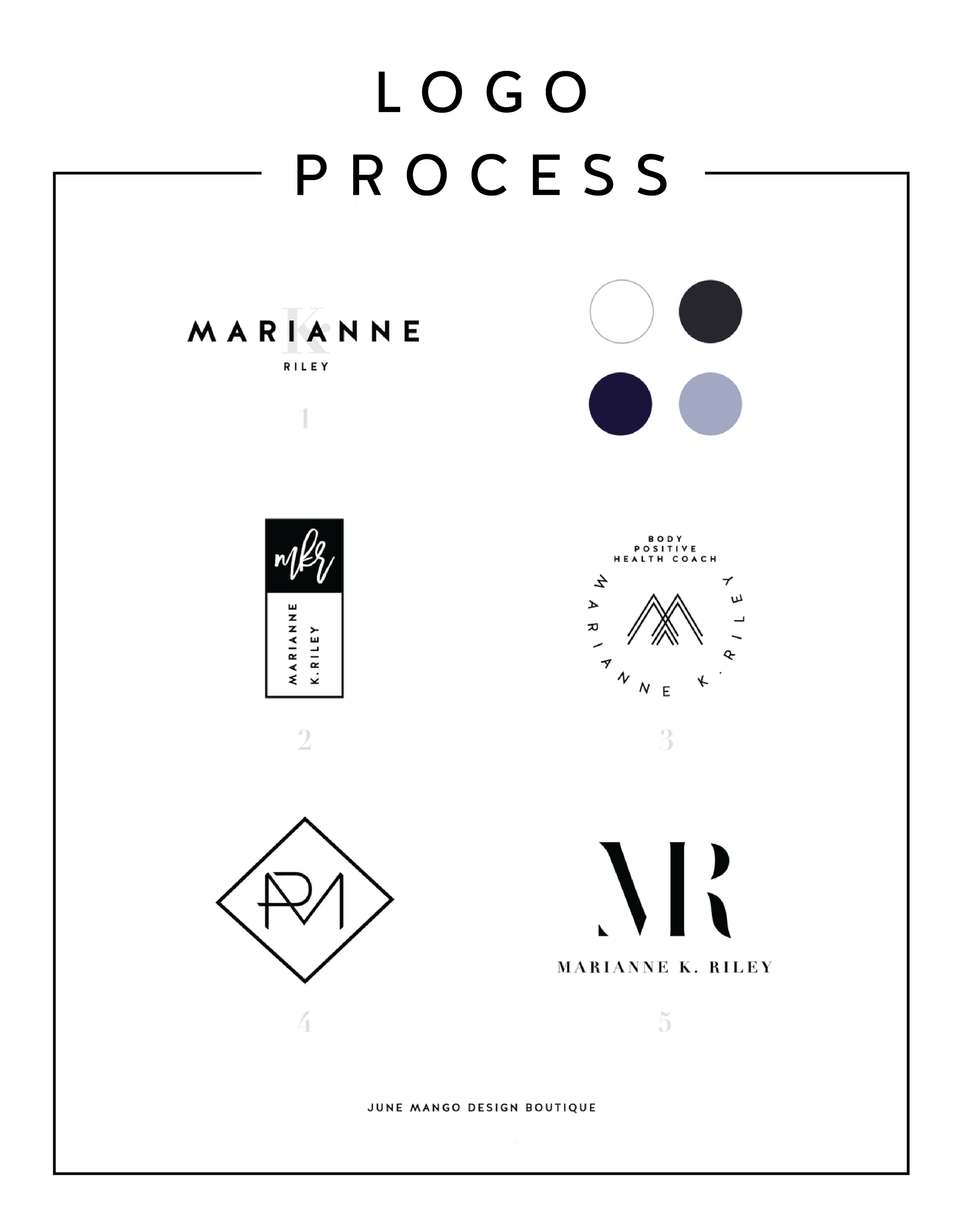
LOGO PROCESS: MARIANNE K. RILEY
Just a little peek inside the process of a logo project I've recently completed. This logo is for a health coach who was looking for a super-sophisticated, font-based mark with a heavy nod toward monograms. I tried to get a little creative with that and so the concepts are pretty varied.
Just a little peek inside the process of a logo project I've recently completed. This logo is for a health coach who was looking for a super-sophisticated, font-based mark with a heavy nod toward monograms. I tried to get a little creative with that and so the concepts are pretty varied.
I'll have more on the final logo and branding deets soon!
Related Posts

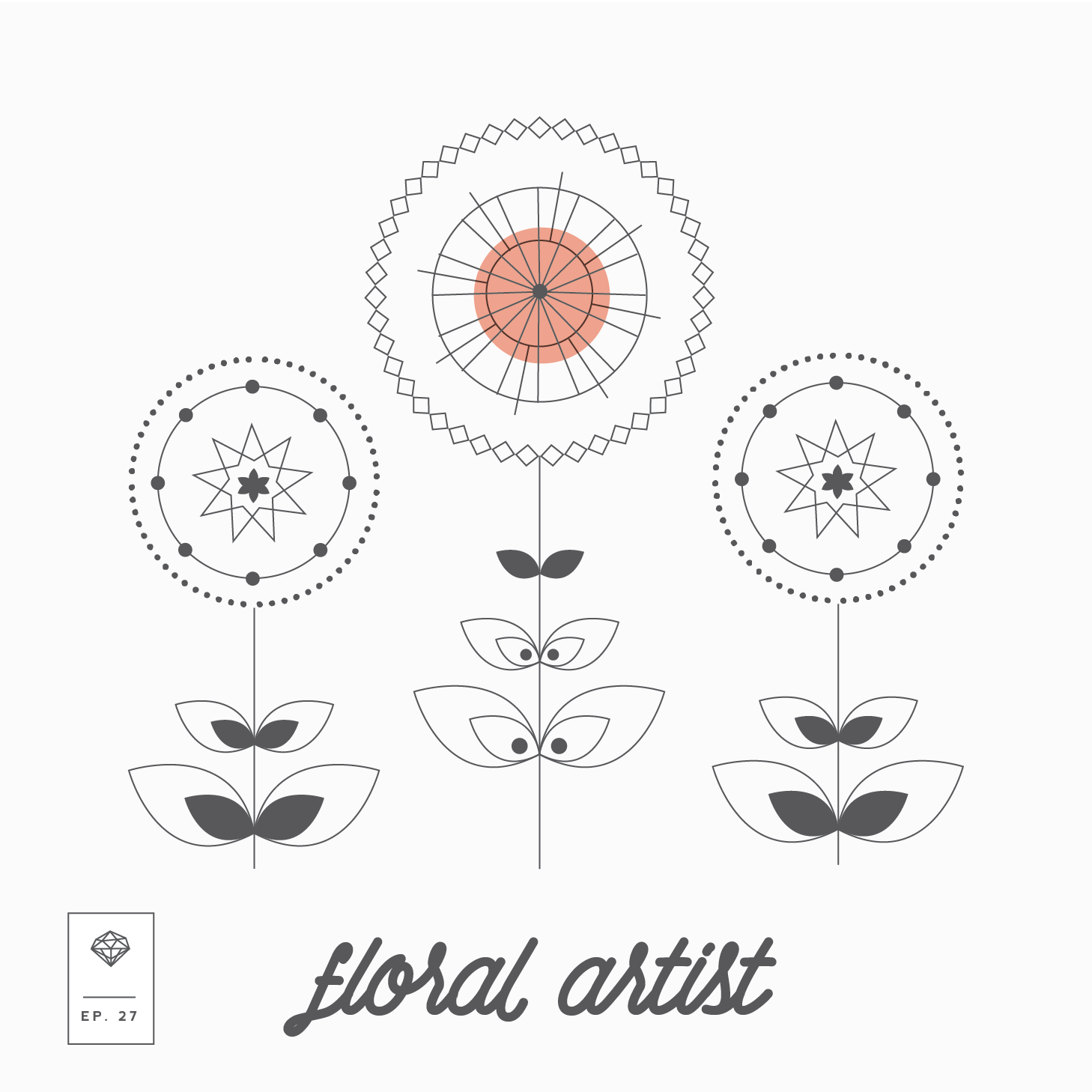
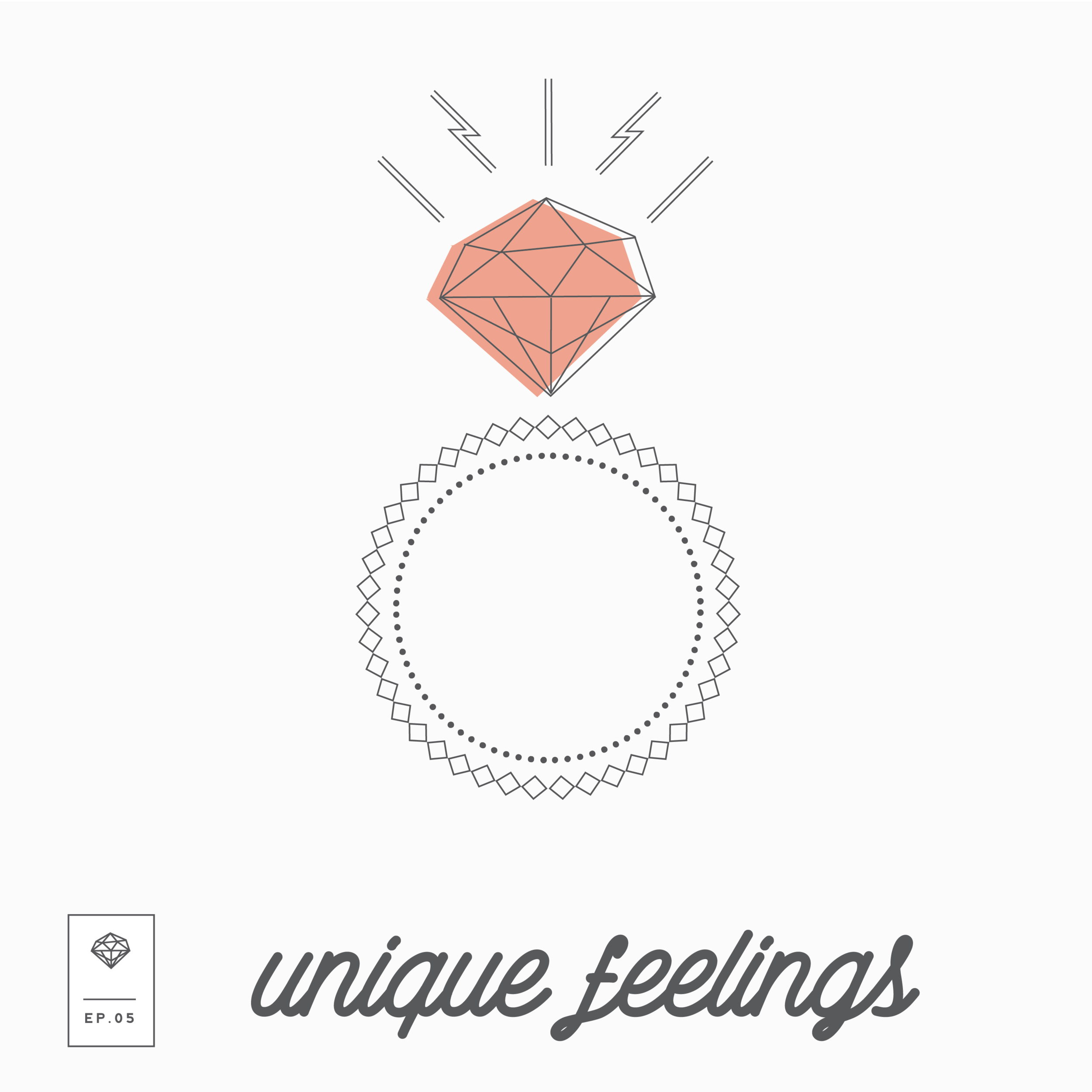
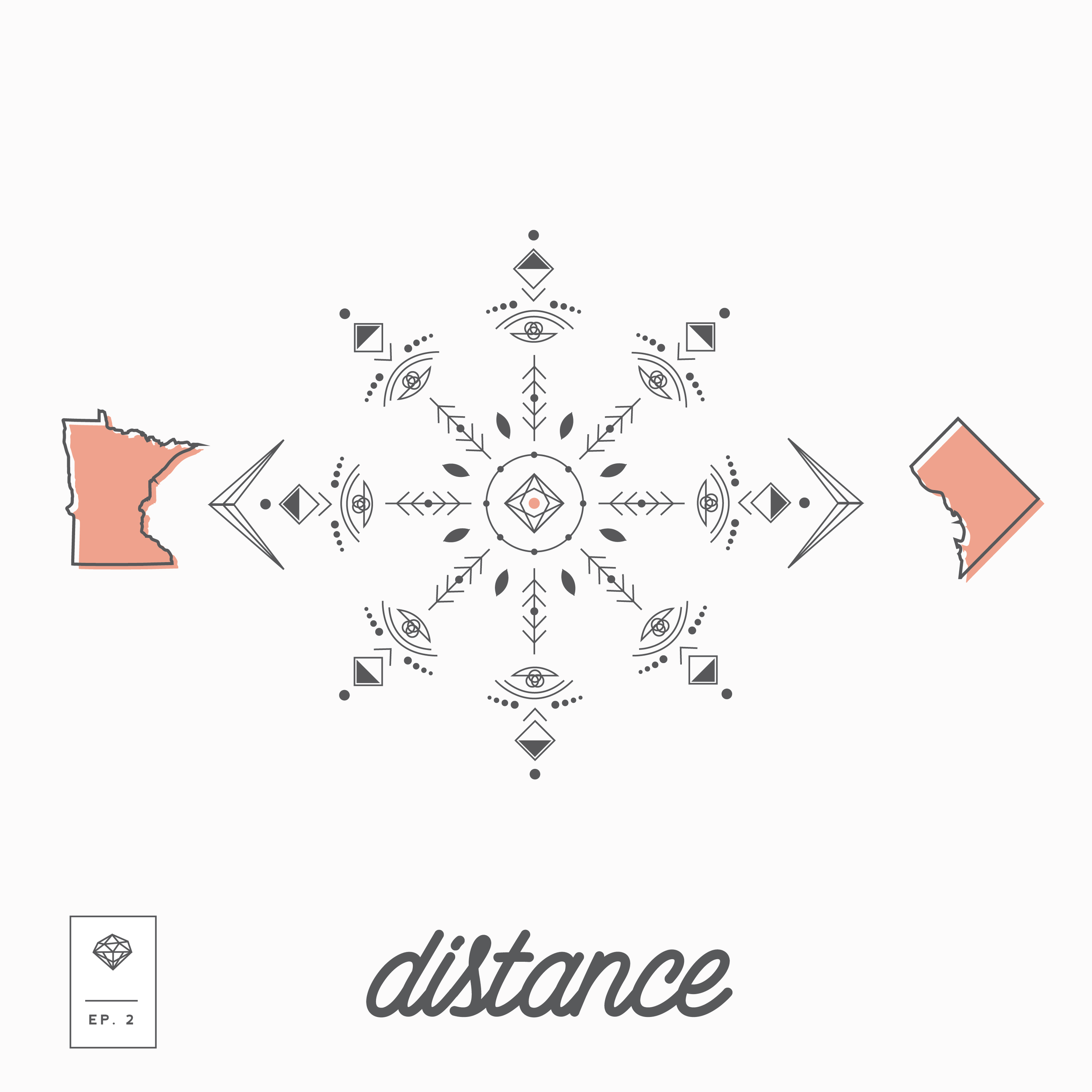
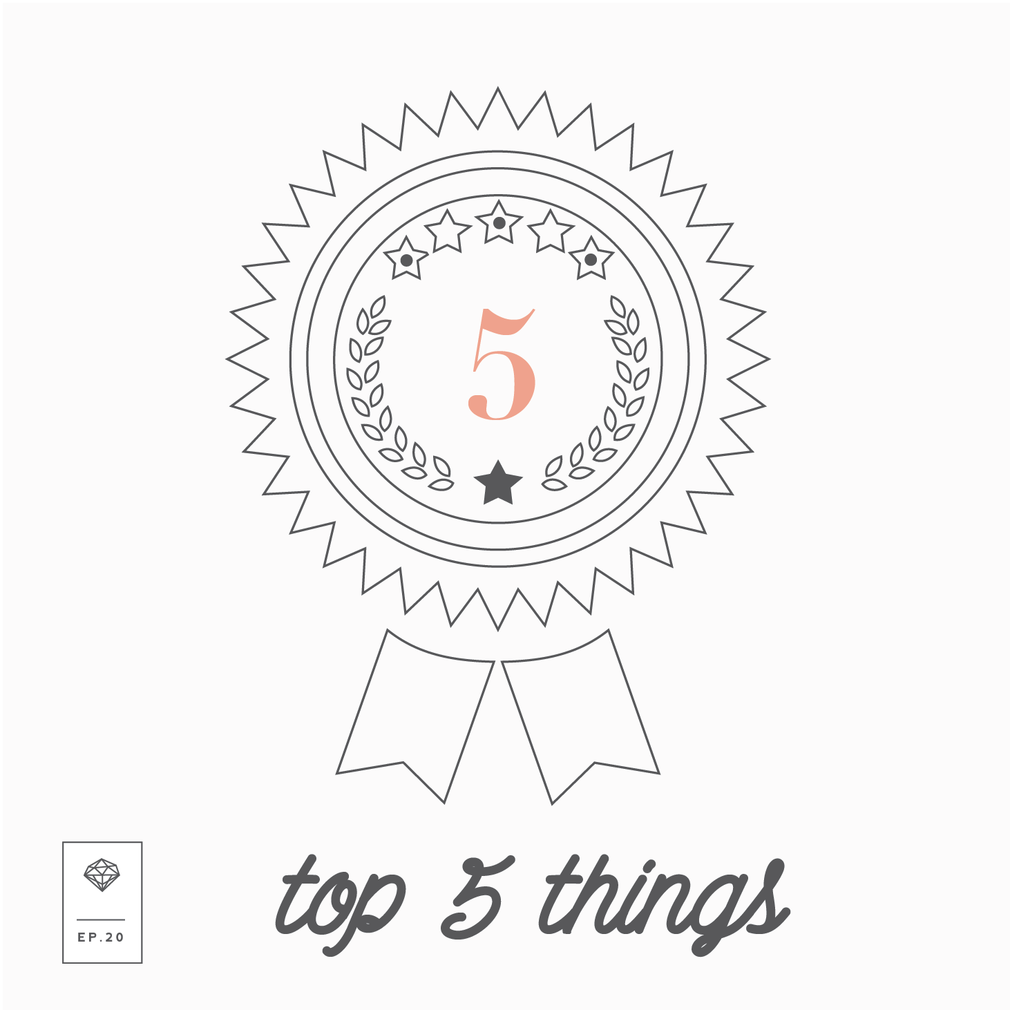
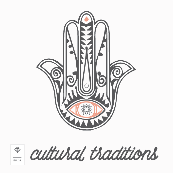
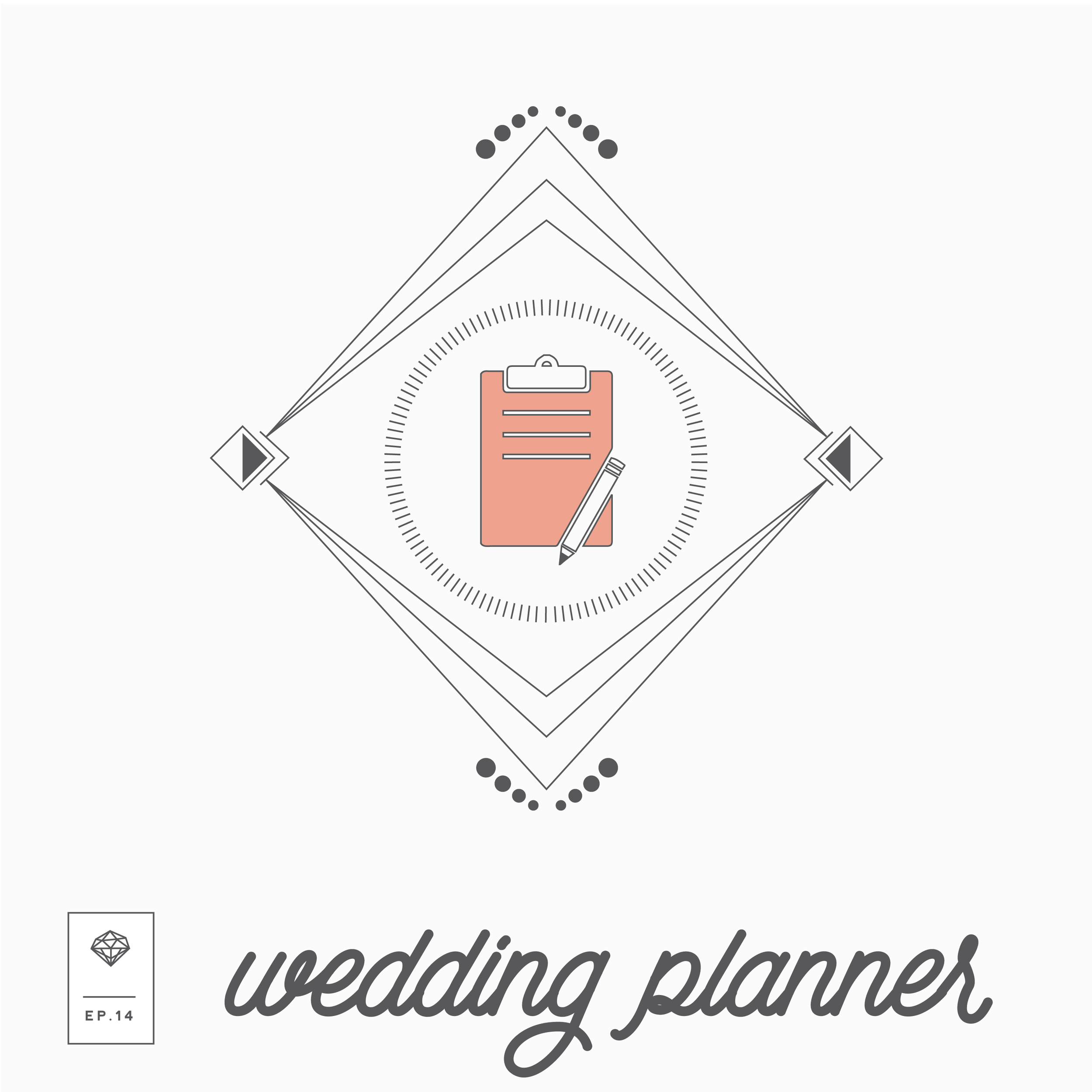
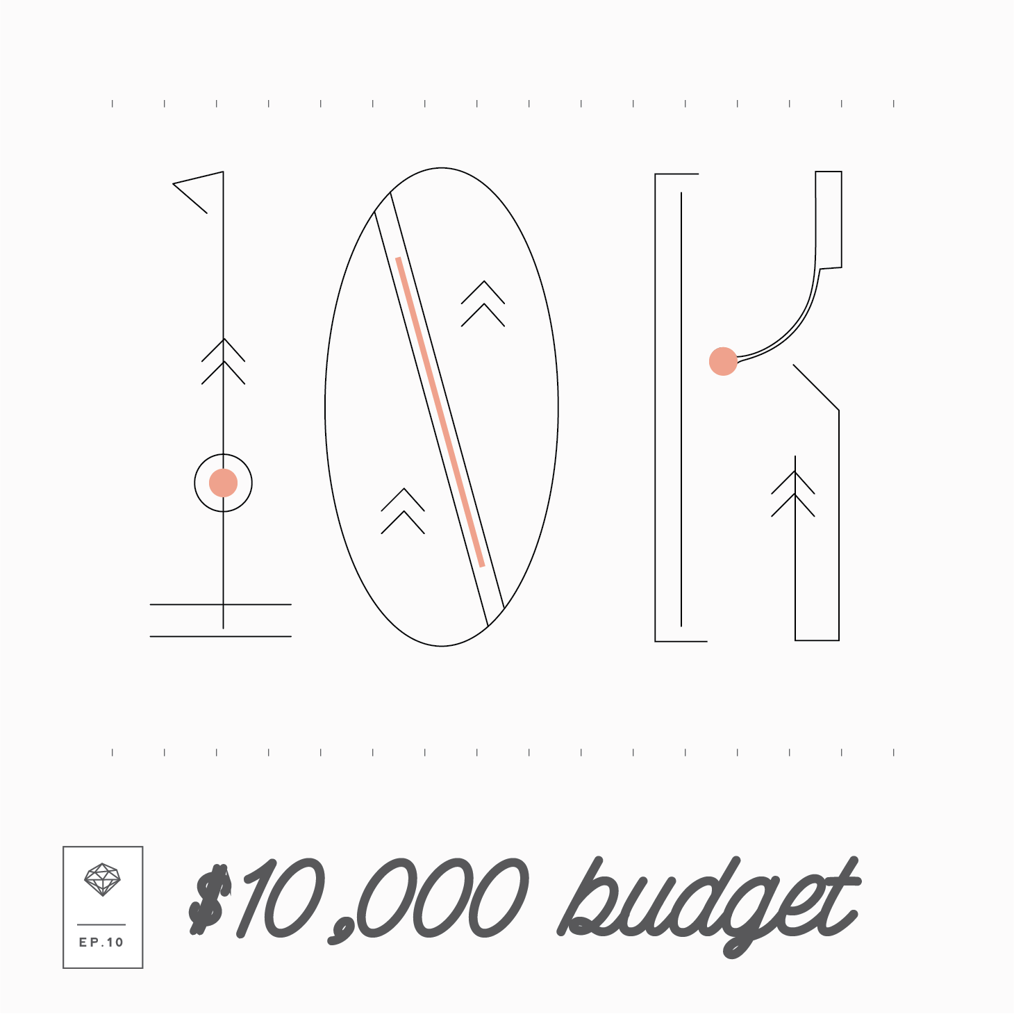
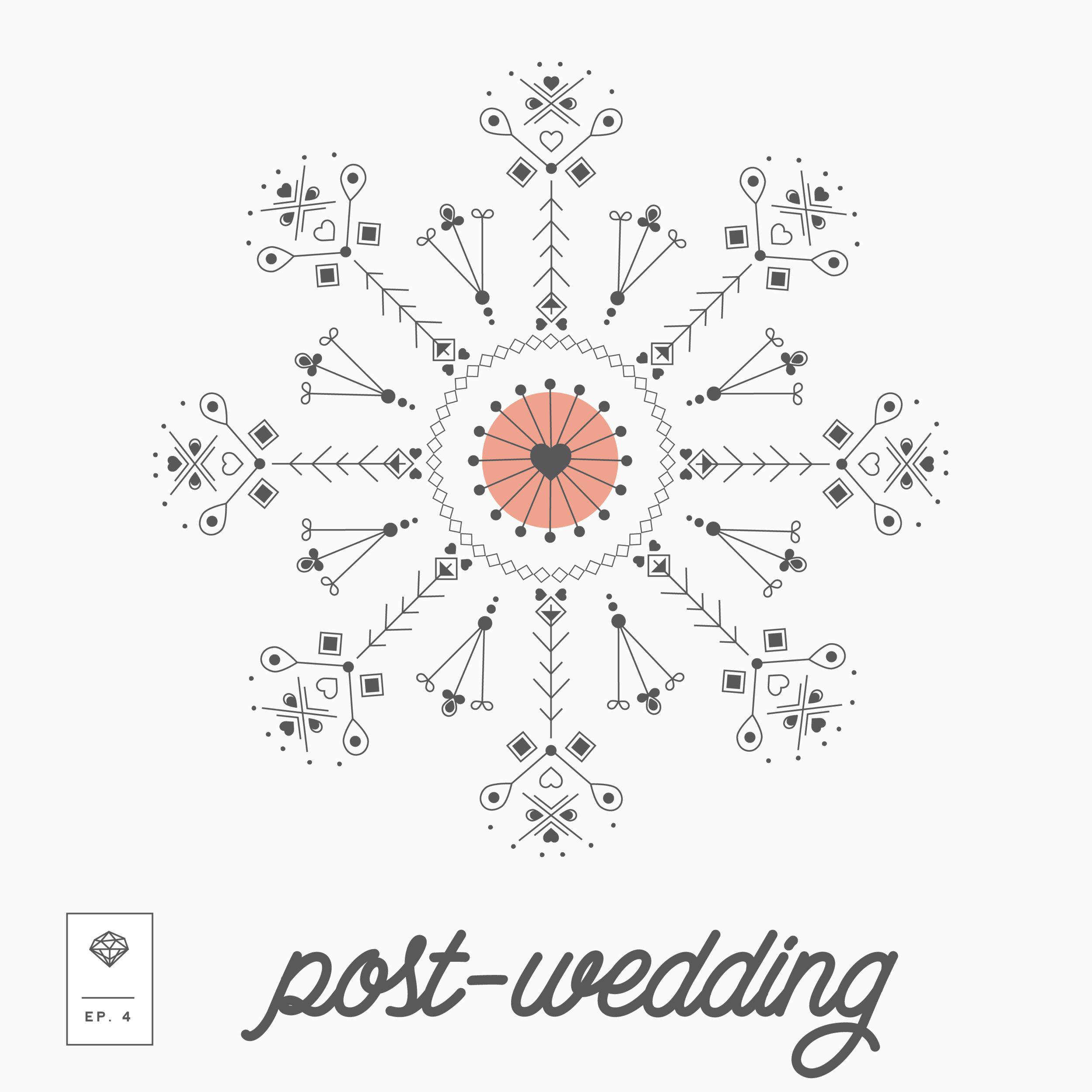
PODCAST COVER ART
I just thought I'd share some of the podcast cover art I made for several of the episodes released. Creating a new addition of cover art for each podcast was admittedly ambitious, but it was well worth it. Such is the life of a creative. Here's a peek at some of the podcast cover art for each episode.


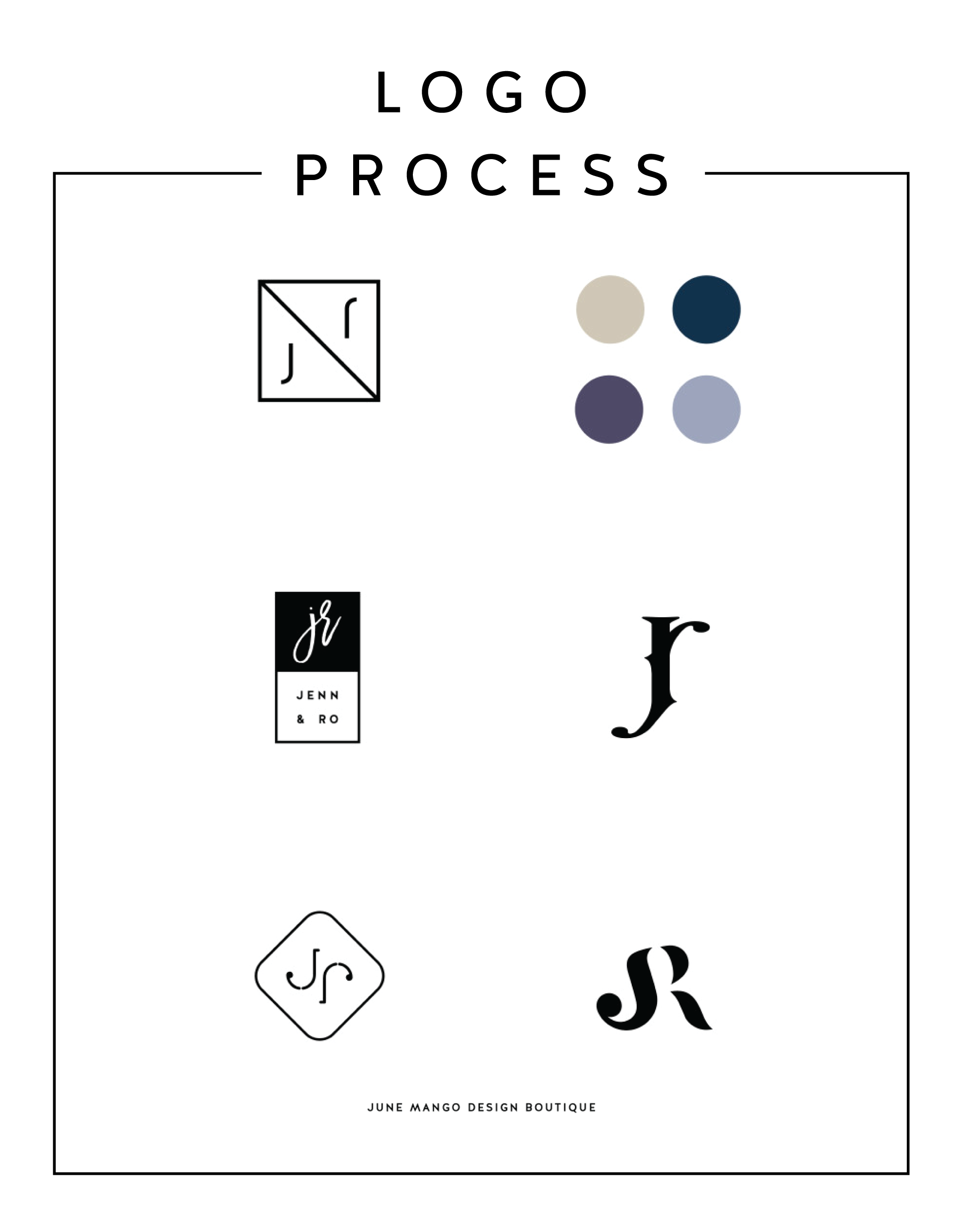
LOGO PROCESS - J&R
Just a little peek inside the process of a current logo project I'm working on right now. It's for a husband and wife photography team, and the trick is to combine the letters of their names - J and R - into a cohesive mark. It's fun and challenging. Can't wait to reveal the final logo!
Related Posts

BRANDING- BEYOND THE LOGO
A brand is a lot more than the fonts, colors, and design elements that make up the visual brand identity. Branding ultimately is the identity of the business if you were to whittle it down to it's core. So, how do you start to carve that baby down?
So you've seen a lot of lovely little logos on Pinterest and are ready to brand your biz! Heck ya, let's do it! But let's make sure we do it right.

So, how do you start to carve that baby down?
Let's start by thinking about what you want to be known for? This could be a service offering or product. It could also be the way you work with you clients. what makes you the best florist in Northern Michigan, for example? What do your clients value about working with you?
Once you have that nailed down, it's time to narrow in on what you have. Look through your answers to the above questions and ask yourself what's essential and what's just bonus material. This may not be the easiest exercise, but consider what feels like it could really elicit the most powerful brand or what the client would tell someone else about you.
Now, try to narrow it down even further. See if you can get this down to just three words. And try to make them pop a little - you want to stand out right. For example, I may be creative, multifarious and efficient but does that make you really excited to take on a design project with me? Probably not.
Make it easy for people to buy from you, not that other guy. Think about what you want your brand to be at the core, and then jazz it up a bit to differentiate yourself. Once you do this, you are ready for a kick-ass, colorful, clean logo design.
Related Posts

KYLEE ACKER BRANDING PROCESS
This is a behind the scenes peek at the branding process. The goal was to really showcase her initials since this is her personal brand. The trick was to make both the K & A recognizable because each letter is of equal importance. Th color palette combines classic neutrals with a slightly feminine, but not overpowering pop of pink.

Every designer has a slightly different process. Some designers like to share just 2-3 design concepts, and some like to share 10+. I'm somewhere in the middle and tend to share 4-6. I think that gives enough variety without overwhelming my clients. Too many choices can be paralyzing and ineffective.
Remember that hella stylish mood board I shared recently? This is a behind the scenes peek at the branding process. The goal was to really showcase her initials since this is her personal brand. The trick was to make both the K & A recognizable because each letter is of equal importance. Th color palette combines classic neutrals with a slightly feminine, but not overpowering pop of pink.
Which one would you choose?
Related Posts

LOGO PROCESS • RLS FASTPITCH
I like to give six logo concepts to my clients, because this feels like the perfect number. It's the Goldilocks of branding ( not too overwhelming and more than just a few options ). I know everyone's process is a bit different. Some designers only give three logos. Some give 15+. But I feel like I can nail down enough concepts to get the ball rolling and have each be creative and unique with six. Too many more than six and my creative juice stop flowing. Plus, I have found that my clients often feel paralyzed by the decision if there are too many to choose from.
I thought it might be nice to show some behind the scenes details for those curious about my branding process. These are six logo concepts that I designed for RLS Fastpitch. Although we ended up going through a few more iterations before we nailed down the final logo, these were a great starting point.
I like to give six logo concepts to my clients, because this feels like the perfect number. It's the Goldilocks of branding ( not too overwhelming and more than just a few options ). I know everyone's process is a bit different. Some designers only give three logos. Some give 15+. But I feel like I can nail down enough concepts to get the ball rolling and have each be creative and unique with six. Too many more than six and my creative juice stop flowing. Plus, I have found that my clients often feel paralyzed by the decision if there are too many to choose from.
The other thing about my logo process is that all of these logos are black and white. I find that color can be distracting, especially in the beginning. Once a client nails down one or two logo concepts, I implement color in the next round. I sometimes include the color palette direction along side the black and white logos, which is what I did here. This helps give them an idea of the logos as a whole ( design + color ).
Related Posts

CALENDARS FOR IPHONE + IPAD
These babes were made for the 2015 calendar year as background for a phone or tablet. I didn't want them to get lost, so they can live for ever in design-land here on the blog!
Click through to see each month and feel free to reach out if you like this idea and would like to see more for 2018!
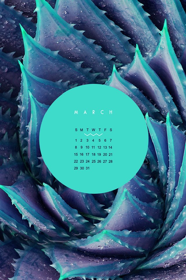
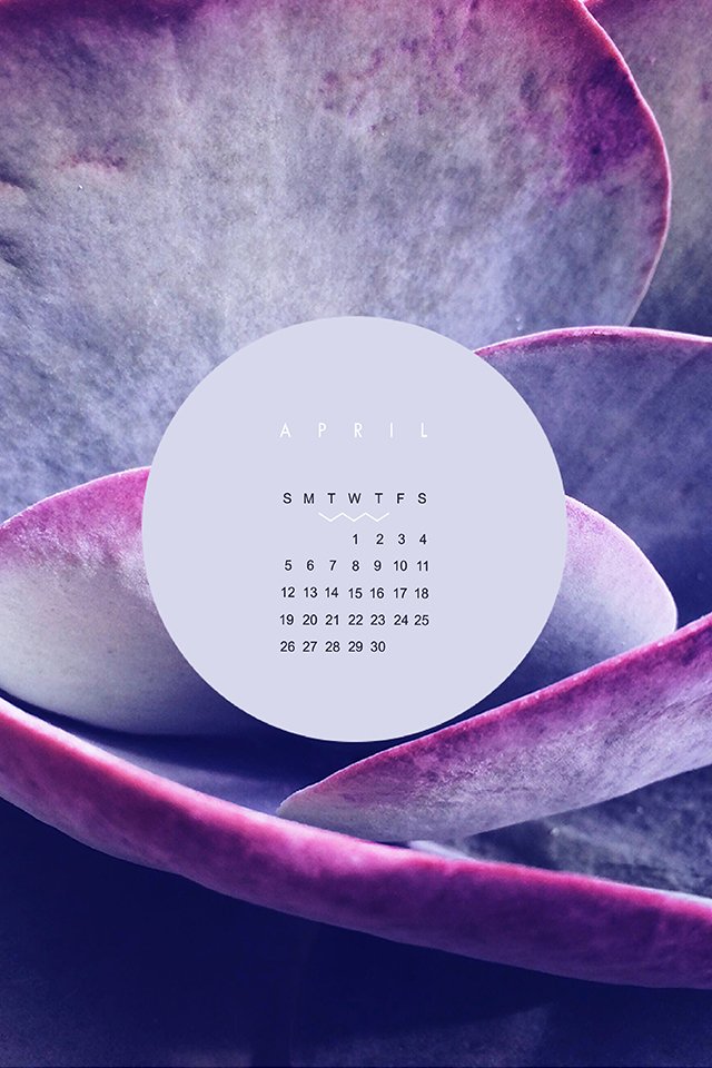
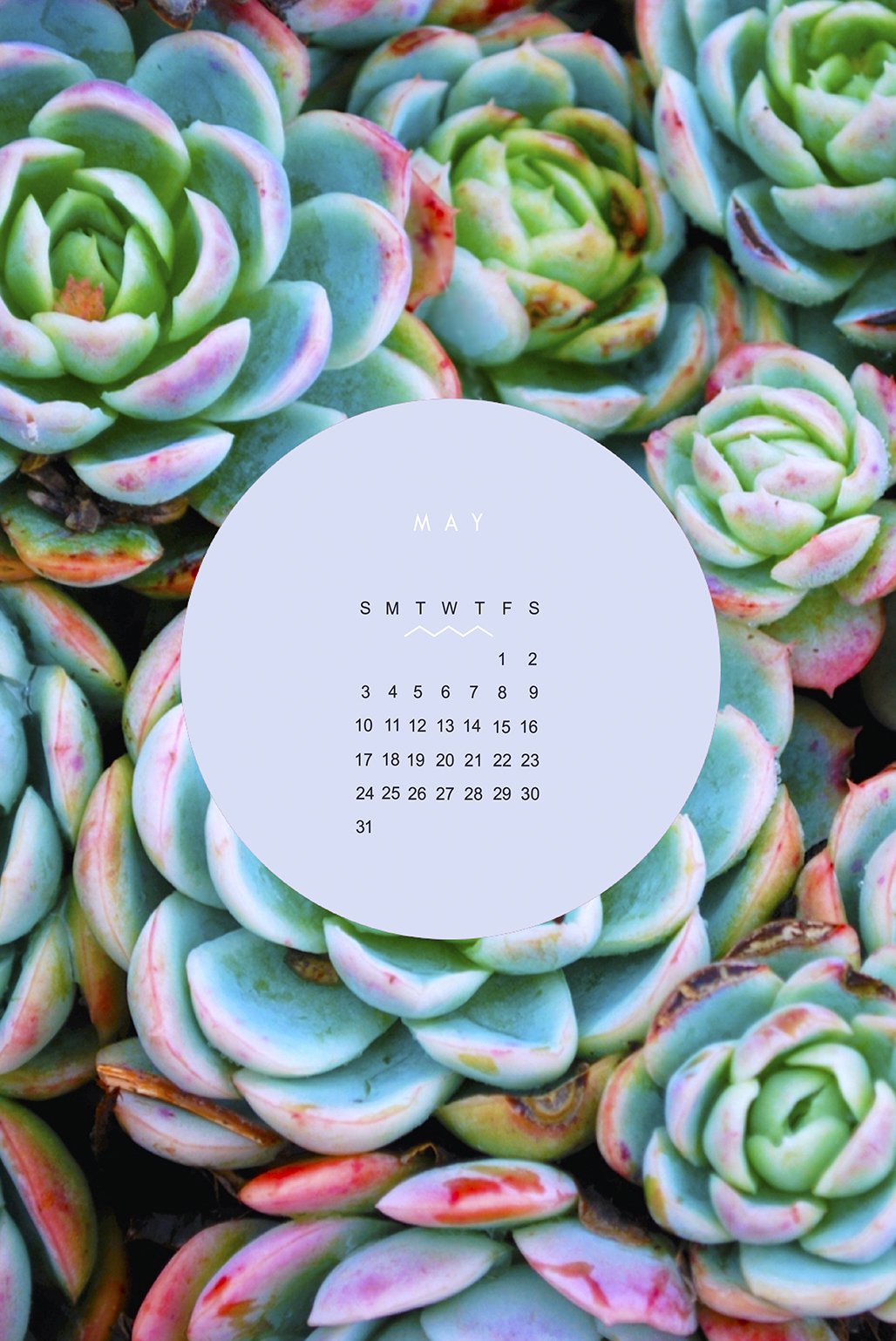

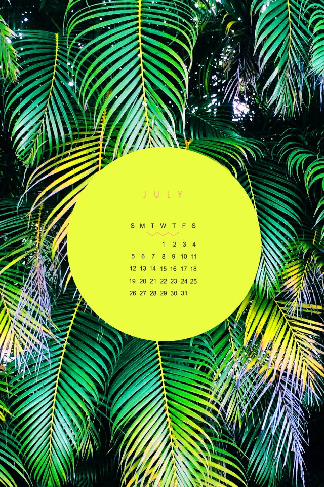

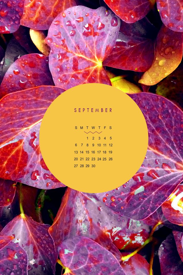
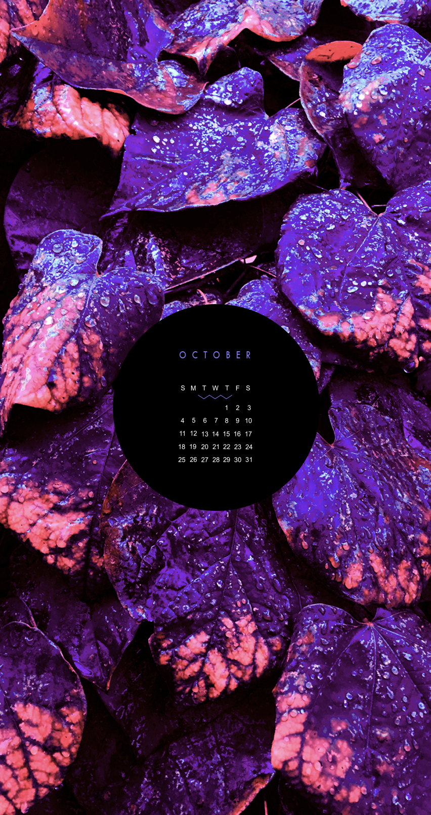
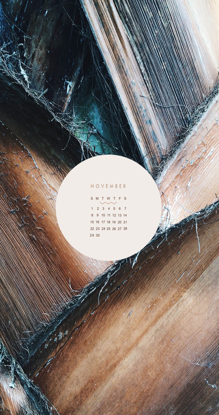
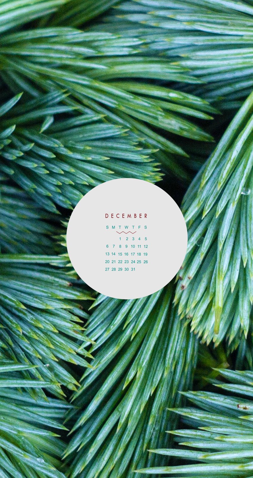
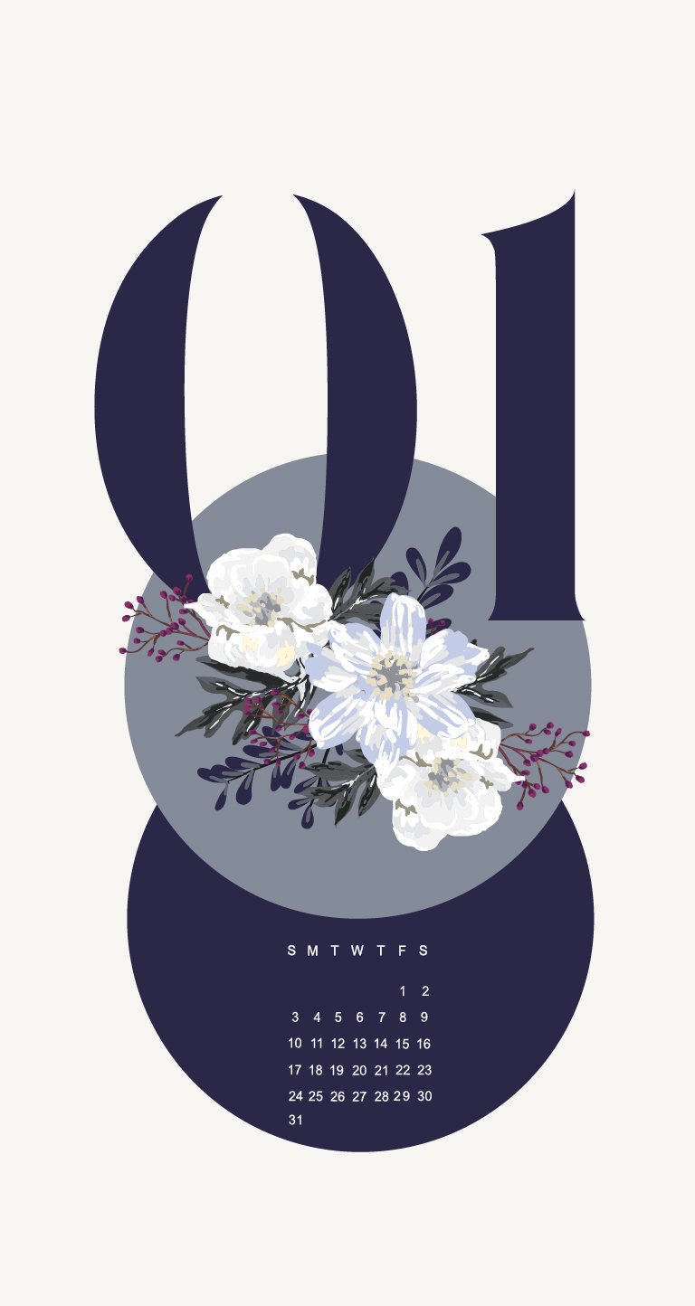

These babes were made as background for my phone and tablet many years ago. I didn't want them to get lost, so they can live for ever in design-land here on the blog.
Click through to see each month and feel free to reach out if you like this idea and would like to see more like this!


