
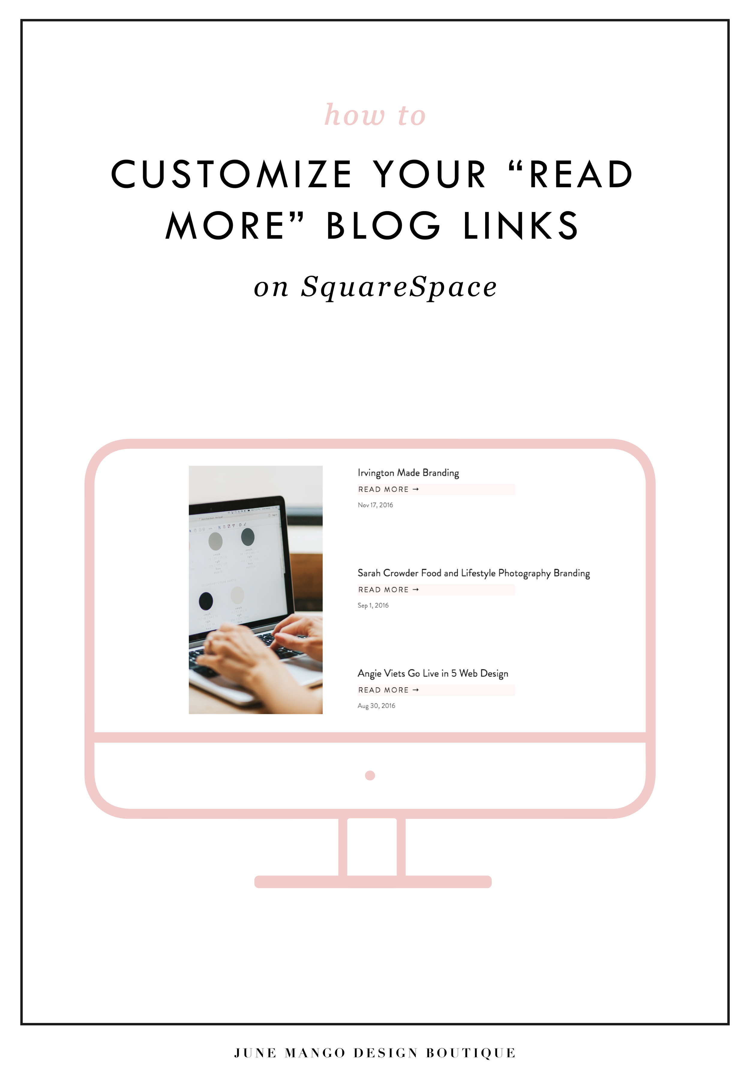
HOW TO CUSTOMIZE YOUR "READ MORE" LINK ON SQUARESPACE
I've got another little snippet of code for all you Squarespace lovers today! This one is for that boring old "Read More" link that appears on a Summary Block. Especially if you are using Squarespace's Summary Block to showcase your blog posts, the "Read More" link is often a good spot to get your audience to engaged (ie: so that they read more!) with your featured posts. So how do you take it from boring black text to something that matches your brand? I've gotcher back.
I've got another little snippet of code for all you Squarespace lovers today! This one is for that boring old "Read More" link that appears on a Summary Block. Especially if you are using Squarespace's Summary Block to showcase your blog posts, the "Read More" link is often a good spot to get your audience to engaged (ie: so that they read more!) with your featured posts. So how do you take it from boring black text to something that matches your brand? I've gotcher back.
There are a few little code changes you can make to jazz up the plain "Read More" to match your branding colors. Here are the steps:
In the main Squarespace menu, click DESIGN. Then CUSTOM CSS.
Copy and paste the following code:
/*** READ MORE LINK - TEXT ***/
.entry-more-link a:not(.sqs-block-button-element) {
color: #F2CBCB !important;
}
.entry-more-link a:not(.sqs-block-button-element):hover {
color: #444444 !important;
}
The pink highlighted text is where you can change your colors. Do not edit the other text. (You can also add this code to an individual page if you don’t want it to affect all “Read More” links on your site).
IMPORTANT ! !
Each template has a different method to define their "Read More" links. Please select the method for your template below, and then replace the red CSS code (.entry-more-link) with your template’s method. (If you’re template isn’t listed below, please try the links below, - many work for more than one template. If none of these work, feel free to email me with your specific template at hello@junemango.com).
Adirondack:.link
Five: .inline-read-more
Fulton: .summary-read-more-link
Horizon: .summary-read-more-link
Peak: .read-more
Mohave: .summary-read-more-link
Marquee: .entry-more-link
And that's it!
The following information was created for use with templates made with Squarespace 7.0.
Stay tuned for more tips and tricks for the new 7.1 platform!


need even more help with squarespace?
Skip the overwhelm and have your website
designed and launched in just 5 days!

MAKING DESIGN TRENDS UNIQUE TO YOUR BRAND - PART 1
Can we just have some real talk right now? Ya? Ok, the thing is, there's a lot of design trends that are just being recycled. Over and over and over. The problem with this (besides being boring), is that the logos aren't actually making their brands standout. You deserve to be on trend AND have a logo that won't be seen anywhere else.
Can we just have some real talk right now? Ya? Ok, the thing is, there's a lot of design trends that are just being recycled. Over and over and over. The problem with this (besides being boring), is that the logos aren't actually making their brands standout. You deserve to be on trend AND have a logo that won't be seen anywhere else.
So how can you take these design trends you're crushing on and make them unique to your brand? I have a few examples below to help you do just that.
Design trend #1: Circular Stamps / Submarks

These work so well for businesses who literally need a stamp created for their business. They're succinct, versatile and sophisticated. So now let's make it more unique to your brand.


A: Change the shape! This could be a simplified shape of the brand's distinctive identity, like the logo by Yossi Belkin above, or something as simple as a hexagon, triangle, or scalloped edge.
B: Break the rules! I am a big fan of breaking design rules. It just makes things a bit more interesting, like this logo by Salted Ink. So bust the design elements out of the circular text or make your circle wrap around only 3/4 of the way closed. Just shake shit up a little bit and see what you can come up with.
Design trend #2: Monograms

A: Combine letters! Simplify, simplify, simplify. That's my #1 rule of thumb for design. When it comes to monograms, using the strokes of each letter and combining them can help you create a totally unique mark.
B: Sneak in the second letter!Using negative space and the natural lines of the letters, you can 'imply' where the second letter is. In the logo for web dev Kyle Acker above, the K is prominent, but the A is inferred. It makes you take a second look, which if you ask me, is the mark of a strong logo.
These are just a few ways you can take something that's ay-ok and up-level it to be something really cool and unique to your brand! I'll have more on this and other common design trend in Part 2 of this series.
Related Posts


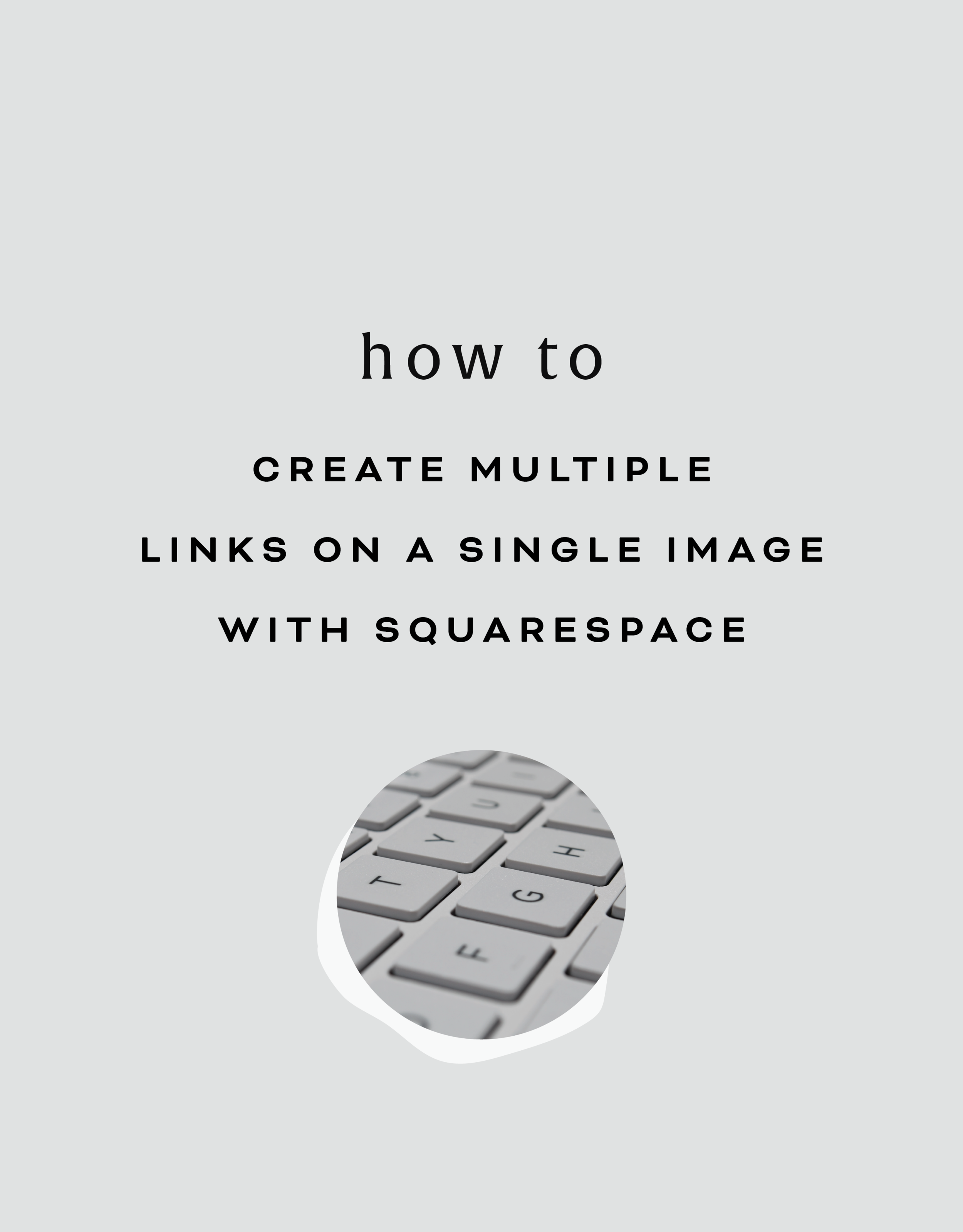
HOW TO CREATE MULTIPLE LINKS ON A SINGLE IMAGE WITH SQUARESPACE
I've recently discovered a new Squarespace hack and it has me super excited! I've always wanted a way to create multiple links on one image, and now I've figured out a way. And the best part is that it's super easy - no custom code needed! I've outlined the steps below so that you can get in on this SquareSpace hack, too because I like you.
Step 1: Start with the full image of what you would like the final image to look like on the site. We will break the image up into sections in the next step.

Step 2: Separate the image into sections (You can crop the original image, or if you're using Illustrator, I just create new artboards on top of the full image - one artboard for each section). Each section should be associated with one link. For example, mine will be broken into 4 sections linking to Pinterest, Facebook, Instagram and my website.


Step 3: Insert a content block and select the Carousel gallery.
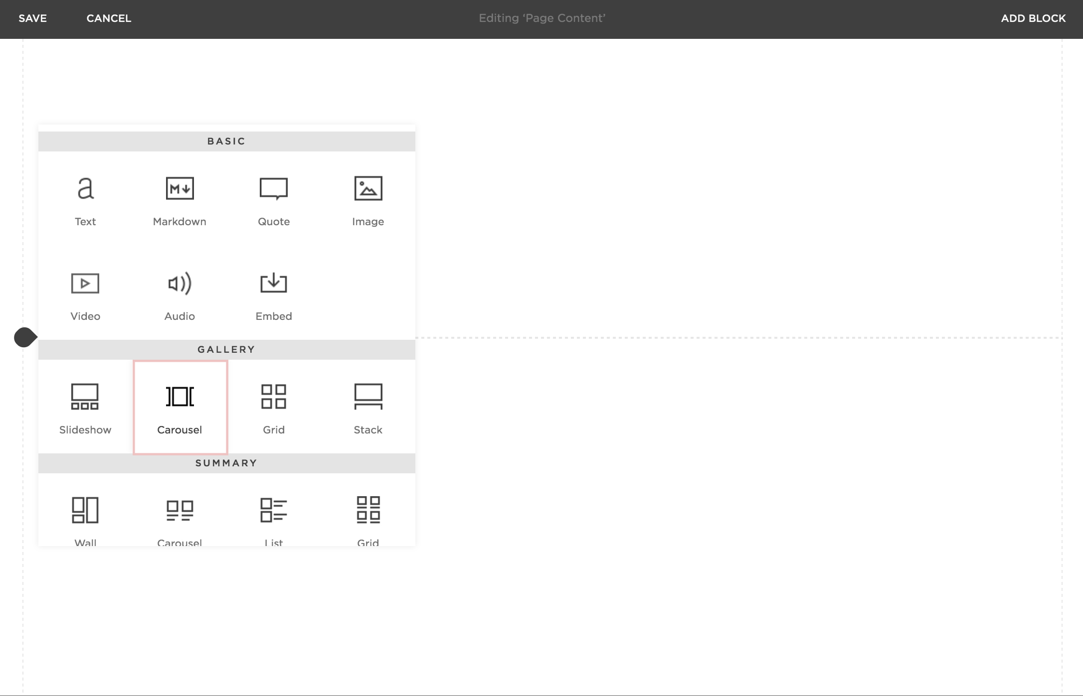
Step 4: Upload your sectioned-off images into the Carousel gallery block.
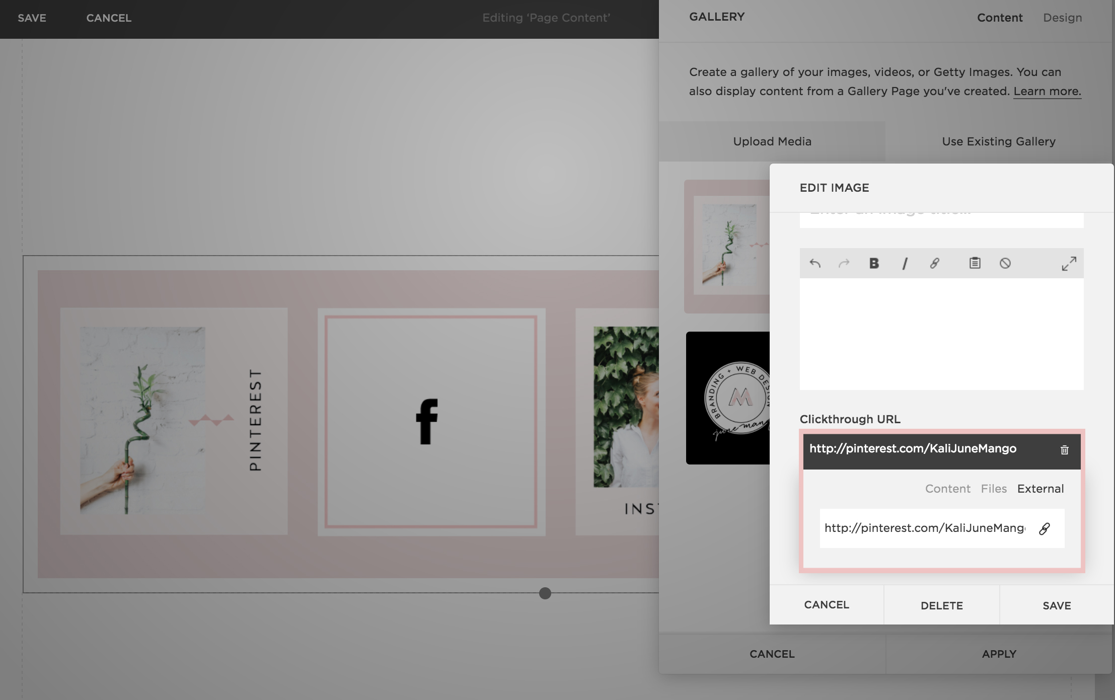
Step 5: After each image is uploaded, hover your mouse over the first image and click the gear icon.

Step 6: Add the website, page or file you would like to link the first section to and click save. Repeat for each additional section.
Step 7: Now that everything is linked, it's time to make sure the sections look like one cohesive image. You can adjust the Carousel block up or down until the sections are all showing up (not cropped) and everything looks good.

Step 7: Click save and that's it!
This little trick opens up so many possibilities from a design + layout standpoint. Another way that I use it is to add two images right next to each other without any space (like this). Or you could create a really cool collage with images/products that all link to each individual service or product page. Oh man, I could go on and on!!
The following information was created for use with templates made with Squarespace 7.0.
Stay tuned for more tips and tricks for the new 7.1 platform!


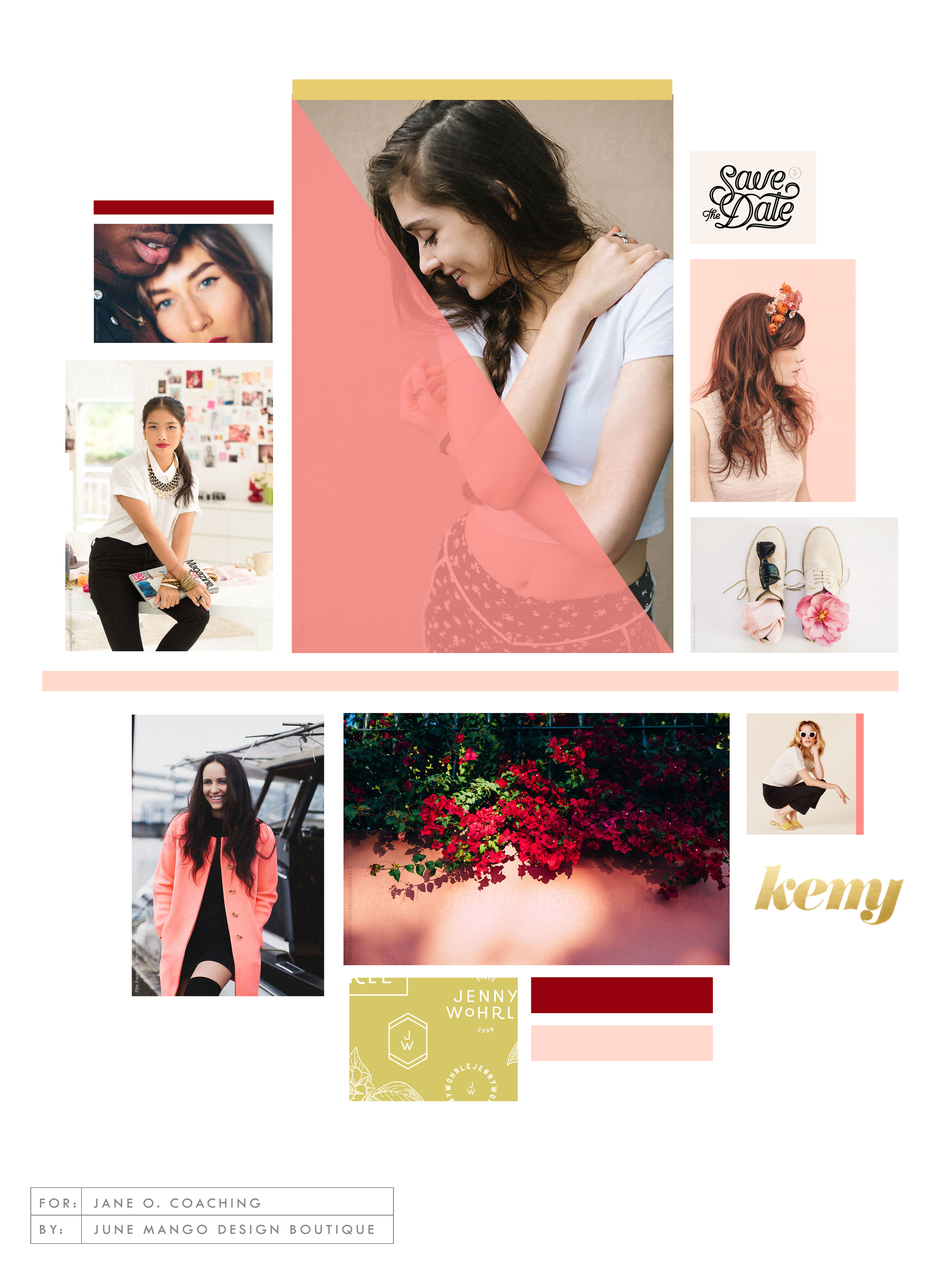
LOGO PROCESS: JANE O. COACHING
I haven't shared a logo process in a while. This logo process is from Jane O. Coaching, who is a love and style coach with an amazing colorful, bright vibe. So of course, she wanted her branding to be feminine, colorful and fun to show off her coaching niches.
I haven't shared a logo process in a while. This logo process is from Jane O. Coaching, who is a love and style coach with an amazing colorful, bright vibe. So of course, she wanted her branding to be feminine, colorful and fun to show off her coaching niches.
We ended up heading in the direction of #3, with some additional tweaks and customizations to make it fully unique to Jane. To see the full branding and web design that came from this logo process, head on over to janeocoaching.com.
And if you want to chat about your own logo or branding, holla at me!
Related Posts
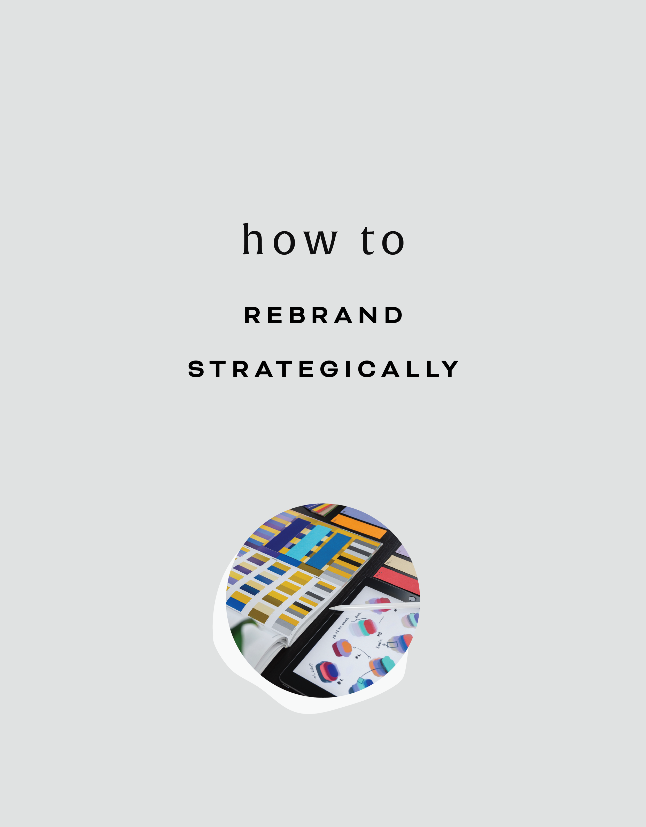
HOW TO REBRAND STRATEGICALLY
There are a lot of moving parts to a business, and your brand is just one of them. Branding is about getting to the heart of what I do best, who I serve best, and how I can best represent that through my business. So how do you even begin to strategically rebrand your biz? I have laid out my process with a few tips below, so read on!
If you have been following June Mango for a while, you will obviously have noticed that it's just gotten a major facelift. I am so excited about it and it's been a long time coming.
What I mean by that is that I have been diving deep behind the scenes to strategically rebrand my biz. This is more than just a new logo and color palette, although that's definitely part of it. This is about really getting to the heart of what I do best, who I serve best, and how I can best represent that through my brand. So how do you even begin to strategically rebrand your biz? I have laid out my process with a few tips below, so read on!
There are a lot of moving parts to a business, and your brand is just one of them. For me, I knew it was time for a rebrand when I felt that my messaging and design weren't matching up with:
A) the level of clients I was working with
B) the types of clients I wanted to attract
C) the level of expertise that I have collected from running my business for a few years
D) the actual design work I want to be creating
So these pieces each were key elements that just weren't matching up with what I was putting out into the world. In short, I had grown a lot as a designer and business owner, and wanted my brand to reflect that.
So now that I as aware of what I wanted to be sharing with my ideal audience, it was time to create the messaging and design to match. Now, I am NOT a copywriter, but I do think that the copy in your brand is just as important for your consistent business voice as your design. There are a lot of amazing copywriters that can help you share your vision in your voice, so don't be afraid to hand over the reigns.
Design-wise, I tried to really get clear on what:
A) I'm really good at
B) I can do that not many other designer's can
C) type of design I like to create
D) what type of design my ideal audience is looking for
With these things in mind, it was easy to create a website and brand that showcased all of the above. And the key here is that the real reason it was easy, is because it was natural. This is another reason I knew it was time to rebrand - I was eager to stretch my legs into design that fit me better.
Finally, I always like to keep in mind the visuals of the previous logo and branding. You don't want to completely change your look or else no one will recognize you! (Think Jennifer Grey after the nose job). So I stuck closely to the layout of my old logo, kept some of the same colors, like the pink, and just updated the hues. I also added a new stamp as an alternative logo to help share my services + expertise in a clear way and round everything out.
Overall, I am so happy with it. It really represents me, my design style, and my ideal clients. And that is exactly what your brand should do. :)
The full branding + web design:


5 QUESTIONS TO ASK BEFORE SWITCHING FROM WORDPRESS TO SQUARESPACE
So you've been thinking about switching from WordPress to SquareSpace, but aren't sure if it's right for you or your business. So how do you know if you should switch things up or stay put? Here are a few questions to help you decide:

So you've been thinking about switching from WordPress to SquareSpace, but aren't sure if it's right for you or your business. So how do you know if you should switch things up or stay put? Here are a few questions to help you decide:
How much do you blog? If you are a regular blogger posting content more than once a week, you may want to stay with WordPress. Not only does WordPress have an amazing database for all that content, but it will also be quite a process to move all of that content over to SquareSpace without messing with the posts' formatting, plugins, etc. If you don't blog as regularly, this is less of an issue. I merge blogs over from WordPress to SquareSpace all the time, so it definitely can be done. You may end up tweaking each post to make sure it works in the new SquareSpace site, but if you don't have hundreds of posts, this isn't a huge issue.
How often will you be adding pages or tweaking your content? If you know you're going to be adding new forms, creating pages for an e-course or anything else that would require you to get in the backend and easily create your own content, SquareSpace is the clear winner. It's user interface is extremely easy to use and it even has pre-made page layouts for the novice web designer.
Do you need a lot of customization?Do you need to be able to tweak a lot of little things or have some crazy-cool functionality like a unicorn that flies across the screen? If so, stick with WordPress. WordPress allows you to create a custom-coded child theme and you can pretty much do anything you want with that (with the help of a developer). SquareSpace's customization is a little limited, mostly because they don't want the novice web designer to break his/her site! But even SquareSpace can be customized to a certain extent , like I've talked about this and this post.
Do you want to be hands-off for the website's maintenance? Then SquareSpace is the better choice. Since SquareSpace isn't open-source, unlike WordPress, they control everything. This means there are hardly any bugs, no need to manually backup your site, and if you ever have an issue, their support team is ah-mazing. I can't even count how many times I've used their live chat option when I have a question about something.
What's your price point? There's obviously no "set cost" for either of the platforms, it just depends on what you need. For WordPress, you have to pay for hosting as well as your domain name, plus any theme you purchase or web designer/developer you may hire to help create the site. If you're creating a custom site, you could be paying upwards of 20K! SquareSpace has a few plans that you can choose from, and most businesses can get away with the Personal plan, which is $12/month. Add that cost to your domain name and it's only a few hundred dollars if you set it up yourself. If you hire a web designer to help you, you will likely still walk away with a brand new site for less than a few thousand dollars.
So what do you think? It really just depends on your answers to these questions, but hopefully you find them helpful in determining which choice is right for you! And hey, if you want to chat through any of this more, I'm here! Just holla at me.
The following information was created for use with templates made with Squarespace 7.0.
Stay tuned for more tips and tricks for the new 7.1 platform!
Related Posts
need even more help with squarespace?
Skip the overwhelm and have your website designed and launched in just 5 days (or less)!
LEARN MORE

HOW TO CREATE A POP-UP FORM ON SQUARESPACE

When I discover a new trick on SquareSpace I get so excited because...
A) I have a new tool in my toolkit when building client websites.
B) I get to share it with you! Because if I didn't know this existed, chances are other people don't either.
I recently discovered a super helpful, and super simple way to create a pop-up form for your SquareSpace website. And you can do it without any custom code or tech-savvy-ness.
Just follow the 4 simple steps below.
Open your Content Block options, and click Add Form.

2) Create your form in the normal way, adding the fields you need. Then click the Advanced tab.
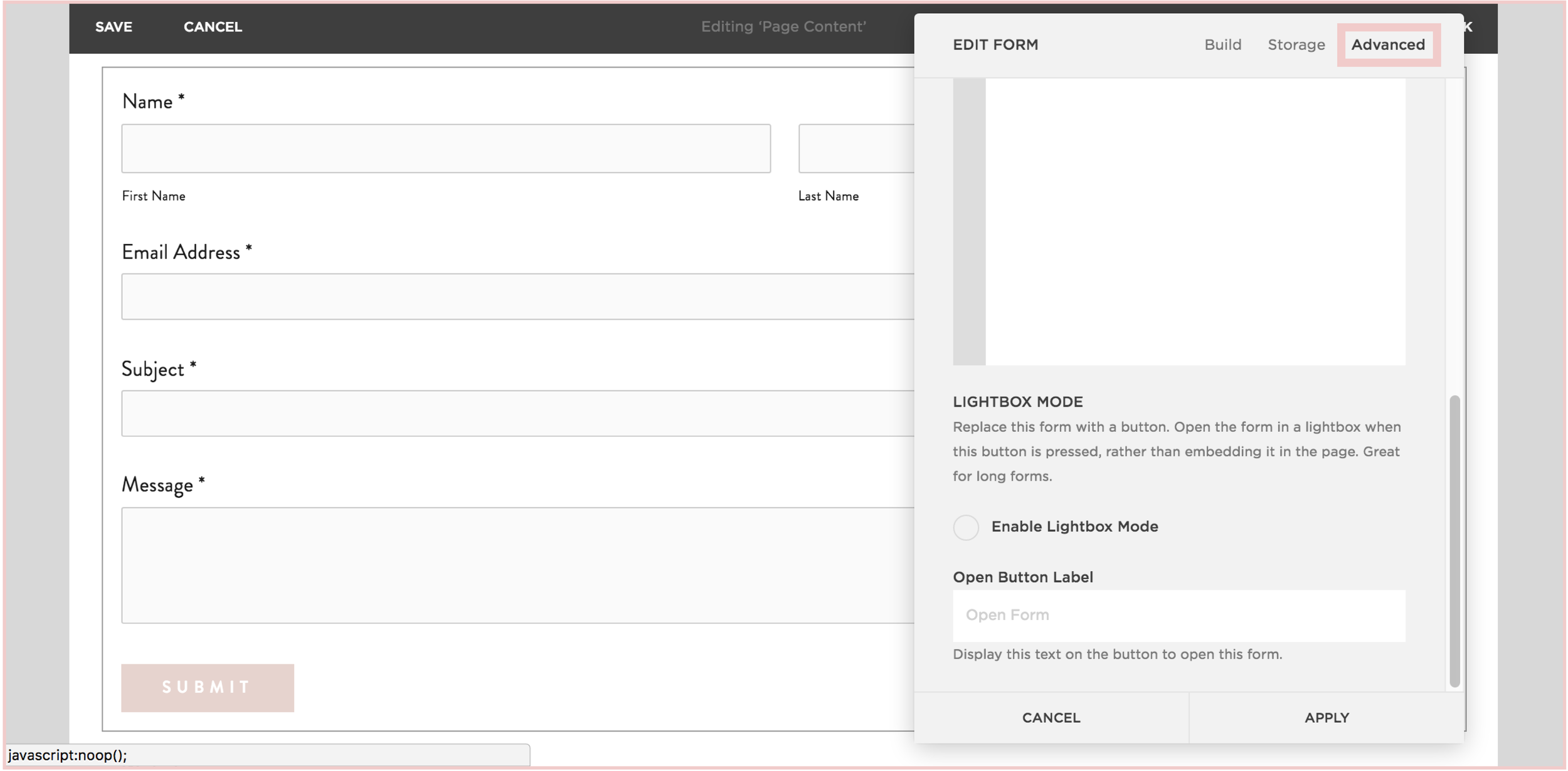
3) In the Advanced tab, click the circle next to "Enable Lightbox Mode". This is the key to making your form pop-up, verses just sit on your page as a regular form. You can also write the call-to-action text you want for your pop-up button in the "Open Button Label" field.

4) And TA - DA ! You just created a pop-up form on your SquareSpace site!


The following information was created for use with templates made with Squarespace 7.0.
Stay tuned for more tips and tricks for the new 7.1 platform!
LOGO PROCESS: JULIA KILKENNY
This little behind the scenes of the logo process is from the branding project for Julia Kilkenny, who is a coach for creative entrepreneurs. She described her ideal brand to me as "the first blue sky day of Spring." Amazing, right?! I took that and really ran with it and created these little nuggets for her.
This little behind the scenes of the logo process is from the branding project for Julia Kilkenny, who is a coach for creative entrepreneurs. She described her ideal brand to me as "the first blue sky day of Spring." Amazing, right?! I took that and really ran with it and created these little nuggets for her.
We ended up going with #2 and brought in more of that gorgy color palette. You can see the final branding and the web design to match this logo process over at juliakilkenny.com.
And if you feel like chatting with me about your own logo and branding, I'd love for you to holla at me
Related Posts

CHANGING THE COLOR OF SOCIAL MEDIA ICONS IN SQUARESPACE
So you've created your brand-spankin' new SquareSpace website and styled it perfectly to match your brand with font pairings, gorgeous colors and a lovely layout. BUT, you can't get those pesky social media icons to match your pretty palette. Don't worry! I've gotcher back.
There's a tiny string of code that you can use to change the SquareSpace social media icons from black and blah to any color you want! Follow the steps below on your own site and voila, styled social icons!
Here are the details:
In the backend of your SquareSpace site, navigate to DESIGN.
Click on CUSTOM CSS.
Paste in this bit of code:
.sqs-use--icon { fill: #F65959 !important; } .sqs-svg-icon--wrapper:hover { .sqs-use--icon { fill: #444 !important; } }
The bolded HEX color is what you'll need to change to match your own color palette. If your not sure what HEX your color is, check out this handy converter.
That's it! You're set.
Don't you feel like a Squarespace genius?!
Note: This set of code works for the "Regular" style of icons.
The following information was created for use with templates made with Squarespace 7.0.
Stay tuned for more tips and tricks for the new 7.1 platform!
HOW TO USE & ABUSE GRIDS FOR WEB DESIGN
A little design secret is that any good design is probably breaking a rule. Not ALL the rules, because otherwise, things get a little confusing. But breaking a rule here and there allows you to create something that catches your eye. And eye-catching design is noteworthy. And noteworthy sites are remembered. You see where I'm going with this, right??

Every website is designed using a grid. This is so helpful when you are thinking about layout and placement of content. If you're just starting out in web design, or are DIY-ing your site, this is basically the number one rule to keep in mind. JUST FOLLOW THE GRID.
But! You can also use the grid to your advantage to create unique layouts. A little design secret is that any good design is probably breaking a rule. Not ALL the rules, because otherwise, things get a little confusing. But breaking a rule here and there allows you to create something that catches your eye. And eye-catching design is noteworthy. And noteworthy sites are remembered. You see where I'm going with this, right?? :)
So using this website as an example, you can see that there is a grid as a guide, but the elements in the layout don't all fit perfectly within the rules of the grid. Some elements are perfectly centered, like the mission statement at the top and the newsletter opt-in at the bottom.
Other elements use the grid, but in unexpected ways, like the "Next Step" graphic and text. While the white space that holds the text is along the line of the grid, the pattern that encompasses the white space + text is above the line of the grid. But you'll also notice that the black pattern does follow the rules of the grid from left to right and fits nice and snug into the right-hand side of the site. The images on the left do the same thing. They break the grid vertically, but fit centered from left to right.
So you can see that this website breaks the rules a little, but each element still follows the grid in another way, which keeps it clean and cohesive, but also a little interesting and eye-catching.
If you want to take a look through the full website used in this example to see how I carried this organized rule-breaking throughout the rest of the site, head on over this-a-way!
For even more web design craziness, check out this, this, and this site.
Related Posts
need even more help with squarespace?
Skip the overwhelm and have your website designed and launched in just 5 days (or less)!
LEARN MORE

BREAKING THE BOUNDARIES OF MOOD BOARD MOSAICS
Totally deconstructed. More white space, more breathing room. More color blocks, but all integrated into the collage vs. being stacked together. Still a brand-focused lifestyle image at the center grounding the collage as well as the brand. And little, layered type elements.
I think all designers have a touch of Creative ADD. All of my favorite designers are constantly changing and pushing their brands + the creative processes to be better, cooler, or more unique.
I have this ADD too, and recently I've been itching to bust out of the standard mood board mosaic design. It's just EVERYWHERE, and frankly, I'm bored. And here's a little secret: boredom = creativity's best friend. Being bored makes me want to shake it up! Create something new and funky! Get weird and wild! Design-wise, that is. :)
So here's where I ended up on a the new make-up of my mood boards.
Totally deconstructed. More white space, more breathing room. More color blocks, but all integrated into the collage vs. being stacked together. Still a brand-focused lifestyle image at the center grounding the collage as well as the brand. And little, layered type elements.


I think mood board collages + color are my love language. ❤️
So what do you think? Love it? Hate it? Wanna live in it (I do!!). I'd love to hear your thoughts on the new mood board so feel free to holla at me!
Related Posts

THE SIMPLEST GUIDE TO COLOR PSYCHOLOGY
If you know anything about me at all, you know how much I love color. It is one of my favorite things - right up there with my family and chocolate. So it’s no wonder that adding color to a project is my favorite part of the process. It's also a crucial part of the process because it can change the feeling and appeal of a brand or website.
There are literally college courses (I took many!), books and a ton of in-depth resources devoted to the study of color and color psychology. But since you are probably not a #colornerd like me, I have broken down how to work with your color palette without having to dive deep into all that is Color Psychology.

Quick Color Psychology Overview
Whether you realize it or not, colors evoke emotions, feelings, and memories, and you can utilize this to create a brand or business presence that works to attract your dream client or customer. But since this can quickly become a rabbit hole of color-nerdiness, I have laid out the Quick and Dirty Guide to Color Psychology above. This little chart will show you how you can apply this knowledge to your logo, branding, website and anything else that incorporates color. Feel free to click the image to download a PDF version for yourself to reference in your future projects.
As John Ruskin said, "The purest and most thoughtful minds are those which love color the most.” And I couldn't agree more. 😉
WANT to CREATE
a custom WEBSITE?

LOGO PROCESS: DEVAN DANIELLE
I had such a crazy-good time creating this little logo, and the logo process above was only step one. We took these logos, refined them and added in some really cool photo elements until we got to a really versatile final logo and matching branding elements.
Devan contacted me to create her logo and branding with some super interesting and unique ideas. She basically said, "I want you to go wild and do whatever you want."
Um, HELL YAS!
The only requirement was that she wanted the logo to feel light, airy and open. Done and done.
I had such a crazy-good time creating this little logo, and the logo process above was only step one. We took these logos, refined them and added in some really cool photo elements until we got to a really versatile final logo and matching branding elements. You should probably head over here to check out the finished project, because, well, it's just so damn lovely!
And if you feel like chatting with me about your own logo and branding, I'd love for you to holla at me!
Related Posts

ESSENTIAL FILE FORMATS FOR DESIGN
This post is for those of you who may not understand a lot of the terms designers talk about when it comes to sending along your final logo or design files. And this is also helpful for you to know once you get that big ol' package of file formats so that you can use each file type in the appropriate place. So, today I am focusing on understanding the main file formats used for design, which includes JPG, PNG, GIF, EPS, PDF, and TIFF files. Each file type can be used for a different reason. I’ve listed out each of the main types along with their best uses below.
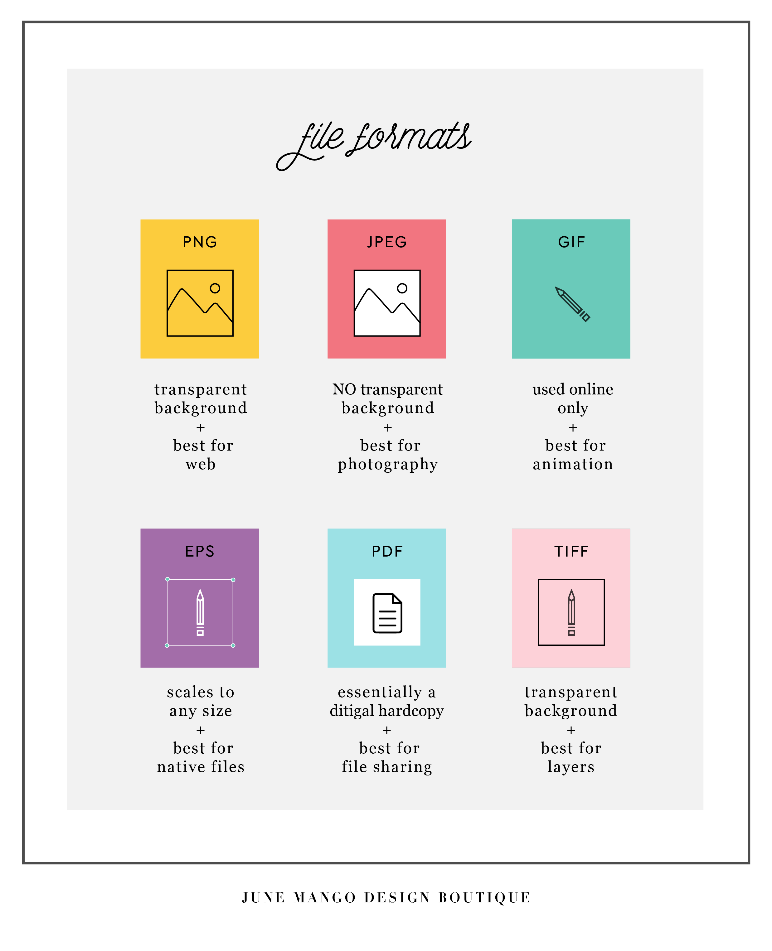
Hopefully you can use this as a quick guide to your file formats when you're feeling a little lost in the proverbial design jungle. Feel free to save this to your desktop and look back to it whenever you need it!
Related Posts

HOW TO ATTRACT YOUR IDEAL CLIENTS
Your brand's logo has some serious power to help you attract your ideal client. You just need to know how to use it. Your logo is one of the first things people see when they meet your biz, whether it's online or on your business card. Make your logo work for you by attracting your ideal clients ... like a magnet!
Your brand's logo has some serious power to help you attract your ideal client. You just need to know how to use it. Your logo is one of the first things people see when they meet your biz, whether it's online or on your business card. Make your logo work for you by attracting your ideal clients ... like a magnet!
So here's the trick:
Take out a notebook and really think about who your ideal client is. Write down as much information about them as you can (gender, hobbies, where do they hang out online, what do they do on weekends, what's their age, etc.). From there, try to understand EXACTLY what visually inspires them.
Next, pretend you're them. I'd head to Pinterest for this part of the exercise. Create a pinboard and GO TO TOWN. Pin everything you think they would like. Get that visual inspiration all in one place. And VOILA! What you now have is a great resource of visuals that you can use to apply to your logo. Look for common colors, patterns, styles and apply it all to your branding design. And that, my friends, is how to make your logo attract your ideal clients like a magnet.
Want to see these tips in action? Here’s an example or two of a client magnet.
Related Posts
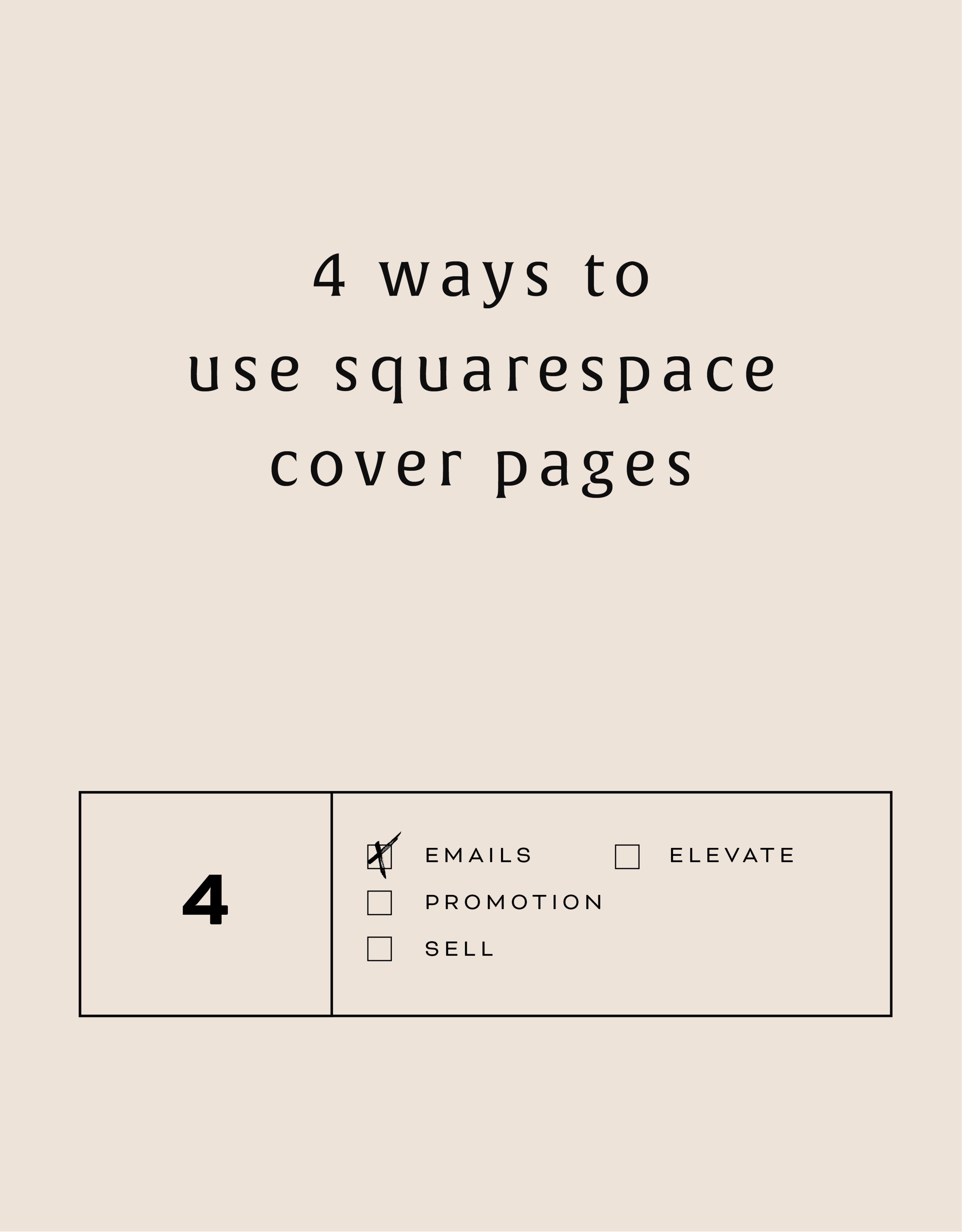
4 WAYS TO USE SQUARESPACE COVER PAGES

Have you heard of SquareSpace cover pages? These unique and versatile web pages are great way to add a bit of flair to your creative endeavors. Below are four unique ways to utilize these cover pages to make a powerful introduction.
Collecting email addresses. Whether your website is under construction (or not yet begun!), you're about to launch something new, or you just want to grow your email list, a SquareSpace cover page is the perfect solution.
Promoting anything. If you're launching a new product, podcast, or course, cover pages allow you to present and promote before people move on into your regular website.
Sell something. Cover pages can be a free, high-converting landing page for a digital product or service. Send people to your sales page or create the opt-in directly on the cover page.
Elevate your homepage. Cover pages can be a great pause for people before entering your site. By using a cover page as your homepage, you can also be very specific about where you send people on your website.
These are just a few options but I'd love to hear more! Comment below or holla at me if you've used SquareSpace cover pages in a unique way!
The following information was created for use with templates made with Squarespace 7.0.
Stay tuned for more tips and tricks for the new 7.1 platform!
Related Posts
need even more help with squarespace?
Skip the overwhelm and have your website designed and launched in just 5 days (or less)!
LEARN MORE

15 BOOKS FOR CREATIVES
As creatives running our own businesses, it can be hard to wear All The Hats and be experts in every area. I find this is especially true for creatives because we usually start our businesses because we want to do what we love all day everyday - not because we're great at business plans, marketing or legal business issues.
To help you be the very best creativepreneur you can be, I've compiled a list of 15 books for creatives to help you keep learning and growing professionally!

This book will give you a swift kick in your creative ass. It lists practical ideas and questions to help you beat back fear, overcome your vulnerbility, validate your plans and launch ANYTHING.
We get so used to our own story, that sometimes we even forget that we're telling it. This book helps creatives explain their stories and re-launch your brand in a way that makes people want to you buy you.
This is a great book for the creative entrepreneur that is just starting out on their own. It can feel like a big leap and this book gives you all you need to get started including creating a portfolio of work, legal issues and the basics of building a business doing what you love.
I'm a big planner and so anything that gives me a concise way of organizing my creative content is a winner in my book.
This is such a great book for creatives who aren't formally trained in branding. Touching on all the elements that go into logo designa nd branding, the book touches on how to color to create an emotive connection; how patterns can create personality and how to carefully select typefaces that are intentional and well-integrated into your brand.
This book is a perfect blend of business plan meets art project, and as creatives, isn't that the best way to create a business plan?! Using "the four pillars" of every successful business (great name, great business setup, a legit legal structure, and a well thought out financial system), the book guides you through the steps to create a strong business foundation the right-brain way.
As someone who makes lists just to cross things off (shower...check!), I love this book! The weekly prompts allow you to open a space in your life to create goals and dream that you may have otherwise missed. While this is less likely to directly help you run your business, it will certainly get those creative juices flowing!
This books dives into why and how things become popular or even viral! It reveals the interesting science behind word-of-mouth and the social spread of information. It even breaks it down into six basic principles that you can compare your own business + marketing decisions.
For those of use who need a good kick in the ass for planning, and staying on top of our creative careers (and if you don't fall into this category at some point, please give me your secret powers!), this book gives you actionable advice for building a steady work routine, focusing your creative energy, beating back the never-ending emails, and generating new ideas.
This book is a breath of fresh air when it comes to setting goals and getting clear on what you want to achieve. Danielle LaPort suggests we first think about our "core desired feelings" and work backward from there to set a clear pathway to reaching those the accomplishments that will drive those feelings into existence.
Anything I missed? What are you guys currently reading? I'd love to know, so holla at me!
Related Posts

GOAL SETTING FOR BRANDING YOUR BUSINESS
As the savvy business owner you are, you probably set certain goals for yourself when you started your business. Setting tangible steps to reach your goals is a foolproof way to reach tangible results.
Here's a secret: you can take those same building blocks you used to start your business and apply them to your branding.
Here's an example. Let's say your goal is to grow your Instagram following to 1000 die-hard Insta-fans. Ok, now what are the steps that will get you there?
Post great content.
Engage with your followers.
Post more regularly.
In this example, we set a goal and created the specific steps to reach it.
Now, let's apply this to branding. What is your goal?
Keep in mind, this can still be a business goal. It doesn't have to be related to design. For example, if you're a photographer trying to book more weddings, your goal might be to attract more brides-to-be. So think about what these women may be looking for. Your goal-oriented branding steps may look like this:
Look through your previous work and identify which shoots relate most to weddings that you would like to build from. Do these shoots have any common aesthetics?
Determine the feeling you want to evoke from future brides (romantic, fun, professional, whimsical, etc).
Translate those adjectives into a branding style. If you choose whimsical and romantic, think about what visuals represent those words (script lettering, florals , and soft colors are a good start!).
By working through these goal-oriented steps, you will find that you're able to fine-tune your branding and vision.
The more specific you can get with this exercise, the better your branding experience will be! If you want to chat about this more, holla at me!
Related Posts

HOW TO REMOVE THE DATE FROM YOUR SQUARESPACE BLOG POSTS
If you would like to remove the blog date and time from Squarespace, there is an easy bit of CSS code you can use to make it work. The catch is that you have to do a bit of research first. I've listed the steps below, which are super simple, but they work best if you're working within a Chrome browser.

Squarespace is so great for its Drag and Drop abilities, but once in a while, SquareSpace gets a little stubborn and won't let you change the simplest things. One of those things is your blog post publish date.
If you would like to remove the blog date and time from SquareSpace, there is an easy bit of CSS code you can use to make it work. The catch is that you have to do a bit of research first. I've listed the steps below, which are super simple, but they work best if you're working within a Chrome browser.
How to remove the date from your Squarespace blog posts:
First, move your cursor over the date on your blog and right click.
Click "Inspector". This should bring up all the code from your SquareSpace site.
Find the "Class" that contains the date. The "class" name should look something like this: <time class="thisisthenameoftheclass">March 31, 2016</time>
Copy and paste the class name into your Custom CSS. To get here, go to DESIGN -> CUS TOM CSS and paste in the code below. (Make sure you change .insertclass to the name of your class from Step #3).
.insertclass{ display: none; }
And that's it! You should now have hidden all the dates from showing on your Squarespace blog.